Moody Pink Bedroom Design Ideas: Rich, Romantic Styles for a Dramatic Space
Picture this: you've pinned a dozen photos of dark, sultry pink bedrooms. The kind where the walls feel like velvet and the light glows warm. Then you look at your own room with its builder-white walls and overhead lighting that hums like a fridge.
The gap between the vision and reality feels enormous.
Moody pink bedroom design isn't about slapping a coat of blush on the walls and calling it a day. It's about understanding light, undertones, and texture in a specific sequence that actually works. As of 2026, the trend has matured well beyond the 2023 "dark feminine" wave, and the results people are sharing online are genuinely stunning when done right.
The difference between a dreamy retreat and a garish mess comes down to a few technical details that most tutorials skip entirely. Let's walk through the complete process, one layer at a time.
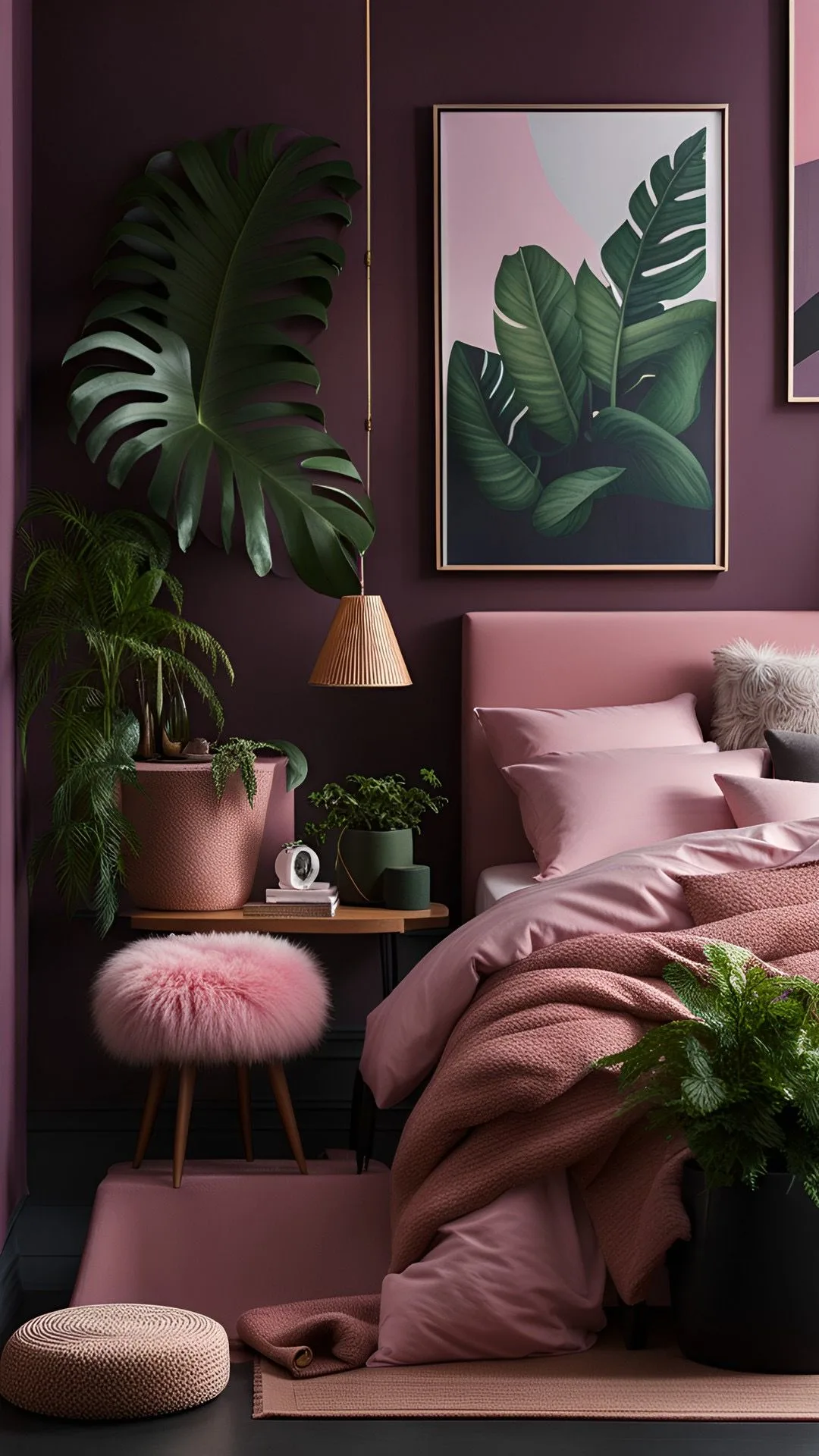
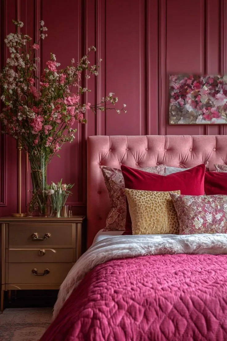
Image source: Web (Bing) / cl.pinterest.com (Web image (fair-use with source credit))
Quick Answer
Start with your room's natural light. North-facing rooms need warmer pinks; south-facing rooms can handle cooler tones. Choose a pink with an LRV between 10 and 30 for true moodiness.
Paint one accent wall first, then add velvet textures and warm 2700K lighting. Test swatches on the actual wall for 48 hours before committing. Layer lighting in three zones: overhead, task, and ambient.
Why "Moody Pink" Works — And Why It's Tricky
The appeal is obvious. Moody pink feels intimate, romantic, and endlessly cozy. It wraps you in warmth in a way that stark white or cool gray simply can't match.
That's why interior designers keep returning to it decade after decade.
But here's the catch: pink is one of the most lighting-sensitive colors you can put on a wall. The same shade that looks like dusty rose in a sun-drenched showroom can turn into Pepto-Bismol pink in a dim, north-facing bedroom. Anyone who says "just pick a shade you like" has clearly never painted a room and watched the color shift dramatically between morning and evening.
The other challenge is balance. Deep pink walls demand thoughtful furniture choices, layered lighting, and deliberate restraint with accessories. Get it right and you have a five-star hotel suite.
Get it wrong and you have a room that feels like a dollhouse exploded.
The solution comes down to reading your environment first, then making decisions based on what you see. This isn't guesswork. It's a predictable process that any homeowner can follow.
The First Step: Reading Your Room's Natural Light
Before you even look at paint swatches, spend a day watching your bedroom. Seriously. The direction your windows face determines which pinks will work and which will flop.
North-facing rooms get cool, blue-gray light all day. This light makes warm, peach-based pinks look muddy, while blue-based pinks like mauve or dusty rose stay true. South-facing rooms get warm, golden light for hours.
Here, the opposite happens: cool pinks can look washed out, but terracotta and apricot-leaning shades bloom beautifully.
East-facing rooms get bright morning light that fades by afternoon. West-facing rooms start dim and warm up dramatically as the sun sets. Both need you to decide when you spend the most time in the room.
If you're only in there at night, the morning light matters less than evening ambiance.
Here's the practical method:
- Check the wall at 9 AM, noon, and 8 PM.
- Hold paint swatches against the actual wall, not on paper.
- Note how the color changes with your lamp lighting at night.
Manufacturer specifications show that most paint colors shift noticeably when the light source changes. Benjamin Moore and Sherwin-Williams both publish Light Reflectance Values (LRV) precisely so you can predict this behavior. A color with an LRV of 15 will absorb about 85 percent of the light hitting it.
That's dramatic. It means the wall color will look significantly darker than the swatch card suggests in a dim room.
If your room gets almost no natural light, lean into it. Choose a slightly brighter pink than you think you need, around LRV 25 to 35. The darkness will pull it down naturally, landing you in moody territory without going full cave.
Choosing the Right Shade of Pink (Undertones Matter)
This is where most people go wrong. They pick a pink based on how it looks on a tiny chip at the hardware store. Then they paint a 12-foot wall and wonder why it looks completely different.
The secret is undertones.
Every pink has a base hue hiding underneath. Some lean orange or peach, which feels warm and earthy. Others lean blue or violet, which feels cool and sophisticated.
And some lean red, which pushes into sultry, almost burgundy territory.
For a moody bedroom, you want pinks in the mid-to-deep range with strong undertones that anchor them. Pastel baby pinks won't read as moody no matter how dark you make the room. Instead, look for shades with descriptors like:
- Dusty rose (cool, muted)
- Mauve (purple-tinged)
- Terracotta pink (warm, earthy)
- Raspberry (red-leaning)
- Clay (brown-tinged)
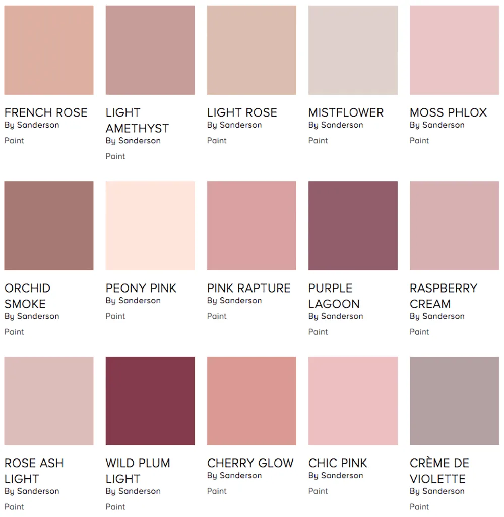
Image source: Bing (Web (fair-use with source credit))
The photo above shows what real paint swatch patches look like on an actual wall. Notice how the warm, peach-based pinks at the top feel completely different from the cool, blue-based options at the bottom. That visual difference is exactly what you're looking for when you hold swatches against your own walls.
A practical trick: compare your top three choices side by side on the wall. Paint a 2-foot square patch of each, about six inches apart. Live with them for two full days.
Wake up with them. Come home to them at night. The winner will reveal itself quickly.
Another tip from aggregate interior design research: avoid any pink that looks like it belongs in a children's room. That usually means skipping anything with a bubblegum or cotton candy descriptor. Those shades have LRVs above 50, which is far too reflective for a moody aesthetic.
You want depth, not brightness.
Paint Finishes and Application: Matte, Eggshell, and Texture
Once you've nailed the color, the finish matters just as much. Paint finish controls how light bounces off your walls, which dramatically affects the moody factor.
Matte finish is the gold standard for dark bedrooms. It absorbs light rather than reflecting it, which creates that soft, velvety appearance that defines the aesthetic. The trade-off is durability.
Matte walls show scuffs and fingerprints more readily, and they're harder to clean. For a bedroom, that's usually acceptable since walls don't get heavy traffic.
Eggshell offers a slight sheen while staying mostly flat. It's easier to wipe down than matte and reflects just a hint of light. This is a solid compromise if you're worried about wall maintenance.
The finish reads as slightly more formal than matte, which can work well in a sophisticated space.
Satin and semi-gloss are risky choices for dark pink walls. They reflect too much light, creating distracting hotspots that kill the moody effect. The exception is accent details like trim or wainscoting, where a subtle sheen adds dimension.
Application technique matters more with dark colors than light ones. Deep pigments show every roller mark, lap line, and patchy spot. Experienced painters recommend:
- Use a high-quality 3/8-inch nap roller for smooth walls.
- Apply two full coats minimum, then assess for patchiness.
- Consider a third coat for deep, saturated colors.
- Roll in a W pattern to avoid visible seams.
- Never paint in direct sunlight; it causes flash drying.
Primer is non-negotiable. A grey-tinted primer specifically for dark colors will give you better coverage and truer color than white primer. Some brands sell "high-hide" primers designed for this exact purpose.
In our research, grey primer reduces the number of coats needed by one in most cases, saving both time and paint.
If you're renting or hesitant to commit to full pink walls, peel-and-stick wallpaper is your friend. Modern options include deep rose patterns, floral wallpaper with black backgrounds, and solid velvet-textured vinyl. They're removable without damaging most walls and give you the moody look without the permanence.
Lighting: The Secret Weapon of a Moody Bedroom
Lighting is where moody pink bedrooms succeed or fail. You can nail every other element, but a single harsh overhead fixture will destroy the entire effect. The fix is layered lighting, which means having multiple light sources at different heights and intensities.
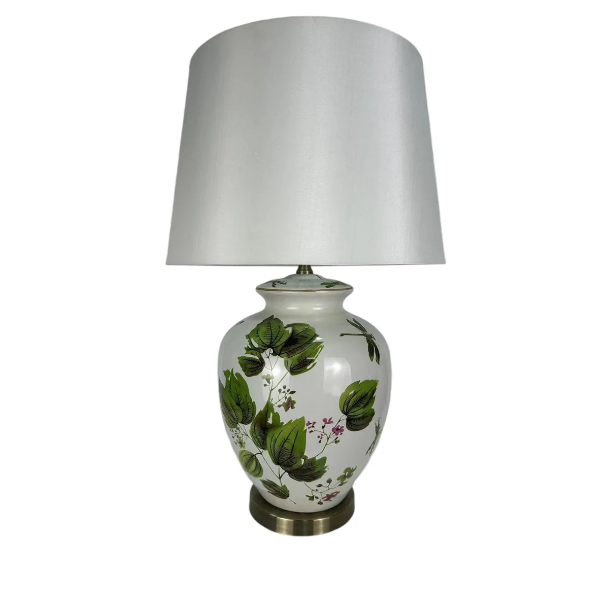
Image source: Bing (Web (fair-use with source credit))
The lamp above is a perfect example. Its warm glow spills across the headboard and softens the wall color behind it. That's the effect you're chasing: light that wraps around your furniture and creates pools of warmth rather than flooding the whole room.
Start with the color temperature. Use bulbs rated at 2700K, which produces that classic warm, amber glow. Avoid anything above 3000K; it will read as clinical and blue, instantly cheapening the look.
Dimmer switches are your best friend here. They let you drop your lighting from comfortable to sultry with a simple twist.
Layer your lighting in three zones:
- Overhead: a soft, diffused fixture with a shade that casts light upward.
- Task: table lamps or wall sconces aimed at reading areas or nightstands.
- Ambient: LED strips behind the headboard, floor lamps in corners, or candles.
For the overhead fixture, choose something with a fabric or frosted glass shade. Bare bulbs create harsh shadows. A drum shade in linen or silk will diffuse the light beautifully.
If you're using LED strips, pick a warm-white version with an adhesive backing that can mount behind your headboard or under floating shelves.
Wall sconces work wonders in tight spaces. They save nightstand surface, add vertical interest, and create a reading arc of light that feels intentional. Look for sconces with adjustable arms so you can point the light where you need it.
Warm-brass or antique-bronze finishes pair beautifully with pink walls, adding a vintage touch that feels collected rather than decorated.
One mistake people make is relying solely on one lamp. A single source creates harsh shadows and leaves corners in darkness. You want multiple sources at different heights to create a soft, ambient wash.
Aim for at least three light sources in a standard 12-by-12 bedroom. And always test your lighting before finalizing the wall color. Turn on your new lamps and check how the pink looks under them.
The color will shift from daytime, and that's exactly what you need to plan for.