Dark Pink Bedroom Ideas for a Bold, Romantic Space
You’re drawn to dark pink bedroom ideas because you want a space that feels warm, sophisticated, and full of personality, but you’re also worried it might end up looking like a little girl’s room or just feel overwhelming. You’re right to be thinking about this, it’s the exact challenge that makes or breaks the look. Dark pink is a surprisingly versatile color that can be cozy, modern, or romantic, depending on how you handle it, but the key is in the visual execution, not just the paint can.
The real secret isn’t a color name, it’s the Light Reflectance Value, or LRV. In our research of major paint brands, as of 2026, a true “dark pink” typically has an LRV below 50, which means it absorbs more light than it reflects. This is what gives it that rich, moody depth but also means your lighting plan is non-negotiable.
Let’s walk through what you actually need to see before you commit to a single brushstroke.
Quick Answer
Dark pink bedroom ideas create a cozy, sophisticated space. Start by understanding if your chosen pink has warm or cool undertones. Test paint samples on your actual walls to see how light changes them.
Use dark pink on one accent wall or in bedding to add drama without overwhelm. Always balance it with plenty of neutral tones like cream, white, and natural wood. Layer warm lighting to keep the room from feeling dark.
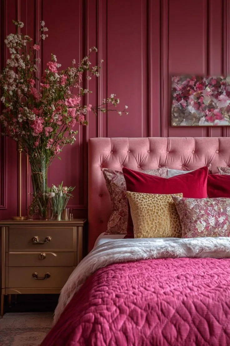
Why Your Brain Needs to See Dark Pink Before You Paint
Thinking about color isn’t the same as seeing it in context. You can read about “dusty rose” all day, but your brain won’t grasp the vibe until it sees how that color lives with your specific wood floors, the light from your north-facing window, and the texture of your linen bedding. This is why generic advice fails, your room is a unique ecosystem of light and materials.
Dark pink is an emotional color. It can feel incredibly intimate and cocooning, but in the wrong setting, it can also feel jarring or dated. The difference comes down to the visual relationships you create.
A photo of a successful room shows you these relationships: how the pink wall interacts with a black iron bedframe, how a brass lamp casts a warm glow on it, how a cream-colored rug breaks up the floor. Your planning should start with collecting images that make you feel the way you want your room to feel.
Decoding “Dark Pink”: It’s Not Just One Color
Calling a color “dark pink” is like saying “a sports car”, it tells you very little about what you’re actually getting. The two most critical factors to understand are undertone and saturation. Getting these wrong is the number one reason a color feels off in a room.
Undertone is the hidden color within the pink. Is there a hint of brown (warm), a touch of blue (cool), or a bit of gray (muted)? Saturation refers to the color’s intensity, is it a vivid, pure pink or a softened, grayed-out version?
A high-saturation dark pink is bold and dramatic, while a low-saturation one feels more earthy and relaxed.
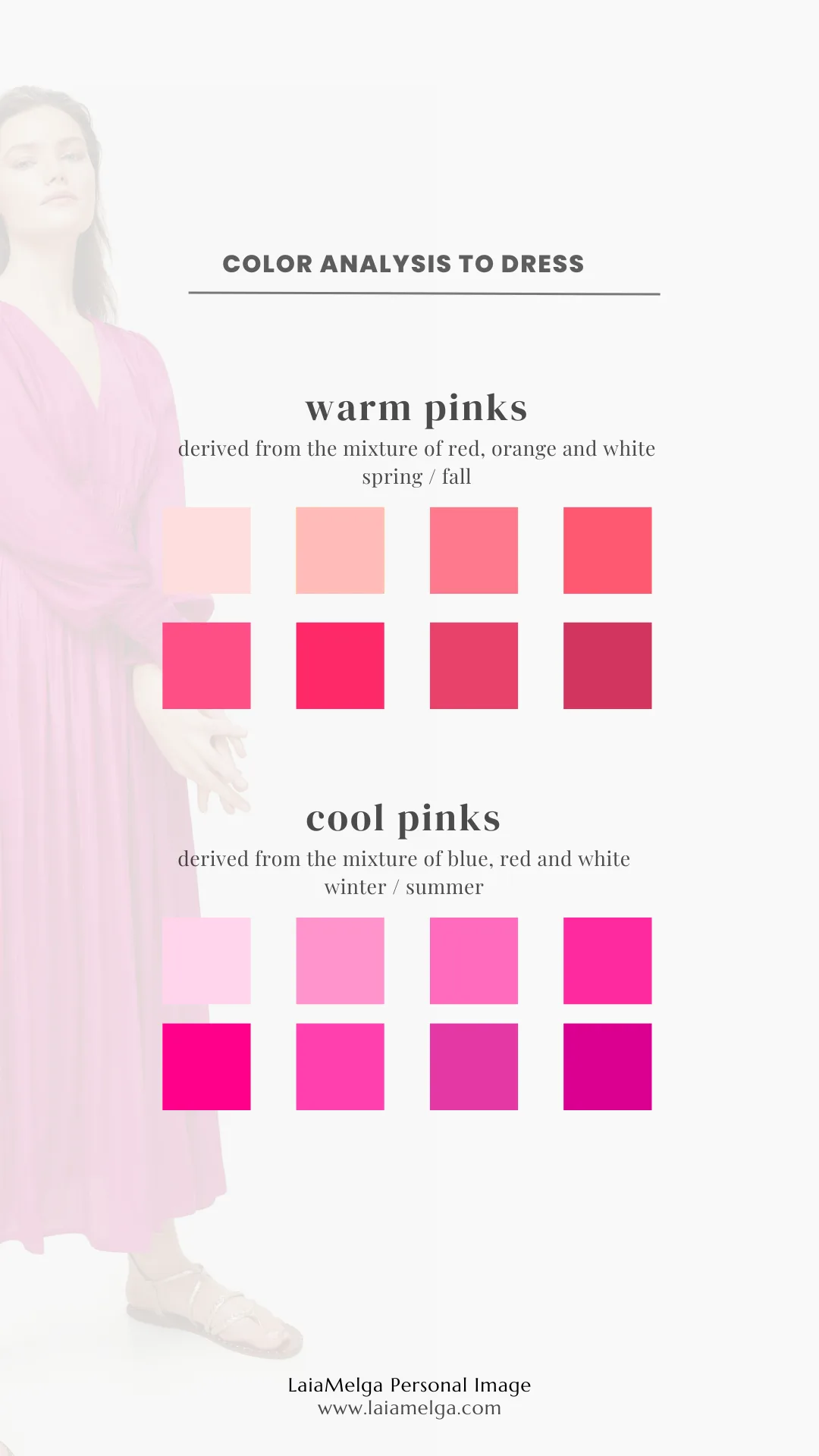
Warm vs. Cool Undertones: The Secret to Harmony
Warm undertones have hints of red, orange, or brown. Think terracotta pink, clay, or a rusty rose. These pinks feel earthy, cozy, and inviting.
They pair beautifully with other warm materials like oak flooring, brass fixtures, leather, and creamy off-whites. They’re excellent for rooms with cool north light, as they add a sense of warmth.
Cool undertones lean towards blue or purple. Berry, fuchsia, and some mauves fall here. These pinks feel more modern, crisp, and even a bit glamorous.
They work well with cool grays, black metals, chrome, and stark white. If your room gets a lot of warm afternoon sun, a cool pink can provide a refreshing balance.
Mistaking one for the other leads to clash. A warm pink next to cool gray bedding will look dirty. A cool pink against golden oak can look strangely neon.
Always compare your pink sample to a pure white and a piece of brown paper to see its true leaning.
Saturation & Light: Finding Your Perfect Shade
Saturation is what keeps a dark pink from feeling childish. The most sophisticated and livable dark pinks for bedrooms are almost always desaturated. They have gray, brown, or black mixed in, which tones down the pinkness and makes it feel more like a neutral.
This is where Light Reflectance Value (LRV) becomes a practical tool. You can find a paint’s LRV on the brand’s website or fan deck. For a dark pink that’s still restful, aim for an LRV between 30 and 50.
Below 30, it becomes a very deep, nighttime color that demands excellent artificial lighting. Above 50, it starts to read as a medium or even light pink.
Remember, LRV is measured under perfect lab conditions. The true test is how it looks on your wall at 9 AM and 9 PM. That deep terracotta you love might become a flat brown at night if you only have a single overhead light.
The Dark Pink Moodboard: Core Elements to Visualize
Now that you know what kind of dark pink you’re dealing with, it’s time to build its visual family. A great dark pink bedroom isn’t a monochrome box. It’s a careful balance of color, texture, and neutrals.
Think of your pink as the lead actor, it needs a strong supporting cast to shine.
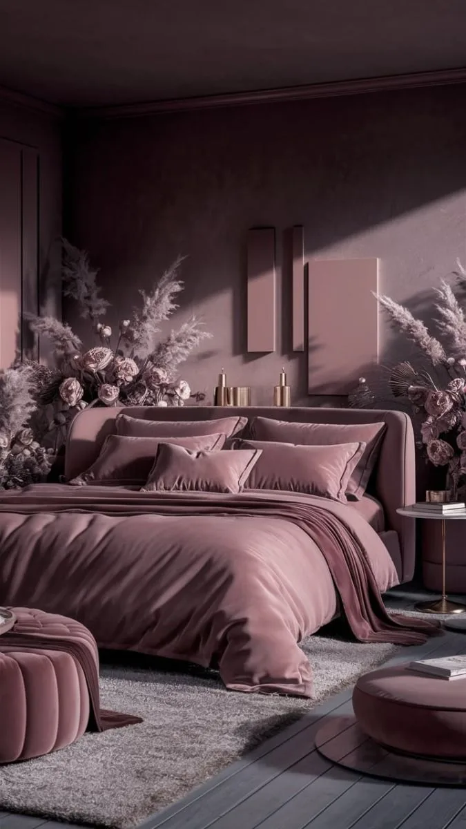
Your Foundation: Walls & Big Surfaces
This is your biggest commitment. You have three main approaches:
- The Accent Wall: The safest and most popular choice. One dark pink wall (usually behind the bed) makes a huge statement without enclosing the space. It instantly creates a focal point.
- Color Drenching: Painting all walls, and often the ceiling, the same dark pink. This is a bold, immersive move that creates a ultra-cozy, cocoon-like effect. It works best in bedrooms with good architectural details and a dedicated lighting plan.
- Wallpaper: A patterned dark pink wallpaper adds instant depth and personality. A large-scale floral feels romantic, a geometric print feels modern, and a textured grasscloth adds organic warmth.
For paint, a matte or eggshell finish is ideal for dark colors. It helps hide imperfections and absorbs light beautifully, enhancing the rich, velvety look. A satin or semi-gloss will reflect more light, which can sometimes make a dark color look streaky or less sophisticated.
The Supporting Cast: Furniture & Wood Tones
Your furniture finishes will make or break the harmony.
- Light & Natural Woods: Oak, ash, pine, and rattan bring in warmth and lightness, preventing the room from feeling too heavy. They’re perfect with warm, earthy pinks for a relaxed, organic feel.
- Dark or Stained Woods: Walnut or espresso-stained pieces add contrast and grounding. They create a more dramatic, modern look, especially with cooler-toned pinks.
- Painted Furniture: White or cream painted furniture is a classic, foolproof choice. Black painted pieces add bold, graphic contrast. For a softer look, consider painting a dresser in a lighter, complementary pink.
Texture & Shine: Fabrics, Metals, and Finishes
This is where the room gets its tactile, lived-in feel. Mixing textures prevents a flat, one-dimensional look.
- Fabrics: Think velvet for luxury (on a headboard or pillows), linen for relaxed breathability (on bedding or curtains), and wool or chunky knits for cozy accents (in a throw blanket).
- Metals: Your choice of metal is a key style definer.
- Brass & Gold: Warm, traditional, glamorous. Pairs perfectly with warm pinks.
- Black Iron & Matte Black: Modern, industrial, grounding. Excellent with both warm and cool pinks.
- Chrome & Nickel: Cool, crisp, contemporary. Best with cool-toned pinks.
The Essential Balance: Neutrals & Accent Colors
No dark pink bedroom is complete without strategic neutrals. They give the eye a place to rest and prevent sensory overload. The 60-30-10 rule is a helpful guideline here: 60% of the room is your dominant color (this could be your dark pink plus neutrals), 30% is a secondary color (like your wood tones and larger textiles), and 10% is for an accent.
| Neutral Role | Color Examples | Effect |
|---|---|---|
| Primary Neutral | Cream, Oatmeal, Warm White, Light Gray | Used for bedding, rugs, and other large soft surfaces to create breathing room. |
| Grounding Neutral | Black, Charcoal, Dark Brown | Used in frames, small furniture legs, or lighting for definition and depth. |
| Accent Color (10%) | Sage Green, Navy Blue, Mustard Yellow, Burnt Orange | A small pop in art, a single pillow, or a vase to add visual interest and complexity. |
For example, a moody pink bedroom often uses black as its grounding neutral for a dramatic effect, while an earthy moody bedroom decor scheme might use sage green as its accent to enhance the natural feel.
Step-by-Step: Building Your Dark Pink Room (A Visual Plan)
Let’s translate all that theory into action. Following a visual plan means you’re making decisions based on what you see, not what you imagine. This process saves you from expensive and disappointing mistakes.
Step 1: Find Your Inspiration Image & Define the Vibe
Don’t just collect pretty pictures. Be analytical. Find one or two photos that perfectly capture the feeling you want.
Is it the moody boho bedroom design with layered textiles? Or the crisp, modern look of a pink bedroom ideas for adult space? Deconstruct that image.
What is the wall color? What color are the woods? What metal finishes do you see?
What’s the lighting like? Write these elements down. This becomes your project brief.
Step 2: Test Real Paint Samples In Your Room
This is the single most important step. Order large, peel-and-stick paint samples (like Samplize) or buy sample pots and paint 2’x2′ squares directly on your wall. Paint at least two samples on different walls, one that gets direct light and one that’s in shadow.
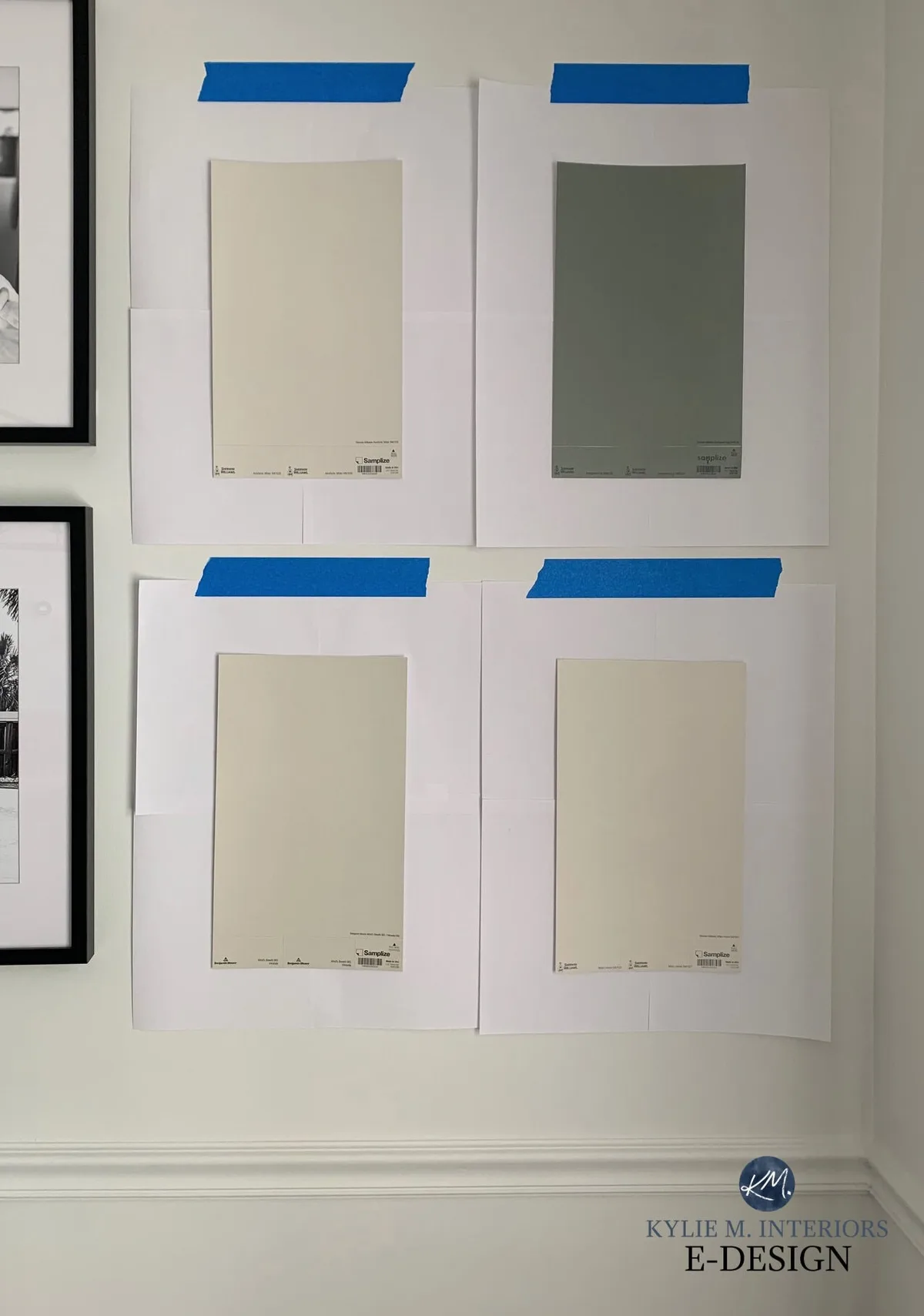
Live with them for at least 48 hours. Look at them in the morning light, the afternoon glare, and under your bedside lamp at night. The color will shift.
The goal is to see which one looks good in all conditions, not just in the bright showroom. This process often leads you to choose a slightly lighter or more muted shade than you first picked.
Step 3: Choose Your Focal Point (Start Here)
Decide where your dark pink is going to have the most impact. This is your starting point for the entire design.
- If your focal point is an accent wall: Style that wall first. Arrange your bed, choose your headboard, and hang your main art piece. Build the rest of the room out from there.
- If your focal point is your bedding: Select your dark pink duvet or velvet headboard. Then, choose your wall color (likely a neutral) to complement it.
- If your focal point is a piece of furniture: Maybe it’s a dark pink dresser. Place it in the room and select your wall color and bedding to make it stand out or blend in as desired.
Working from a single focal point keeps the design cohesive and prevents you from feeling overwhelmed.
Step 4: Layer in Your Neutrals for Breathing Room
Once your focal point is set, it’s time to add the calm. Bring in your large neutral elements. This is your bedding, area rug, and curtains.
If you have a dark pink accent wall, choose creamy white linen sheets and a light-colored jute or wool rug. If your bed is the pink star, paint your walls a soft, warm white.
The neutrals act as a visual palate cleanser. They frame the pink and give it space to be the hero without fighting for attention. Think of it like a gallery wall, the art needs white space around it.
In a bedroom, that “white space” is your neutral textiles and walls.
Step 5: Add Texture and Light for Dimension
Now, bring the room to life. This is where you add the layers that make it feel collected and comfortable, not like a showroom.
- Texture: Drape a chunky knit throw at the end of the bed. Add velvet pillows in a complementary color. Choose curtains with a subtle weave. Even the frame of a mirror or the base of a lamp can add a textured finish.
- Lighting: You cannot rely on a single overhead light. Dark colors absorb light, so you need to add it back in layers.
- Ambient: This is your general, soft illumination. A ceiling fixture on a dimmer is ideal.
- Task: Bedside lamps or wall sconces for reading.
- Accent: A small picture light over art, or LED strips behind the headboard for a glow.
Always use warm white bulbs (2700K-3000K). Cool white light will make your cozy dark pink look cold and clinical.
Classic Dark Pink Bedroom Styles You Can Model
Seeing finished styles helps you identify which direction you’re leaning in. Here are three distinct approaches that work beautifully with dark pink.
The Moody & Modern Look
This style is all about drama and contrast. It often uses a cool-toned dark pink, like a deep berry or mauve, paired with stark black and gray.
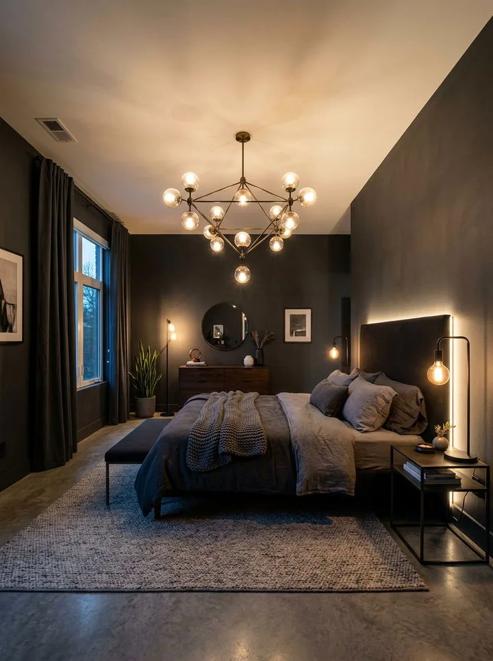
- Key Elements: A black iron bed frame, charcoal gray bedding, abstract black-and-white art, and matte black lighting fixtures. The vibe is sleek, intentional, and a bit moody. It’s a popular approach in many modern barndominium design spaces where clean lines meet bold color.
- The Twist: To keep it from feeling too cold, incorporate one warm element, like a natural wood nightstand or a sheepskin rug on the floor.
The Vintage & Romantic Retreat
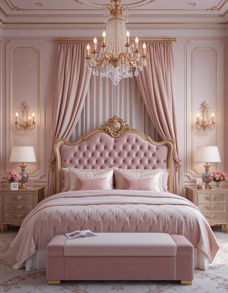
This style leans into the traditional warmth of pink. It uses warm, dusty pinks with lots of texture and curated details.
- Key Elements: A carved wooden headboard, mixed metallic finishes (brass and silver), vintage-inspired floral patterns in art or a single pillow, and crystal or ceramic lamp bases. The bedding is all about linen and lace. It shares the ornate, layered feeling you might see in a pink Victorian bedroom, but updated.
- The Twist: Avoid it looking too precious by adding something slightly rough, like a rustic wood bench or a simple, undecorated clay vase.
The Earthy & Organic Vibe
This is where dark pink acts as a warm neutral. Think terracotta, clay, or blush with strong brown undertones.
- Key Elements: Lots of natural materials, jute rugs, rattan baskets, linen everything, and live plants. Wood furniture is light and natural (oak, cane). Accent colors are other earth tones like sage green, ochre, and cream. This style feels incredibly grounded and peaceful, similar to the principles behind cabin barndominium decor.
- The Twist: Introduce a small bit of sleekness, like a simple dome pendant light in brass, to keep the look refined instead of rustic.
Common Visual Pitfalls (And How to Sidestep Them)
Knowing what can go wrong is half the battle. Here are the mistakes we see most often, and exactly how to avoid them.
Mistake 1: Ignoring the Undertone Clash
You fall in love with a pink online, paint the wall, and then your beige carpet looks suddenly yellow and sickly. That’s undertone clash.
- The Fix: Always, always test your pink against the permanent elements in your room. Hold the sample next to your flooring, countertops, and tile. If your fixed elements are warm (yellow-beige floors, cream tile), you need a warm pink. If they’re cool (gray floors, white marble), a cool pink will harmonize.
Mistake 2: Forgetting the “Light Layering” Rule
A dark pink room with only one bright ceiling light will feel like a cave. The corners will disappear, and the color will look flat and unflattering.
- The Fix: Plan your lighting scheme with your paint samples. Ensure you have light sources at multiple heights, floor lamps, table lamps, and possibly wall sconces. Use dimmers everywhere. The goal is to wash the walls with soft, indirect light to show off the color’s richness.
Mistake 3: Going All-Pink, No Contrast
It’s tempting to match everything, but a room where the walls, bedding, and curtains are all the same dark pink feels overwhelming and one-dimensional.
- The Fix: Embrace the power of contrast. Use the table of neutrals and accents from earlier. Let your dark pink be the star, and let everything else play a supporting role. If you want more pink, introduce it in a different texture or a slightly different shade for depth.
Balancing Act: Dark Pink in Small or Low-Light Bedrooms
You can absolutely use dark pink in a small room. In fact, it can make it feel cozy and intentional instead of just cramped. The rules just get stricter.
- Choose a Higher LRV: Pick a dark pink closer to an LRV of 40-50. It will still feel rich but will reflect more of the limited light you have.
- One Wall Only: Make the accent wall your strategy. The other three walls should be a light, reflective color (a bright white or very pale cream). This keeps the space feeling open.
- Maximize Reflection: Use mirrors strategically opposite windows to bounce light around. Choose furniture with reflective surfaces, like a glass-top nightstand or a glossy white dresser.
- Keep Furnishings Light: Avoid heavy, dark furniture. Opt for leggy, light-colored pieces that don’t block sightlines. A light wood bed frame and a transparent acrylic chair can make the room feel larger.
For rooms with no natural light, your artificial lighting plan is everything. Prioritize warm, diffuse light sources and avoid any dark, matte finishes on large furniture pieces.
The Renter-Friendly Playbook: Commitment-Free Dark Pink
Love the idea but can’t paint? No problem. You can get 90% of the look without touching a wall.
- The Bedding Strategy: Invest in a gorgeous dark pink duvet cover, quilt, or a set of velvet pillowcases. This is your largest block of color. Keep your walls and curtains neutral.
- The Textile Layering: Add dark pink through a large area rug, heavy throw blankets, and even tapestry-style wall hangings. Texture is your friend here.
- The Furniture Statement: Find a second-hand dresser or armoire and paint it your perfect dark pink. It becomes a stunning focal point. Since it’s a piece of furniture, you can take it with you.
- Removable Wallpaper: Modern peel-and-stick wallpapers are a game-changer. Apply it to your accent wall or even inside a bookshelf or niche for a pop of color that comes off cleanly.
These approaches let you experiment with the color’s impact in your space before making a permanent decision, or simply enjoy the vibe without breaking any lease rules.
Frequently Asked Questions
Is dark pink too feminine for a shared bedroom?
Not at all. The perceived femininity of pink is often tied to its saturation and context. A dark, earthy terracotta pink or a muted mauve reads as a sophisticated neutral.
Pair it with masculine textures like leather, black metal, and raw wood, and the overall feel is balanced and modern, not gendered. It’s about the curation, not the color itself.
What’s the best white to pair with dark pink walls?
The best white depends on your pink’s undertone. For a warm (peachy, terracotta) pink, choose a white with warm undertones, think “creamy,” “ivory,” or “linen.” For a cool (berry, mauve) pink, a clean, cool white or a soft gray-white works best. Always test the white swatch next to your pink sample on the wall.
A stark blue-white next to a warm pink will make the pink look dirty.
Can I use dark pink if my bedroom furniture is dark wood?
Yes, but you need to create separation. If your furniture is very dark (espresso, walnut), avoid a dark pink with similar depth, as it will all blend into a murky shadow. Instead, choose a mid-tone pink (higher LRV) for the walls to provide contrast.
Alternatively, use dark pink only in your textiles (bedding, rug) against lighter walls to let the dark wood furniture frame the space.
How do I keep a dark pink room from feeling dark?
The answer is in your lighting and contrast. Use multiple warm light sources at different levels, overhead, bedside, and floor. Ensure you have ample reflective surfaces (mirrors, glass, metallics) to bounce that light.
Most importantly, incorporate large areas of light neutrals, like a cream-colored rug and light bedding, to visually brighten the space and provide balance.
Final Touches and Getting Started
The hardest part is starting. Don’t try to perfect the entire plan in your head. Pick one step from the visual plan and do it.
Order those paint samples. Buy that one throw pillow. Momentum is more valuable than a perfect blueprint.
Your room will evolve. You might add a piece of art years from now that changes the whole vibe. That’s okay.
A well-considered dark pink foundation is flexible. It provides a rich, warm backdrop that only gets better with layers of your life.
So go find your inspiration image. Trust the process of testing and balancing. Build your cozy, personal retreat one visual decision at a time.