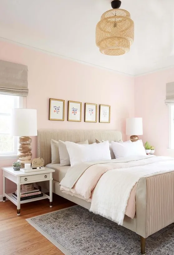
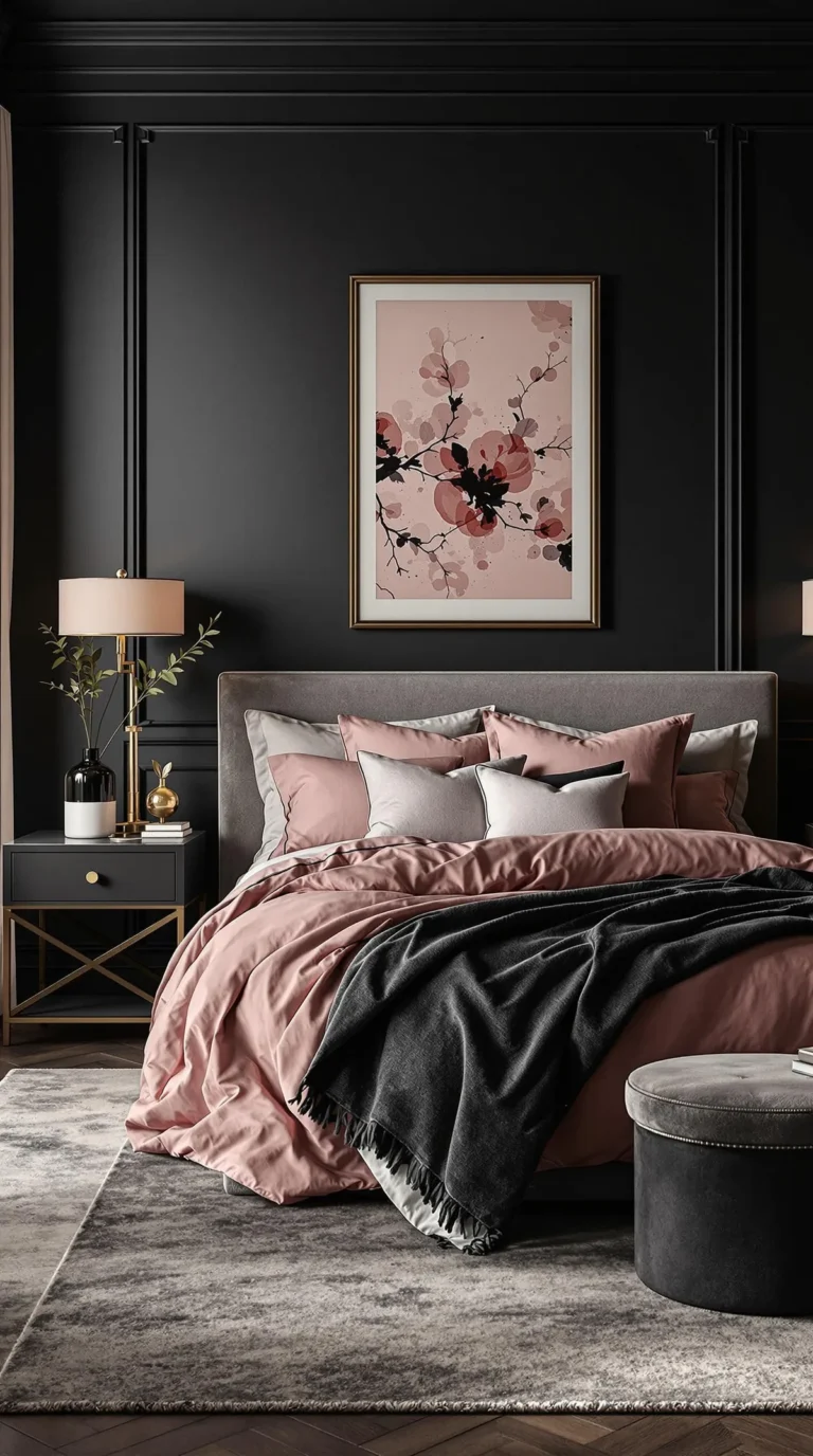
Moody Bedroom Color Inspiration: Rich, Dramatic Palettes for a Cozy and Stylish Space
Let’s be honest. You’re not just picking a paint color. You’re picking a feeling you want to walk into every night.
“Moody Bedroom Color inspiration” is about trading that generic beige for something that actually feels like a personal sanctuary. It’s the difference between a room that looks fine and one that feels like a deep breath after a long day. The good news is you don’t need a design degree to get it right.
Our research into paint specifications shows the key technical factor is a paint’s Light Reflectance Value, or LRV. This number, which you can find on any major paint brand’s website, tells you exactly how much light a color bounces back. Moody colors typically have an LRV below 50, often dipping into the 20s.
Starting here is how you avoid a color that looks perfect on a chip but feels flat or overwhelming on the wall. So, let’s dig into what makes these colors work.
Quick Answer
Moody bedroom color inspiration uses deep, saturated hues to create a cozy, intimate retreat. Good choices include charcoal blues, forest greens, and warm terracottas. Look for a paint’s Light Reflectance Value (LRV) below 50.
A matte finish will enhance the enveloping feel. Always test large samples on your wall at different times of day. Moody colors ground a space and can make a room feel more personal and restful.
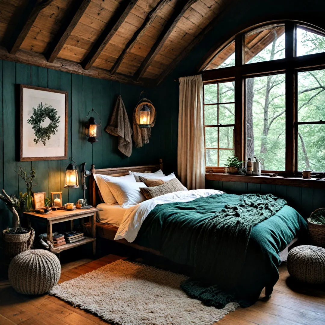
Image source: Bing (Web (fair-use with source credit))
Why Your Bedroom Needs a Moody Color Palette
A light and airy bedroom has its place, but it often feels more like a showroom than a sanctuary. A moody palette, on the other hand, is designed for rest. It works on a psychological level, creating visual boundaries that signal to your brain it’s time to unwind.
Think of it as visual cocooning. It’s an intentional choice that makes the room feel grounded, secure, and deeply personal.
This approach is especially powerful in master bedrooms where you want to shut out the world. It also has practical benefits. Darker, richer colors are phenomenal at hiding minor wall imperfections.
They provide a dramatic, sophisticated backdrop that makes your art, textiles, and furniture pop. If you’re aiming for a space that prioritizes atmosphere over brightness, this is your path. It’s a foundational element for many popular styles, from an earthy, grounded aesthetic to a more eclectic boho-inspired vibe.
The Real Psychology Behind Dark Bedroom Walls
It’s not just about aesthetics. Darker colors have a measurable effect on how a space feels. They advance visually, making walls feel closer and the ceiling lower.
This creates a sense of intimacy and enclosure that lighter, receding colors simply can’t match. It’s the difference between standing in a bright, expansive hall and sitting in a cozy, paneled library.
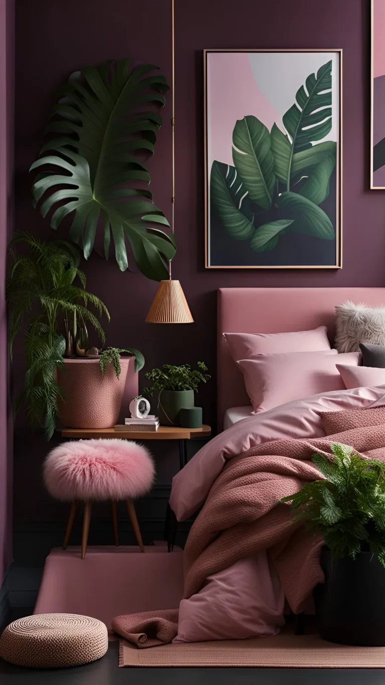
From a color psychology standpoint, deep blues and greens are inherently calming, linked to nature and stability. Rich purples and warm, deep pinks can feel luxurious and romantic. The key is saturation.
A muted, dusty rose creates a soft mood, while a deep, saturated aubergine feels dramatic and enveloping. You can explore this spectrum in our look at creating a deeply personal and romantic space. Ultimately, the right dark color doesn’t depress a room.
It embraces you.
Understanding LRV and Undertones: Your Secret Color Weapons
This is where most people go wrong. They pick a color they love on a tiny chip, paint the whole room, and wonder why it looks wrong. You need two pieces of data: the Light Reflectance Value and the undertone.
Light Reflectance Value (LRV) is a scale from 0 (pure black, absorbs all light) to 100 (pure white, reflects all light). This isn’t a guess. It’s a printed number on the back of every paint swatch or listed on the brand’s website.
For a truly moody feel, you want to look at colors with an LRV below 50. For a deeply dramatic, enveloping effect, aim for 30 or lower. This number tells you objectively how much light the paint will “eat” versus bounce around the room.
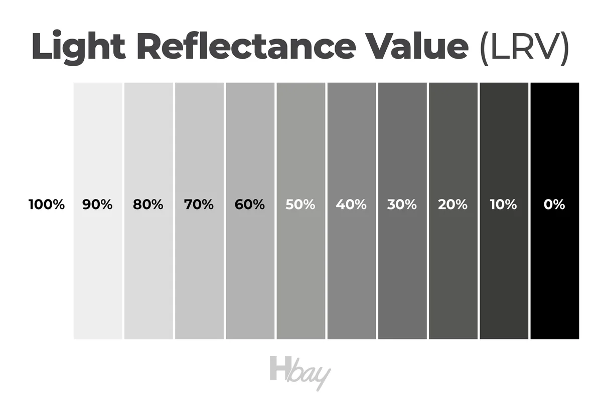
Image source: Bing (Web (fair-use with source credit))
Undertones are the secret color hiding within your main color. This is what makes a gray look blue, green, or purple. It’s what makes a beige look pink, yellow, or green.
In moody colors, undertones become magnified. A navy with a green undertone will feel very different from one with a violet undertone. The best way to see it is to compare your chosen swatch to a pure version of the color.
Hold that deep green next to a primary green card. Does it look more yellow? More blue?
That’s its undertone.
You must consider your room’s fixed elements. Do you have warm oak floors or cool gray tiles? Is your bedding warm white or crisp white?
The undertone in your wall color should be a friend, not a fighter, to these existing tones. Ignoring this is the fastest route to a color that just feels “off.”
Step 1: Find Your Color Personality (Warm vs. Cool Moody Tones)
You don’t have to commit to a specific color yet. First, decide on your temperature direction. This narrows the field instantly and aligns the room’s emotional feel.
Warm Moody Tones are inviting, cozy, and often feel earthy or spicy. They have red, orange, or yellow undertones. Think:
- Deep terracotta and burnt sienna
- Chocolate browns and coffee hues
- Spiced aubergine (a red-violet)
- Mustardy ochres and deep golds
These colors work beautifully in north-facing rooms that get cool light, as they add warmth. They pair naturally with wood tones, leather, and brass accents. They create a feeling of being nestled and secure.
Cool Moody Tones are calm, serene, and can feel more modern or moody. They have blue, green, or violet undertones. Think:
- Charcoal blue and navy
- Forest green and hunter green
- Slate gray and iron ore
- Deep teal and stormy blue-green
These colors excel in south-facing rooms with abundant warm light, as they provide a balancing coolness. They pair well with black metal, marble, and crisp white. They create a quiet, atmospheric, and reflective vibe.
Some colors, like a deep olive green or a murky sage, can straddle the line, having both warm and cool elements. If you love a specific color but aren’t sure of its temperature, look at it next to your other room elements. The right one will feel like it belongs.
Step 2: Test the Mood—How to Get the Sample Right
Buying a sample pot and dabbing a spot on the wall is practically useless. You’re seeing the color at one scale, in one light, next to the old wall color. It tells you almost nothing about how it will feel to live with.
Here’s the professional method.
- Buy the sample pot. Don’t skip this.
- Paint a LARGE swatch. We’re talking at least 2 feet by 2 feet. Use a foam roller or brush to apply two coats to a primed piece of poster board or directly onto the wall. This gives you the true color and finish.
- Move it around. Place your board (or paint multiple swatches) on different walls. See it next to the window, in a corner, and on the wall you’ll see from bed.
- Live with it for 48 hours. Observe it in the morning light, the afternoon glare, and under your artificial lighting at night. A color can look serene by day and cavernous by night, or vice-versa. Your evening lighting is critical for a bedroom.
- Look at it with your stuff. Place your sample next to your headboard, a pillow, or your rug. Do they play nicely together? This is the final check for clashing undertones.
This process feels like overkill, but it’s the single best way to guarantee you’ll love the result. It turns the biggest risk in the project into a controlled experiment. As of 2026, some paint brands even offer oversized, peel-and-stick samples, which are a fantastic, mess-free alternative for this crucial testing phase.
Step 3: Build Your Room’s “Mood Layer” with Paint, Texture, and Light
The paint is your foundation, but the mood is built in layers. A flat wall of dark color can feel stark if it’s the only element. You need to add dimension and interest.
Think about texture. A matte finish is your first texture layer. From there, consider your bedding, rugs, and curtains.
Heavy linen, velvet, or a chunky knit throw add tactile softness. A rug with depth breaks up the floor plane. This layering prevents the room from feeling one-dimensional or like a painted box.
Your lighting strategy is non-negotiable. A single overhead light will flatten a dark room. You need layers of light.
- Ambient Light: This is your soft overall glow. Think dimmable wall sconces, a central fixture on a dimmer, or uplighting.
- Task Light: Bedside reading lamps are essential. They provide focused light without washing out the whole room’s atmosphere.
- Accent Light: A small lamp on a dresser or some LED strip lighting behind a headboard adds pools of light that highlight texture and create visual interest.
This layered approach ensures your moody room is inviting and functional, not dark and gloomy.
The Sheen Selection Guide: Why Finish Changes Everything
Choosing a matte, eggshell, or satin finish isn’t just about durability. It’s a major mood-setting tool. The sheen controls how light interacts with your color, and with dark paints, this effect is amplified.
- Matte/Flat: This is the gold standard for moody walls. It absorbs light, minimizing reflections and hiding wall imperfections. The color looks rich, deep, and velvety. It creates the most enveloping, cocoon-like feel. The trade-off is that it’s less durable and harder to clean.
- Eggshell: It has a very slight sheen, more than matte but less than satin. It offers a touch more washability while still feeling soft. It can be a good compromise if you need a bit more practicality but want to maintain a mostly matte look.
- Satin: This has a noticeable gloss. It reflects more light, which can make a dark color feel brighter but also flatter. It can highlight every bump and ripple in the wall. We generally don’t recommend satin for moody bedroom walls, as it fights the atmospheric goal.
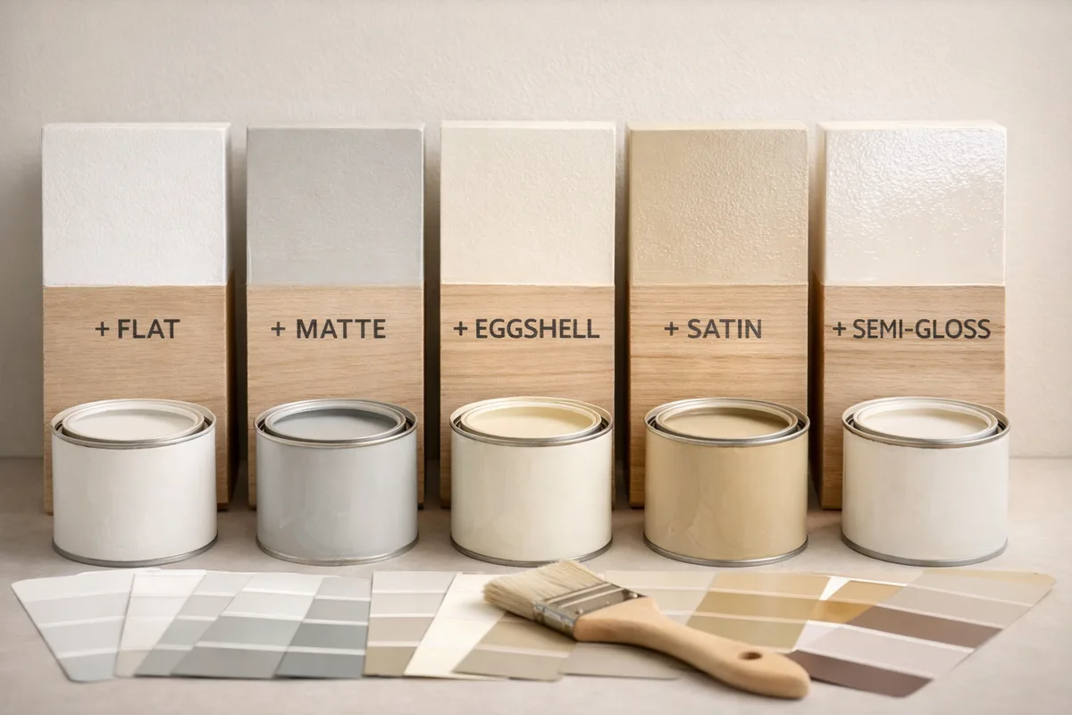
Image source: Bing (Web (fair-use with source credit))
For ceilings and trim in a moody room, the rules shift. Painting the ceiling the same color as the walls in a matte finish, a technique called “color drenching,” maximizes the cocoon effect. If you keep the ceiling white, use a pure, bright white to create crisp contrast.
For trim, either match the wall color for a seamless look or use a high-gloss white for a bold, graphic frame.
Pros and Cons of Going Moody (A Realistic Look)
Let’s be honest about what you’re signing up for. A moody bedroom is a fantastic choice, but it’s not for everyone in every situation.
Pros:
- Creates unparalleled coziness and intimacy.
- Makes a large room feel more grounded and proportionate.
- Hides wall flaws better than light colors.
- Provides a dramatic, intentional backdrop that feels personal.
- Can support relaxation and better sleep through color psychology.
- Often feels more sophisticated and designed than neutral schemes.
Cons:
- Requires more strategic lighting planning and investment.
- Can make a very small, windowless room feel cave-like if not done carefully.
- Dark colors typically need 3 coats for perfect, even coverage, increasing paint cost and labor.
- Repainting back to a light color later is a major, multi-coat project.
- Can feel oppressive if the undertone clashes with your furnishings or if you use too many dark, heavy textiles.
The key is to go in with your eyes open. If your bedroom gets minimal natural light and feels cramped already, a full dark paint job might amplify the problem. In that case, consider a dark accent wall or using moody colors in your bedding and art instead.
Common Moody Bedroom Mistakes (And How to Dodge Them)
Even with the best intentions, it’s easy to slip up. Here are the most frequent missteps we see and how to avoid them.
Mistake 1: Not testing large samples. We covered this, but it’s the number one error. A postage stamp of color tells you nothing about light absorption at scale.
Mistake 2: Ignoring the LRV. Picking a color just because it’s called “Midnight” or “Forest” is risky. Check the LRV. If it’s above 50, it might not give you the deep, saturated mood you’re after.
Mistake 3: Using the wrong sheen. A satin finish on a dark navy wall will look shiny and cheap, not cozy. Commit to matte for the true moody effect.
Mistake 4: Forgetting the fifth wall. The ceiling is a huge surface. A dark room with a bright white ceiling can feel like the walls are closing in from the sides. Consider painting it the same color or a slightly lighter tint.
Mistake 5: Skimping on lighting. One bright overhead light is the enemy of a moody room. It creates harsh shadows and flattens all your careful color work. Plan for at least three light sources at different heights.
Mistake 6: Matching everything. A room where the walls, bedspread, rug, and curtains are all the same dark hue can feel heavy and monotonous. Introduce contrasting textures and slightly lighter or complementary colors in your soft furnishings.
Steering clear of these pitfalls will get you 90% of the way to a stunning, magazine-worthy result. For more ideas on balancing dark walls with other elements, our guide on achieving a cozy rustic look has some great crossover principles.
Moody Color Inspirations: A Breakdown of Palettes That Work
Let’s move from theory to specific inspiration. These are proven, livable palettes that form a solid starting point. Remember, your lighting and undertone check is still required.
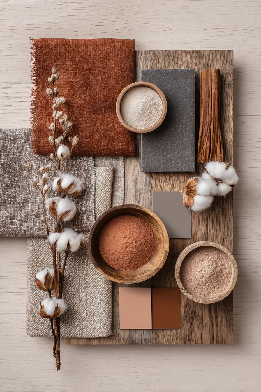
Image source: Bing (Web (fair-use with source credit))
Deep & Earthy (Forest Greens, Chocolate Browns)
This palette is grounded, serene, and connects you to nature. It’s incredibly versatile.
- Wall Color: A forest green with an LRV in the low 20s. Look for names like “Hunter Green” or “Dark Olive.”
- Pair With: Warm woods (oak, walnut), creamy off-whites, black iron accents, and textured natural fibers like jute or linen.
- Feeling: Stable, calm, organic. It’s perfect for creating a restorative escape.
- Tip: Add a pop of terra cotta or mustard yellow in a throw pillow or art piece for warmth.
Cool & Atmospheric (Charcoal Blues, Slate Grays)
This is for a serene, reflective, and slightly moodier vibe. It feels modern and polished.
- Wall Color: A charcoal blue or a deep slate with definite blue or green undertones. Avoid grays that lean too brown or purple here.
- Pair With: Crisp white, marble, brass or chrome metals, and light wood like ash or bleached oak.
- Feeling: Quiet, atmospheric, sophisticated. It can make a bedroom feel like a calm, cloudless night.
- Tip: Keep bedding and rugs in light, neutral tones to prevent the room from feeling too heavy. This palette is a great foundation for a serene blue-themed sanctuary.
Warm & Enveloping (Burnt Terracotta, Spiced Aubergine)
This palette is all about warmth, romance, and spice. It’s inviting and visually rich.
- Wall Color: A burnt terracotta or a deep, red-based purple (aubergine). These colors have strong red or orange undertones.
- Pair With: Gold and brass, dark woods, vintage patterns, and rich velvet textiles.
- Feeling: Luxurious, intimate, cocooning. It’s bold and confident.
- Tip: Balance the warmth with some crisp white or cream in your linens. This approach shares DNA with the concepts in our feature on romantic, dramatic pink spaces.
Your furniture and existing decor will point you toward one of these families. Don’t fight what you already own. Use it as your guide.
Small Bedroom? How to Go Moody Without Feeling Closed In
The fear is real. You love the idea but worry a dark color will shrink your space. It doesn’t have to.
The trick is strategic contrast and reflection. Paint only the wall your headboard sits against in a deep color. Keep the other walls, especially those opposite windows, a light, bright neutral.
This creates a focal point without enclosing the room.
Use a large mirror on a wall perpendicular to a window. It will bounce light around and create the illusion of depth. Keep your bedding and major furniture pieces in lighter tones.
A dark wall with a light linen duvet and a pale rug keeps the room feeling airy. Finally, ensure your lighting is excellent. Ample, layered light prevents any dark corner from feeling like a cave.
The Rental-Friendly Guide to a Moody Vibe
You can absolutely achieve this look without touching a paintbrush. Focus your efforts on the layers you can take with you. Start with a dark, dramatic bedspread in a velvet or heavy linen.
Add a deep-colored area rug that covers a good portion of the floor. Hang floor-to-ceiling curtains in a rich hue, even over boring blinds.
Use removable wallpaper on a single accent wall. Many brands now offer high-quality, peel-and-stick options in beautiful dark patterns and solids. Decorate with large-scale art in dark frames and use table lamps with dark shades to cast moody pools of light.
Your foundational backdrop might be beige, but everything you add creates the enveloping atmosphere.
Expert Tips for Long-Term Satisfaction
First, invest in a high-quality paint. Cheaper paints have less pigment. They often require more coats to achieve a rich, even depth on a dark color, negating any savings.
Second, always use a tinted primer. Ask the paint store to tint your primer gray or a shade close to your final color. This provides a uniform base and can reduce your finish coats from three to two.
Third, embrace the process. Dark rooms look worst after the first coat. They can appear streaky and unconvincing.
Trust the system and apply the second and third coats as recommended. Finally, edit your accessories. A few well-chosen pieces of art or a single striking sculpture will have more impact than a cluttered gallery wall.
Let the color be the star.
Frequently Asked Questions
Will dark paint make my bedroom look smaller?
It can, but it often does the opposite in a perceptive way. Dark colors recede, making walls feel farther away. In a poorly lit room, it can feel closing.
The key is using contrast (light bedding, rugs) and excellent, layered lighting to define the space without relying solely on reflected light from the walls.
What is the most timeless moody bedroom color?
Deep, neutral-based colors are the most timeless. Think charcoal gray, navy blue, or olive green. These are complex colors found in nature.
They are less trend-driven than a specific shade of terracotta or aubergine, though those can be beautiful personal choices.
Can I use moody colors in a room with no natural light?
You can, but your lighting plan is absolutely critical. Without any natural light, you must create all the atmosphere artificially. Prioritize warm-toned bulbs (2700K-3000K) and use multiple light sources at different heights.
A matte finish will help absorb artificial glare and maintain the cozy feel.
Is it more expensive to paint a room a dark color?
Often, yes. High-quality dark paints are worth the investment for richness. You will likely need three coats for perfect coverage, which uses more paint.
You also need a tinted primer. Factor in about 30% more paint and time compared to a standard light-colored two-coat job.
How do I choose between a warm and cool moody tone?
Look at the fixed elements you can’t change. What color are your floors? What’s the tone of your wood furniture?
Do you have warm brass light fixtures or cool chrome? Choose the undertone family (warm or cool) that harmonizes with these existing items. Your room’s natural light direction can also guide you.