Hot Pink Bedroom Aesthetic: Bold Decor Ideas for a Playful, Stylish Space
A hot pink bedroom aesthetic can feel like a bold, joyful statement or a chaotic mistake, and the difference isn’t just about your shade of paint. It’s about seeing the room as a complete, layered composition, not a single splash of color. Many people end up with a space that feels more like a candy store than a calming retreat because they focus on the pigment and forget about texture, light, and visual breathing room.
To avoid that, our research into paint manufacturer color systems shows that choosing the right undertone is the most critical step a DIYer can take. An eggshell or satin finish is generally recommended for bedrooms as it balances durability with a soft light diffusion that flatters bold colors. Getting this right from the start sets the stage for a cohesive space you’ll actually enjoy living in.
Image source: Bing (Web (fair-use with source credit))
Quick Answer
A hot pink bedroom aesthetic is bold, energetic decor using magenta or fuchsia as the dominant color. The look succeeds through careful balance. You must ground the intense pink with ample neutral tones and natural textures.
Layer materials like velvet, linen, and wood to add depth. Use lighting to control the room’s mood and warmth. An accent wall is a smart, low-commitment way to start.
What Does a “Hot Pink Bedroom” Actually Feel Like?
Living in a hot pink room is an experience, not just a visual. When done well, it feels energetic and confident, a space that sparks creativity and lifts your mood the moment you walk in. It’s playful without being childish, bold without being aggressive.
The right balance creates a sanctuary that feels personally expressive and surprisingly cozy.
When the balance is off, the feeling shifts dramatically. A room with too much unbroken pink can become visually exhausting, making relaxation difficult. It might feel chaotic, garish, or cheap if textures are flat and lighting is harsh.
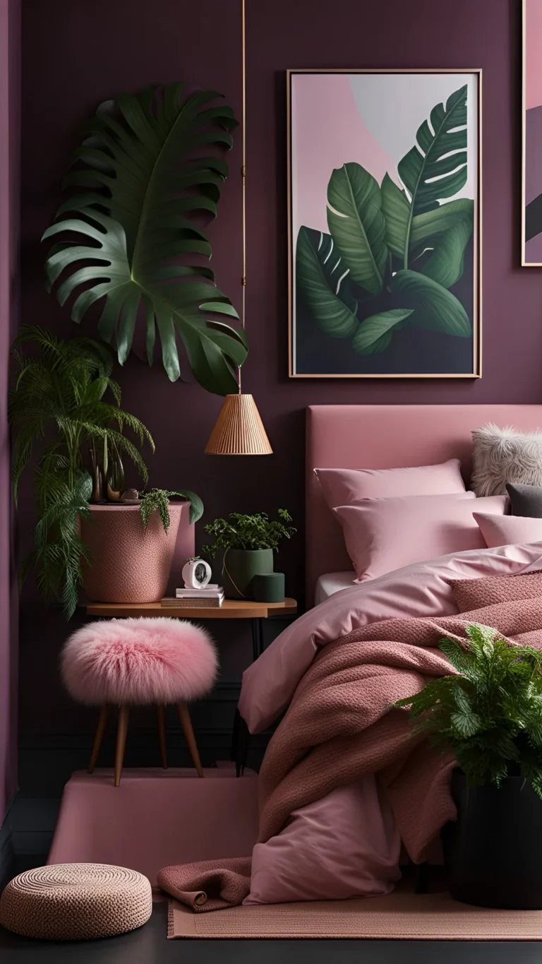
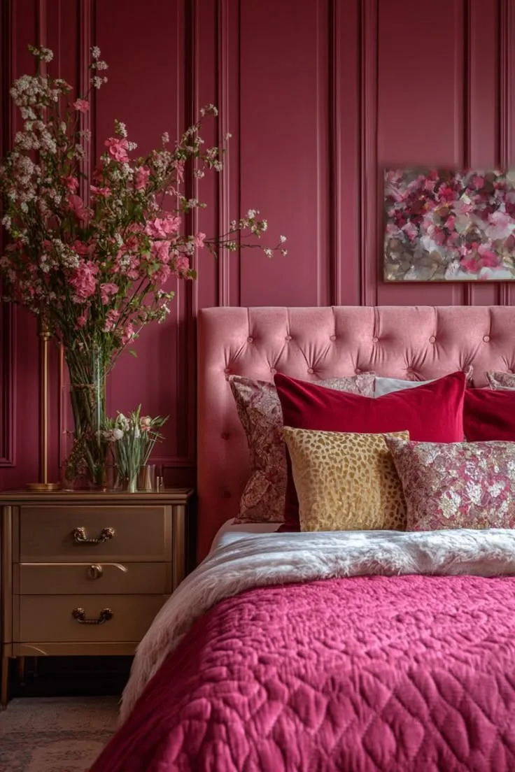
The key is that a successful hot pink bedroom shouldn’t scream at you, it should energize you, there’s a fundamental difference in the atmosphere it creates. This is why looking at photos of real rooms, like the one above, is so much more helpful than just imagining a color swatch.
Before You Pick Up a Paintbrush: Crucial First Decisions
Jumping straight to the paint aisle is the number one mistake. First, assess your room’s architecture and light. A small room with a single north-facing window will interact with color very differently than a large, south-facing space flooded with afternoon sun.
That cool northern light can make a warm-toned pink look dull, while a south-facing room might need a cooler pink to prevent it from feeling overly warm.
Next, honestly audit your existing furniture. Do you have neutral, natural wood pieces, black metal frames, or white laminate? Or is your current furniture also colorful?
A hot pink aesthetic works best as a statement against a calm, neutral backdrop of furnishings. If your bed frame is already a bright color, you might be heading for visual clash. The goal is for the pink to be the star, supported by a quiet, textured ensemble.
Is Your Room a Candidate for Bold Color?
Not every space is ideal. Your room is a strong candidate if it has defined architectural features (like a picture rail, chair rail, or interesting ceiling), good natural light, and you’re willing to commit to a layered approach with rugs, textiles, and art. It’s also perfect if you’re looking for a high-impact, rental-friendly update using temporary wallpaper on a single wall.
You might want to reconsider if your room is very small with low ceilings, has almost no natural light, or functions as a multi-purpose space where you need to focus (like a bedroom/home office). In these cases, the intensity of the color could work against the room’s functionality. For smaller or darker spaces, you can explore more muted takes on the theme, like the sophisticated approach in some moody pink bedroom designs.
Accent Wall vs. Full-On Color Drenching: The Commitment Scale
This is your primary strategic decision. An accent wall is the gateway approach. It delivers maximum visual impact with minimal commitment and cost, making it ideal for renters or the color-hesitant.
You paint or paper one wall, typically behind the bed as a focal point. The rest of the room stays a light neutral, which keeps the space feeling open and allows the pink to truly pop without overwhelm.
Color drenching, painting the walls, ceiling, and often the trim all the same hot pink, is a high-commitment, high-drama technique. It creates a immersive, cocoon-like effect that can feel incredibly luxurious and modern. This approach demands excellent lighting (both natural and artificial) and a confident use of contrasting textures and materials to prevent the room from feeling like a monochromatic box.
It’s a statement best suited for those who love bold design and have a room with decent proportions.
Choosing Your Shade of Hot Pink (It’s Not Just One Color)
“Hot pink” isn’t a single paint code. It’s a spectrum ranging from red-leaning fuchsias to blue-based magentas. This choice of undertone will dictate the entire mood of your room and what other colors it will harmonize with.
A pink with a red or orange undertone feels warmer, more vibrant, and retro. A pink with a blue or purple undertone feels cooler, more modern, and slightly more sophisticated.
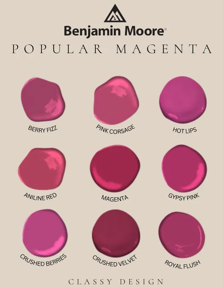
Image source: Bing (Web (fair-use with source credit))
The paint chip photo above illustrates this perfectly. Seeing swatches in context is non-negotiable. The same color looks radically different on a small chip under store lighting versus on your wall at home.
Undertones that are invisible on the chip become glaringly obvious when spread across a large surface. Always sample.
Warm vs. Cool Undertones: Why It Changes Everything
Warm undertones (leaning toward red, coral, or orange) make a room feel cozy, energetic, and playful. They pair beautifully with other warm neutrals like cream, beige, brass, and gold, as well as natural wood tones. Think of a vibrant sunset or retro 80s decor.
This direction often feels more casual and inviting.
Cool undertones (leaning toward blue, purple, or berry) feel more modern, crisp, and slightly edgier. They work well with cool neutrals like pure white, gray, chrome, and black, and can create a stunning contrast with touches of deep green. This is the route you’d take for a more contemporary, almost futuristic or moody pink bedroom vibe.
The wrong undertone next to your fixed elements, like a beige carpet or warm wood floor, can make the color look “off” or dirty.
The Power of a Physical Paint Chip
Buy the largest sample pots you can and paint at least a 2′ x 2′ square on two different walls in the room. Look at the color at different times of day, morning, noon, and with your artificial lights on at night. How does it make you feel in the soft morning light versus under the glare of an overhead bulb?
Does it turn neon or go flat?
This step reveals everything. It shows you how the color interacts with your room’s specific light and shadows. It’s the only way to be confident in your choice before committing to gallons of paint or rolls of wallpaper.
Manufacturer specifications for light reflectance value (LRV) can give you a technical hint, a lower LRV means a darker, more absorbing color, but your eyes in your space are the final judge.
Your Non-Negotiables: The Neutrals and Complements That Ground the Space
Hot pink cannot exist in a vacuum. It needs a supporting cast of colors to feel intentional and designed, not accidental. Your neutrals are the silent heroes that give the eye a place to rest and prevent sensory overload.
They provide the framework that makes the pink look expensive and considered.
The Best Neutral Partners (White, Cream, Gray, Black, Wood)
Not all neutrals are created equal here.
- Pure White: Crisp and modern. It makes the pink look its cleanest and brightest, creating a high-contrast, graphic feel. Best with cool-toned pinks.
- Cream or Oatmeal: Warm and soft. It tones down the vibrancy of the pink, adding a cozy, inviting layer. It prevents the scheme from feeling sterile. Best with warm-toned pinks.
- Gray: Sophisticated and calming. A medium to dark charcoal gray can add incredible depth and a modern edge, steering the look toward a more adult, moody aesthetic.
- Black: Dramatic and grounding. Used in small doses, on a bed frame, picture frames, or lamp bases, it adds strong definition and weight, stopping the room from feeling too sweet or flighty.
- Natural Wood: Warm and organic. Wood tones (oak, walnut, cane) are arguably the most important neutral. They add vital texture and warmth, literally grounding the ethereal quality of the pink. This is a key element in many modern barndominium design principles, where natural materials balance bold statements.
Adding a Complementary Pop: The Greenery Trick
For a vibrant, lively contrast, look to the opposite side of the color wheel. The direct complement to pink is green. Introducing even a small amount of fresh, leafy green, through live plants, a verdant patterned pillow, or botanical art, makes the pink appear even more vibrant and alive.
This doesn’t mean lime green accent walls. Think of deep emerald in a velvet pillow, the variegated leaves of a monstera plant, or sage green in a subtle stripe on a throw blanket. This touch of green breaks up the pink-neutral palette in the most natural, visually pleasing way possible.
It’s a classic designer trick that works every time.
The Visual Tool Kit: How to Layer a Room, Not Just Paint It
This is where generic advice fails and visual expertise wins. A room with just pink walls and pink bedding looks flat and one-dimensional. A layered room feels rich, intentional, and livable.
Think of building the space in distinct visual planes, from the largest surfaces down to the smallest details.
Step 1: The Foundation (Walls, Floor, Ceiling)
Start with your biggest canvas pieces. Your wall decision is made (accent or full). Now, address the floor.
A light-colored rug (cream, pale gray, natural jute) will help reflect light and make the space feel larger, acting as a neutral field for everything else. If your floor is a warm wood, that’s your built-in texture, embrace it. For the ceiling, painting it a pure white or continuing your wall color are the two main options.
A white ceiling keeps the room feeling taller and airier, while a pink ceiling intensifies the cocoon effect dramatically.
Step 2: The Big Furniture Pieces (Bed, Dresser, Nightstands)
These should primarily be in your chosen neutrals. A upholstered bed in cream linen, a black metal frame, or a natural wood platform bed all act as anchors. Avoid matching furniture sets; mix materials for interest, a wood nightstand on one side, a black metal one on the other.
The goal is for these pieces to provide a calm, structured foundation that the colorful layers will play against. This principle of mixing materials is central to achieving an eclectic yet cohesive look, similar to what you might find in some cabin barndominium decor.
Step 3: The Textile Layer (Bedding, Curtains, Rug)
This is your main opportunity to introduce pattern, softness, and more texture. Your bedding should be a mix: white or cream sheets, a neutral duvet cover, and then hot pink and textured accent pillows.
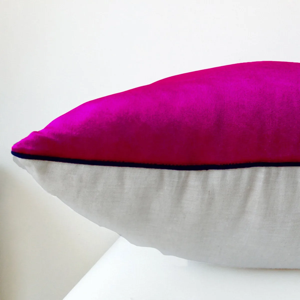
Image source: Bing (Web (fair-use with source credit))
As the close-up image shows, contrast a smooth, hot pink velvet pillow with a nubby oatmeal linen sham. The visual interest is in the difference between the materials. Curtains should be light-filtering and neutral (white, cream, or a very pale gray) to frame the window without competing.
A thicker, textured throw blanket at the end of the bed adds another layer of cozy depth.
Step 4: The Light Layer (Ambient, Task, Accent)
Lighting controls the mood. Overhead lighting alone will cast harsh shadows and can make bold colors feel stark. You need a layered lighting plan:
- Ambient: This is the general fill light. A central fixture with a dimmer is ideal, or rely on reflected light from lamps.
- Task: Bedside lamps for reading. Choose lamps with neutral bases (ceramic, metal, wood) and warm white bulbs (2700K-3000K color temperature). Warm light softens the pink and makes the room feel inviting in the evening.
- Accent: This is for drama and highlighting. Consider plug-in wall sconces, a small lamp on a dresser, or even fairy lights behind a headboard. Accent lighting creates pools of light that add dimension and make the room feel larger.
Step 5: The Personality Layer (Art, Accessories, Plants)
Finally, add the pieces that make it yours. Art with black frames and white mats provides crisp contrast. A few well-chosen books, a simple vase, or a unique sculpture on a shelf add points of interest.
And don’t forget plants, they’re the ultimate life-giving accessory. A tall fiddle leaf fig in a neutral pot or trailing pothos on a shelf brings in that essential green complement and softens hard edges. This final layer should feel curated, not cluttered.
Common Visual Mistakes (And How to Sidestep Them)
Even with the best plan, it’s easy to slip up. Being aware of these common pitfalls before you start shopping can save your design.
Mistake 1: The Pepto-Bismol Effect (Too Flat, No Depth)
This happens when every pink element is the exact same shade and finish. A room painted in a single satin pink, with pink polyester bedding and a pink plastic lamp, will feel cheap and overwhelming. It lacks visual sophistication.
The Fix: Introduce multiple textures (velvet, linen, bouclé, wood, metal, glass) and slight variations in your pink tones. Use a glossy pink picture frame against a matte pink wall. Let materials create the interest, not just the color itself.
Mistake 2: Visual Claustrophobia (No Breathing Room)
When pattern and color cover every single surface, the eye has nowhere to rest. It feels busy, stressful, and makes the room seem smaller.
The Fix: Be ruthless with negative space. Ensure you have large, calm, neutral zones. A solid-colored rug, a blank wall section, a simple bed skirt.
Let the pink be the star against a quiet background. This philosophy of balance is equally important in more rustic settings, like when planning a barndominium exterior design.
Mistake 3: The Candy Shop Clash (Too Many Competing Brights)
Pairing hot pink with other equally saturated primary colors (like bright yellow, cobalt blue, or lime green) can quickly feel childish and chaotic. The colors fight for attention instead of working together.
The Fix: If you want additional color, let pink be the only true “bright.” Add other colors in muted, earthy, or pastel tones. A dusty blue, a sage green, or a mustard yellow are far more compatible. They provide contrast without creating a visual shouting match.
For inspiration on combining bold colors with more muted, sophisticated tones, you can look at approaches used in dusty pink bedroom designs.
If You’re Renting (or Just Scared): Temporary & Low-Commitment Ideas
Full commitment isn’t required. You can achieve a powerful hot pink aesthetic with removable, changeable elements.
- Peel-and-Stick Wallpaper: The ultimate rental-friendly tool. Apply a bold pink pattern or solid color to your accent wall. High-quality brands remove cleanly from most painted surfaces when done correctly. It’s a weekend project with massive impact.
- The Bed as the Focal Point: Instead of a pink wall, make your bed the statement. Use a hot pink duvet cover, a pile of pink pillows in different textures, and a neutral headboard. The color is concentrated and easy to change out with the seasons.
- Art and Textile Bombardment: Cover a large wall with a gallery of art framed in black and white, but where the art itself features pops of hot pink. Add a vibrant pink throw blanket and a couple of accent pillows. The color is distributed in smaller, manageable doses.
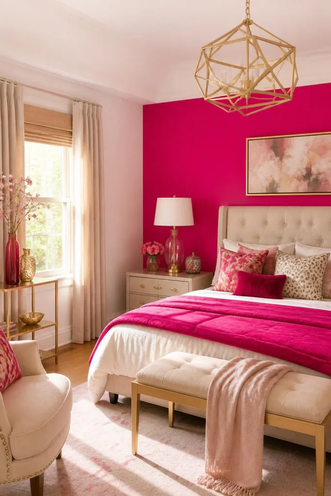
Image source: Bing (Web (fair-use with source credit))
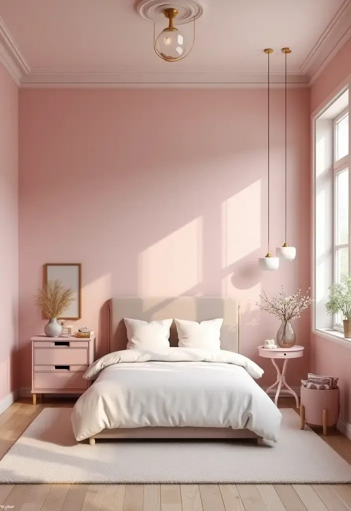
The accent wall photo demonstrates this low-commitment, high-impact approach perfectly. The pink is the undeniable star, but the neutral bedding, wood furniture, and plants make it feel integrated and sophisticated, not like a temporary dorm room.
The Budget Breakdown: Where to Splurge and Where to Save
You don’t need a limitless budget. Allocate your funds strategically for maximum effect.
- Splurge On: A high-quality paint in the perfect shade (good paint covers better and lasts longer), a comfortable, neutral rug that will anchor the room for years, and excellent bedside lighting. These are foundational items that dictate the room’s quality and feel.
- Save On: Decorative accessories, throw pillows, and art. These are the elements you’ll want to change most often. Shop vintage stores, DIY your own art, or swap pillow covers instead of buying all new inserts. A gallon of quality paint (covering ~400 sq ft) and a basic roller kit might cost $60-$100, while a single designer throw pillow can be $80. Prioritize the big-ticket neutrals.
Your “Hot Pink Bedroom” Lookbook: Three Real-World Styles
To help visualize the finish line, here are three distinct directions you can take, each with a different core feeling.
The Modern Glam Vibe
- Core Colors: Cool-toned hot pink, pure white, black, chrome.
- Key Materials: Velvet, lacquered furniture, metallic accents, clear acrylic.
- Feeling: Sleek, sophisticated, and bold. Think a pink velvet headboard against a white wall, a geometric black floor lamp, and a few strategically placed pieces of glossy decor.
- Best For: Those who want a clean, contemporary look that feels luxurious and designed.
The Retro Playful Vibe
- Core Colors: Warm, orange-leaning hot pink, cream, mustard yellow, natural wood.
- Key Materials: Plastic (like an old phone), vinyl records, shaggy textures, curved furniture shapes.
- Feeling: Fun, energetic, and nostalgic. Incorporate vintage posters, a funky patterned rug with pink accents, and rounded nightstands.
- Best For: The color enthusiast who wants a room that feels joyful, personal, and a little bit funky.
The Moody, Grown-Up Vibe
- Core Colors: Deep, blue-based magenta, charcoal gray, black, forest green.
- Key Materials: Matte finishes, heavy linen, iron, distressed wood.
- Feeling: Dramatic, cozy, and intimate. This might involve color-drenching with a darker pink, using blackout curtains, and adding moody botanical prints. It’s a far cry from a little girl’s pink room.
- Best For: Those who love depth and drama, and want a retreat that feels secluded and rich. This shares a lot of conceptual ground with the principles behind creating an earthy moody bedroom decor.
Quick-Answer FAQs for the Hesitant Decorator
What colors go with hot pink in a bedroom?
The best companions are neutrals (white, cream, gray, black, natural wood) and its complementary color, green. Neutrals ground the space, while touches of deep emerald or sage green make the pink pop in a natural, sophisticated way. Avoid pairing it with other bright primaries.
Is hot pink good for a small bedroom?
It can be, with strategy. Use it on a single accent wall to create a focal point without closing in the space. Keep the other walls, ceiling, and floor in light, reflective colors.
Use ample mirrors and layered lighting to enhance the sense of space. Avoid color-drenching a small, dark room.
How do I make a hot pink bedroom look more mature?
Focus on texture, contrast, and sophistication. Pair the pink with rich materials like velvet and linen, use plenty of black and wood tones for grounding, choose art with clean lines and black frames, and avoid overly sweet or childish patterns. A moody, deeper pink also reads as more adult than a neon shade.
What is the difference between hot pink and blush pink?
Blush pink is a very pale, desaturated pink with a dusty quality. It acts as a neutral and creates a soft, calming atmosphere. Hot pink is fully saturated, vibrant, and high-energy.
It’s a dominant statement color that requires careful balancing to keep a room feeling restful. They serve completely different design purposes.
Can I use hot pink if I’m renting?
Absolutely. Use removable peel-and-stick wallpaper on one wall, or forego wall treatments entirely. Concentrate the color in your bedding, a large area rug, curtains, and removable art.
These elements can all come with you when you leave, making it a completely reversible update.
Process & Workflow Entities
The step-by-step process matters. Start by clearing the room as much as possible. This gives you space to work and a clean visual slate.
Wash your walls with a mild detergent if you’re painting, and make any necessary repairs to drywall or trim. Proper prep prevents paint from adhering poorly or wallpaper from bubbling.
Gather all your tools before you start. For painting, you’ll need painter’s tape, a high-quality angled brush for cutting in, a roller with an extension pole, and a paint tray. For peel-and-stick wallpaper, you need a smoothing tool, a level, and a sharp utility knife.
Having everything at hand stops the project from stalling.
Follow the natural order of operations. Paint your ceiling first if it’s a different color, then your walls. Install any built-in lighting or ceiling fixtures next.
Bring in your large furniture, then lay your rug. Finally, layer your textiles, hang your art, and style your accessories. This prevents you from damaging finished surfaces.
Data & Metrics
Specific numbers help you plan and budget. A standard gallon of paint covers about 350 to 400 square feet with one coat. Measure your walls to calculate how much you need.
A typical 12′ x 12′ bedroom with 8′ ceilings has about 384 square feet of wall space, excluding windows and doors. One gallon might suffice for an accent wall, but a full room likely needs two.
Consider paint sheen performance. Eggshell (10-25% gloss) is the most popular for bedrooms. It’s more durable and washable than flat paint but has less shine than satin.
Satin (25-35% gloss) is easier to clean, making it good for kids’ rooms. A higher sheen can make bold colors feel more intense, while matte finishes absorb light for a softer look.
Standard rug sizes guide your foundation layer. For a queen bed, an 8′ x 10′ rug is ideal. It should extend at least 2 feet beyond the sides of the bed.
For a full or twin bed, a 5′ x 8′ rug often works. This ensures you step onto something soft when you get out of bed. Bedding sizes are straightforward, but duvet covers often need to be sized up for a fuller look.
Safety / Legal / Compliance
Safety starts with your materials. When painting, always use low-VOC or zero-VOC paint formulas. VOCs are volatile organic compounds that can off-gas and affect indoor air quality.
This is especially important in a bedroom where you sleep. Manufacturer specifications and material safety data sheets (MSDS) list this information. Look for Greenguard or similar certifications.
If you’re renting, your lease agreement is your legal framework. Many standard leases prohibit painting walls without written permission, or require you to repaint to a neutral color upon moving out. Peel-and-stick wallpaper is often a better, less contentious option.
Always get written permission for any permanent alteration to avoid losing your security deposit.
Physical installation safety is key. Use sturdy wall anchors for hanging heavy mirrors or shelves on drywall. A simple nail won’t hold the weight long-term and can damage the wall.
Ensure any electrical work, like installing a new light fixture, is done by a licensed professional or is plug-in only. Never overload outlets with too many lamps or string lights.
Location & Market Context
Your room’s compass direction changes everything. A north-facing room receives cool, indirect light all day. This light can make warm pinks look dull, so lean toward a cooler, blue-based magenta to keep it vibrant.
South-facing rooms get warm, direct light. A warm pink here can feel overwhelmingly hot, so a cooler pink can balance the warmth.
Climate and regional styles play a role. In sunny, warm climates, a hot pink room can feel energizing and appropriate. In often-overcast regions, it can be a powerful tool to combat grey skies and boost mood.
The maximalist trend, embracing bold color and pattern, is more prevalent in urban design centers, while suburban markets might still favor safer neutrals.
Rental markets demand smart solutions. In competitive rental markets, making bold, personal changes can be risky. Focusing on non-permanent decor allows you to personalize your space without jeopardizing your lease or requiring a costly reversion.
This approach is savvy for young adults in apartments or anyone in a temporary living situation.
Authoritative Sources
For color accuracy and performance, rely on paint manufacturer systems. Brands like Sherwin-Williams and Benjamin Moore have meticulously calibrated color systems. Their professional-grade paints offer better consistency, coverage, and fade resistance than generic store brands.
Their official color decks and fan decks are the industry standard for selection.
Material standards provide safety guidance. ASTM International standards govern the performance and safety of paints, coatings, and wallcoverings. Checking a product’s compliance with relevant ASTM standards (like those for fire resistance or VOC content) offers a layer of quality assurance beyond marketing claims.
This is part of responsible product selection.
For rental rights, your local tenant union or .gov housing authority website is the definitive source. They outline landlord and tenant responsibilities regarding alterations and repairs. This provides the legal backing you need if you seek to negotiate changes with your landlord or understand your obligations when moving out.
Always go to the primary source.