Pink Girly Bedroom Ideas: Cute Decor for a Fun, Dreamy Space
Pink is one of those colors that either feels dreamy and intentional or chaotic and childish. There's no middle ground. If you've been scrolling through inspiration boards and wondering why some pink bedrooms look like high-end boutique hotel suites while others look like a toddler's playroom, the difference isn't just the shade.
It's the entire approach.
Getting pink right takes planning around undertones, texture, lighting, and proportion. That's where most people stumble. They pick a lovely blush paint, buy some matching bedding, and end up with a space that feels flat or overwhelming.
With the right process, you can build a pink bedroom that feels sophisticated, personal, and genuinely restful. These pink girly bedroom ideas will walk you through exactly how.
Quick Answer
The key to pink bedroom design is undertone control. Warm pinks pair with cream and brass. Cool pinks pair with grey and silver.
Muted pinks pair with natural wood and rattan. Limit pink to walls or bedding, not both. Layer in at least three textures.
Use warm lighting at 2700K to 3000K. Test paint swatches on your wall for 48 hours before committing.
Why Getting the Visuals Right Matters More Than You Think
Here's the thing about pink that catches everyone off guard. It's the most lighting-sensitive color in the entire paint deck. A dusty rose that looks soft and romantic at noon can turn into a muddy, depressing grey by evening.
The same shade that looks chic in a bright showroom can feel like Pepto-Bismol in a dimly lit room.
Manufacturer specifications for pink paints consistently show the importance of undertones. Benjamin Moore's and Sherwin-Williams's color collections each treat pink as a base that shifts dramatically with natural light exposure. Pantone's color matching system confirms that pink sits on a spectrum from purple-leaning to orange-leaning, and every step in between changes the entire feel of a space.
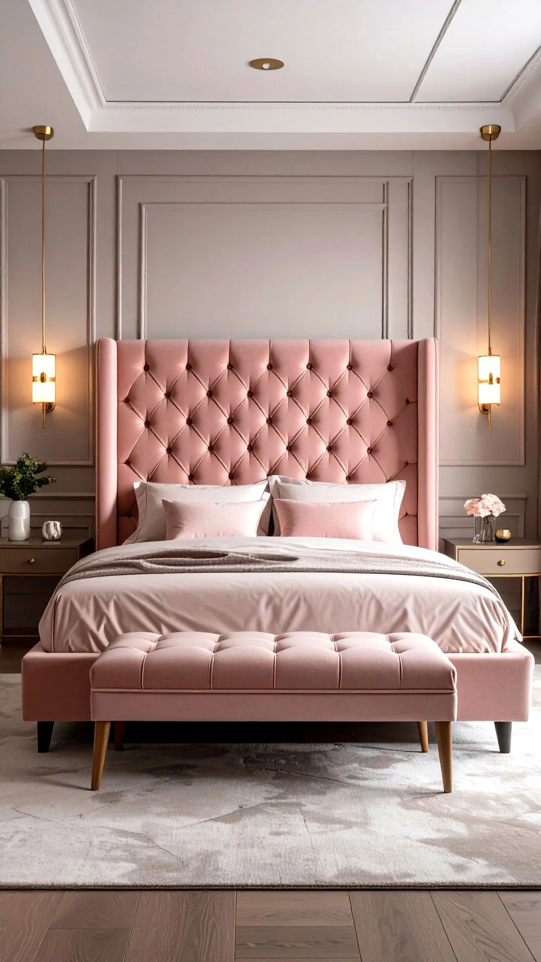
Image source: Web (fair-use with source credit)
This is why the visual approach matters. You can't just pick a color. You have to understand how that color will behave in your specific room.
That means checking how much natural light you get, identifying the direction your windows face, and understanding whether your warm or cool undertones match the rest of your decor.
The good news is that once you understand these variables, pink becomes one of the most flexible colors you can work with. It can swing from playful to sophisticated, from cozy to airy, from traditional to modern. You just need to control the factors that influence the final look.
The 5-Step Process: Building Your Pink Bedroom from Scratch
Step 1: Pick Your Pink Undertone
This is the foundation of everything else. Look at the pink you're considering and figure out whether it leans warm, cool, or somewhere in between.
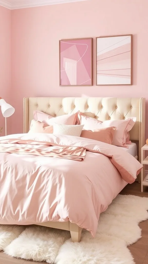
- Warm pinks have peach, salmon, or coral undertones. They pair beautifully with brass, gold, and cream.
- Cool pinks lean toward blue, berry, or magenta. They work with silver, chrome, and white.
- Muted pinks have grey or beige mixed in. They feel more neutral and pair with almost anything.
For a quick test, hold your hand next to the paint chip. If your skin looks warmer, it's a warm pink. If your skin looks cooler, it's a cool pink.
It's not scientific, but it gives you a sense of where you're starting.
Step 2: Choose Your Anchor Furniture Piece
Decide what the largest visual element in the room will be. Usually that's the bed, but it could also be a statement vanity or a bold armoire. Pick one piece that establishes the style direction.
For example, a velvet tufted headboard immediately telegraphs glamour. A rattan or cane headboard signals boho or coastal. A simple upholstered frame in a neutral tone lets the pink walls do the talking.
Step 3: Layer in Texture Before Color
This is the step almost everyone skips, and it's the one that makes the biggest difference. Before you start buying pink accessories, think about materials.
- Velvet adds depth and luxury.
- Linen feels relaxed and natural.
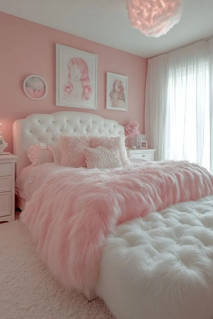
- Boucle brings a cozy, tactile warmth.
- Satin and silk add a touch of glamour.
- Chunky knits give a casual, lived-in feel.
- Wood and rattan ground the space and prevent it from feeling too sweet.
Texture does more work than color in creating a sophisticated room. A pink bedroom with five different materials will always look more intentional than one with five different shades of pink.
Step 4: Add Lighting in Three Zones
Lighting is the most overlooked element in pink bedroom design. You need three separate light sources to make pink look its best.
- Overhead light for general illumination. Choose a warm bulb at 2700K to 3000K.
- Task light near your vanity or bedside for reading and makeup application.
- Ambient light from lamps, LED strips, or string lights to create a cozy glow in the evening.
The label on the LED strip package will list a color temperature range. Look for the warm side of the spectrum. Cool white LED strips at 5000K or higher will make pink walls look flat and clinical.
Step 5: Style with Decor That Adds Personality
Now comes the fun part. Add wall art, mirrors, trays, candles, vases, and personal items that make the room feel like yours. But keep each piece intentional.
A few well-chosen items will always beat a cluttered collection of knick-knacks.
As of 2026, the trend is shifting toward more personal, collected-over-time styling. Instead of matching everything perfectly, mix vintage finds with new pieces. That mix creates the layered, lived-in feel that separates a curated room from a showroom.
The Best Pink Palette Combinations That Actually Work
You don't have to reinvent the wheel here. Certain pink palettes are proven to work because they respect the undertone science we talked about earlier. These combinations have been featured consistently in interior design publications and manufacturer color guides because they hit the right balance.
| Palette Style | Pink Shade | Pairing Colors | Metal Finishes | Best For |
|---|---|---|---|---|
| Soft and Elegant | Blush | Cream, ivory, warm white | Brass, gold | Small bedrooms, romantic style |
| Modern and Calm | Dusty rose | Grey, charcoal, oak wood | Matte black, nickel | Contemporary spaces |
| Bold and Edgy | Hot pink | Pure white, black | Silver, chrome | Statement rooms, teens |
| Boho and Warm | Mauve | Terracotta, clay, rattan | Copper, warm brass | Coastal or boho style |
| Glamorous and Airy | Ballet pink | Silver, glass, crystal | Chrome, polished nickel | Glam or Hollywood style |
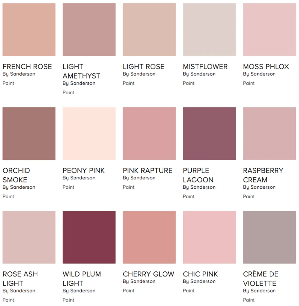
Image source: Web (Bing) / pinterest.com (Web image (fair-use with source credit))
The 60-30-10 Rule for Pink
If you're nervous about going too bold, apply the 60-30-10 rule. It's a classic interior design guideline that works perfectly for pink.
- 60% of the room should be a dominant color. This is usually your walls and large furniture pieces.
- 30% should be a secondary color. This includes area rugs, curtains, and bedding.
- 10% should be an accent color. Think throw pillows, art, vases, and decorative objects.
For a pink bedroom, you could keep the walls a warm cream or white, choose a dusty pink for the bedding and rug (the 30%), and add hot pink accents in the pillows and decor (the 10%). That gives you the pink energy without the risk of overkill.
When to Go All-In on Pink
Some rooms are ready for a full pink commitment. If you have excellent natural light, high ceilings, and neutral furniture already in place, an all-over pink treatment can look stunning. The key is to keep the pink fairly muted, either a dusty rose or a soft blush, and let the texture do the heavy lifting.
When your room is dark, has low ceilings, or already has busy patterns in the flooring or furniture, reserve pink for the accessories and accent wall instead. Those conditions change the entire calculation.
Pink Bedroom Furniture: Choosing the Right Focal Points
Your furniture choices anchor the entire design. They're the largest physical objects in the room, and they set the style tone before you ever add a single pillow. Getting these decisions right makes everything else easier.
The Bed Frame: Where It All Starts
The bed is the natural focal point in any bedroom, and in a pink room it becomes even more important because it balances the sweetness of the walls.
A canopy bed makes a huge statement. It draws the eye upward and creates a dramatic vertical line. This works beautifully in rooms with tall ceilings, but it can overwhelm a small, low room.
If your room is under 120 square feet, skip the canopy and consider a four-poster bed without the fabric instead.
An upholstered headboard is the safest and most versatile choice for pink rooms. It adds texture and softness that complements the wall color. Choose a neutral tone like cream, oat, or dusty grey, and let the pink walls do the color work.
If you want pink in the headboard, pick a deep velvet mauve instead of a bright pink. The contrast with lighter walls will feel more intentional.
A simple metal bed frame in brass or matte black is a great choice for boho or industrial styles. The thinner lines create a lighter feel, leaving more visual space for the pink elements.
Vanity and Seating Areas
A vanity adds charm and practical function to a pink bedroom. It doesn't have to be huge. A slim console table with a large mirror above it works perfectly in most rooms.
For seating, consider a small bench, an upholstered stool, or a cozy reading chair. A soft pink accent chair in velvet or boucle makes a wonderful addition if space allows. If the room is tight, a cushioned window seat serves double duty as storage and seating.
Wood Tones and Pink
Here's where the undertone science meets your furniture choices. Warm pinks love warm wood tones like oak, walnut, and cherry. Cool pinks pair better with maple, ash, or painted furniture in white or grey.
If you're mixing wood tones in the same room, keep a maximum of two or three different shades. Too many create visual chaos. For example, if your bed is walnut and your nightstands are white, keep your dresser in the same walnut family to maintain some cohesion.
As 2026 design trends continue toward biophilic and nature-inspired interiors, mixing pink with natural wood feels more relevant than ever. The warmth of the wood grounds the pink and prevents it from feeling too artificial or synthetic.
Storage That Works With Pink
Open shelving is your friend in a pink bedroom. Floating shelves create visual interest on the walls and give you space to display personal items that add texture. Store everyday items in woven baskets or lidded boxes to keep the space feeling calm and organized.
When you're choosing a wardrobe or dresser, consider painted furniture. A soft sage green, a warm cream, or a dusty blue dresser can actually look stunning against pink walls. The contrast becomes a design feature rather than a design problem.
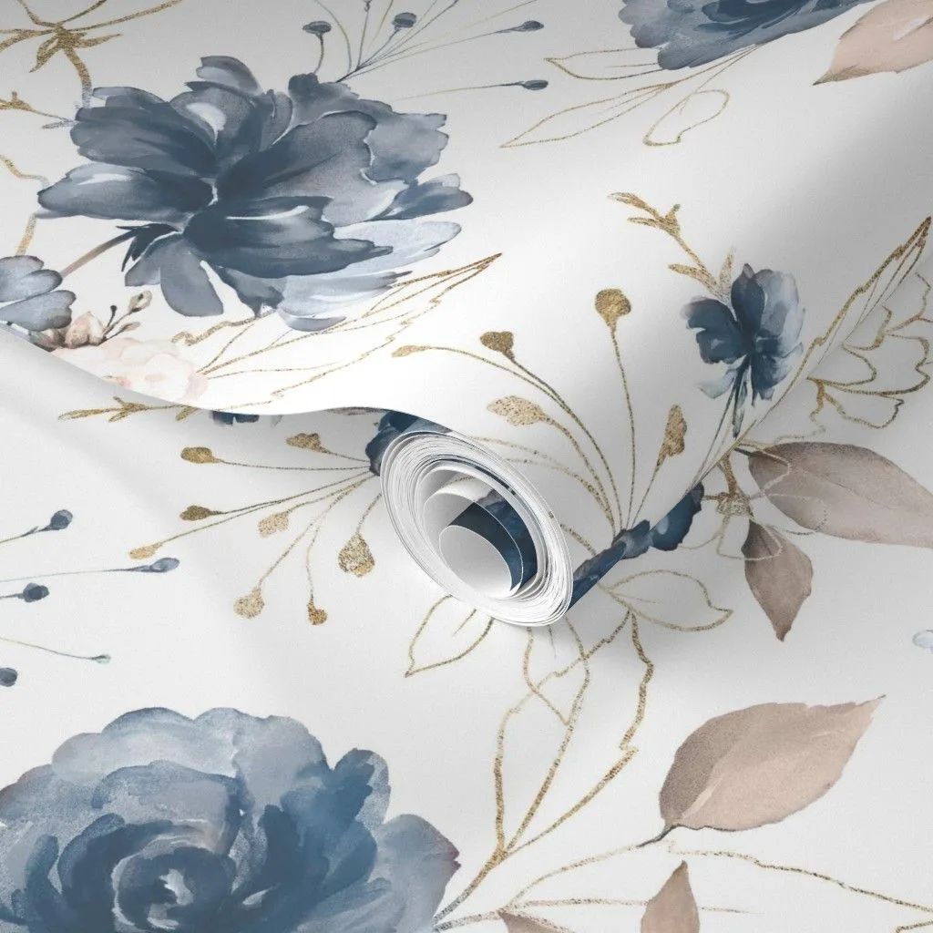
Image source: Web (Bing) / pinterest.com (Web image (fair-use with source credit))
Wall Treatments: Paint, Wallpaper, or Accent Walls?
Wall treatments are the first thing people see when they walk into your bedroom, so this decision deserves real consideration. Each option has its own strengths and challenges, and the right choice depends on your space, your timeline, and whether you own or rent.
When to Go All-Over with Paint
Full-room paint is the classic choice. It's affordable, it's easy to change later, and it creates a cohesive backdrop for everything else in the room. You can pick any shade from a soft ballet pink to a deeper, more saturated dusty rose.
- Pros: Even coverage, endless shade options, easy to touch up.
- Cons: Can be flat if the room lacks texture, takes a full day plus drying time.
A full paint job runs about $50 to $100 for a standard bedroom if you do it yourself. Premium brands like Benjamin Moore and Sherwin-Williams offer low-VOC options that are safer for bedrooms. Their color consultants recommend flat or matte finishes on the walls and a satin or eggshell finish in high-traffic areas like doors and trim.
Wallpaper as a Statement
Wallpaper adds pattern, depth, and texture that paint simply can't match. Floral patterns feel romantic and traditional. Geometric patterns feel modern and edgy.
Scalloped patterns add a touch of playfulness without becoming juvenile.
Peel-and-stick wallpaper has changed the game for renters. You can apply it in an afternoon and remove it without damaging the walls when it's time to move. The key is proper wall preparation.
Clean your walls, let any existing paint cure fully, and apply primer if the wall has any texture or previous damage.
Installing wallpaper yourself costs between $25 and $50 per roll, with most bedrooms needing 5 to 8 rolls for an accent wall or 10 to 15 rolls for a full room. Professional installation runs $5 to $15 per square foot.
The Accent Wall Strategy
An accent wall behind the bed is the sweet spot between a full paint job and committing to wallpaper everywhere. It gives you a focal point, adds drama, and limits your cost. There's actually an if/then logic here that simplifies the decision:
- If you have a small room, painting all four walls pink can feel like a lot. Use an accent wall instead.
- If your room gets strong, direct sunlight, pink on all four walls can wash out. An accent wall controls that.
- If you're a renter, use an accent wall in peel-and-stick wallpaper for a dramatic effect you can remove.
- If you want maximum visual impact, go all-over with a muted pink and let the accent wall be structural.
For the accent wall itself, you can choose to paint it a slightly deeper shade of the same pink, apply wallpaper to just that wall, or create texture with wood slats or wainscoting painted in a complementary tone. Any of these options will add depth and interest without overwhelming the space.
The 48-Hour Test
No matter which treatment you choose, test your pink before you buy in bulk. Paint a large swatch, at least two feet by two feet, directly on your wall. Live with it for 48 hours.
Observe how it looks in the morning light, in the midday sun, under artificial light in the evening, and in the darker pre-dawn hours. The same paint will look different at each point. That's not a flaw in the paint.
That's just how pink behaves, and it's exactly why the visual approach matters so much.