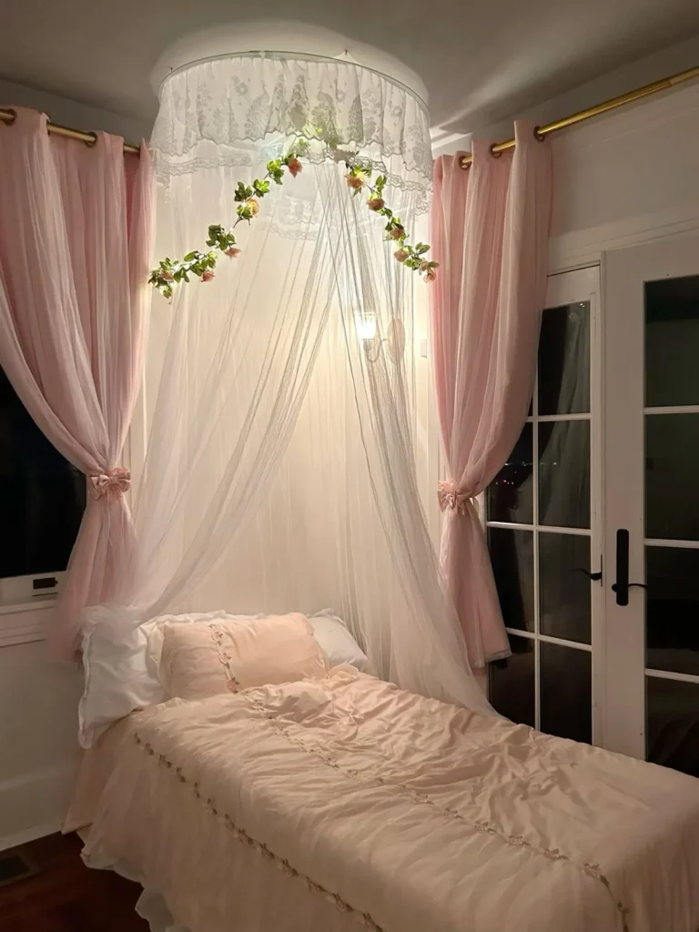
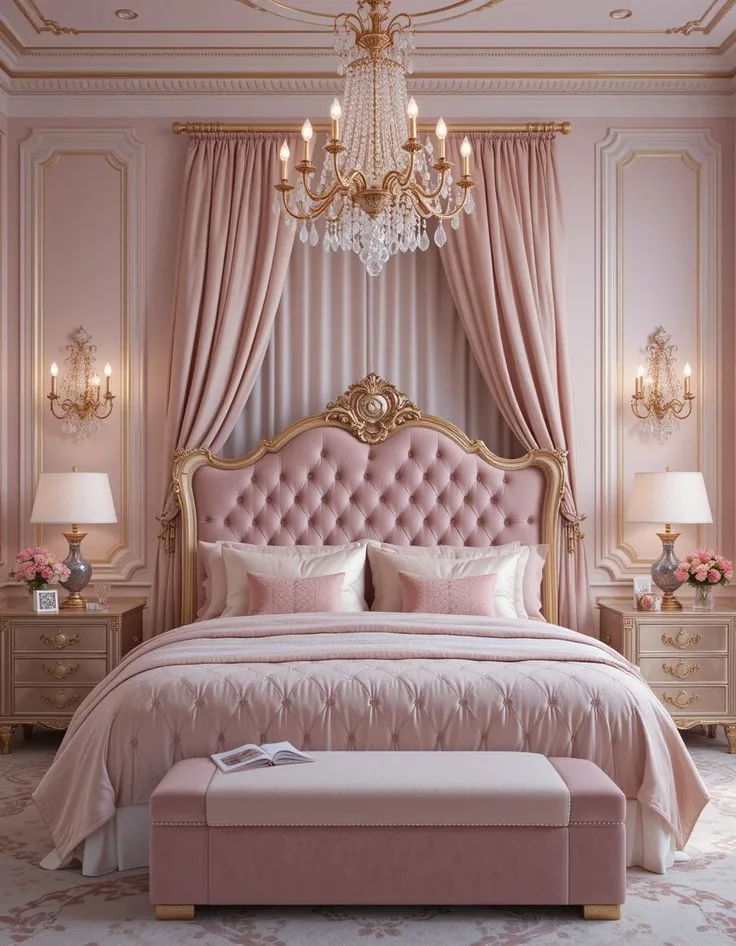
Moody Farmhouse Bedroom Style: Rustic Ideas with a Dark, Cozy Modern Twist
You want your bedroom to feel like a retreat, a place that’s cozy, personal, and a little bit dramatic, but maybe you’re worried that painting it a dark color will make it feel small or gloomy. The moody farmhouse bedroom style is the perfect solution, blending the warmth and texture of rustic decor with a sophisticated, darker palette to create a space that’s intimate but never cave-like. It's not about adding a few vintage knick-knacks to a dark room, it’s a specific balance of elements.
Our research into popular paint formulas shows that colors with a Light Reflectance Value (LRV) under 50 are the sweet spot for creating that enveloping mood without losing all light, and flat or matte finishes are key to avoiding a shiny, modern look that fights the farmhouse feel. Let’s unpack exactly what makes this style tick, and how you can get it right without needing a full renovation.
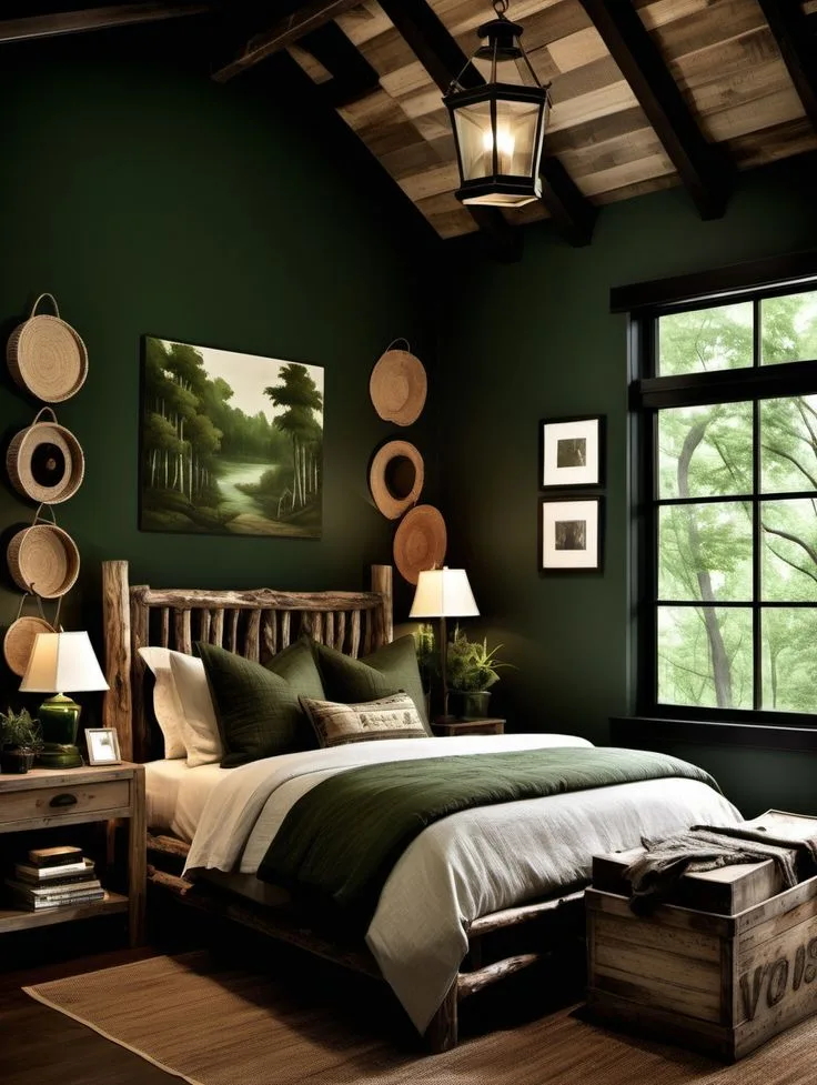
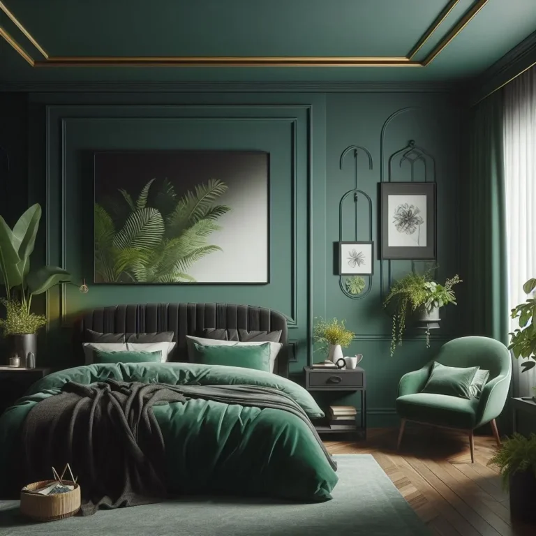
Image source: Bing (Web (fair-use with source credit))
Quick Answer
A moody farmhouse bedroom style combines deep, rich paint colors with natural, rustic textures. The goal is a cozy, intimate retreat. Key elements include matte-finish walls in charcoal, navy, or forest green.
Balance these with warm wood tones, linen textiles, and layered lighting. Avoid making the room feel dark and flat by mixing in light-reflecting elements and varied materials. This style is ideal for creating a personal sanctuary away from the bright, open feel of the main living areas.
So You Want a Moody Farmhouse Bedroom?
It makes sense. After years of all-white, ultra-bright modern farmhouse spaces, there’s a real pull towards rooms that feel more grounded and personal. A bedroom is the perfect place for that shift.
It’s your private space, so why not make it feel like a true sanctuary? This style answers that by taking the comforting, textural elements of farmhouse, the wood, the linen, the handmade feel, and setting them against a darker, more dramatic backdrop.
The trick, and where most people get tripped up, is in the balance. Go too dark without the right texture and light, and you’ve got a dungeon. Go too rustic without a cohesive color story, and it can look like a themed barn instead of a curated bedroom.
The intent isn’t to recreate a historical space, but to create a modern feeling of comfort and collectedness. It’s a style that allows for imperfection and personality, which is why it resonates so deeply. If you love the idea of a cozy, earthy retreat but want a touch more sophistication, this is your lane.
Why Moody Farmhouse Isn't Just "Dark and Rustic"
Calling it "dark and rustic" sells it short and leads to the most common mistakes. That phrase implies you just slap some dark paint on the wall and add a cow print. In reality, it’s a nuanced blend of two distinct aesthetics that, when done right, elevate each other.
The "moody" part is about atmosphere and emotion. It’s about using color to create a sense of enclosure, intimacy, and calm. Colors like deep olive green, charcoal, or navy blue have a psychological grounding effect.
They recede visually, making walls feel less imposing and the room feel like a protective cocoon. This is a stark contrast to the bright, airy "feel" of standard farmhouse decor.
The "farmhouse" part provides the warmth and soul that prevents the moody palette from feeling cold or stark. It’s the texture of nubby linen against a smooth dark wall, the glow of warm wood tones next to cool iron, and the patina of something old and loved. This style isn't about new, matching furniture.
It's about a collected look where each piece has character. It shares some foundational principles with modern barndominium design, where raw materials meet contemporary living, but applies them to a softer, more bedroom-appropriate scale. The magic happens in the intersection, where a dark wall makes the grain in an old oak dresser pop, or where a simple iron bed frame feels sculptural against a deep backdrop.
The Two Pillars: Mood & Material (A Visual Guide)
You can’t fake this style with a shopping list. You have to understand the visual relationship between the two core components. Think of it as a conversation: the mood (color) sets the stage, and the material (texture) tells the story.
If one dominates, the conversation falls flat.
The Moody Palette: Seeing the Right "Dark"
Not all dark colors are created equal for this look. You’re not looking for pure black or a super-saturated primary. The goal is a complex, softened dark, colors that have depth because they’re muted with gray, brown, or blue undertones.
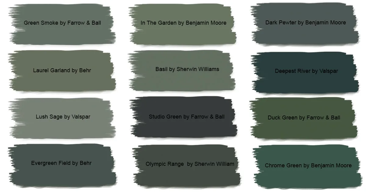
Here’s what to look for:
- Undertones are Everything: A "dark gray" can read as blue, purple, or green. In a north-facing room with cool light, a gray with a warm taupe or brown undertone (often called "greige") will feel cozier. In a south-facing room, you can handle a cooler charcoal.
- Embrace Low LRV: Light Reflectance Value (LRV) measures how much light a color reflects. Pure white is near 100, pure black is near 0. For moody farmhouse walls, aim for an LRV between 15 and 45. This range ensures the color is definitively dark but still reflects enough light to see nuances in the finish and your textures. Paint manufacturer websites list LRV for every color.
- Finish is Non-Negotiable: A flat or matte finish is crucial. Eggshell or satin will create a subtle sheen that reads as modern or traditional, not rustic. The flat finish absorbs light, making the color feel richer and more velvety, and it helps hide imperfections in older walls, a bonus in many homes. For trim and doors in the same color, you can use a satin for durability, but keep it on the sheen.
Pro Tip: Always, always test large swatches on multiple walls. Observe the color at different times of day. The right dark color will feel like an embrace, not a void.
Farmhouse Materiality: It's All in the Texture
If color is the stage, texture is the actor. This is where the warmth and livability come in. Without varied texture, a dark room feels flat and lifeless.
Texture here refers to both visual and tactile surfaces. You need a mix. Think about it in layers:
- Structural Texture: This is the "bones" of the room. Reclaimed wood plank walls, shiplap, exposed beams, or a brick accent wall. These large-scale textures add massive character and are a direct link to farmhouse origins. You don't need all of them, one strong structural element is often enough.
- Surface Texture: This is the furniture and fabrics. The roughness of a burlap lampshade, the nubby weave of a linen duvet cover, the soft cable-knit of a throw blanket, the smooth-worn surface of an old pine dresser. Even the matte finish on pottery adds a textural note.
- Metallic Texture: This is your contrast. Wrought iron bed frames, blackened steel light fixtures, or unlacquered brass hardware provide a smooth, hard counterpoint to all the soft, organic materials. They catch the light differently and keep the look from feeling too rustic.
The goal isn't to use every texture at once. It's to create a rich tapestry where your eye moves from the smooth wall to the nubby linen to the rough wood, creating a sense of depth and interest that makes the dark colors feel inviting. This layered approach to materials is also a hallmark of great cabin-inspired decor, where comfort is built through a sense of touch.
How to Start: Picking Your Anchor Point
You don’t have to start from scratch with empty white walls. The easiest way to avoid decision paralysis is to choose one "anchor" element and build everything else around it. This could be an item you already own and love, or the one thing you’re most excited to change.
Option 1: Anchor with a Color.
This is the most direct route. Fall in love with a specific paint color, maybe a deep forest green or a charcoal with blue undertones. Once that’s on the walls, every other choice is made in reaction to it.
Your wood tones need to complement it (warm oak against a cool green, for example), and your textiles should provide contrast (cream linen against navy walls). This approach creates a very cohesive, intentional backdrop.
Option 2: Anchor with a Material.
Maybe you have a gorgeous reclaimed wood headboard or you’re installing shiplap on one wall. Let that piece dictate the mood. Is the wood very warm and orange-toned?
A cooler, gray-based wall color (like a deep slate) will make it stand out beautifully. Is the wood gray and weathered? A warmer dark color (like a deep olive or coffee brown) will balance it.
Your anchor material sets the textural tone.
Option 3: Anchor with a Piece.
This is for the collectors. Start with your favorite vintage rug, a meaningful piece of art, or an inherited dresser. Pull the dominant color from that piece for your walls, and let its material (the rug’s wool, the art’s frame, the dresser’s wood) guide your other texture choices.
This method guarantees the room feels personal and collected from the start. It’s how you achieve a truly personalized adult bedroom that doesn’t look like a showroom.
Whichever anchor you choose, write it down. Every subsequent purchase or paint sample should be held up against this anchor and asked: "Does this enhance my anchor, or compete with it?" If it competes, put it back.
The Quick-Start Guide: Four Visual Moves You Can Make Right Now
You don't need a sledgehammer or a huge budget to start shifting your bedroom's vibe. These are high-impact, visual changes that work even in a rental.
- Swap Your Bedding.
This is the single biggest surface in the room. Ditch the bright white or printed comforter for solid, textured neutrals in cream, oatmeal, or light gray. Look for linen or a linen-cotton blend, the inherent wrinkles and texture are the point.
Layer a chunky knit or wool throw at the foot of the bed. Immediately, the bed becomes a soft, light-reflecting island against darker walls.
- Change Your Lighting.
Overhead lighting is the enemy of mood. Replace a modern dome light with a fixture that has character: a wrought-iron chandelier, a lantern-style pendant, or a simple canopy made of rattan. Add at least two other light sources, table lamps with ceramic or iron bases and fabric drum shades on nightstands, and a floor lamp in a corner.
Use warm-white bulbs (2700K) in everything.
- Introduce One "Old" Wood Piece.
You don't need to furnish the whole room. Find one piece with character: a small vintage stool as a bedside table, an old wooden crate to stack books on, or a simple floating shelf made from a sanded-down reclaimed plank. The warmth and story of that one piece will start to ground the space.
- Go Dark on One Wall.
If painting the whole room feels like a leap, paint the wall behind your bed. This is your focal point. Use a flat-finish paint in your chosen deep color.
It instantly creates a dramatic backdrop that makes your bed (and that new linen bedding) the star of the show. It’s a commitment, but a contained one. For more ideas on using a single dark accent wall, the principles in creating a moody blue bedroom work perfectly here.
Common Visual Mistakes (And How to Fix Them)
Getting the feel right is more important than checking off items from a list. Here are the pitfalls we see most often, and how to course-correct.
Mistake 1: The Single Overhead Light Dungeon.
This is the most common error. A dark-painted room lit only by one bright ceiling light creates harsh shadows and makes the space feel flat and uninviting.
- The Fix: Layer your lighting. You need three types: ambient (overhead, but dimmed), task (bedside lamps for reading), and accent (a floor lamp or wall sconce). Put all lights on dimmers. The goal is to create a pool of light in each corner, washing the walls gently and eliminating dark, gloomy corners.

Mistake 2: Matching Wood Tones.
A room where every piece of wood is the same stain color (like everything in "espresso" or "golden oak") looks dated and furniture-store generic. It kills the collected, over-time feel.
- The Fix: Intentionally mix wood tones and species. Pair a warm oak nightstand with a cooler ash wood dresser. Use a pine bed frame with a dark walnut vintage trunk. The variation adds depth and visual interest. Let the wood grains be different, it tells a better story.
Mistake 3: Going Too "Themed" with Decor.
This happens when you lean into farmhouse clichés. Think excessive use of chicken wire, outright barn stars, or signs that say "Farm Fresh." It feels costume-y, not curated.
- The Fix: Source decor with authenticity, not a theme. Choose a hand-thrown pottery vase, a vintage framed botanical print, a well-worn leather-bound book, or a simple iron candlestick. Each item should feel like it has a history and could belong in other styles, too. It’s about the vibe, not the literal label.
Mistake 4: Ignoring the Fifth Wall (The Ceiling).
Leaving the ceiling bright white when the walls are dark can create a visually jarring "lid" on the room. It can make the dark walls feel like they’re boxing you in.
- The Fix: You have options. Painting the ceiling a few shades lighter than the wall color (or even the same color) makes the room feel cocoon-like and cozy. If that’s too much, consider a very light application of texture, like a simple plank detail on the ceiling painted in a soft white, to draw the eye up and add interest without contrast.
Balancing the Light: Your Lighting & Contrast Plan
Since we’ve established lighting is critical, let’s build your plan. Good lighting in a moody room isn't about brightness, it's about distribution and quality of light.
First, assess your natural light. A north-facing room needs more and warmer artificial light to combat the cool, gray natural light. A south-facing room gets warm light all day, so you can use fewer fixtures but should still layer them for evening.
Your lighting plan should create a triangle of light in the room. Here’s a simple layout:
| Light Type | Purpose | Examples for This Style | Placement Tip |
|---|---|---|---|
| Ambient | General, overall illumination. | Wrought iron chandelier (on dimmer), canopy pendant. | Center of room, or over the bed if no other overhead exists. |
| Task | Focused light for specific activities. | Table lamps with linen shades, swing-arm wall sconces. | On nightstands, mounted on wall beside bed for reading. |
| Accent | Highlights texture or architecture, adds glow. | Plug-in wall sconce, floor lamp with adjustable head, LED strip inside open shelving. | In a dark corner, aimed at a textured wall or piece of art. |
Now, contrast. This is about balancing dark and light elements so the room feels dynamic, not heavy. Your dark walls are a given.
Your light elements are your tools:
- Bedding: Light-colored, textured linen is your biggest light reflector.
- Rug: A natural fiber rug like jute or sisal, or a light vintage-style wool rug, adds a large light layer at foot level.
- Window Treatment: Avoid heavy blackout drapes in a dark fabric. Use linen or cotton curtains in a neutral, lighter color. They diffuse light beautifully during the day.
- Mirrors: Strategically placed mirrors (not huge gallery walls of them) bounce light around. An aged wood-framed mirror leaning against a wall is perfect.
- Ceiling & Trim: As mentioned, don't ignore these. A lighter ceiling or trim can act as a frame, defining the space of the dark walls.
Sourcing the Look: Where to Find Authentic Character
You can’t buy this look in a single trip to a big-box store. The charm comes from the mix of new and old. Here’s where to look.
For Vintage & Antique Pieces:
- Local Architectural Salvage Yards: Gold mines for old doors, windows, wood planks, beams, and unique hardware. Perfect for that one structural texture element.
- Estate Sales & Auctions: Look for solid wood furniture, old lighting fixtures, mirrors, and art. The pieces often have a patina that can’t be replicated.
- Online Marketplaces (Facebook Marketplace, Craigslist): Search for terms like "old pine dresser," "iron bed frame," "vintage rug," "wooden crate." Be willing to refinish or clean items.
For New Items that Feel Old:
- Small Batch Makers & Etsy: For handmade pottery, linen bedding, wrought-iron curtain rods, and reproduction hardware. You’re supporting an artisan and getting something unique.
- Specialty Lighting Retailers: Many companies now make high-quality new lighting that perfectly mimics vintage industrial and farmhouse styles without the wiring hassles of true antiques.
- Paint Companies with Historic Collections: Brands like Farrow & Ball, Benjamin Moore (their Historical Collection), and Sherwin-Williams have curated colors that are complex and period-appropriate, taking the guesswork out of finding the right deep hue.
The Rule: For every two or three vintage/antique items, you can have one new, clean-lined piece (like a comfortable modern chair or a simple platform bed frame). This keeps the look from veering into "old-fashioned" and makes it feel lived-in today. This balanced sourcing strategy is similar to what works for achieving an authentic barndominium exterior, mixing traditional materials with contemporary function.
Moody Farmhouse vs. Other Styles (A Visual Comparison)
It’s easy to get styles confused, especially when they share words like "farmhouse" or "moody." Here’s a quick visual differentiation to help you stay on track.
| Style | Color Palette | Key Materials | Overall Vibe | Best For You If… |
|---|---|---|---|---|
| Moody Farmhouse | Deep, muted darks (charcoal, navy, forest green). | Reclaimed wood, wrought iron, linen, stone. | Cozy, intimate, collected, dramatic yet warm. | You want a cozy retreat with character, not a bright space. |
| Modern Farmhouse | White, cream, light gray, black accents. | Shiplap, subway tile, brushed nickel, clean-lined wood. | Bright, airy, clean, family-friendly. | You love farmhouse but prefer a light, open, and minimal look. |
| Cottagecore | Soft pastels, creams, sage green, floral patterns. | Painted wood, cotton, lace, china, wicker. | Romantic, whimsical, gentle, nostalgic. | You want a sweet, storybook feel that’s light and pretty. |
| Industrial Farmhouse | Grays, blacks, browns, with maybe one deep color. | Galvanized metal, concrete, exposed brick, dark wood. | Utilitarian, rugged, urban, edgy. | You like the raw, unfinished look and want more metal than fabric. |
| Boho | Earth tones, but also rich jewel tones and patterns. | Macramé, rattan, velvet, fringe, global textiles. | Eclectic, layered, colorful, free-spirited. | You love pattern, color, and a globally-inspired, personal collection. |
Real Room Walkthrough: A Practical, Step-by-Step Example
Let’s apply everything to a hypothetical main bedroom that’s 12’ x 14’ with standard 8-foot ceilings and one north-facing window.
The Anchor: The homeowner loves a deep, green-gray paint color (like Benjamin Moore's "Newburg Green" or Farrow & Ball's "Green Smoke").
Step 1: The Shell.
They paint all walls and the ceiling in the same color, using a flat finish. The trim is painted in the same color but in a satin sheen for wipeability. This immediately creates the cocoon.
Step 2: The Biggest Textures.
A reclaimed wood headboard in a warm, weathered oak is installed. It contrasts beautifully with the cool green walls. A large, neutral jute rug is layered over the existing carpet (or floor) to add light and texture underfoot.
Step 3: Lighting Plan.
- Ambient: A simple black wrought-iron chandelier with candelabra bulbs is installed in the center of the room, wired to a dimmer.
- Task: Two swing-arm wall sconces with black metal arms and linen shades are mounted on either side of the headboard, providing perfect reading light without taking up nightstand space.
- Accent: A plug-in wall sconce with an adjustable arm is placed in a dark corner opposite the window, aimed at a small gallery wall of vintage botanical prints.
Step 4: Furniture & Layering.
The nightstands are mismatched: one is a small vintage pine table, the other is a simple black metal cabinet. The bedding is a rumpled linen duvet cover in cream with white sheets. A charcoal gray wool throw is folded at the foot.
A tall, weathered oak dresser sits on the wall opposite the bed, topped with a collection of pottery and an iron-framed mirror.
Step 5: The Final Layer.
Linen curtains in a light oatmeal color hang simple and full on either side of the window, pooling slightly on the floor. A few hardcover books, a wooden tray, and a single ceramic lamp on the metal nightstand complete the surfaces.
The result? A room that feels deeply relaxing, intentionally layered, and personal. The dark walls don’t feel small because the varied textures and layered lighting create endless points of visual interest.
It’s a masterclass in how to design a bedroom that feels like a true sanctuary.
Costs, Planning & Practical Data
Let’s talk numbers so you can plan realistically. This style can be achieved on a range of budgets, but smart allocation is key.
Paint: This is your highest-impact, lowest-cost item. A gallon of quality paint (flat finish) runs $50-$80 and will cover a standard bedroom with one coat over primer. Factor in supplies (brushes, rollers, tape, drop cloths) for another $50. Pro Tip: Never skip primer when going dark, especially over lighter colors.
A tinted primer (gray for your dark color) ensures true color and fewer coats.
Lighting: This is where you shouldn’t overly cheap out. A good statement fixture can be $200-$500. Quality table lamps are $100-$250 each.
However, you can find incredible vintage fixtures for less at sales, they just may need rewiring ($50-$100 per fixture by an electrician). Budget $500-$1000 total for a complete layered lighting plan.
Textiles (Bedding & Curtains): Good linen bedding is an investment but lasts for years. A king-size duvet cover and shams can range from $200-$600. Look for sales from direct-to-consumer brands.
Curtains for one window, ready-made in linen-look fabric, can be $100-$200. A natural fiber rug (8’x10’) starts around $300.
Furniture & Decor: This is the most variable category. A vintage dresser might be $200 at a sale but need $50 in supplies to clean and wax it. A new, simple iron bed frame can be $500-$800.
Decor is best collected slowly. Set a monthly "hunt" budget of $50-$100 for vintage finds.
A Quick-Reference Table:
| Item Category | Budget-Friendly Approach | Investment Approach | Where to Splurge |
|---|---|---|---|
| Paint & Walls | Quality paint is non-negotiable; save by doing labor yourself. | Consider adding real shiplap or a plaster finish for texture. | The paint itself. A cheap paint won’t look rich. |
| Lighting | Hunt for vintage and rewire. Use plug-in sconces to avoid new wiring. | Buy new, well-made fixtures with authentic details and dimmers. | The overhead fixture and bedside task lights. |
| Bedding | Start with one set of quality linen blend sheets and a duvet cover. | Invest in a full set of European flax linen. | The sheets and duvet cover you touch every day. |
| Key Furniture Piece | Find one solid vintage wood piece and refinish it. | Buy a handcrafted bed frame or armoire as the anchor. | The bed frame—it’s the focal point. |
Expert Tips for Long-Term Cohesion
You’ve put the room together. Here’s how to keep it feeling right and avoid the "done and dead" feeling.
Edit Ruthlessly.
The collected look can tip into cluttered. Once a year, take everything off surfaces and shelves. Only put back the items you truly love and that contribute to the calm, textured vibe.
Store or donate the rest. This keeps the room feeling intentional.
Let it Evolve.
Your moody farmhouse bedroom shouldn’t be frozen in time. As you travel or find new treasures, swap things out. Replace a piece of art, change the throw blanket seasonally (a heavier knit in winter, a lighter cotton in summer).
The base is neutral and dark, so it can handle these small evolutions.
Maintain Your Materials.
- Wood: Dust regularly. Use a beeswax or oil-based polish (not silicone-based) on raw wood once or twice a year to nourish it and maintain the patina.
- Linen: Embrace the wrinkles. Wash on gentle and tumble dry low, or hang to dry. It softens beautifully over time.
- Metals: For unlacquered brass or iron, a light wipe with a dry cloth is usually enough. If you want to prevent natural tarnishing on brass, you can apply a thin coat of clear lacquer, but many prefer the living finish.
The Power of Plants.
Add one or two simple, architectural green plants. A snake plant or a ZZ plant in a terracotta or simple ceramic pot adds life, a touch of color, and another organic texture. They thrive in lower light and are hard to kill.
Frequently Asked Questions (The Real Ones)
Can I do a moody farmhouse style in a small bedroom?
Absolutely. In fact, dark colors can make a small room feel cozy and intentional rather than just small. The key is to use the darkest color on the walls and ceiling to blur the boundaries, and then keep furniture light in color (light wood, cream upholstery) and scaled appropriately.
Maximize light reflection with mirrors and ensure your lighting is layered to eliminate dark corners.
What if I’m a renter and can’t paint?
You have great options. Focus on the material layers you can control. Use a large, light-colored rug and extensive textured bedding.
Add structural texture with a removable peel-and-stick wood plank wall covering behind the bed. Layer in vintage wood furniture and multiple lamps. The concentration of texture and warm lighting can create a surprisingly moody feel even with white walls.
My room gets very little natural light. Will this style make it darker?
It will change the light, but not necessarily for the worse. In a low-light room, a very dark color can actually look softer and more consistent than a mid-tone color that just looks dingy in poor light. Your job is to compensate artificially.
Be diligent with your layered lighting plan, using more and warmer light sources. Also, be extra strategic with light-reflecting elements like mirrors, cream-colored textiles, and even a high-gloss (but discreet) finish on a picture frame to bounce light around.
How do I keep it from looking too masculine or somber?
The warmth of the farmhouse elements is your antidote. Incorporate curves (a round mirror, a ceramic vase), softer textiles (a chenille throw, a braided rug), and personal, delicate items (vintage books, dried flowers, a piece of lace). The mix of the strong, dark backdrop with these softer, finer details creates a balanced and inviting space that isn’t gendered.
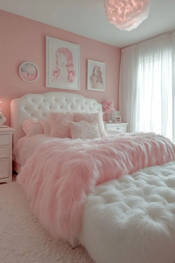
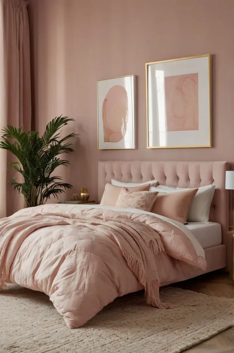
For a more romantic take on this balance, you can explore ideas from moody pink bedroom design.
Is this style expensive to achieve?
It can be, but doesn’t have to be. The cost is in the materials (good linen, solid wood, real iron) not in the brand names. It’s a style perfectly suited to patience, DIY, and thrifting.
Splurge on the items you interact with daily (your mattress, bedding, a comfortable chair) and save on decor by hunting for vintage finds. The most expensive version tries to buy the "look" new all at once. The most authentic version collects it slowly over time.
Safety / Legal / Compliance / Warnings
Let’s keep your beautiful space safe and sound. Working with vintage items and dark colors involves a few specific considerations.
First, lighting fixtures. If you find a vintage chandelier or sconce you love, have it professionally rewired before you install it. Old wiring insulation can be brittle and pose a fire risk.
This usually costs between $50 and $150 per fixture. It’s a non-negotiable investment for safety.
Paint choices matter in a bedroom where you spend hours breathing the air. Look for low-VOC or no-VOC paints. Most major brands now offer these formulas.
They significantly reduce off-gassing of volatile organic compounds, leading to better indoor air quality as you sleep.
Hanging heavy items like large mirrors or wooden shelves on plaster or lath walls requires proper anchors. Hollow wall anchors or toggle bolts rated for the weight are essential. Manufacturer specs on the anchor packaging tell you the weight limit per anchor.
Distribute weight across multiple anchors for large pieces.
Finally, be mindful of textiles near heat sources. Keep throw blankets, curtains, and bedding a safe distance from space heaters, radiators, or high-wattage bulbs in lamps. This simple habit prevents a major fire hazard.
Location & Market Context
Your local environment influences your approach. This style adapts beautifully but benefits from regional tweaks.
In colder, northern climates with long winters, the cozy, enveloping feel of a moody farmhouse bedroom is a natural fit. It leans into the desire for a warm retreat. You might use heavier wool throws and darker, warmer wall colors to combat the gray exterior light.
In warmer, sunnier southern climates, you can still achieve the look. Opt for slightly lighter shades within the deep palette, like a muted sage green over a forest green. Prioritize breathable natural fibers like linen and cotton for bedding to maintain comfort.
The style provides a cool, shaded retreat from the bright sun.
Room orientation is your biggest daily factor. North-facing rooms demand warmer light bulbs (2700K) and may benefit from warmer paint undertones (greiges, brown-based colors) to offset the cool light. South-facing rooms can handle cooler, truer darks and still feel warm in the afternoon sun.
Urban apartments and suburban homes both work. In an apartment, focus on movable items and textiles. Use removable peel-and-stick planks for texture and rely heavily on layered lighting you can take with you.
In a house with more permanent architecture, you can invest in installed elements like real shiplap or ceiling beams.
Real Scenarios / Case Examples
Let’s look at two specific challenges people often face and how this style solves them.
Scenario 1: The Builder-Grade Bedroom Box. Many newer homes have bland, beige bedrooms with low ceilings and no architectural detail. The goal is to inject character and intimacy.
- Solution: Paint the walls and ceiling the same deep color (like a charcoal gray) to visually raise the ceiling by blurring the line where wall meets ceiling. Add texture with a board and batten treatment or shiplap on the lower half of one wall, painted the same color. Use a low-profile platform bed to keep the sightline open. The dark color and added texture completely transform the sterile box into a designed space.
Scenario 2: The Cluttered, Multi-Purpose Room. This is a bedroom that also serves as a home office or craft space. It needs to feel calm and unified, not chaotic.
- Solution: Use the moody farmhouse principle of a dark, cohesive backdrop. Paint the entire room one deep, calming color. Then, use furniture in consistent materials (all wood tones in the same family, all black metal frames) to house the different functions. A large vintage wooden desk and a matching dresser create visual harmony. Use baskets and closed storage (like an old cupboard) to taway clutter, maintaining the textured but tidy aesthetic. The dark walls make the functional pieces recede, promoting focus and rest.
Authoritative Sources
While this is an aesthetic topic, grounding your choices in quality information is key. Here are the types of sources we rely on.
For paint, the most authoritative sources are the color archives and technical data sheets from reputable paint manufacturers themselves. Brands like Benjamin Moore, Sherwin-Williams, and Farrow & Ball provide detailed LRV values, sheen recommendations, and historical color context that is invaluable.
When sourcing authentic vintage materials, architectural salvage guilds and historical building material associations are excellent resources. These organizations often provide guidelines on dating materials, proper restoration techniques, and sustainable sourcing, ensuring you’re respecting the history of the pieces.
For broader understanding of historic interior design principles that inform the farmhouse aspect, university extension programs and .edu museum sites often publish well-researched articles on period-appropriate materials, colors, and construction methods. This research helps you make choices that feel authentic, not just trendy.
Related Terms & Semantic Entities
You might hear these terms when exploring this style. Here’s how they connect.
Dark Academia: Shares the moody, scholarly vibe and love of dark wood and rich colors, but is more bookish and ornate. Moody farmhouse is warmer and more rustic.
Grandmillennial: Embraces traditional patterns, ruffles, and vintage china. It can overlap with moody farmhouse in its love of collected antiques, but is generally brighter, busier, and more formal.
Organic Modern: Focuses on neutral palettes, clean lines, and natural materials. It’s a close cousin, but moody farmhouse allows for more color, more pattern, and a distinctly "lived-in" collectedness, whereas organic modern is more minimalist and curated.
Patina: This is a key concept. It refers to the beautiful aging on surfaces, the worn edge on wood, the tarnish on brass, the faded paint. Actively seeking items with patina is central to achieving the authentic, time-worn feel.
Collected Look: The opposite of a matching suite. It means your room looks like it was furnished over decades with pieces you love, not bought in one day. This is the ultimate goal of the style.
New England Style: Often features similar deep, historical paint colors and rustic beams, but with a more coastal, nautical influence (think navy and white stripes). Moody farmhouse is less themed and more broadly rustic.