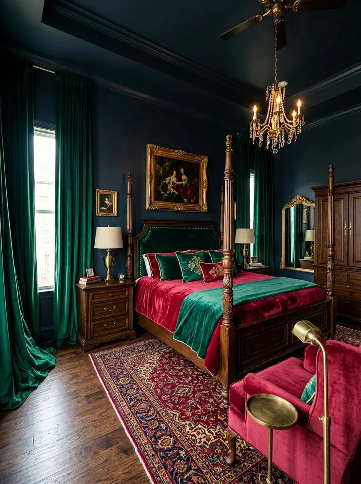
Serene Green Bedroom Design Inspirations for a Calm, Natural, and Stylish Space
If you're searching for Moody Green Bedroom Ideas, you're probably looking for a retreat. Not just a place to sleep, but a sanctuary that feels calm, sophisticated, and a little bit dramatic. It's about swapping bright, busy energy for a grounded, enveloping atmosphere that helps you truly switch off at the end of the day.
The good news is you don't need an architect to get it right. Our research into design principles shows it comes down to a few key choices, like picking a paint with a matte finish to absorb light properly. As of 2026, leading paint manufacturers are still championing matte and flat finishes for dark, moody colors to avoid a shiny, artificial look.
Let's walk through what actually makes this style work.
Quick Answer
Moody green bedroom ideas use deep, saturated greens to create a dramatic and cozy retreat. Start with a matte-finish paint like forest or hunter green on at least one wall. Layer in rich textures like velvet bedding and wool throws.
Use warm metal accents and plenty of ambient lighting to keep the space inviting, not dark. The goal is a grounded, nature-inspired sanctuary that feels intimate and relaxing.
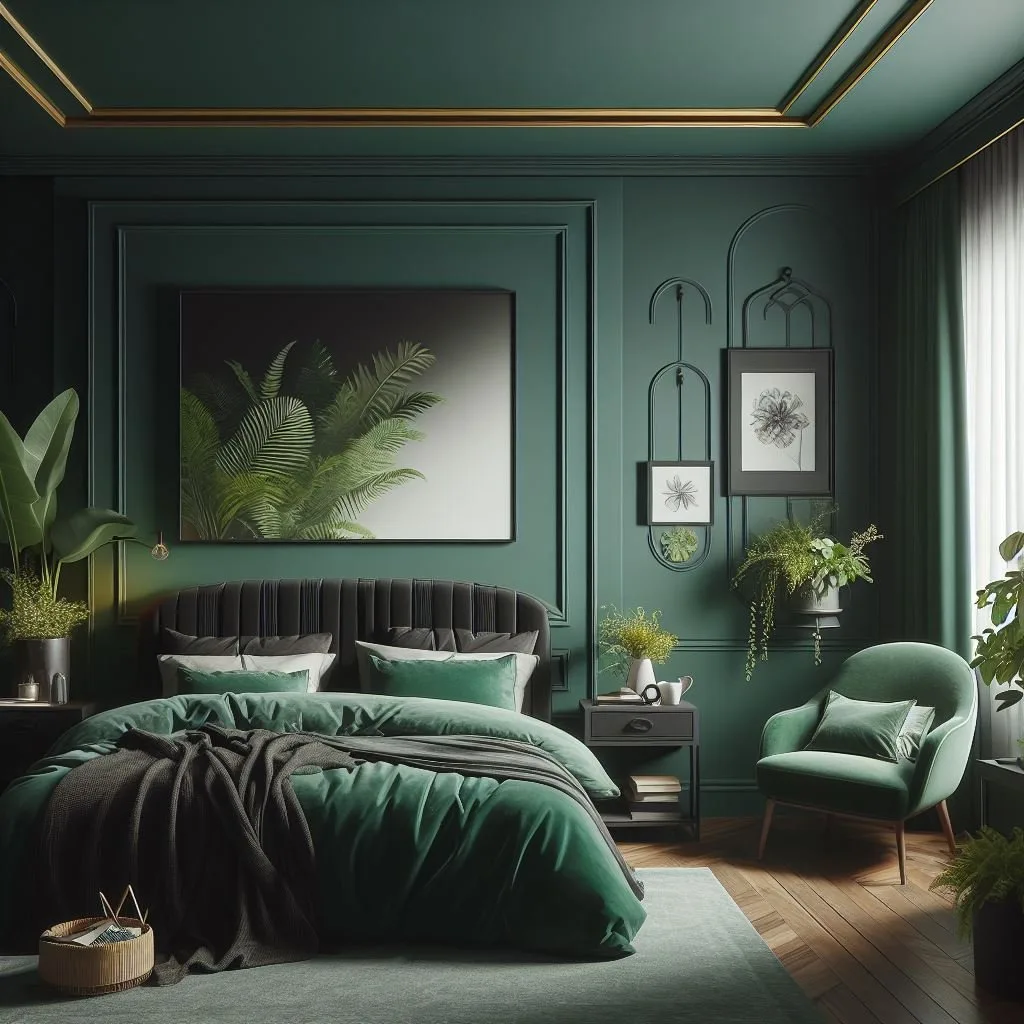
What Makes a Bedroom "Moody," Anyway?
Forget the dictionary. In interior design, "moody" isn't about being sulky. It's a specific atmospheric effect.
It describes a space that feels intentional, intimate, and emotionally resonant. Think of the quiet drama of a library, the cocooning feel of a high-end hotel suite, or the deep tranquility of a forest at dusk.
A moody room uses color, light, and texture to manipulate how a space feels, not just how it looks. It embraces darker tones to make a large room feel cozier or to give a standard bedroom a sense of grandeur. It's a deliberate move away from the all-white, airy aesthetic toward something more personal and enveloping.
This approach works beautifully in other intimate spaces, like creating a serene bathroom retreat, using similar principles of texture and controlled light.
The magic trick is balancing that depth with warmth. Done poorly, a dark room can feel cold and cavernous. Done right, with the right undertones and lighting, it becomes the most inviting spot in your home.
The Power of Green: More Than Just a Color
Green is the secret weapon for a moody bedroom. While other dark colors like navy or charcoal can work, green brings something unique to the table. It's inherently connected to nature, which our brains associate with calm and restoration.
This psychological link is why green feels grounding instead of oppressive.
It's also incredibly versatile. Green has a wide range of personalities, from the almost-gray serenity of sage to the bold intensity of emerald. It plays well with a huge spectrum of other materials.
Warm woods, creamy whites, brass, black iron, and even other colors like dusky pink or deep blue can all sit comfortably next to the right green. This makes it a forgiving and flexible foundation to build upon.
If you love the moody aesthetic but aren't sure about green, you're not locked in. The same principles of depth and coziness translate to other palettes, like the sophisticated calm of moody blue or the rich, romantic vibe of a moody purple scheme. Green just tends to be the most universally calming starting point.
Start Here: Your Room's Non-Negotiable Features
Before you buy a single paint sample, you have to become a detective in your own room. The existing architecture and light will dictate your plan more than any Pinterest board. Ignoring this is the number one reason a beautiful color turns into a daily frustration.
The Light (Natural and Artificial)
This is the biggest variable. Which direction do your windows face? North-facing rooms get cool, indirect light all day.
South-facing rooms are flooded with warm, direct sunlight. This dramatically changes how paint color appears.
In a north-facing room, a green with gray or blue undertones can look even cooler and potentially a bit dull. You might want to lean toward a green with a touch of warmth, like an olive or a deep sage, to counteract the cool light. In a sun-drenched south-facing room, that same warm green might feel brighter than you want.
Here, a true forest green with neutral undertones will stay rich and deep.
Then there's your artificial light. What color temperature are your bulbs? For a moody bedroom, you always want warm white bulbs (2700K-3000K).
Cool white or daylight bulbs will fight against the cozy atmosphere, making your green walls look stark and clinical. Your lighting plan isn't an afterthought. It's part of the color scheme.
The Size and Layout
A common fear is that dark paint will make a small room feel smaller. In practice, it often does the opposite. A dark color can blur the edges of a room, making the walls visually recede.
It creates a sense of intimacy, not claustrophobia. The key is embracing it fully, often on all walls, to avoid a choppy, boxed-in feel.
For a large bedroom with high ceilings, a moody green is perfect for making the space feel more human-scaled and cozy. It helps to bring the ceiling down visually. Pay attention to the room's layout.
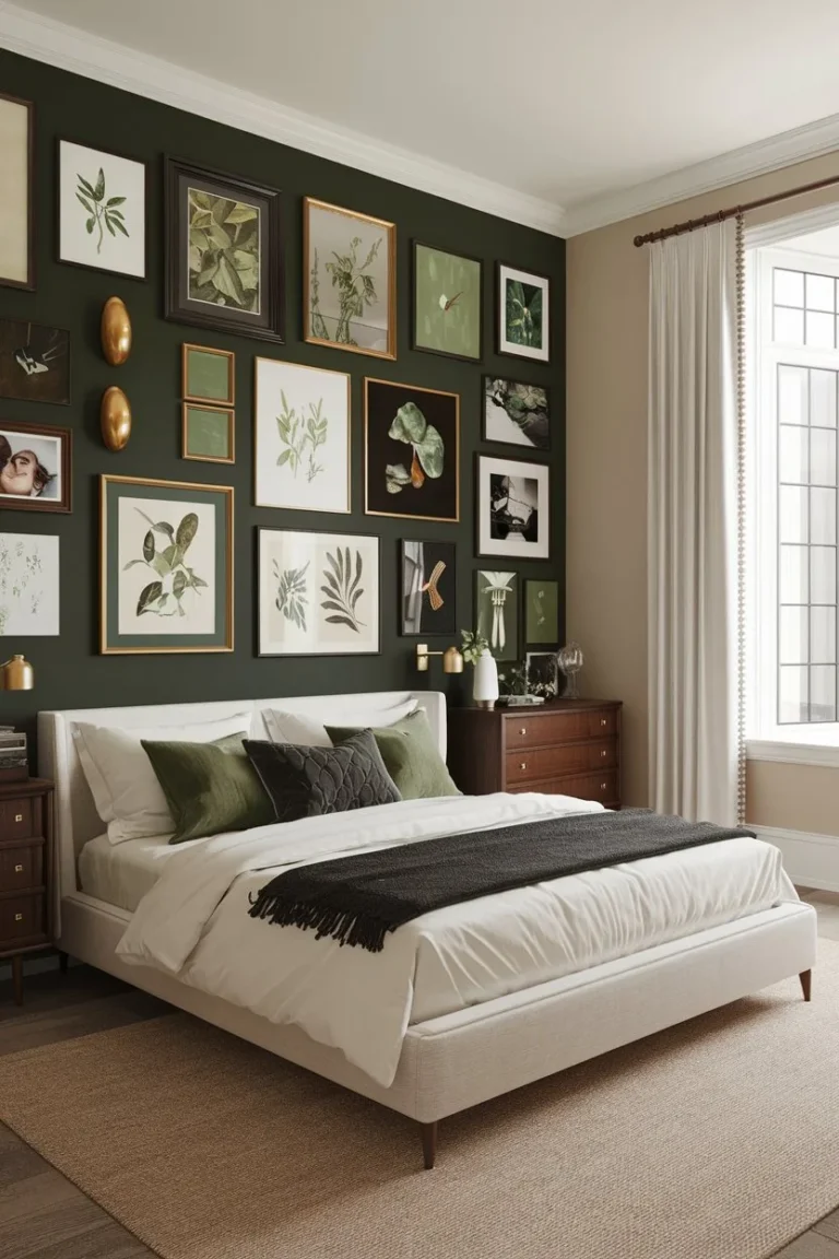
Where is the natural focal point? It's usually the bed wall. That's often the best candidate for your boldest color move, whether it's an accent wall or the spot for your most dramatic artwork.
Choosing Your Shade of Moody Green
This is where people get stuck. You walk into the paint store and see fifty green chips that all look vaguely "dark." The difference between success and a repaint job often lives in the undertone. Every green has a hidden base color that comes out under different light.
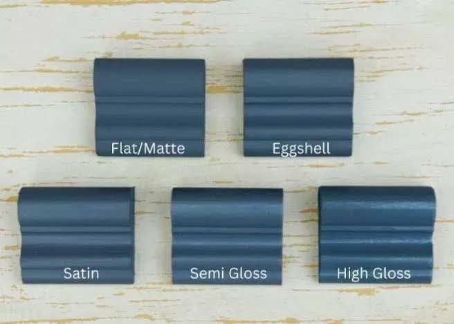
The finish is as important as the color. For moody, deep greens, a flat or matte finish is almost always the right choice. It absorbs light, giving you that rich, velvety depth.
A satin or eggshell finish will reflect light, which can make a dark color look shiny and cheaper, like a sports car rather than a library wall. Matte finishes are more forgiving of wall imperfections, too.
Here’s a breakdown of the two main families of moody green:
The Deep and Dramatic (Forest, Hunter, Emerald)
These are the high-impact greens. They’re saturated, often with neutral or slightly cool undertones. Think of a pine forest at twilight or a jewel-toned velvet curtain.
- Best for: Rooms with good natural light that you want to feel cozy and dramatic. They create a strong, anchoring presence. They pair brilliantly with dark woods, black iron, and crisp white trim for a classic, high-contrast look.
- Watch out for: In a room with very little natural light, these can tip into feeling flat or gloomy if not balanced with ample warm artificial lighting and light-reflecting textiles.
The Soft and Serene (Sage, Olive, Gray-Green)
These greens are muted and complex. They have gray, brown, or yellow mixed in, which softens them. They feel earthy, organic, and incredibly restful.
- Best for: Rooms where you want a subtle moodiness, not a dramatic punch. They're fantastic in north-facing light, as the gray undertones work with the cool light. They are the backbone of an earthy, organic bedroom style and blend seamlessly with natural materials like linen, rattan, and oak.
- Watch out for: Depending on the undertone, some gray-greens can look a bit sickly or drab. Always test a large sample on the wall.
The only way to know for sure is to sample. Paint a 2'x2' square on at least two different walls. Look at it in the morning, afternoon, and with your lamps on at night.
Live with it for two days. The right color will feel like a warm embrace, not a cold shoulder.
The Visual Blueprint: A 5-Point Plan for a Moody Green Bedroom
Now for the fun part: putting it all together. Think of this as a layered approach, where each element supports the others to build that perfect atmosphere. It's less about matching and more about harmonizing.
1. Your Dominant Color: How to "Drench" a Room Right
"Color drenching" is the pro term for using a single color on multiple surfaces. It’s a powerful technique for a moody room. Instead of just painting the walls green, consider using the same color (or a slightly lighter/darker shade) on the ceiling, trim, or even built-in cabinetry.
This eliminates visual breaks and makes the room feel like a cohesive, enveloping capsule.
If full drenching feels like too much, start with a feature wall. But be strategic. Paint the wall your bed is against, not a random small wall.
This makes the bed the rightful focal point. The other walls can be a lighter, complementary neutral, a warm gray, or even a textured wallpaper.
2. Texture is Everything: Building Layers of Coziness
Color sets the mood, but texture makes it cozy. This is how you prevent a dark room from feeling cold or flat. You need a variety of tactile surfaces that catch the light differently.
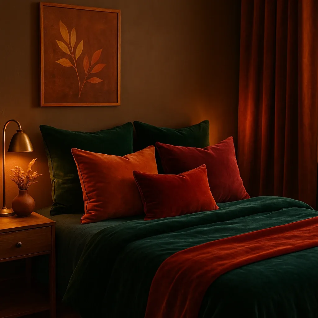
Think in terms of a texture checklist:
- Something plush: Velvet is the MVP here. Use it on a throw pillow, the headboard, or a bench at the foot of the bed.
- Something nubby: A chunky wool or knit throw adds instant warmth and a lovely casual contrast.
- Something smooth: Linen bedding or curtains introduces a relaxed, breathable feel.
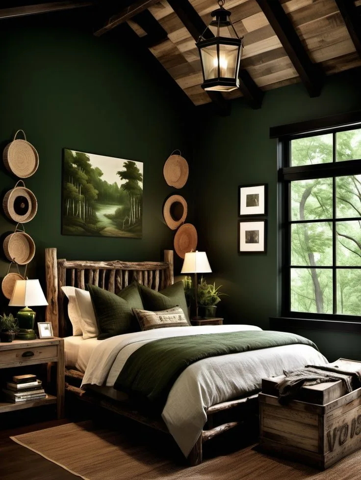
- Something natural: A jute or sisal rug, a rattan basket, or wooden nightstands bring in organic texture.
This layered, collected feel is a hallmark of boho-inspired designs, where pattern and texture tell the story. In a moody green room, you keep the patterns minimal and let the textures do the talking.
3. The Lighting Plan: Creating Pools of Light, Not a Flood
Overhead ceiling lights are the enemy of a moody bedroom. They create a flat, harsh light that washes out all your careful depth. You want to sculpt with light, creating pockets of warmth and shadow.
Build a layered lighting scheme:
- Ambient Light: This is the soft, general glow. Use a floor lamp with a shade in a corner, or sconces on either side of the bed (mounted at about 60-65 inches from the floor).
- Task Light: For reading in bed. This should be focused and direct, like adjustable wall sconces or small table lamps with dark shades.
- Accent Light: The fairy dust. This could be a tiny picture light over artwork, LED strips on the back of a headboard, or a simple plug-in pendant over a nightstand.
Always use dimmers. They are non-negotiable. They let you adjust the mood from "bright enough to find a sock" to "soft evening glow" instantly.
4. The Wood and Metal Mix: Anchoring the Palette
Your furniture finishes are the jewelry of the room. They need to complement the green, not fight it.
For wood tones, lean warm. Walnut, oak, cherry, or even a rich teak have yellow or red undertones that glow against cool greens. For a more modern look, black-stained wood is incredibly sharp.
Avoid woods that are too orange or too ashy-gray, as they can clash.
Metal finishes should also be warm. Brushed brass, antique bronze, and black iron are your best friends. They add a gleam of warmth without being too flashy.
Avoid polished chrome or nickel in large amounts, as their coolness can make the green feel sterile.
5. The Organic Touch: Plants and Botanical Motifs
This is the literal connection to nature. Real plants are fantastic if you have the light. A large fiddle-leaf fig, a snake plant, or a cascading pothos adds life, improves air quality, and reinforces the natural theme.
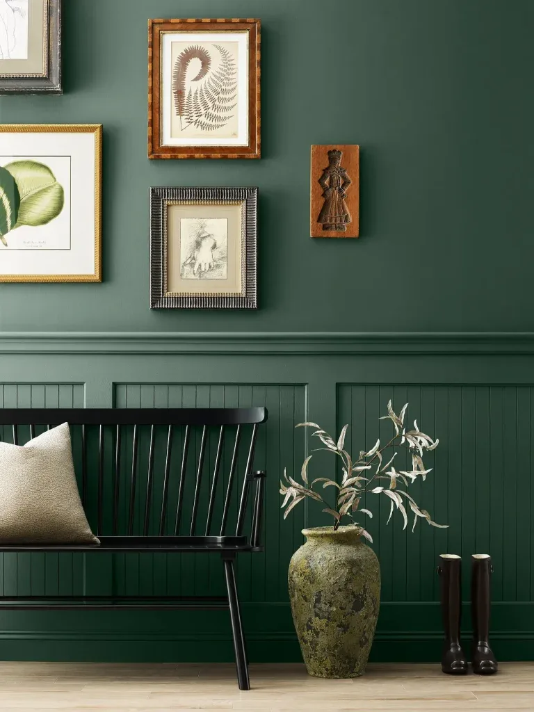
If you lack light, go for botanical art. Framed vintage fern prints, a large-scale leaf photograph, or even a subtle wallpaper with a leafy pattern keeps the organic feeling alive. This touch is what separates a sophisticated moody green room from one that just feels dark.
It’s a reminder of the life and growth the color represents, similar to how botanical elements can soften the industrial lines in a modern structural design.
Common Visual Mistakes (And How to Fix Them)
Even with the best plan, it's easy for a moody green room to go slightly off. These aren't dealbreakers. They're common tuning errors with straightforward fixes.
Recognizing them is the mark of a practiced eye.
When the Room Feels Like a Cave
This is the top fear. It happens when the balance between dark and light tips too far. The room feels oppressive instead of cozy.
The culprit is usually insufficient or poorly placed lighting, or a lack of light-reflecting surfaces.
First, audit your light sources. Do you have at least three points of warm light in the room, not counting the overhead? If not, add a floor lamp or plug-in sconces.
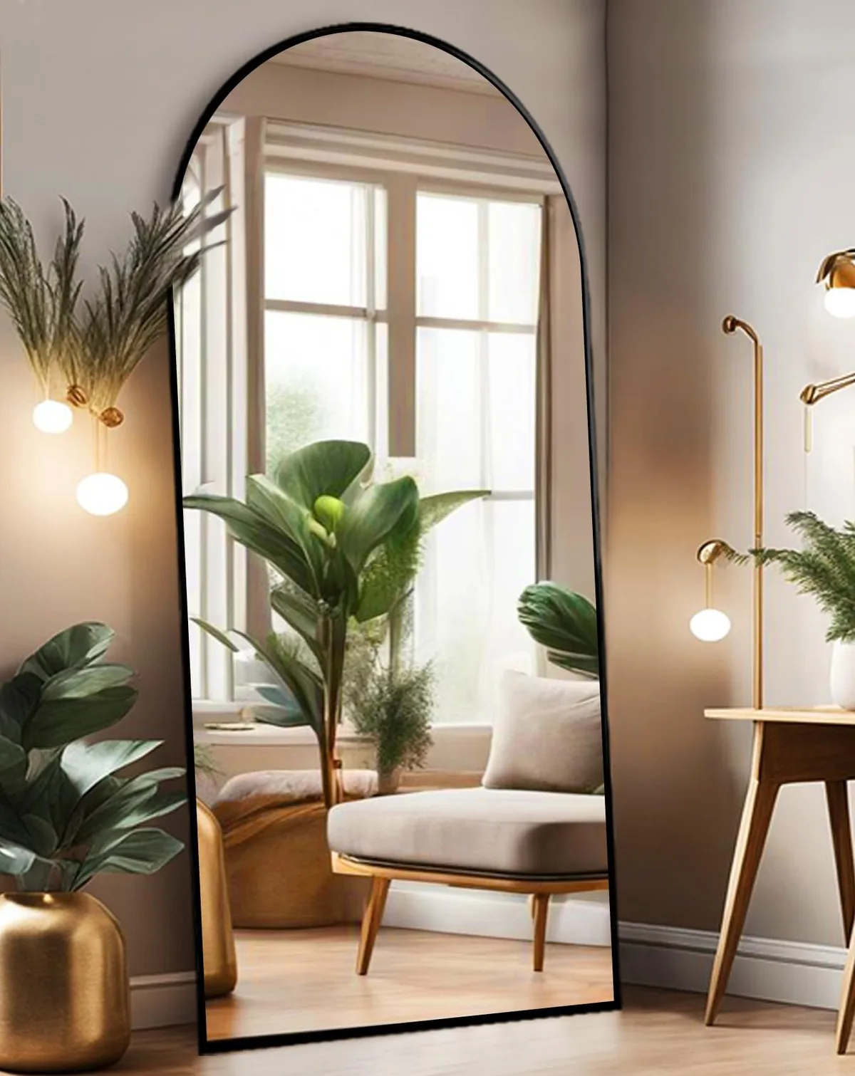
Second, introduce a mirror, like a large floor model angled to reflect a window or a lamp. It visually doubles the light source. Third, ensure some of your textiles are light in color, like a cream-colored linen duvet or a pale rug.
These act as visual relief.
When the Green Looks "Off" or Artificial
Sometimes a green that looked perfect on the chip reads as too bright, too blue, or even slightly neon on the wall. This is almost always an undertone issue reacting badly with your room's fixed elements, like flooring or cabinetry.
If it looks too blue and cold, your room likely has cool-toned flooring or fixed lighting. Warm it up with your decor. Add wood furniture with warm undertones, a rug with red or gold hints, and brass accents.
If it looks too yellow or sickly, the green has a strong yellow base clashing with gray floors or cool light. Counteract with crisp white bedding, black accents, and cool-toned artwork frames. In severe cases, repainting one accent wall with a corrected color can rebalance the whole room.
When the Space Feels Cluttered, Not Curated
Moody rooms thrive on a sense of deliberate calm. Too many small, disparate items create visual noise that fights the serene atmosphere. This often comes from adding decorations piecemeal without editing.
Apply the "one in, one out" rule. For every new pillow or art piece, remove something. Group items intentionally.
Cluster three complementary candles on a tray instead of scattering them. Hang artwork in a cohesive gallery wall, not as isolated singles. Choose furniture with clean lines and closed storage to tuck things away.
Remember, negative space is a design element. It lets the rich color and key textures breathe.
Budget Breakdown: Where to Splurge and Where to Save
Creating a high-impact moody bedroom doesn't require a bottomless budget. It's about strategic allocation. Our analysis of project costs shows you can achieve about 80% of the look for 50% of the price by knowing where to invest.
Your biggest splurge should be paint. Don't cheap out here. High-quality paint from reputable brands has better pigment density, which is critical for deep colors.
It goes on smoother, covers better in fewer coats, and its matte finish will be more durable and washable. This is a one-time cost that defines the entire room.
The bed is your second investment piece. A substantial headboard, a quality frame, or luxurious bedding acts as the room's anchor. Splurge on the bed linens you touch every night.
A good down-alternative duvet and high-thread-count cotton or linen sheets make the daily experience feel luxurious.
Here's where you can save effectively:
| Category | Save Strategy | Why It Works |
|---|---|---|
| Nightstands | Look for vintage wooden stools, painted dressers, or even stacked crates. | Function matters more than perfect style. You can always paint or change hardware. |
| Artwork | Source vintage botanical prints online, frame beautiful calendars, or DIY abstract art. | Art is about personal connection, not price. A large, inexpensive piece has more impact than a tiny expensive one. |
| Lighting | Find second-hand brass lamps and spray paint them. Use plug-in sconces instead of hardwired. | The finish and shade shape matter more than the brand. Upcycling is easy and effective. |
| Textiles | Layer an inexpensive jute rug over your existing carpet. Buy velvet pillow covers, not entire pillows. | Texture is perceived. An affordable natural fiber rug feels just as organic as a costly one. |
Curtains are a middle-ground item. You don't need custom silk drapes. A well-made, ready-made linen or velvet panel in the right length and color will do the job beautifully.
The goal is to avoid the budget pitfalls that can drain funds without delivering a proportional visual return.
Expert Tips: The Details That Pull It All Together
This is where you move from a well-decorated room to a magazine-worthy space. These are the subtle, often overlooked touches that designers use to create cohesion and depth. They require more thought than money.
First, pay attention to your switch plates and outlet covers. Painting them the same color as the wall (or replacing them with brass or black versions) makes them disappear. It's a tiny detail that erases visual clutter.
Second, consider the bedding layers. A European sham behind your standard pillows, or a folded quilt at the foot of the bed, adds height and luxury. It breaks up the large plane of the bed.
Third, introduce a single contrasting color in small, intentional doses. This could be the burnt orange of a terracotta pot, the blush pink of a single throw pillow, or the deep aubergine in a piece of art. This tiny pop creates sophistication and keeps the palette from feeling monotonous.
It’s a trick that works across styles, adding a focal point in a cohesive modern space.
Finally, engage multiple senses. A moody room shouldn't just look good. Add a subtle, woodsy room spray or a diffuser with cedar or sandalwood oil.
Choose bedding with a soft, tactile finish. The complete sensory experience is what makes the room feel truly immersive and restorative.
FAQs for a Moody Green Bedroom
Does a dark green wall make a small room feel smaller?
Not necessarily. When done correctly, it can make a small room feel more intimate and cozy, not cramped. The key is to use the same color on all walls to blur the corners, and to add ample reflective surfaces like mirrors and metallics to bounce light around.
What color bedding goes with dark green walls?
Cream, white, and warm beige are the most foolproof choices. They provide clean contrast and light. For more drama, try charcoal gray, black, or even a pattern that incorporates the wall color, like a botanical print.
Avoid bedding in a similar mid-tone green, as it can look muddy.
What if I'm renting and can't paint?
You have great options. Use dark green in large, removable elements. A dramatic green velvet headboard, lush floor-to-ceiling curtains, or a large area rug in a forest green pattern can set the tone.
You can also use temporary peel-and-stick wallpaper on a single accent wall. These elements pack the same visual punch.
Can I mix different wood tones with green?
Absolutely. In fact, mixing woods adds depth and a collected-over-time feel. The rule of thumb is to ensure they share a similar warmth.
Pair your green with warm-toned woods like walnut, oak, and teak. Avoid mixing very orange pine with very ashy, cool oak in the same sightline, as that can look accidental.
How do I keep the room from looking too masculine?
The perceived "masculinity" often comes from high contrast and lack of softness. To soften the look, incorporate curved furniture shapes, a fluffy sheepskin rug, floral or botanical artwork, and metallic finishes like polished brass or gold. Introducing a softer secondary color, like dusty pink, can also beautifully balance the green's strength.
What's the best white for trim with dark green walls?
Avoid stark, cool whites. They can create a harsh contrast. Choose a white with warm undertones.
Look for names like "Swiss Coffee," "Alabaster," or "Dove White." These creamy, soft whites complement the depth of the green and keep the overall feeling warm and inviting, not clinical.