Eclectic Moody Jewel Tone Bedroom: Bold Color Ideas for a Dramatic Retreat
So you’re thinking about an eclectic moody jewel tone bedroom. It’s that gorgeous, layered look you’ve seen in magazines, deep, saturated walls, sumptuous fabrics, and a collected, personal vibe that feels both dramatic and incredibly cozy. It’s not about buying a single matching set.
It’s about creating a sanctuary that feels like you, built from color, texture, and light.
Our research into popular color palettes, as of 2026, consistently shows jewel tones like deep emerald and sapphire rising to the top for creating intimate, retreat-like spaces. The key isn’t just picking a dark color, but understanding how light, texture, and your own collected pieces work together to build the mood without tipping into gloom. Let’s break down what that really looks like and how to get it right.
Quick Answer
An eclectic moody jewel tone bedroom combines deep, rich colors with layered textures and collected decor. It creates a personal, dramatic, and cozy retreat. The style relies on strategic lighting to balance the dark hues.
Success hinges on mixing patterns and eras intentionally, not randomly. Avoid a single overhead light and cluttered surfaces to keep the space feeling curated.
What Exactly Is an Eclectic Moody Jewel Tone Bedroom?
Think of it as a three-part recipe. “Eclectic” means a curated mix of furniture styles and decor periods, maybe a mid-century modern bed paired with a vintage rug and contemporary art. “Moody” refers to the overall atmosphere: intimate, cocoon-like, and emotionally resonant, achieved through low, warm lighting and dark, enveloping colors.
“Jewel tone” is your color story: those deep, saturated hues you find in gemstones, emerald, sapphire, amethyst, ruby.
It’s a Feeling, Not Just a Paint Color
The goal isn’t to create a dark cave. It’s to build a space that feels rich, intentional, and deeply personal. A true eclectic moody jewel tone bedroom should feel like a welcome embrace at the end of the day.
It’s visually stimulating yet profoundly relaxing, a direct contrast to sparse, all-white schemes. The magic happens in the balance between the bold color and the soft, textural layers that keep it comfortable.
The “Visual Vocabulary” of This Style
You can spot this style by a few key visual markers. The walls are often a single, deep saturated color or a statement wallpaper. Lighting is never harsh; it’s always layered and warm.
You’ll see a mix of fabric textures like velvet, linen, and silk. Finally, surfaces are styled with intentional collections, books, ceramics, art, that tell a story, rather than being minimally bare. This approach to personal display is a hallmark of thoughtful interior design.
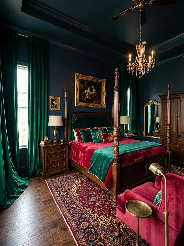
Image source: Bing (Web (fair-use with source credit))
Before You Start: Is This Style Right for Your Space?
This look is powerful, but it’s not a universal fit. Your room’s architecture, light, and your own lifestyle play a huge role in whether it will work for you. It’s less about square footage and more about light quality and your comfort with color.
Best For: The Personality and the Room That Thrives in Moody Glamour
This style is perfect for you if you’re bored with safe neutrals and want a bedroom that expresses your personality fully. It works exceptionally well in north-facing rooms that get cool, indirect light, as warm jewel tones can make the space feel cozier. It’s also ideal if you already own pieces you love from different eras and want a framework to unite them.
If you appreciate the drama of a moody blue bedroom but want to turn up the color saturation and personal collections, this is your next step.
Think Twice If: When a Calm, Neutral Retreat Is Your True Goal
If your primary need is a bright, airy, mentally-clear space to wake up in, this might feel too heavy. Small rooms with only one small window can risk feeling claustrophobic without very careful planning. Also, if you strongly prefer a minimalist, clutter-free environment, the “collected” nature of eclectic decor might cause more stress than joy.
In that case, a more earthy moody bedroom palette with softer, natural tones might be a better bridge between cozy and calm.
Your Visual Toolkit: Breaking Down the Core Elements
Let’s open the toolbox. You can’t build this look without understanding its fundamental components. It’s less about specific products and more about the categories of elements you need to combine.
The Jewel Box Palette: More Than Just “Dark Colors”
Not all dark colors are jewel tones. Jewel tones are defined by high saturation (color intensity) and often have a slightly cool, blue-based undertone that gives them depth. Think of the difference between forest green (earthy) and emerald green (a jewel tone).
Here’s your core palette:
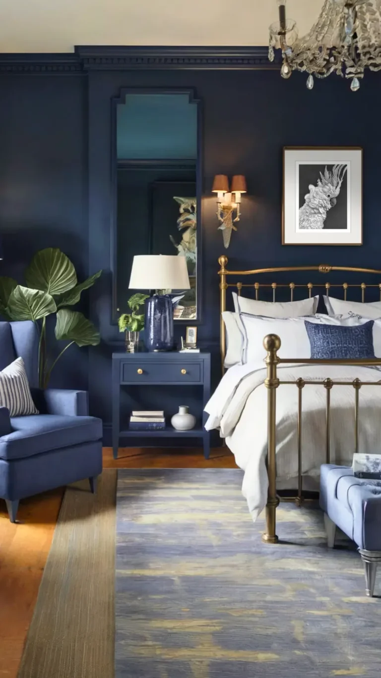
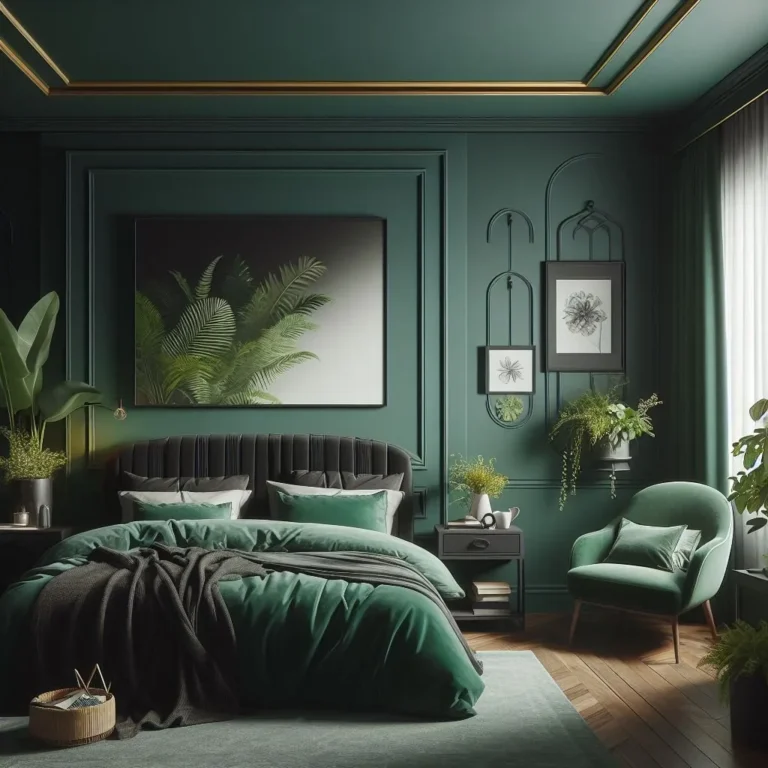
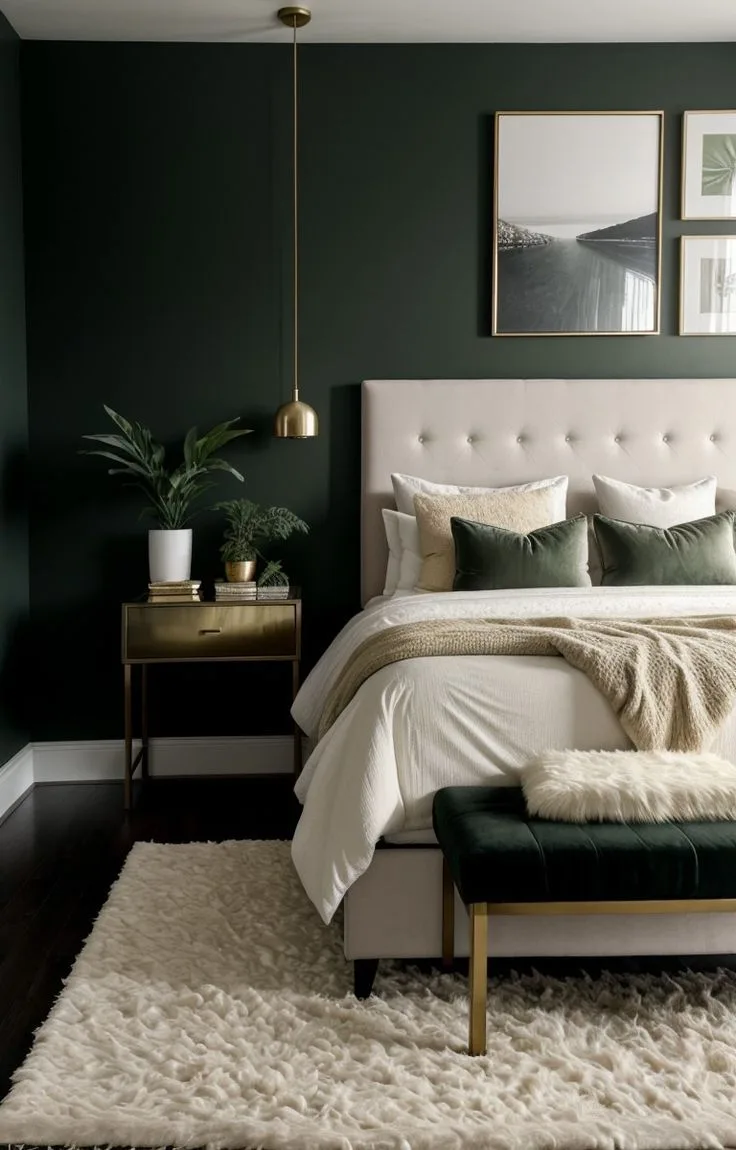
- Emerald Green: The most popular anchor. It’s grounding, rich, and pairs beautifully with warm woods and brass.
- Sapphire Blue: Deep and serene. It can feel more formal but is incredibly relaxing.
- Deep Amethyst/Purple: Luxurious and creative. It works wonderfully in bedrooms as it’s associated with relaxation and introspection.
- Ruby Red: Use this as an accent. A ruby velvet pillow or lampshade adds a shot of passionate energy.
- Rich Topaz/Gold: Not a wall color, but your essential metallic. Brass, antique gold, and warm bronze finishes provide the necessary sparkle against the dark matte backgrounds.
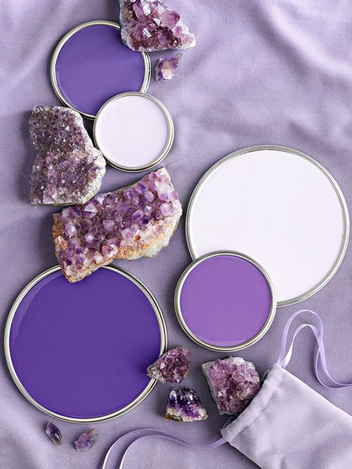
Image source: Bing (Web (fair-use with source credit))
The Eclectic Mix: How to Blend Eras and Styles Without Chaos
“Eclectic” done wrong looks like a thrift store pile-up. Done right, it looks curated. The trick is to establish a few common threads.
Use color to unite everything, your modern frame, vintage chest, and global textile can all share hints of your main jewel tone. Repeat materials, like wood finishes or metal types, to create visual rhythm. Finally, balance shapes: pair a sleek, linear bed with a round, ornate mirror.
The Moody Factor: Lighting and Texture Are Everything
This is where the “moody” atmosphere is built. Paint color provides the base, but lighting and texture create the feeling. Moody lighting is low, warm, and comes from multiple sources at different heights.
Texture adds tactile softness and visual interest that keeps dark walls from feeling flat, think nubby bouclé throws, silky pillowcases, and heavily draped curtains. This interplay of shadow and softness is what transforms a colored room into a moody sanctuary, a principle that also elevates a moody boho bedroom.
Start With a Visual Plan: How to Build a Mood Board That Actually Works
Don’t buy a single gallon of paint or piece of furniture until you do this. A physical or digital mood board saves you from costly, disjointed purchases. It’s your visual blueprint.
Gathering Inspiration Without Getting Overwhelmed
Start by saving images that give you the feeling you want, not just ones that look exactly like your room. Use Pinterest, magazines, or design blogs. Look for commonalities: Do you keep saving rooms with velvet headboards?
Or with dark green walls and black accents? Those are your clues. This process is similar to planning a modern barndominium design, where you’re blending industrial elements with comfort, it all starts with a clear visual direction.
The Anchor-and-Accent Method for Color (With Visual Examples)
This is your guiding principle. Choose one dominant jewel tone as your “anchor.” This is typically your wall color or your largest textile (like a bedspread). Then, choose one or two other jewel tones as “accents.” These appear in smaller doses: throw pillows, a vase, the trim on a lampshade.
Use a tool like the Pantone Color Institute’s palettes to see which colors are professionally designed to work together. Your board should clearly show this hierarchy so your final room has depth and focus, not competition.
Step 1: Choose Your Dominant Jewel Tone (And See It in a Room)
This is your biggest decision. The right color changes with your light, and the wrong one can make the room feel off.
How Light Direction (North vs. South Facing) Changes Your Color
Light quality is non-negotiable. North-facing rooms have cool, bluish light. Here, warm jewel tones (emerald, ruby) can help counteract the chill.
South-facing rooms are flooded with warm, yellow light. Cooler jewel tones (sapphire, amethyst) can balance that warmth and prevent the color from looking neon. Always, always paint a large swatch (at least 2’x2′) on multiple walls and observe it at different times of day before committing.
Visual Guide: Emerald, Sapphire, or Amethyst? Comparing the Moods
- Emerald Green: Creates a grounded, natural, and enveloping feel. It’s bold but still restful, often considered the most versatile. It pairs perfectly with natural wood and leather.
- Sapphire Blue: Evokes calm, stability, and depth. It can feel more formal or traditional but becomes cozy when paired with creamy whites and textured wool.
- Deep Amethyst: Feels luxurious, creative, and a bit mystical. It’s a daring choice that creates incredible intimacy. For a different take on a purple-hued retreat, you could explore moody purple bedroom ideas for deeper tonal variations.
The Critical Step: Swatching Paint and Fabric in Your Actual Light
Buy sample pots of your top two color choices. Paint them on primed boards or directly on the wall. Place your fabric swatches (for bedding, curtains) and wood or metal samples right next to them.
Live with this setup for at least three days. Look at it in the morning light, the afternoon sun, and under your evening lamp. The color that feels right in all lights is your winner.
Step 2: Layer in Texture and Pattern Visually
Color sets the stage, but texture and pattern bring the script to life. Without them, a dark room can feel flat and uninviting. Your goal is to add layers that catch the light and invite touch.
The Textural Hierarchy: From Velvet Bedspreads to Woven Baskets
Start with your largest, most tactile layer. This is often your bed. A velvet or heavy linen duvet cover provides an instant base of luxury.
Next, add secondary textures through smaller textiles. Think cable-knit throws, silk or satin pillowcases, and a nubby wool rug.
Don’t forget hard surfaces. A polished marble tray on your nightstand, a worn leather book binding, or the grain of a dark wood dresser all contribute. Finally, incorporate organic texture.
A woven seagrass basket for blankets or a dried pampas grass arrangement adds a crucial natural element that softens the overall scheme.
Pattern Mixing That Works: A Visual Rule of Thumb
Mixing patterns is where eclectic design shines or falls apart. The key is to vary scale and maintain a common color thread. Choose one large-scale pattern for a major element, like a floral or damask wallpaper on an accent wall or a bold curtain.
Then, select a medium-scale pattern for a secondary layer. A geometric or stripe on a couple of throw pillows works well. Finally, add a small-scale pattern or texture for detail.
A tiny paisley on a lampshade trim or a textural weave in a rug completes the mix. Ensure all patterns share at least one color from your jewel tone palette to tie them together.
Incorporating Your “Collected” Pieces So They Look Curated, Not Cluttered
The difference between curated and cluttered is intention and grouping. Instead of scattering small items everywhere, create intentional vignettes. Group three objects of varying heights on your nightstand.
Place a stack of books, a small sculpture, and a candle together.
Use trays to corral smaller items like perfume bottles or jewelry. Limit the number of these vignettes in the room. Two or three well-styled spots feel intentional.
A wall of framed art hung in a tight grid or salon-style cluster looks far more deliberate than a few pictures dotted randomly. This principle of intentional display is just as valuable in other personalized spaces, like a barndominium bathroom.
Step 3: Design the Lighting Scheme That Makes or Breaks the Mood
This is the most critical step for nailing the “moody” aspect. A single overhead light will destroy the ambiance, making your beautiful jewel tones look flat and harsh. You need to sculpt the light.
Why Overhead Lights Are the Enemy
Central ceiling fixtures, especially cool-toned LED panels or bare bulbs, cast unflattering shadows and eliminate all mystery. They flood the room with even, clinical light that fights against the cozy, intimate vibe you’re building. Your first move should be to install a dimmer switch on any overhead fixture you can’t remove, and keep it set low.
The Three-Layer Lighting Plan: Ambient, Task, Accent (With Fixture Examples)
Follow this professional lighting design principle.
- Ambient Lighting: This is your soft, general fill light. It can come from a dimmable overhead fixture (like a chandelier on a dimmer), but it’s better achieved with multiple indirect sources. Consider wall sconces with opaque shades that bounce light off the ceiling and walls.
- Task Lighting: This is directed light for specific activities. Bedside table lamps are the classic example, perfect for reading. Ensure they have warm-white bulbs (2700K color temperature is ideal) and shades that direct light downward.
- Accent Lighting: This adds drama and highlights decor. It includes picture lights over art, a small lamp on a dresser, or LED strip lighting behind a headboard. This layer creates pools of light and draws the eye to your favorite details.
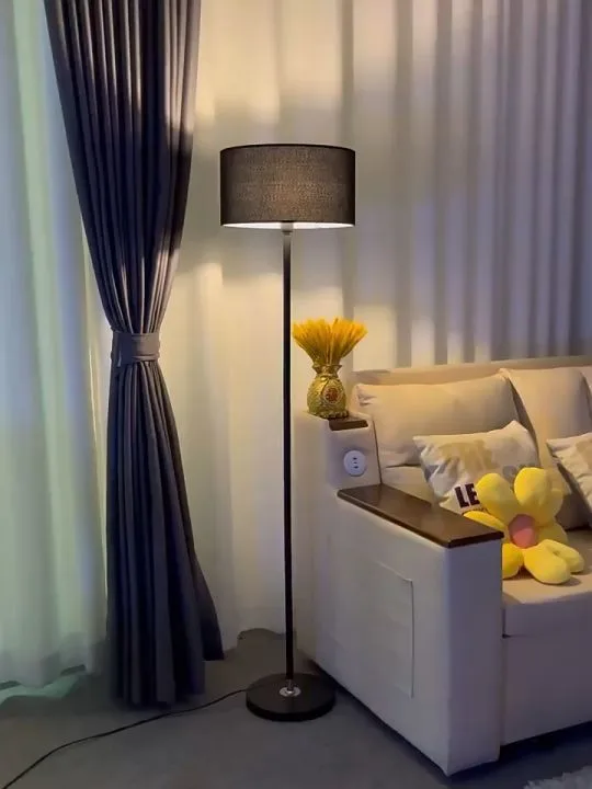
Image source: Bing (Web (fair-use with source credit))
Choosing the Right Bulb: Warmth, Dimming, and Placement
The bulb specification is non-negotiable. Always choose warm white bulbs, typically labeled 2700K to 3000K on the Kelvin scale. This replicates the warm glow of incandescent light.
Avoid “daylight” or “cool white” bulbs at all costs. They will make your jewel tones look gray and sterile.
Invest in dimmable bulbs and fixtures wherever possible. Dimmers give you total control over the atmosphere, from bright enough to find a sock to a soft glow for relaxing. Finally, think about placement.
Light should come from multiple heights, eye-level (sconces), table height (lamps), and low (floor lamps). This creates a more interesting and flattering landscape of light and shadow.
Common Visual Mistakes (And How to Spot Them Before It’s Too Late)
Even with the best plan, it’s easy to slip into a few common traps. Knowing what to look for lets you course-correct early.
The “Cave” Effect: When It’s Too Dark and How to Fix It
If your room feels oppressive or closed-in, you’ve likely under-lit it or missed the textural balance. The fix is to add reflective surfaces and lighter elements. Hang a large mirror opposite a window to bounce light.
Incorporate creamy white or beige in your bedding or a rug. Paint the ceiling a lighter tone than the walls, or leave it a crisp white to “lift” the space. Ensure you have enough light sources from the three-layer plan.
The “Thrift Store Pile-Up”: When Eclectic Tips Into Cluttered
This happens when too many small, unrelated items fight for attention without a unifying structure. The room feels busy and stressful instead of interesting. The solution is to edit ruthlessly.
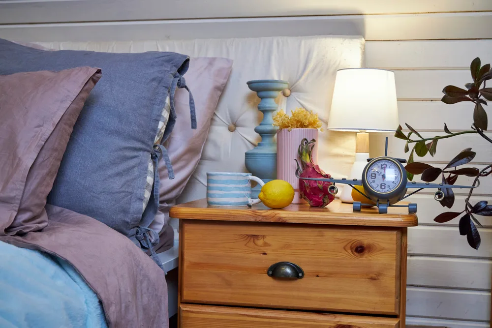
Image source: Bing (Web (fair-use with source credit))
Remove about one-third of your decorative objects. Group the remaining items into intentional vignettes, as discussed earlier. Make sure each surface has some breathing room.
If you love collections, display them together in a dedicated cabinet or on shelving, not spread over every table. This approach to avoiding visual noise is useful in any design project, from a bedroom to planning a cabin barndominium.
The Clashing Jewel Tone Problem: Creating Harmony, Not Competition
If your room feels visually tense, your colors might be fighting. You might have equal amounts of two strong jewel tones that don’t complement each other. Remember the anchor-and-accent method.
Re-evaluate your palette. Choose one dominant color. Use the other as a much smaller accent.
Introduce neutrals like taupe, charcoal, or cream as buffers between the strong colors. Refer back to your original mood board to check your color hierarchy.
Budget-Friendly Ways to Get the Look
You don’t need a full renovation or a limitless budget. High impact often comes from strategic, smaller changes.
Start Small: Pillows, Art, and a Single Statement Wall
The most cost-effective transformation is a statement wall. Painting just one wall in a bold jewel tone requires a single gallon of paint and makes a huge impact. Then, build around it.
Swap out throw pillow covers for velvet ones in your accent colors. Frame a large, impactful piece of art or create a gallery wall with thrifted frames. Change your bedding to a solid-colored duvet cover with a great texture.
These changes refresh the entire room’s feel without replacing big-ticket items.
High-Impact, Low-Cost Updates: Swap Hardware, Change Bedding, Layer Rugs
Look for easy swaps that add metallic shine or texture. Change out basic cabinet knobs and drawer pulls on your dresser for brass or black hardware. Layer a smaller, vintage-style rug over your existing carpet or a neutral jute rug.
This adds instant pattern and coziness. Drape a heavyweight throw blanket at the foot of the bed. Finally, the cheapest update of all.
Replace all your light bulbs with warm-white, dimmable versions. The difference in ambiance is immediate and profound.
Real Room Scenarios: Adapting the Vision for Different Spaces
Your room’s specific constraints aren’t deal-breakers. They’re just design parameters.
The Small Bedroom: Creating Intimacy Without Shrinking the Space
In a small room, a dark color can actually make the walls recede, creating a sense of cozy intimacy. The trick is to keep things airy. Use your jewel tone on the walls but paint the ceiling and trim a bright white to define the space.
Choose low-profile furniture, like a platform bed without a tall headboard. Use mirrors strategically to reflect light and create the illusion of depth. Keep patterns relatively small in scale to avoid overwhelming the room.
The Rental-Friendly Makeover: Bold Moves That Are Temporary
You can still commit to the look without permanent changes. Use removable wallpaper on a single accent wall. It comes in stunning jewel-tone patterns and peels off cleanly.
Invest in large, dramatic artwork and statement lighting fixtures you can take with you. Use rich, dark curtains hung high and wide to frame your windows, creating a colored backdrop. Focus your budget on furniture and decor you love, and let the rental’s neutral walls be a canvas for your portable jewel tones.
This flexible mindset is great for all kinds of temporary spaces, including those looking for cheap barndominium ideas.
Your Eclectic Moody Bedroom Maintenance Plan
A room this personal needs occasional tweaks to stay fresh. Seasonal shifts in light or your own tastes will prompt small updates.
Keeping a Layered Room Feeling Fresh (Not Stale)
The simplest refresh is a textile swap. Change your throw pillows and blanket with the seasons. A lighter linen quilt in summer and a heavier velvet one in winter keeps the bed feeling new.
Rotate the artwork on your walls or restyle your vignettes with different collected objects. This prevents the decor from becoming static background noise.
How to Edit and Rotate Your Collections Over Time
Every few months, do a quick edit. Remove one or two items from a surface. Does the grouping look better without them?
If so, box them up. Introduce something you haven’t displayed in a while from your storage. This curatorial approach keeps the space feeling alive and authentically you, not like a staged set.
Final Visual Checklist Before You Commit
Run through this list after you think you’re finished. It helps you spot any missing pieces or imbalances.
A Quick Scan to Ensure Your Room Hits All the Right Notes
- Color: Is there one clear dominant jewel tone? Do accent colors appear in smaller doses?
- Light: Do you have at least three light sources at different heights? Are all bulbs warm white (2700K-3000K)?
- Texture: Can you spot at least three different fabric textures (e.g., velvet, linen, silk, knit)?
- Surfaces: Are your tabletops intentionally styled, not cluttered? Is there breathing room?
- Balance: Does the room feel cozy and intimate, not dark and cave-like?
Frequently Asked Questions
Can I use jewel tones in a room with little natural light?
Yes, but your lighting plan becomes even more critical. You must compensate with excellent artificial light. Commit fully to the three-layer lighting plan.
Also, lean into lighter, reflective elements like mirrors, metallic finishes, and creamy neutral textiles to bounce the light you do create.
What’s the best white to pair with deep jewel tone walls?
Avoid stark, cool whites. They can create a jarring contrast. Choose whites with warm, subtle undertones.
Look for names like “off-white,” “cream,” “ivory,” or “natural white.” Test swatches against your wall color in your room’s light to see which one creates a harmonious, not harsh, transition.
How many different patterns is too many?
There’s no hard number, but a good rule is three per visual zone. For the whole room, you might have a large pattern on the walls, a medium on the bedding, and a small on an accent pillow. The key is varying the scale dramatically so they don’t compete.
Is this style expensive to achieve?
Not necessarily. The most expensive element is often lighting. You can start with paint, which is low-cost, and thrifted furniture you paint or reupholster.
Build the room slowly, investing in key textiles and a great lamp before buying all new furniture. The collected nature of the style welcomes second-hand finds.
How do I keep a moody bedroom from feeling depressing?
The antidotes are texture, light, and life. Abundant warm lighting eliminates gloom. Rich textures like velvet and wool add tactile comfort.
Finally, incorporate something organic and growing, like a hardy low-light plant such as a snake plant or ZZ plant. Its greenery provides a vital spark against the dark backdrop.