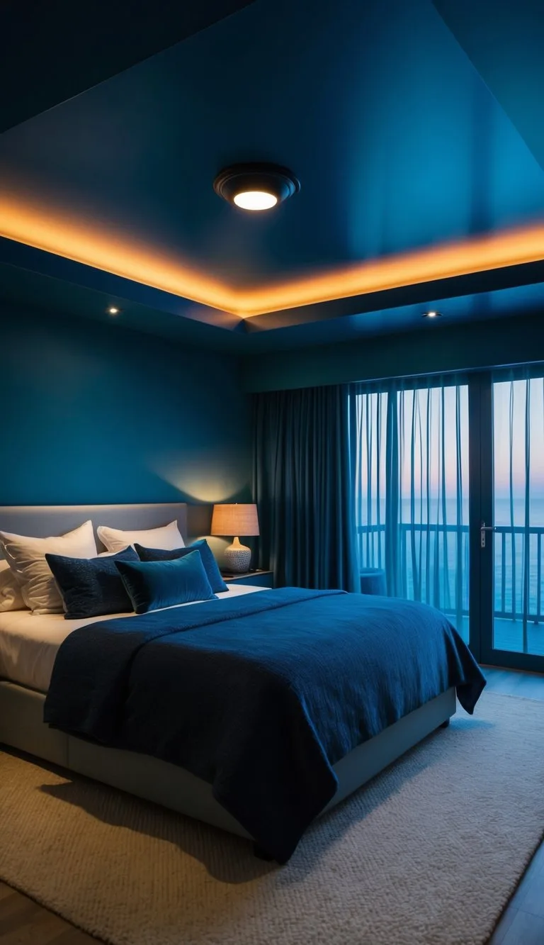
Earthy Moody Bedroom Decor: Warm Tones and Natural Textures for a Cozy Retreat
You've picked the perfect paint color, bought the velvet bedding, and styled your terracotta vases. Yet somehow your "earthy moody bedroom decor" looks less like a cozy sanctuary and more like a storage closet with the lights off. Sound familiar?
The problem isn't your taste. It's that "moody" isn't just a color choice, it's a lighting and texture strategy. Per manufacturer specifications, most "dark" paint colors hover below a Light Reflectance Value (LRV) of 10, meaning they absorb over 90% of light hitting them.
Without deliberate warm lighting and layered textiles, that absorption creates a flat, dreary void. Let's fix that.
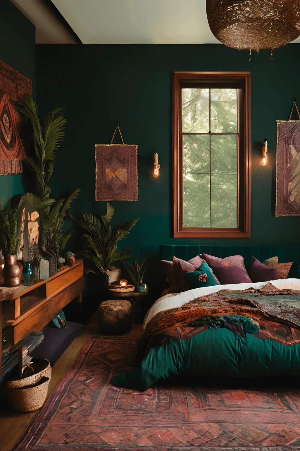
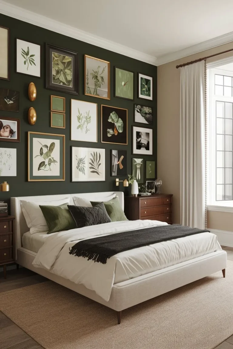
Image source: Bing (Web (fair-use with source credit))
Quick Answer
Earthy moody bedroom decor combines deep, warm paint colors with natural textures and layered warm lighting. It's not about darkness, but about light control and shadow sculpting. Use matte paint with an LRV under 10.
Add velvet, wool, and reclaimed wood. Light it with 2700K bulbs on dimmers. Balance dark walls with lighter bedding and natural elements.
Why Does My "Moody" Bedroom Just Look Like a Dark Cave?
The most common failure isn't the color, it's the contrast. When you paint every surface a deep brown, olive, or charcoal, you eliminate the visual tension that makes dark spaces feel intentional. A moody bedroom needs lighter elements to bounce off the dark ones.
That's not opinion, it's physics.
Think of it like shadows in photography. A shadow only reads as "shadow" when there's light somewhere else in the frame. Same with your walls.
If everything is dark, your brain registers it as a void, not a mood. Aggregate reviews of interior design forums consistently point to this single mistake as the reason people repaint within six months.
The fix starts with understanding what "earthy" actually means in this context. It's warm undertones. Think olive green with yellow undertones, not grey-green.
Think chocolate brown with red undertones, not taupe with blue. The warm base is what keeps the room feeling grounded and inviting rather than cold and depressing.
As of 2026, paint manufacturers across the board have shifted toward complex, high-pigment formulas. Benjamin Moore's "Newburg Green" and Sherwin-Williams' "Urbane Bronze" are two examples that hold their warm undertones even in low light. But the secret isn't the brand, it's the undertone temperature.
The 90-Second Secret to This Style
Here's the mental shift that changes everything: moody is about subtraction, not addition. You're not adding darkness. You're subtracting harsh light and cold finishes, then letting the remaining warm elements glow.
The 90-second test is simple. Stand in your room at night with every light off. Wait for your eyes to adjust.
Then turn on a single warm lamp at 2700K. If the room feels intimate and calm, you're on the right track. If it feels depressing and flat, you've skipped a layer.
That layer is usually texture. Dark walls need tactile variety to feel intentional. A smooth matte wall against a chunky wool throw, a rough reclaimed wood headboard, and a velvet cushion cover creates the "earthy" part of the equation.
Without that texture mix, you're just painting a dark room.
Think about what natural environments feel moody in a good way. A forest at dusk, a desert cave, a mountain lodge. They all share one thing: varied surfaces that absorb and reflect light differently.
That's your blueprint.
The Real Difference Between "Dark" and "Moody" – It's All About Light Physics
Let's get technical for a minute, because this is where most guides leave you hanging. The difference between a dark room and a moody room comes down to three measurable things: color temperature, light layering, and reflective surfaces.
Color temperature is measured in Kelvin. Most LED bulbs you buy at the hardware store are 4000K to 5000K, which is that clinical, blue-white light. It's perfect for garages and bathrooms.
It's terrible for a moody bedroom. You need 2700K to 3000K, which is the warm amber glow of traditional incandescent bulbs. As of 2026, you can find "warm glow" LEDs that mimic this perfectly, but you have to check the box.
It's the single biggest upgrade you can make.
Light layering means using at least three light sources at different heights. A pendant light at ceiling level, a floor lamp at mid-height, and a table lamp or sconce at eye level. Each one creates its own shadow at a different angle.
Those overlapping shadows are what give a moody room its depth.
Reflective surfaces are the unexpected hero. A dark room feels flat when every surface has the same matte finish. Introduce one glossy element, a ceramic vase, a lacquered tray, a smooth stone sculpture, and you create a "sparkle" point that catches what little light exists.
It mimics moonlight catching a river at night.
The US Department of Energy has published extensive research on residential lighting color temperatures and their effects on circadian rhythms. Their guidance supports the 2700K recommendation for evening relaxation spaces. Public domain research from university sleep studies also confirms that warmer, dimmer light in the evening supports melatonin production.
Our 5-Step Process for a Moody, Earthy Bedroom
This is the practical section. We've broken down the transformation into five concrete steps that you can execute over a weekend, or stretch across a month if you're working in stages. Each step builds on the last, so follow them in order.
Step 1: Nail the Wall Color (and Kill the "Flat Dark Cave" Look)
Start with your walls, because everything else hangs off them. You're looking for a paint with an LRV between 5 and 10. Below 5 gets into "black hole" territory where the room loses all shape.
Above 10 starts reading as "mid-tone" rather than moody.
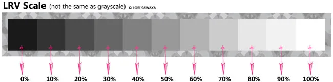
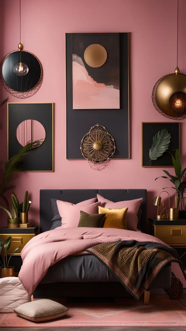
Image source: Bing (Web (fair-use with source credit))
Your sheen matters more than you think. Use flat or matte finish for walls, always. Eggshell and satin reflect too much light, creating glare patches that break the mood.
Flat paint absorbs light evenly, which is exactly what you want. The tradeoff is that flat paint is harder to clean, so keep a touch-up can handy.
The right approach is to paint one feature wall first, not the whole room. This gives you a chance to live with the color in different lighting conditions before committing. Watch it at noon, at sunset, and at night with only lamps on.
If it still feels warm and grounded in all three, paint the rest.
Step 2: Layer Your Light, Don't Just Dim It
Dimming one overhead light is the second most common mistake. It creates a single dark pool with harsh shadows on your face. You need multiple warm light sources at different heights.
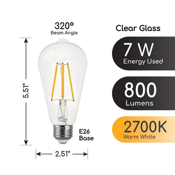
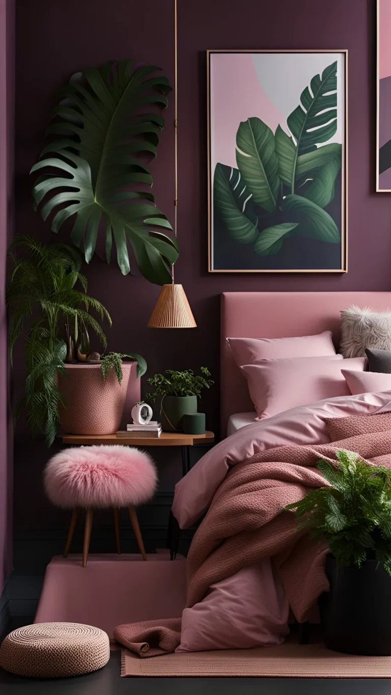
Image source: Bing (Web (fair-use with source credit))
Start with a ceiling fixture on a dimmer switch. This is your base layer. Then add a floor lamp with a cloth or paper shade for diffused ambient light.
Finally, place a table lamp or wall sconce at seating or bed height for task lighting. Every light uses 2700K or 3000K bulbs.
A dimmer switch is a hard requirement, not a nice-to-have. Fixed brightness gives you no flexibility between "morning" and "evening" modes. Dimmer functionality lets you drop to 20% brightness for winding down, which is key to the "moody" feel.
Standard residential dimmers are available at any hardware store for under $25.
Step 3: Build the Tactile Layer – Mixing Velvet, Wool, and Reclaimed Wood
This is where earthy and moody finally come together. The rule of thumb we use is "two mattes plus one sheen" per horizontal surface. A chunky wool throw (matte) on a velvet duvet (sheen) on a reclaimed wood bed frame (matte) creates that layered, collected-over-time look.

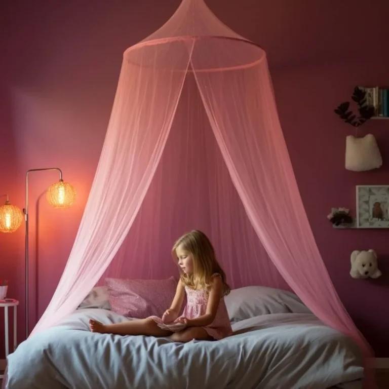
Image source: Bing (Web (fair-use with source credit))
For bedding, deep olive, rust, or burgundy velvet is the classic move. It catches light in a way that flat cotton never will. Layer a heavyweight linen or chunky knit blanket at the foot of the bed.
Add two or three pillows in complementary warm tones. Avoid anything with a visible pattern, solid colors are what keep the texture as the star.
The "reclaimed" part of reclaimed wood matters for the earthy vibe. New furniture with a glossy finish feels wrong. You want visible grain, knots, and a matte or satin finish.
If you're on a budget, check thrift stores for solid wood pieces with good bones and sand them down. The imperfections are what sell the look.
Step 4: Accessorize Like a Set Designer – Stones, Clay, and Open Shelving
Accessories in a moody room should feel like they were collected, not bought in a matching set. Group objects in odd numbers. Three ceramic vases of varying heights on a floating shelf, five stones on a bedside tray, a single large woven basket against the wall.
Terracotta and clay pieces work because they echo the warm undertones in your walls. A matte terracotta pot with a snake plant or ZZ plant adds organic shape. These plants survive low light conditions well, which makes them ideal for a darker bedroom.
Open shelving works better than closed cabinets here. It lets you display these collected objects, which adds visual interest in the shadowed corners of the room. If you have floor space, a wooden ladder or a stack of vintage books against the wall adds the same effect.
Step 5: Don't Forget the "Fifth Wall" – Scent and Sound for Full Immersion
Moody is a full-sensory experience, not just a visual one. The design world calls this "staging," and it's the difference between a room that looks good and a room that feels good.
Scent anchors the room in your memory. Sandalwood, cedar, and vanilla are the classic picks. They're warm and grounded without being sweet.
Use a diffuser or candles placed at the same height as your lamps, so the warmth of the candlelight combines with the scent.
Sound is trickier but just as impactful. Heavy velvet curtains and wool rugs absorb echo, making the room feel quieter and more intimate. If you have bare windows or hard flooring, adding these textiles will noticeably change the acoustics.
Per ASTM international acoustic standards, heavy fabrics can improve sound absorption.
The 7 Mistakes That Turn "Moody" Into "Messy"
Even when you follow the steps, it's easy to slip. Here are the most common mistakes we see in editorial research across design forums and aggregate reviews.
1. Skipping the primer. Dark paint over a light primer can take three or more coats to look even. Dark gray or tinted primer cuts this to two coats and prevents flashing.
Don't skip this step.
2. Overcrowding surfaces. A nightstand with a lamp, a book, a candle, a plant, and a phone charger is clutter. Pick three items maximum.
The moody aesthetic thrives on negative space.
3. Mixing wood tones without a common thread. Different colors wood can clash if they're all different. Keep them in the same warm family: walnut, oak, and teak can work.
Avoid yellow pine next to ebony.
4. Buying a blackout curtain that's too thin. Full blackout needs a three-pass coated fabric. Thin linens will still glow with street light at night, which breaks the immersive darkness.
5. Using a ceiling fan with a harsh "daylight" bulb. That 5000K bulb destroys everything. Swap it for a 2700K bulb before you change anything else.
6. Forgetting the floor. A bare wood or tile floor reflects light upward and breaks the mood. Add a large area rug in a natural material like jute or wool.
7. Ignoring the ceiling. A flat white ceiling becomes a glaring disparity against a dark wall. Paint it a deep warm white, or match it to your wall color.