Soft Pink Bedroom Ideas for a Calm, Romantic Look
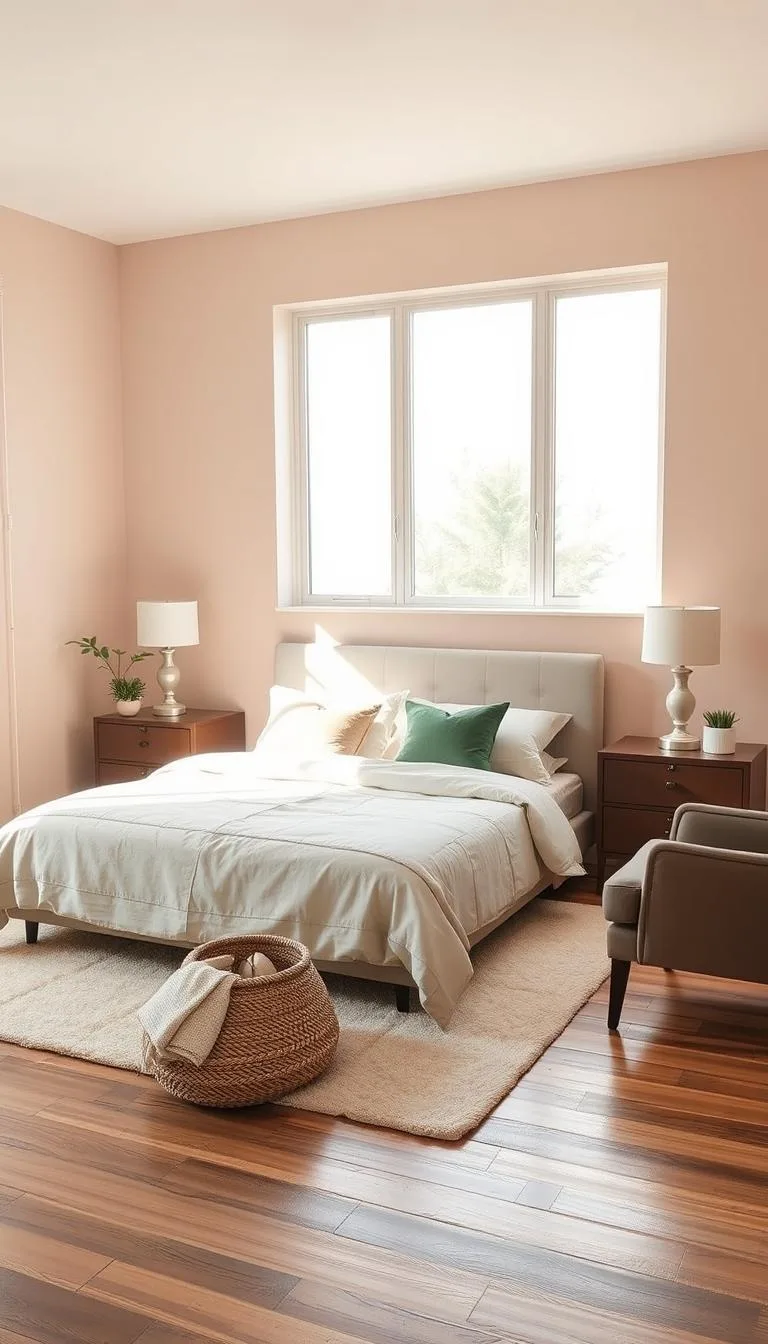
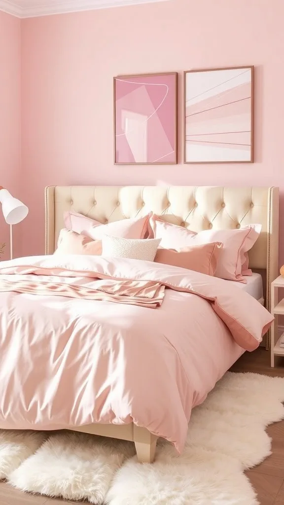
For successful soft pink bedroom ideas, pick a pink with an LRV over 60. Test large swatches on multiple walls. Pair it with natural wood tones and earthy greens for balance.
Avoid matching every textile perfectly. Instead, layer different textures like linen and velvet to add depth without clutter.
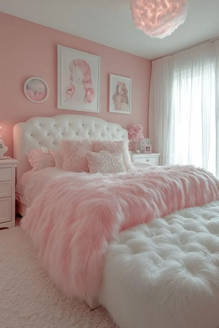
Let's be honest, most soft pink bedroom ideas you find online look perfect. But in your own room, that same pink can look childish, garish, or just plain wrong. You end up with a nursery vibe instead of the serene, sophisticated retreat you wanted.
The gap between the idea and reality is almost always a handful of small, missed details.
Understanding paint specifications, like Light Reflectance Value (LRV), is the best place to start. A soft pink with an LRV above 60 will reflect more light, keeping the room feeling airy. From there, the entire design hinges on building visual layers.
It's less about the color itself and more about how you orchestrate everything around it.
Why Your "Soft Pink" Looks Wrong (And How to Fix It)
The most common mistake is picking a pink from a tiny chip or a screen. Without context, it's impossible to judge its undertone. A pink that looks soft and neutral online can scream "bubblegum" or look dingy gray on your wall.
The second mistake is treating pink like a solo act. A room painted head-to-toe in a single flat pink, with matching pink bedding and curtains, will feel flat and one-dimensional.
The fix is a two-part strategy. First, you must commit to understanding the color's character before you buy a single gallon. Second, you design the room as a series of deliberate, contrasting layers.
The pink is your foundation, not your entire vocabulary. Think of it as the quiet background singer that lets the other elements, texture, wood, metal, and accent colors, take their turns in the spotlight. This approach is the key to moving from a themed room to a thoughtfully designed space.
The #1 Rule for a Soft Pink That Doesn't Look Like a Nursery
Balance warmth with sophistication. A nursery pink is often very sweet, pure, and one-note. An adult soft pink has complexity.
It might have a whisper of gray (a "muted" or "dusty" pink), a hint of peach ("blush"), or a touch of beige ("ballerina"). This subtlety prevents it from feeling saccharine.
The practical rule is to never choose a pink in isolation. Always hold your paint sample next to the other permanent elements in the room. Lay it on your floor.
Tape it to your wood trim or existing furniture. Does it make the wood look rich and warm, or does it clash? Does it complement the undertones in your flooring?
If your pink looks good next to the fixed items you can't change, you're on solid ground. This comparative step is what separates a lucky guess from an intentional choice.
Start Here: Choosing Your Exact Shade of Soft Pink
This is the most critical step. Getting the base wrong means every subsequent choice is an uphill battle. Don't rush it.
Start by collecting sample pots of three or four pinks that catch your eye. Look for names that suggest subtlety: "blush," "dusty rose," "ballerina slipper," "peach blossom," or "muted coral."
Apply large swatches (at least 2' x 2') on at least two different walls in the room, one that gets direct sun and one that's in shadow. Live with them for two full days. Look at them in the morning light, the harsh afternoon sun, and under your artificial evening lighting.
The color will shift, and you need to love all its personalities. In our research, the pinks that perform best across different lights typically have an LRV between 60 and 75, hitting that sweet spot of being light-reflective without looking washed out.
Reading Paint Undertones: Warm vs. Cool Pinks
This is the secret language of color. Every pink has an underlying hue that pushes it toward warmth or coolness. Identifying it prevents nasty surprises.
- Warm-toned pinks have hints of yellow, peach, or coral. They feel cozy, inviting, and sunny. In north-facing rooms or spaces with little natural light, a warm pink can add crucial warmth. Think "blush" or "terra cotta pink."
- Cool-toned pinks lean toward blue, lavender, or gray. They feel more modern, serene, and sophisticated. In a south-facing room awash with warm light, a cool pink can provide a refreshing balance. Think "dusty rose" or "mauve."
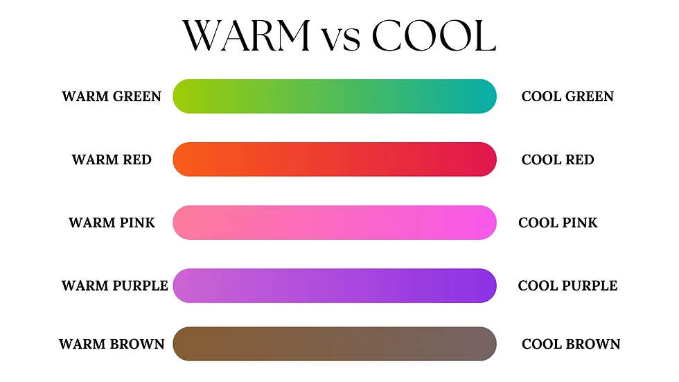
How do you tell? Place your sample card on a pure white piece of paper. Compare it to other colors.
If it seems to sit comfortably with creams and beiges, it's likely warm. If it seems more at home with grays and slate blues, it's cool. Manufacturer specifications, when available, sometimes list base pigments that can clue you in.
The Light Reflectance Value (LRV) Sweet Spot
LRV measures how much light a color reflects on a scale of 0 (absolute black) to 100 (pure white). For a soft pink bedroom, you generally want an LRV above 60. This ensures the color contributes to the room's brightness rather than absorbing light and making the space feel smaller or darker.
You can find a paint's LRV on the brand's website or the back of the physical swatch card. As of 2026, most major paint companies provide this data digitally. A pink with an LRV in the 60s will feel present and colorful but still light.
One in the 70s will be very airy and work like a neutral.
Always, Always Test Swatches This Way
Skipping proper testing is the number one regret in DIY painting. Here’s the non-negotiable process:
- Buy sample pots. Don't rely on paper chips.
- Paint large squares. Small swatches are deceptive. Paint at least two 2' x 2' squares per color.
- Place them strategically. Put one on a wall that gets direct light and one on a wall in permanent shadow. Also test near wood trim or built-ins.
- Observe for 48 hours. Look at the colors in morning, noon, evening, and with the lights on. The right color will feel "right" in all conditions.
- Make your final choice at the time of day you'll be in the room the most. If it's a bedroom, choose under evening lighting.
Building Your Color Palette: What to Pair With Soft Pink
Once you've locked in your perfect pink, the fun begins. This is where you give the room its character and depth. Soft pink is remarkably versatile; it's a supporting player that makes other colors sing.
The Foolproof Neutrals: Grey, Beige, and White
These are your foundational partners. The specific shade matters.
- With Grey: Choose a grey with a complementary undertone. A warm pink pairs beautifully with a greige (a grey with beige undertones). A cool pink sings next to a true grey with blue or green undertones. This creates a modern, tailored look that's far from childish.
- With Beige/Cream: This combination is inherently warm and cozy. It leans into a cottagecore or comfortable farmhouse aesthetic. Avoid yellowy beiges; opt for soft, pink-friendly tones like "ivory" or "cloud white."
- With White: Not all whites are created equal. A stark, blue-based white can make a soft pink look dirty. A white with a hint of warmth ("off-white," "natural white") creates a seamless, luminous effect. This is a classic strategy for a bright and airy feel.
Adding Depth: Earthy Greens and Natural Wood Tones
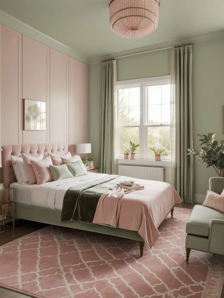
This is where magic happens. The complement to pink on the color wheel is green, and using earthy, muted greens creates a grounded, organic feel that's incredibly sophisticated.
- Sage, Olive, or Eucalyptus: These muted greens don't compete with the pink; they converse with it. Use them in bedding, an accent chair, or through plentiful greenery in pots.
- Natural Wood: Wood brings necessary warmth and texture. Light oaks, walnuts, and rattans add a natural element that breaks up the color blocks. This is a key technique in modern barndominium design, where organic materials soften clean lines. The wood grain adds a visual pattern that’s subtle but vital.
For a Bold Touch: Navy, Black, and Brass
If you want more drama, soft pink can handle it.
- Navy Blue: Creates a preppy, bold contrast that feels confident and modern. Use it sparingly, in a patterned rug, a single velvet pillow, or on an accent wall.
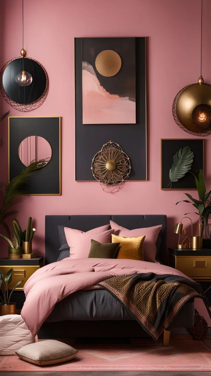
- Black: Used as an accent, black (or very dark charcoal) adds graphic punch and keeps the palette from feeling too sweet. Think black picture frames, lamp bases, or window mullions.
- Brass or Gold: Warm metallics are a perfect partner. Brushed brass hardware, picture lights, or mirror frames add a touch of luxury and reflect light around the room. They tie together warm pink and natural wood beautifully.
The Visual Texture Layer: How to Add Depth Without Clutter
Color is just the first layer. Texture is what makes a room feel inviting and lived-in, not like a showroom. This is about engaging the sense of touch through sight.
The goal is to mix a variety of material feels so the eye has places to rest and explore. A room with only smooth surfaces (flat paint, polyester bedding, shiny laminate) feels cold and flat. One with varied textures feels rich and cozy, even if the color palette is simple.
Choosing Your Core Textiles: Bedding, Curtains, Rugs
Start with the big fabric pieces.
- Bedding: This is your largest textile. Opt for natural fibers like linen or cotton percale. Linen has a beautiful, relaxed slub; cotton percale is crisp and cool. A simple white or neutral duvet cover acts as your textural canvas.
- Curtains: Choose a weight and weave that contrasts with your bedding. If your bedding is crisp cotton, try airy linen curtains. If your duvet is fluffy, try a woven Roman shade.
- Rugs: A rug grounds the space. A jute or sisal rug adds tremendous organic texture. A low-pile wool rug in a complementary color adds softness underfoot. Avoid matching the rug color exactly to the walls or bedding.
Mixing Materials: Linen, Velvet, and Woven Accents
Now, layer in the smaller accents to create a tactile story.
- Linen: For throw pillows, bedding, or upholstered benches. It's breathable, casual, and wrinkles beautifully.
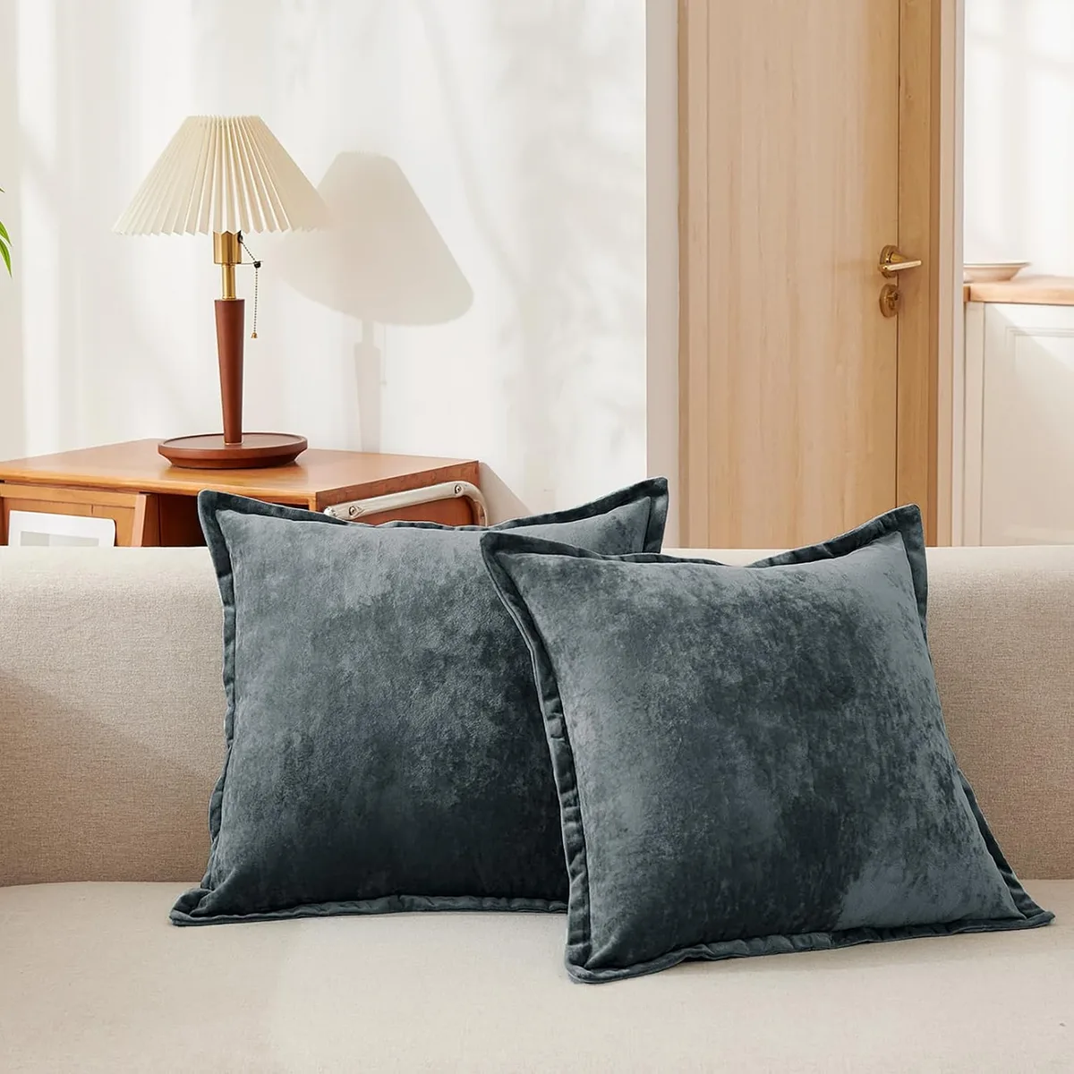
- Velvet: Introduces luxury and depth. A single velvet pillow in sage green or navy blue on the bed, or a velvet accent chair, catches the light differently.
- Woven Textures: Baskets, chunky knit throws, macramé wall hangings, or a rattan headboard. These elements add a handmade, artisanal feel that prevents the room from being too polished.
The Role of Metallics and Glass
These are your "hard" textures that provide shine and reflection, breaking up all the softness.
- Metallics: As mentioned, warm brass or gold is ideal. Use it in lighting fixtures, drawer pulls, and frames. The reflectivity adds tiny points of light.
- Glass: A glass vase, a clear pendant light, or mirrored furniture. Glass adds visual weight without bulk and helps bounce light into darker corners, a useful trick in any bedroom design aiming for spaciousness.
Furniture and Layout: Anchoring the Room
The right furniture grounds your pink walls and keeps the space from feeling floaty or insubstantial. Your goal is to select pieces that create a visual anchor, providing contrast and structure. This is where you integrate the color into a functional, livable environment.
Think of your furniture as the punctuation in a sentence. It gives the room its rhythm and defines how you move through it. A bed is your primary anchor, nightstands provide secondary support, and a dresser or bench offers finality.
Selecting Wood Finishes That Complement, Not Clash
Wood is your most powerful tool for balancing pink's softness. The wrong wood can turn cozy into kitschy.
- Warm Pink Walls: Pair with woods that have a clear, natural warmth. Medium-tone oak, walnut, and cherry work beautifully. Avoid woods with strong yellow or orange undertones, as they can amplify the pink's warmth excessively.
- Cool Pink Walls: Lean towards cooler wood tones. Whitewashed oak, ash, and light maple have gray or neutral undertones that align with the pink's sophistication. Dark woods like ebony-stained oak can create a stunning, high-contrast modern look.
The key is to introduce the wood finish early in your decision process. If you have existing furniture you're keeping, hold your final paint swatch against it. Does the wood look richer and more intentional next to the pink, or does it look dated and separate?
This test is non-negotiable.
The Case for an Upholstered Bed
An upholstered bed frame is one of the best investments for a soft pink bedroom. It introduces a major block of texture and can act as a bridge between your wall color and other elements.
- A Neutral Fabric (linen, velvet, or bouclé) in beige, grey, or even a darker green creates a sophisticated layered look. It's more interesting than a plain wooden frame.
- A Colored Fabric that picks up your accent color (like sage green or navy) makes a bold statement and simplifies your palette.
- A Textured Fabric like a nubby bouclé adds incredible cozy-factor and visual interest right at the room's focal point.
An upholstered bed also softens the acoustics of the room, contributing to that serene retreat feeling. It’s a functional choice that enhances the overall mood.
Balancing Pink Walls with Your Existing Furniture
You don't need to buy all new furniture. You can work with what you have.
If your existing furniture is dark wood, lean into the contrast. Let it stand out dramatically against the soft walls. Add bedding and textiles in light neutrals to prevent the room from feeling too heavy.
If your furniture is light wood or white, you're creating a soft, blended look. This is where texture becomes absolutely critical to prevent the room from feeling washed out. Add depth with a dark charcoal rug, black metal lamps, and richly colored velvet pillows.
The worst outcome is a mid-tone, reddish wood (like some older pine or cherry) that neither contrasts nor blends cleanly. In that case, consider painting or refinishing the piece in a more compatible neutral or darker tone. It’s often easier than trying to force a color marriage that doesn’t work.
Lighting: The Secret to Making Pink Look Right Day and Night
Lighting doesn't just let you see. It completely transforms the color on your walls. A pink that looks perfect at noon can look cold and flat under harsh overhead lighting at night.
You have to design for both.
Think in layers: ambient lighting for overall glow, task lighting for specific spots (like reading), and accent lighting for drama and warmth. A single ceiling fixture is the enemy of a serene pink bedroom.
Choosing the Right Light Bulb Color Temperature
This is the most critical technical spec for your lighting. Color temperature is measured in Kelvins (K). It describes whether light appears warm (yellow/orange) or cool (blue/white).
For a soft pink bedroom, you always want warm white bulbs. Look for bulbs rated between 2700K and 3000K. 2700K is a very warm, cozy, almost candle-like glow. 3000K is a slightly cleaner, but still warm, light.
- Why it matters: Cool white bulbs (4000K+) have a blue cast that can drain the warmth from your pink, making it look grayish and sterile. Warm bulbs enhance the pink's coziness and make wood tones look richer.
- Check your fixtures: Make sure all bulbs in the room match. A warm bulb in a lamp and a cool bulb in the ceiling creates visual chaos.
Layering Ambient, Task, and Accent Lighting
Replace the harsh overhead light with a dimmable fixture or, better yet, avoid using it as your primary source.
- Ambient Light: Achieve this with multiple sources. A pair of wall sconces on either side of the bed, a floor lamp in a corner, or a central pendant with a warm, diffuse shade.
- Task Light: Bedside lamps are essential. Choose lamps with solid bases (ceramic, metal, wood) and fabric shades that soften and direct the light downward for reading.
- Accent Light: This adds sparkle and dimension. It could be a small picture light over art, LED strip lighting behind a headboard, or even candlelight. Accent lighting creates pockets of visual interest that make the room feel larger and more dynamic.
How to Use Mirrors to Bounce Light
Mirrors are a strategic tool, not just decoration. Placed opposite a window, they double the natural light in the room, making your pink walls look brighter and more vibrant during the day.
At night, they reflect your warm artificial light sources, spreading the glow and making the space feel more expansive. A large leaning floor mirror or a collection of smaller vintage mirrors can serve this function while adding great style. It’s a simple trick with a major payoff for room ambiance.
Common Visual Mistakes (And How to Avoid Them)
Even with the right paint and furniture, a few missteps can undermine the whole look. These are the patterns we see most often in rooms that feel "off."
Recognizing these pitfalls beforehand saves you time, money, and frustration. It’s easier to plan around a problem than to fix it after the fact.
The Monochromatic Pink Trap
Using the same pink on the walls, bedding, curtains, and rug. The room becomes a visual sugar rush with no depth or rest for the eyes.
The Fix: Use your chosen pink as the wall color only. For textiles, pull in your coordinating neutrals, greens, or blues. Let the pink be the unifying background, not the star of every scene.
Over-Patterning and Visual Noise
Mixing too many competing patterns. A floral duvet, a geometric rug, striped curtains, and plaid pillows create chaos that distracts from the soft, calming base you've created.
The Fix: Follow the 60-30-10 rule with patterns. Let 60% of the room (walls, large bedding) be solid or subtly textured. 30% (accent pillows, a chair) can have a medium-scale pattern. 10% (a throw, small rug) can be a bold, small-scale pattern for punctuation. Stick to patterns within the same color family for cohesion.
Ignoring the Room's Natural Light
Choosing a pink based on a Pinterest image shot in a bright, south-facing room when your own room is north-facing and dim. The color will perform completely differently.
The Fix: This goes back to swatching. If your room is dark, you may need to choose a pink with a higher LRV (lighter, more reflective) and lean on warm undertones to add cheer. In a very bright room, you can afford a slightly moodier, deeper pink without it feeling overwhelming.
Always design for your room's reality, not an internet ideal.
The Step-by-Step Application Flow
Trying to do everything at once is overwhelming. Break the project into clear, sequential phases. This methodical approach prevents costly mid-stream changes and ensures each layer supports the next.
Think of it like building a painting. You start with the background, add the large shapes, then layer in details and highlights. Skipping steps leads to a disjointed final product.
Phase 1: Commit to Your Wall Color
This is your foundational decision. Complete all testing and painting before you buy a single accessory.
- Select and test 3-4 paint samples as outlined earlier.
- Purchase your final paint. Opt for a matte or eggshell finish for a soft, velvety look that hides wall imperfections.
- Paint the room. Ensure you have proper ventilation. Per EPA guidelines, using low-VOC or zero-VOC paint is best for indoor air quality, especially in a sleeping space.
Do not move to Phase 2 until the walls are completely dry and you're happy with the color in all lights.
Phase 2: Bring in Large Furniture and Textiles
Now you place the anchors and big soft layers.
- Position your bed, nightstands, and dresser.
- Add your rug to define the space.
- Hang your curtains. Choose a rod that extends beyond the window frame to make the window feel larger and allow maximum light when open.
- Make the bed with your foundational bedding (sheets, duvet insert and cover).
At this point, the room should feel structured but a bit bare. That's perfect. You've established the scale and layout.
Phase 3: Layer in Texture and Accent Colors
This is where the personality emerges.
- Add your textured throw pillows and a blanket to the bed.
- Place your task lighting (bedside lamps).
- Introduce your accent color through a few key items. A vase, a small piece of art, or the fabric on an accent chair.
- Bring in natural elements. A potted plant, a bowl of wood beads, or dried grasses adds life and organic shape.
Phase 4: Finalize with Personal Decor and Greenery
The final layer is all about you. This makes the room feel lived-in and personal.
- Hang artwork and mirrors. A pro tip is to hang artwork at eye level when standing, which is usually about 57-60 inches from the floor to the center of the piece.
- Style your surfaces. Add books, a small tray with personal items, or a scented candle to your nightstands.
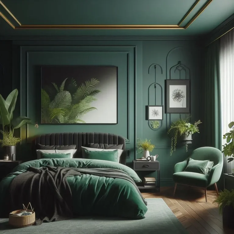
- Add final greenery. A large floor plant in a corner or a few smaller plants on a shelf complete the organic feel. They are the perfect complement to a moody pink bedroom design, adding freshness to the rich palette.
Pro Considerations: Safety, Paint, and Longevity
A beautiful room is also a safe and healthy one. Taking a few extra minutes to consider these factors protects your investment and your well-being.
These aren't just technical details. They're the difference between a room that looks good in a photo and one that feels good to live in for years.
Choosing Low-VOC Paints for Bedroom Health
VOCs (Volatile Organic Compounds) are chemicals found in many paints that can off-gas into the air long after painting is done. In a bedroom where you spend hours sleeping, minimizing exposure is a smart priority.
Look for paints labeled "Low-VOC" or "Zero-VOC." Most major brands now offer these lines. They have minimal odor and are much better for indoor air quality. While they may come at a slight premium, the health benefit in a personal sanctuary is worth it.
Manufacturer documentation will clearly state a product's VOC content.
Anchoring Heavy Wall Decor and Furniture
Safety is non-negotiable, especially in homes with children or in earthquake-prone regions. A tall dresser or a heavy mirror can tip over with tragic consequences.
- Furniture: Use anti-tip brackets or wall straps to secure tall dressers, armoires, and bookshelves directly to wall studs.
- Wall Decor: Hang heavy mirrors and large artwork using proper wall anchors rated for the item's weight. Don't rely on nails in drywall for anything substantial.
This is a simple, one-time task that provides permanent peace of mind. It lets you enjoy the room's beauty without a lurking worry.
A Timeless Look vs. a Trendy One
"Millennial pink" had its moment. The goal with a soft pink bedroom should be longevity, not trendiness. How do you create a space that won't feel dated in three years?
Focus on the principles we've covered: sophisticated undertones, natural material mixes, and classic furniture shapes. Avoid pairing your pink with other super-trendy colors or patterns that have a short shelf life. Instead, anchor it with timeless neutrals and organic textures.
A well-executed soft pink bedroom, like a well-designed dusty pink bedroom, should feel fresh and personal, not like a snapshot of a passing trend. It’s a color that, when treated with respect for its complexity, has enduring appeal.
Real Scenarios: Making It Work in Your Room
Every bedroom has its quirks. These tailored approaches help you adapt the core principles to your specific situation.
The right plan depends on your room's architecture, light, and who uses it. Generic advice fails here. You need a targeted strategy.
Refreshing a Dark or Small Bedroom
In a small or north-facing room, your goal is to amplify light and create a sense of space.
Choose a soft pink with a very high LRV, likely in the 70s. Stick to warm undertones to counteract any grayish light. Use mirrors strategically opposite any light source.
Keep furniture scaled down and legs visible to maintain an airy feel. Avoid heavy, dark textiles.
Blending Pink with a Partner's Style
The key is compromise through balance and neutral grounding.
Use pink as an accent wall or solely in textiles like bedding and art. Pair it with robust, gender-neutral elements like dark wood furniture, charcoal grey, and leather accents. This creates a balanced, sophisticated look that feels intentionally designed, not one-sided.
Updating a Teen's Room for Longevity
Choose a slightly more saturated, fun pink but keep the undertone sophisticated. Invest in quality, adaptable furniture in neutral colors. Let the personality come from easily changeable layers like posters, pillows, and LED lights.
The room can mature with them without a full remodel.
Frequently Asked Questions
What other colors go with soft pink besides grey and white?
Earthy greens like sage and olive are perfect complements. Navy blue adds bold contrast. Warm metallics like brass and natural wood tones are essential for balance and warmth.
Is soft pink a good color for a master bedroom?
Absolutely. When executed with mature undertones and layered with rich textures and contrasting materials, it creates a uniquely calming and sophisticated retreat. It's a far cry from a childish pink.
How do I keep a pink bedroom from looking too girly?
Avoid pure, sugary pinks. Choose a pink with gray, peach, or beige undertones. Balance it with substantial furniture, dark accents like black or navy, and plenty of natural materials like wood and linen.
This adds masculinity and weight.
Can I use soft pink if I have warm oak flooring?
Yes. Select a warm-toned pink (peachy or coral-blush) to harmonize with the orangey tones in the wood. Then, introduce cooling elements like crisp white bedding, chrome fixtures, or slate blue accents to prevent the room from feeling too overwhelmingly warm.
Should the ceiling be painted the same soft pink?
Usually not. Painting the ceiling the same color can make the room feel lower and more enclosed. A bright white or a lighter tint of the wall color (often mixed at 50% strength) on the ceiling will keep the space feeling open and airy.