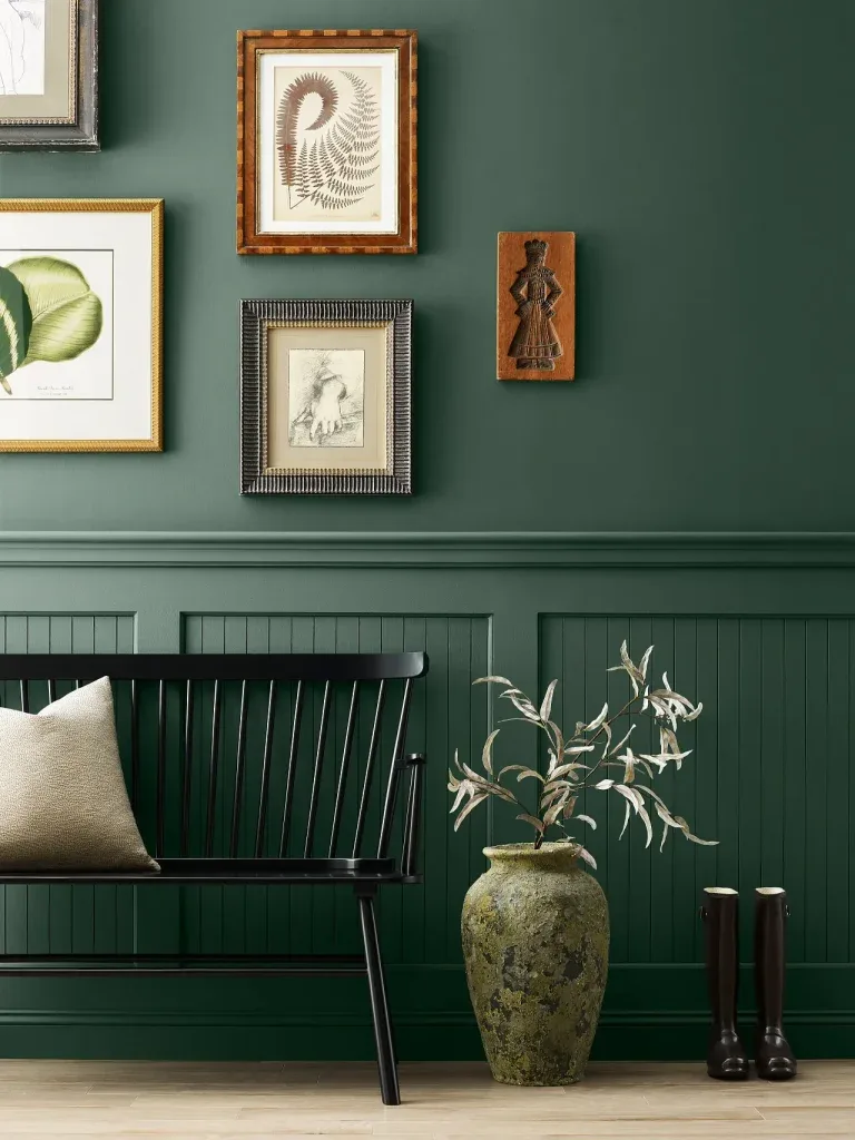
Pink and White Bedroom Ideas for a Fresh, Timeless Look
There's a reason a pink and white bedroom is a classic. It promises a space that's soft, bright, and inviting. But if you've ever felt one looked too juvenile, too saccharine, or just a bit flat, you're not alone.
The gap between that lovely idea and a room that actually feels sophisticated is all in the execution.
The key is treating it as a design strategy, not just a color choice. Our research into successful designs shows the difference hinges on three visual factors: the specific shades you pick, the balance between them, and the textures you layer in. For instance, a satin or eggshell paint sheen, which is the standard for most bedroom walls as of 2026, reflects light differently than a flat matte, changing how your pink reads throughout the day.
Let's break down what makes this palette work.
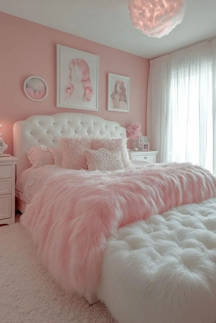
Image source: Bing (Web (fair-use with source credit))
Quick Answer
To create a sophisticated pink and white bedroom, first pick a pink with grey or brown undertones like blush or dusty rose. Pair it with a warm white like Swiss Coffee or a pure cool white like Chantilly Lace. Use a 70/30 ratio, making one color dominant and the other an accent.
Finally, add depth with multiple textures like linen, velvet, and wood.
Why Getting the "Look" Right is a Visual Game
You can't just list "pink paint" and "white bedding" on a shopping list and expect a magazine-worthy room. This is a visual design challenge first. What you're actually building is a cohesive scene where color, light, and texture interact.
Think of it like a painting. A great painting has a focal point, varied brushstrokes for depth, and a balanced color palette. A flat painting uses one color applied evenly.
Your room is the same. The goal is to create visual interest that feels intentional, not random. This means your decisions need to be guided by how things look together in the actual space, with its unique light and dimensions.
Manufacturer specifications for things like paint sheen and LED color temperature exist for this reason. They give you the tools to control the visual outcome. A warm white light bulb (2700K-3000K) will make a pink with warm undertones feel cozy and enveloping.
That same bulb could make a cool, blue-based pink look a bit dirty. You're not just choosing colors, you're designing an environment.
First, Define Your Pink (It's Not Just One Color)
This is the most critical step, and where most plans go off track. "Pink" is not a single color. It's a vast spectrum ranging from neon bubblegum to barely-there blush.
The specific hue you choose sets the entire tone for the room.
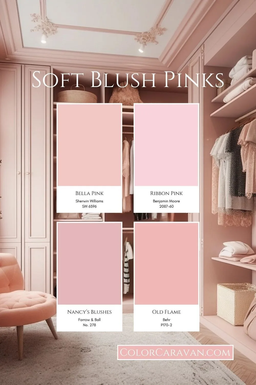
Image source: Bing (Web (fair-use with source credit))
Aggregate reviews and design analysis point to a clear trend: pinks with subtle, complex undertones are the winners for creating a mature, livable space. These undertones add depth and prevent the color from feeling childish.
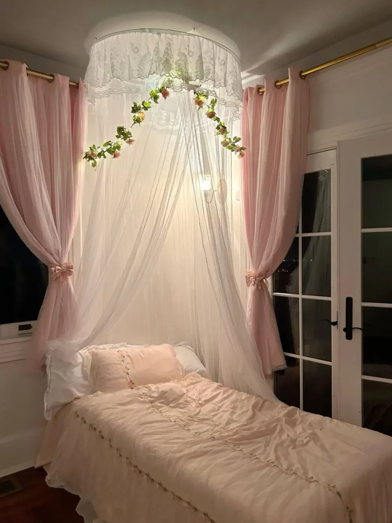
- Blush or Millennial Pink: This is your safe, versatile winner. It has subtle grey or beige undertones that make it feel neutral, soft, and incredibly adaptable. It works in almost any style, from modern to rustic.
- Dusty Rose or Mauve: These have more pronounced grey or purple undertones. They lean moody, romantic, and sophisticated. This is a great choice if you're aiming for a dusky, atmospheric feel or even a dramatic, moody pink bedroom.
- Ballet Slipper or Salmon: These carry soft orange or peach undertones. They feel warm, cheerful, and sunny. They pair beautifully with natural wood and brass accents.
- Avoid (Unless It's Deliberate): Pure, cool bubblegum pinks and hot pinks. These are high-energy colors that dominate a space and are much harder to design around for a restful bedroom. They can work as a tiny, deliberate accent but rarely as a wall color for a serene retreat.
Pro Tip: Always test paint swatches in your room. Paint a 2×2 foot square on at least two walls (one that gets direct light, one that's in shadow). Look at it at different times of day.
The color will shift dramatically, and you must love all its variations.
The Crucial Role of Your White (and Why Undertones Matter)
Choosing your white is equally important, and it's all about harmony. A white isn't just "white." It has undertones too, yellow (warm), blue (cool), pink, or grey. Clashing undertones between your pink and your white is the fastest way to make a room feel "off."
If you've chosen a warm pink (like one with peach undertones), you'll want a warm white to complement it.
- Good Warm Whites: Swiss Coffee, White Dove, Creamy. These have yellow or beige bases.
- Good Clean, Slightly Cool Whites: Chantilly Lace, Pure White, Extra White. These have neutral or faint blue bases and work well with cooler pinks like dusty rose.
The safest bet for beginners is to choose your pink first from a major paint brand's system. Then, look at that brand's off-white color strips. The whites on the same strip as your chosen pink are scientifically formulated to have compatible undertones.
It's a foolproof way to guarantee they work together.
The Golden Ratio: How to Balance Pink and White Without Going Overboard
Now for the visual balancing act. An even 50/50 split between pink and white often feels unresolved and chaotic. Your eye doesn't know where to rest.
The professional approach is to let one color dominate and use the other as a supporting accent.
The most successful and calming formula is a 70/30 split.
Option 1: White-Dominant (70% White, 30% Pink)
This is the most common and failsafe approach for a light, airy, and spacious feel.
- 70% White: Walls, ceiling, trim, large furniture (like a dresser or wardrobe), and the rug.
- 30% Pink: Bedding (comforter/duvet), curtains, an accent chair, and decorative pillows and art.
- Why it works: It creates a bright, clean canvas. The pink acts as gentle, recurring pops of soft color that feel intentional and cozy. This is an excellent strategy for adult bedrooms where you want the femininity to feel subtle and sophisticated.
Option 2: Pink-Dominant (70% Pink, 30% White)
This is a bolder, more enveloping, and dramatic choice. It creates a cocoon-like effect.
- 70% Pink: The walls (all four or a statement wall), the headboard, and the primary bedding layer.
- 30% White: The ceiling, trim, crisp white sheets/linens, and light fixtures.
- Why it works: It makes a powerful style statement. To keep it from feeling overwhelming, the pink must be a muted, sophisticated shade (like those discussed above), and you must commit to ample white in the linens and trim to provide visual relief and brightness.
Visualizing the Split: Don't get caught in mathematical precision. Think of it as a visual weight. A large white rug and white walls carry a lot of weight, so they count toward that 70%.
A few pink throw pillows are light, accent pieces. The goal is for one color to clearly establish the room's foundation.
and the other to provide contrast and detail.
Your Focal Point: Where the Eye Should Land First
Every well-designed room has a focal point, a place where the eye naturally lands first. In a bedroom, this is almost always the bed. Your pink and white scheme should highlight and enhance this focal point, not fight with it.
If your bed is against a wall, that wall is prime real estate. In a white-dominant room, a pink headboard or a stack of pink and white bedding becomes the star. In a pink-dominant room, a crisp white upholstered headboard or stark white bedding frames the space beautifully.
What if your bed isn't the focal point? Maybe you have a stunning window or a fireplace. The rule still applies.
Use your accent color (the 30% in your ratio) to draw attention there. Pink curtains on a white-walled window, or a pink vase on a white mantel, does the job perfectly.
The mistake is scattering both colors evenly everywhere. Your eye bounces around without a place to rest, and the room feels busy instead of curated. Choose your anchor and build out from it.
The Texture Layer: What Makes a Room Feel Designed, Not Decorated
This is the secret weapon. Color alone creates a flat, two-dimensional feel. Texture adds the third dimension, depth, richness, and tactile interest.
It’s what separates a room that looks “decorated” from one that feels “designed.”
Think about how different materials interact with light. A matte linen duvet cover absorbs light softly. A velvet throw pillow absorbs it in deep, rich pools.
A glossy ceramic lamp base reflects it in sharp highlights. Mixing these finishes in your pink and white palette creates a nuanced, expensive look.
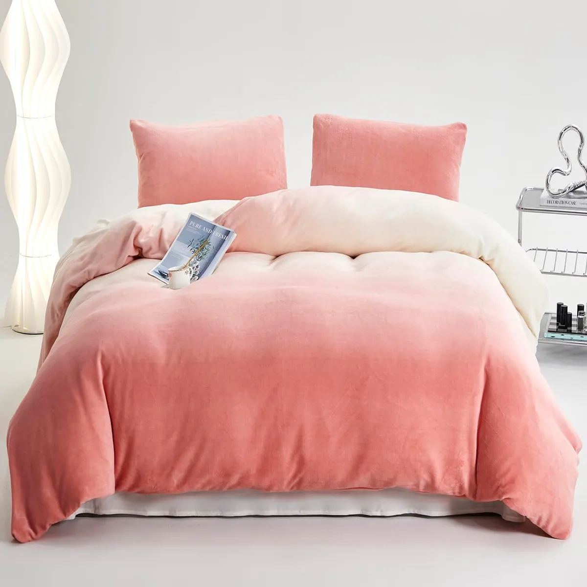
Image source: Bing (Web (fair-use with source credit))
Here’s a practical texture mix for a pink and white bed, which is the easiest place to start:
- Bed Base: Crisp, percale cotton sheets (white).
- Middle Layer: A linen duvet cover or quilt (in your chosen pink or white).
- Top Layer: A knitted throw or faux fur blanket (in the contrasting color).
- Pillows: Mix a velvet pink pillowcase with a bouclé or cable-knit white pillow sham.
- Rug: A plush, high-pile white rug adds softness underfoot.
Apply this thinking everywhere. Instead of a flat pink painted wall, consider a pink grasscloth wallpaper. Swap a smooth white nightstand for one with a wood grain or cane detailing.
This layered approach is key for more complex styles, like achieving a cozy, collected moody boho look.
Bringing in the "Third Element": How to Ground the Scheme
A room of only pink and white can start to feel floaty and insubstantial. You need a “third element” to ground the space, add sophistication, and break up the sweetness. This isn't a third color you splash everywhere, but an accent material used strategically.
The best third elements are neutrals with their own visual weight:
- Natural Wood: Warm oak, walnut, or rattan on furniture legs, nightstands, or picture frames. It adds organic warmth and is a classic pairing.
- Black or Dark Metal: Matte black picture frames, lamp bases, or curtain rods. This adds modern edge and graphic contrast, making both the pink and white pop.
- Brass or Gold: Light fixtures, drawer pulls, or mirror frames. This introduces a touch of glamour and reflects light beautifully.
- Grey: A charcoal grey in a patterned rug or a piece of abstract art. It’s a more subtle, modern grounding choice.
Use this element sparingly, like punctuation. Two or three black-framed botanical prints on a white wall, or brass knobs on a white dresser, are perfect. This touch of contrast is what makes a pink bedroom for adults feel deliberate and chic, not like a themed suite.
Visual Guide: Building Your Room from the Floor Up
Let’s put the theory into a practical, step-by-step visual plan. Imagine you’re walking into an empty room. Here’s how to fill it visually, layer by layer, to ensure cohesion.
Start with the Largest Surfaces (Walls & Floor)
These are your background. Decide on your 70/30 split here. Will your walls be the 70% (white) or the 30% (pink)?
Your floor covering should support this decision.
- Walls are White (70%): Your floor can be a light wood tone, a plush white or ivory rug, or even a pale grey carpet. This establishes your bright, airy base.
- Walls are Pink (70%): You likely want to balance that with a neutral floor. A white or very light natural fiber rug (like jute or sisal) works well. A dark wood floor can add amazing drama but requires confident execution.
Remember the importance of the ceiling. A white ceiling is almost always the right choice, it feels higher and reflects light down. A pink ceiling can feel oppressively low unless the room is very large.
Layer in the Soft Furnishings (Bedding & Window Dressings)
This is where your color story comes to life. If your walls and floor are your neutral background (the 70%), your bedding is your best chance to introduce your accent pink.
- Start with white foundational layers (sheets, a white quilt).
- Add your primary pink layer, the duvet cover or a heavyweight blanket.
- Layer a white textured throw across the foot of the bed.
- For windows, if your walls are white, pink curtains add a soft, billowy frame of color. If your walls are pink, white or off-white linen curtains will provide a light, airy contrast.
Add Personality with Decor and Lighting
Now for the finishing touches that make the room yours. This is where you incorporate your “third element” and personal style.
- Lighting: Choose warm white bulbs (2700K-3000K). A white fabric shade on a black metal pendant creates great contrast. A brass or smoked glass table lamp adds a material moment.
- Art & Mirrors: Avoid art that is only pink and white. Look for pieces that incorporate your grounding color, black line drawings, landscapes with wood tones, or abstracts with a dash of charcoal. A large mirror in a wood or black frame is both functional and a key decor piece.
- Decorative Objects: A stack of books with neutral covers, a simple green plant in a terracotta pot, or a ceramic vase in a solid color. These small hits break up the color field and add life.
Common Visual Mistakes (And How to Spot Them)
Knowing what not to do is just as important. Here are the top pitfalls that make a pink and white bedroom feel amateurish.
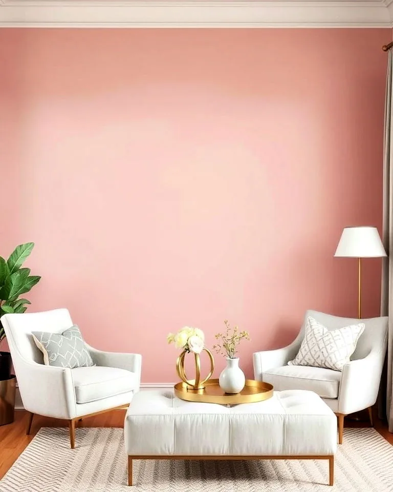
Image source: Bing (Web (fair-use with source credit))
Mistake 1: The Candy-Coated, All-Pink Box
This happens when pink is used on every surface without enough white for balance. Pink walls, pink bedding, pink rug, pink curtains. The result is a visual sugar rush that feels claustrophobic and overwhelmingly youthful.
- The Fix: Remember the 70/30 rule. If the walls are pink, the bedding or major rug must be white. Introduce your grounding third element immediately to cut the sweetness.
Mistake 2: The Sterile, Doctor's Office Vibe
This is the opposite problem: too much stark, cool white without enough warm pink or texture. White walls, white furniture, white bedding. It feels clean but cold and unwelcoming.
- The Fix: Inject your pink through soft, textural layers. Swap a white duvet for a pink linen one. Add a plush pink throw. Use warm wood tones (your third element) on furniture to add natural warmth. The goal is softness, not sterility.
Mistake 3: The Matchy-Matchy Trap
Buying a "pink and white bedroom set" where everything is the same shade and finish. A pink comforter set with matching pink pillows and a matching pink lamp shade. This lacks depth and feels like a staged display, not a lived-in space.
- The Fix: Curate, don't coordinate. Mix different shades of pink and white. Combine different patterns (a small floral, a stripe, a solid) in your pillows. Use different materials, as outlined in the texture section. The room should look collected over time.
Tailoring the Palette for Different Rooms
Your approach should shift slightly depending on who the room is for and how it's used.
For a Sophisticated Primary Bedroom
Lean into muted, complex pinks (dusty rose, mauve, blush) and use the white-dominant (70/30) strategy for a serene, airy feel. Texture is paramount, think linen, wool, and wood. Your grounding element should be mature, like black metal, dark walnut, or unlacquered brass.
This creates a retreat that feels both feminine and firmly adult. For a truly dramatic take, explore the principles of a moody pink bedroom design, using deeper pink tones and moody lighting.
For a Playful (But Not Juvenile) Kid's Room
Kids love color, but you can still be sophisticated. Choose a cheerful pink like ballet slipper or a soft coral. You can afford to be closer to a 50/50 balance here.
Use white on the walls and furniture for easy updates, then bring in pink through bedding, a fun rug, and removable decor. The key is to make the big, permanent items neutral. Add a grounding element like natural wood toy storage or brightly colored (non-pink) art for fun.
For more focused inspiration, you can explore dedicated pink girly bedroom ideas that balance fun with style.
For a Flexible Guest Room
The goal is welcoming and inoffensive. A white-dominant room with blush pink accents is perfect. It feels clean, calm, and stylish to any guest.
Keep patterns minimal and textures soft. A white bed with a blush quilt, white walls, and a natural jute rug is a foolproof, beautiful combination. The room feels open and serene, a blank canvas that anyone can feel comfortable in.
Expert Moves: The Pro Tips That Make a Difference
- Sample in the Room, Always. Lighting is everything. A pink that looks perfect at the paint store can look neon or dull in your room. Observe your large swatches for 48 hours through different daylight and nighttime conditions.
- Embrace Imperfect White. Pure, bright whites can feel clinical. An off-white or cream with subtle warmth (like White Dove or Swiss Coffee) makes a room feel instantly cozier and more inviting, especially when paired with pink.
- Let the Rug Guide You. If you fall in love with a rug that has both pink and white (and maybe a third color) in it, use it as your color palette blueprint. Pull your wall and accent colors directly from its pattern.
- Paint the Trim. If you paint your walls pink, don't default to bright white trim. Painting the trim, doors, and ceiling the same white (often a purer white than the walls) creates a crisp, tailored, and expensive-looking finish.
- Look Beyond the Bedroom. The principles of balancing color, texture, and a grounding element apply everywhere. You can use this same framework for designing a cohesive barndominium bathroom or planning a modern barndominium's interior palette.
Frequently Asked Questions
What is the most timeless pink for a bedroom?
Blush pink with grey or beige undertones is the most timeless. It acts as a neutral, pairs with everything from warm woods to cool metals, and doesn't trend in or out quickly. It's soft enough for a relaxing atmosphere but sophisticated enough to never feel childish.
Can I use pink and white in a room shared by a couple?
Absolutely. The key is to let the pink be soft and muted (avoiding bubblegum tones) and to balance it with strong, neutral elements. Use a white-dominant scheme, bring in pink through soft furnishings, and ground it with masculine materials like dark wood, black metal, or leather accents.
It becomes a soft neutral, not a feminine statement.
Is it okay to use wallpaper instead of paint?
Yes, and it can be stunning. A small-scale pink and white patterned wallpaper on one accent wall adds incredible depth and interest. For a bold look, a large-scale floral or geometric print can be the room's focal point.
Just remember, with busy wallpaper, keep everything else, bedding, furniture, much simpler and more solid in color.
How do I keep a pink and white room from feeling too cold?
Coldness comes from using cool-toned pinks and whites together without warming elements. Choose a pink with warm (peach/beige) undertones and pair it with a warm white or cream. Then, layer in textures like wool, knit, and wood, and use warm white lighting (2700K bulbs).
These elements add visual and perceived warmth.
What if I'm renting and can't paint?
Focus all your color on non-permanent layers. Use a white duvet cover and add pink sheets, a pink blanket, and lots of pink pillows. Hang large pink curtains, lay down a pink rug, and use pink in your wall art and accessories.
You can create a very strong pink and white statement without touching a wall. A large, framed pink fabric panel or tapestry can also mimic a pink wall.
How much does it cost to create a pink and white bedroom?
Costs are entirely dictated by your choices in paint, furniture, and textiles. A refresh using existing furniture might only cost $200-$500 for new paint, bedding, and a few decor items. A full makeover with new furniture, a quality rug, and custom window treatments can easily reach $3,000-$5,000 or more.
The biggest budget items are typically the bed, rug, and dresser. Saving on paint (a gallon is $40-$80) and splurging on textured bedding or statement lighting is a smart way to allocate funds for maximum visual impact.
What other colors go with pink and white?
Many colors act as excellent "third elements." Grey is a classic, modern companion. Sage green adds a fresh, botanical feel. Navy blue creates a preppy, striking contrast.
Mustard yellow offers a warm, vintage vibe. Metallic gold or brass brings in glamour. The trick is to use these as accents, in a patterned rug, a piece of art, or a single throw pillow, rather than introducing them as a major wall color, which can complicate the simple, clean appeal of the core palette.
For example, the principles of adding a rich accent color work beautifully in concepts like a moody purple bedroom.
Maintenance & Long-Term Optimization
Once your room is set, keeping it fresh is easy. This palette is forgiving and adaptable. The core colors are timeless, so you can change the feeling of the space with small, affordable swaps.
Rotate your decorative pillows and throws seasonally. A chunky knit in winter, a light linen in summer. Switch out artwork or swap a lamp base.
Your foundational pieces, the white furniture and pink walls, remain constant. This makes updating cost-effective.
Dust and smudges show more on white. A regular, gentle cleaning routine for painted surfaces and textiles keeps the room looking bright and intentional. Using low-VOC paint from the start, a standard for healthier indoor air as of 2026, also means easier maintenance and fewer odors.
Safety / Legal / Compliance
For a child's bedroom or nursery, safety is the top priority. Anchor all tall dressers and bookshelves to the wall studs. This prevents tip-over accidents.
Use cordless window coverings or secure blind cords well out of reach.
If you're renting, always get written landlord approval before painting or applying removable wallpaper. Check your lease terms. Even "damage-free" products can sometimes leave marks.
Protecting your deposit is key.
Choose low-VOC or no-VOC paints and finishes. These are widely available from major brands. They improve indoor air quality during and after the project.
Look for certifications like GREENGUARD Gold on furniture and rugs, especially for sensitive individuals.
Real Scenarios / Case Examples
Consider a client with a small, north-facing guest room. The goal was cozy, not cave-like. We used a 70/30 white-dominant split.
Walls were painted a warm white (Sherwin-Williams Alabaster). The 30% pink came entirely from soft layers: a blush linen duvet, two velvet accent pillows, and a pale pink ceramic lamp.
The third element was natural oak on the nightstand and picture frames. A mirrored tray on the dresser bounced light around. The room felt instantly brighter, welcoming, and thoughtfully designed without a major renovation.
Another scenario involved a teen's room she felt was too "babyish." The existing hot pink walls were the problem. We repainted them in a muted, warm pink (Benjamin Moore Pink Bliss). We kept her white furniture and bedding.
The refresh came from grounding with black: black-framed posters, a black wire basket for magazines, black knobs on her dresser. The result was a room that felt mature, personalized, and cool, not childish. The existing pink was still present but recontextualized.
Costs / Pricing / Data / Specs
Let's break down typical price ranges for core items. These are averages based on editorial research of major retailers. Costs vary by brand, quality, and region.
| Item | Budget-Friendly | Mid-Range | Investment |
|---|---|---|---|
| Paint (1 gallon) | $35 – $50 | $55 – $80 | $90+ |
| Queen Duvet Cover | $40 – $70 | $80 – $150 | $200+ |
| Area Rug (8×10) | $150 – $300 | $350 – $700 | $800+ |
| Nightstand | $80 – $150 | $200 – $400 | $500+ |
| Table Lamp | $30 – $60 | $80 – $150 | $200+ |
A full room makeover on a tight budget is possible. Prioritize paint and bedding first. Shop secondhand for solid wood furniture you can paint white.
Add texture with affordable throws and pillow covers from open-market retailers. The look is in the layering, not the luxury.
Final Recommendation / Verdict
If you're starting from scratch, follow this path. Choose a complex pink like blush or dusty rose. Pair it with a warm white like Swiss Coffee.
Commit to a 70/30 split, letting white dominate for a fail-safe, spacious feel.
Invest your budget in high-texture bedding and a quality rug. Anchor everything with a natural wood or black metal element. Test your paint colors obsessively in the room's actual light.
This approach creates a bedroom that feels soft, intentional, and genuinely restful. It's a palette that grows with you, allowing for easy updates for years to come. The result is a personal retreat that proves pink and white can be both pretty and profoundly sophisticated.