Pale Pink Bedroom Ideas: Pretty Ways to Create a Soft, Dreamy Space
Let’s get one thing straight from the start: a successful pale pink bedroom has nothing to do with princesses or little girls. The goal is a room that feels calm, sophisticated, and intentionally designed. Where many projects fail is in treating “pale pink” as a single, straightforward color.
It’s not. It’s a spectrum of undertones, light interactions, and textures that, when chosen correctly, creates a sanctuary. When chosen haphazardly, it can feel flat, dated, or just plain wrong.
Our research into manufacturer color systems, like those from Benjamin Moore and Sherwin-Williams, shows the secret lies in the Light Reflectance Value, or LRV. A true “pale” pink typically has an LRV of 65 or higher, meaning it reflects a lot of light, helping the space feel airy. This technical spec is a solid starting point, but the real magic happens when you learn to see color in your own space.
Quick Answer
A pale pink bedroom creates a serene, restful retreat. Success depends on picking the right undertone for your room’s light. You can avoid a childish look by pairing it with rich textures and deep accent colors.
Always test paint swatches on large boards in your space before committing. The final result should feel sophisticated, warm, and timeless.
Why Pale Pink Works in Bedrooms (And How to See It For Yourself)
Pale pink works because it sits in a sweet spot between a true neutral and a color with personality. It has enough warmth to feel inviting and cocooning, but it’s light enough to not overwhelm a space. This makes it a fantastic backdrop for a room dedicated to rest and relaxation.
From a design psychology perspective, it promotes a sense of calm and comfort, which is exactly what you want in a bedroom. Unlike a stark white, which can feel clinical, or a bold color that might be overstimulating, a well-chosen pale pink acts like a visual hug. The challenge, and where most generic advice falls short, is that you can’t just pick a pink you like from a tiny chip.
You have to see it in the context of everything else in the room, your flooring, bedding, and, most critically, your light.
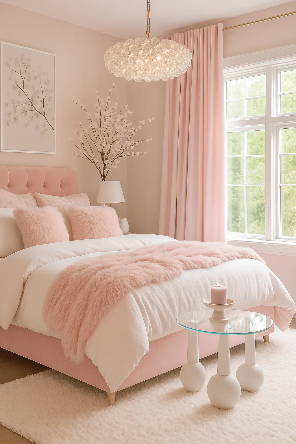
The First Thing to Get Right: Finding Your Pale Pink
This is the step you cannot rush. You aren’t just choosing “pink.” You’re identifying the specific version of pink that will harmonize with your room’s permanent features and natural light. Getting this wrong is the root cause of disappointment, when the paint looks perfect in the store but clashes terribly on your walls.
Understanding Undertones is Non-Negotiable
Every pale pink has a secret color hiding inside it, its undertone. This is the hidden bias that makes the color lean warm, cool, or neutral. It’s what causes one pink to look subtly peachy, another to have a hint of mauve, and a third to read as a soft beige-pink.
- Warm Undertones: These pinks have a hint of yellow, peach, or coral. They feel sunny, cozy, and inviting. They work beautifully in rooms with north-facing light (which is cooler) to add warmth, or with wood furniture that has orange or yellow tones.
- Cool Undertones: These lean into blue, purple, or magenta. They feel crisp, clean, and more modern. A cool pale pink can be stunning in a south-facing room flooded with warm light, as it provides a balancing counterpoint.
- Neutral Undertones: The most versatile option. These pinks are essentially a very light beige or greige with a pink tint. They are the safest bet for tricky lighting situations and work with almost any other color you introduce.
The only way to see undertones is by comparison. Never look at a single swatch in isolation.
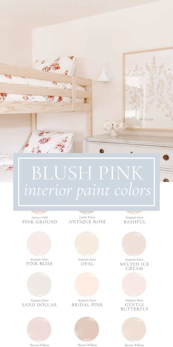
How Your Room’s Light Changes Everything
Natural light is the ultimate variable. The exact same can of paint will look completely different in a bright, south-facing room versus a dim, north-facing one. Manufacturer specifications give you the LRV, but your windows dictate the final effect.
- North-Facing Light: This light is cool, bluish, and diffuse. It can make colors look flatter and drain warmth. Here, a pale pink with a warm undertone (peach, coral) will help combat the chill and keep the room from feeling sterile. A cool pink might look a bit grayed-out.
- South-Facing Light: This is warm, yellow, and abundant. It intensifies colors and brings out warm undertones. A pale pink with a cool or neutral undertone works well here to prevent the room from feeling overly warm or “hot.” A warm pink might look brighter than intended.
- East/West-Facing Light: These rooms have dramatic shifts. East rooms get warm morning light and cooler afternoon light. West rooms are the opposite. A neutral-undertone pink is often the most stable choice, as it won’t swing wildly throughout the day.
The rule is simple: observe your candidate colors at multiple times over 24 hours. The color you see in the midday sun is not the color you’ll wake up to or go to sleep with.
Building Your Visual Palette: Start With the Walls
Once you’ve identified the right undertone, you can move to execution. The walls are your largest canvas, so the decisions here set the stage for everything else.
How to Test Paint Colors the Right Way
Forget the tiny paint chips taped to the wall. They’re almost useless because they’re too small to judge how a color will feel on a large scale. Instead, invest in sample pots and paint large boards (at least 2′ x 2′) or directly paint a 3′ x 3′ section on two different walls.
Move these boards around the room. Look at them in shadow and in direct light. Lean them against your floor and next to your bedding or a piece of furniture.
This process shows you the color’s true personality and how it interacts with every element in the space. It’s the single most important visual test you can perform.
Choosing a Finish That Enhances the Mood
The sheen of your paint isn’t just about durability; it’s a texture and light-control tool.
- Matte/Flat: This finish has no shine. It’s supremely sophisticated and hides wall imperfections well. It absorbs light, giving the color a rich, velvety depth. This is the go-to choice for a serene, enveloping feel in a master bedroom.
- Eggshell: Has a very slight, pearl-like sheen. It’s more washable than matte and adds a gentle luminosity to the walls, helping reflect a bit more light in a darker room.
- Satin: Has a noticeable soft shine. It’s durable and washable, but that shine can highlight every bump and imperfection on your walls. Generally, we recommend a satin finish for trim and doors in a bedroom, not for the main walls where you want a calmer look.
For a pale pink bedroom aiming for tranquility, a matte or eggshell finish on the walls is almost always the right call. The lack of glare supports the restful mood.
The Visual Balancing Act: Adding Depth and Contrast
This is where a room goes from “nice” to “wow.” A common mistake is to match everything, pink walls, pink bedding, pink rug. This creates a flat, one-dimensional look that feels amateurish. The goal is to create layers of visual interest.
Your Go-To Color Pairings for Pale Pink
Pale pink is an incredibly friendly color. It plays well with many others, but some combinations are particularly effective for creating a balanced, adult look.
- With Deep Greens (Sage, Olive, Forest): This is a classic, nature-inspired combo. The earthy green grounds the soft pink, creating a sense of harmony and balance. It’s timeless.
- With Navy or Charcoal: For a more modern, graphic look. The deep, cool tones of navy or charcoal provide strong contrast, making the pink feel crisp and intentional rather than sweet.
- With Warm Neutrals (Cream, Beige, Terracotta): This keeps the palette soft and monochromatic but adds warmth. Terracotta, in particular, brings in a rich, earthy note that feels very current.
- With Metallic Neutrals (Brass, Black Iron): This isn’t a wall color, but a finish. Brass warms up the pink, while black iron adds definition and edge.
Think of your pale pink walls as the backdrop. These other colors should appear in your larger textiles (rug, curtains, a blanket), your furniture, or your art.
The Power of Texture Over More Color
When you want to add richness without introducing another hue, turn to texture. Different materials catch the light in unique ways, adding depth and sophistication.

Think about incorporating a mix of:
- Soft and Cozy: Chenille, faux fur, knitted wool.
- Crisp and Tailored: Linen, cotton percale, velvet.
- Natural and Organic: Rattan, seagrass, unfinished wood, live plants.
A bed dressed in linen sheets, a chunky knit throw, and a velvet pillow is infinitely more interesting than a bed with three matching pink satin pillows. This tactile variety is what makes a room feel curated and lived-in.
Using Metallics as Your Visual Anchor
Metallics are the jewelry of the room. They provide small points of light and refinement. The choice here steers the style.
- Brushed Brass or Gold: Adds warmth and a touch of vintage glamour. It works beautifully with warm-undertone pinks.
- Polished Nickel or Chrome: Feels cooler, more modern, and pairs well with cool-undertone pinks.
- Black Iron: Offers an industrial, grounded contrast that keeps the look from becoming too delicate.
Use these on your lighting fixtures (the most important placement), drawer pulls, picture frames, or decorative objects. Stick to one or two metal finishes for cohesion.
Furniture and Layout: Making the Space Feel Intended
Your furniture choices can either complement your pale pink scheme or fight with it. The goal is harmony, not matchy-matchy.
Choosing Woods and Materials That Don’t Clash
This goes back to undertones. The wrong wood tone can make your beautiful pink wall look off.
- With Warm Pink Undertones: Embrace warm woods like oak, walnut, cherry, or teak. Their yellow/red/orange notes will feel harmonious. Avoid woods with a strong gray or ash finish, as they can look disconnected.
- With Cool Pink Undertones: You have more flexibility. Cool pinks work well with the gray tones in weathered oak, ash, or even painted furniture (in black, navy, or white). Warm woods can still work but may create a more intentional, high-contrast look.
- The Universal Solver: Natural, light-toned woods like bleached oak, maple, or bamboo have very neutral undertones and work with any pink. They keep the room feeling light and airy.
Don’t forget other materials. A black metal bed frame offers strong definition. A linen-upholstered headboard adds softness.
Mixing materials, wood, metal, upholstery, is key to a layered look.
Arranging for Calm, Not Clutter
A serene color palette needs a serene layout. The bedroom’s primary function is sleep, so the arrangement should promote that feeling.
- Anchor the Bed: This is the focal point. Center it on the main wall whenever possible. Ensure there’s walking space on both sides.
- Clear the Nightstands: Nightstands are for essentials: a lamp, a book, a glass of water. Avoid using them as catch-all shelves for clutter. This visual simplicity is crucial.
- Create a Landing Zone: If space allows, have a small chair, a bench at the foot of the bed, or a dedicated spot for a robe. This contains items and keeps the bed area purely for sleep.
- Conceal Storage: Use dressers with clean lines and consider baskets or closed cabinets for items that don’t need to be on display. Visual clutter is the enemy of a peaceful pale pink retreat.
A thoughtful layout ensures the beauty of your color and texture choices can be appreciated without competition. For more inspiration on creating a cohesive, intentionally designed space, you can explore some of our guides on achieving a specific moody boho look or a more earthy, grounded atmosphere. These principles of balance and restraint apply universally.
Lighting: The Make-or-Break Factor
Lighting isn’t an afterthought. It’s the tool that reveals all your careful work with color and texture. Get it wrong, and your perfect pink can look washed out, dingy, or garish.
Your lighting plan needs layers: ambient for overall illumination, task for specific activities, and accent for drama.
Using Natural Light to Your Advantage
You already assessed your natural light for undertone selection. Now, use it to enhance the mood. Sheer, light-filtering curtains in white or cream let in maximum soft light while maintaining privacy.
They prevent the harsh shadows that come with heavy drapes.
For south-facing rooms with intense sun, consider a light linen roman shade. It diffuses the brightness, preventing your pale pink from looking faded or bleached by the strong rays. The goal is to soften and manage the light, not block it out completely.
Choosing Artificial Light That Flatters, Not Flattens
The color temperature of your light bulbs is critical. It’s measured in Kelvins (K). Warm white light (2700K to 3000K) contains more yellow and red tones.
Cool white light (3500K+) has more blue.
For a pale pink bedroom, you always want warm white bulbs. A cool white bulb will clash with the warmth of the pink, making it look sickly or gray. Warm white bulbs enhance the cozy, inviting feeling.
They make the pink glow.
Think about light placement. A central overhead light alone creates harsh shadows. Layer in table lamps on nightstands for soft, focused reading light.
A floor lamp in a corner adds ambient glow. Dimmer switches are your best friend, allowing you to adjust the intensity for different times of day.
Common Visual Mistakes (And How to Sidestep Them)
We’ve covered what to do. Now let’s look at what commonly goes wrong. Spotting these pitfalls early saves time, money, and frustration.
The “Flat Pink Box” Effect
This happens when every surface is the same shade of pink. Pink walls, a pink bedspread, a pink rug. The room lacks depth and feels one-dimensional, like a monochrome set.
The fix is intentional contrast. Introduce at least two other distinct colors or a strong mix of textures and materials. A charcoal velvet headboard, a cream linen duvet, and a jute rug will instantly add the visual layers a flat pink box lacks.
The Undertone Mismatch
Your pink walls have a cool, mauve undertone, but your bedding has warm peach tones. They fight each other, making the whole room feel unsettled and “off.” This is the most common cause of paint regret.
The solution is systematic testing. Always hold your large paint sample boards next to your key furniture and textiles before you buy gallons. If they clash, you either need to pick a new paint or plan to swap out the clashing item.
Don’t hope it will look better once it’s on all four walls.
Over-Accessorizing
In an effort to add personality, it’s easy to clutter surfaces with too many small decor items. A crowded nightstand or a gallery wall that’s too busy competes with the serene simplicity a pale pink room should embody.
Edit ruthlessly. Choose a few meaningful, well-scaled pieces. One large piece of art is often more powerful than a grid of small ones.
Leave surface areas clear. Let the color, texture, and a few key objects breathe.
Real-World Scenarios: Applying the Rules
Let’s apply everything to specific situations you might face. This is where theory meets practice.
Scenario: The Small, North-Facing Room
The challenge here is a lack of light and potentially a cool, shadowy feel. Your goal is to add warmth and make the space feel larger.
- Paint Choice: Opt for a pale pink with a definite warm undertone (peach, coral). This counteracts the cool light. Choose a paint with a high LRV (70+) to reflect as much light as possible. A matte finish will help walls recede.
- Furniture & Layout: Use light-colored woods (bleached oak, maple) and keep furniture low-profile. Avoid bulky, dark pieces that will feel heavy. A mirror placed opposite the window will bounce light around.
- Textiles: Layer in textures for coziness without darkness. A cream bouclé throw, linen curtains, and a light, textured rug will add interest without visual weight.
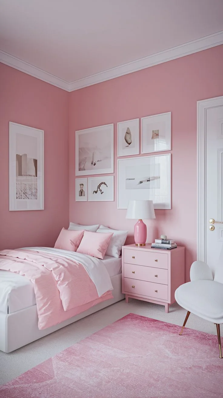
Scenario: The “Grown-Up” Bedroom (Not a Nursery)
The goal is sophistication, avoiding any hint of childishness. The trick is in pairing and contrast.
- Paint Choice: A neutral-undertone pink or a very subtle cool pink works best. It reads as a complex neutral. Stay away from pinks that are too bright or sugary.
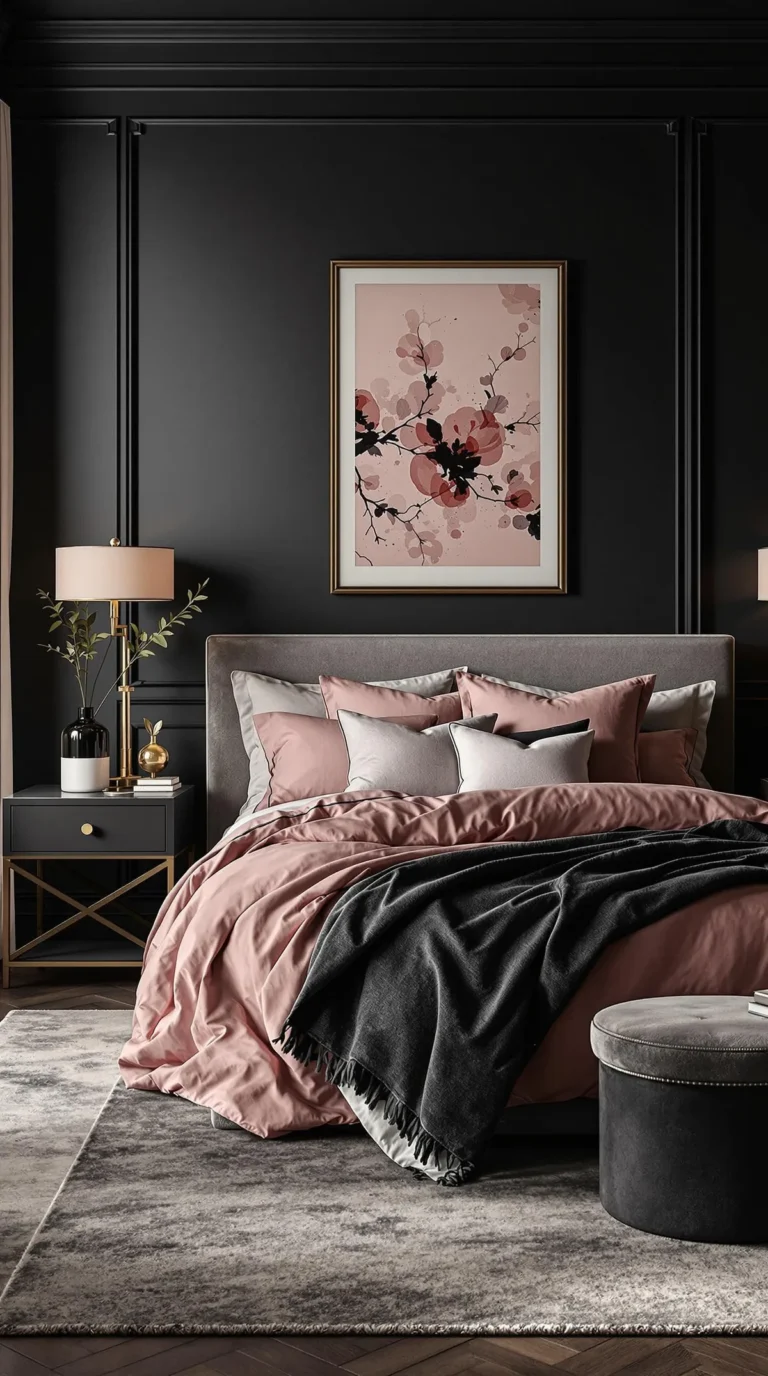
- Color Pairing: Immediately introduce “adult” colors. Pair it with charcoal gray bedding, navy accent pillows, or a dark wood (like walnut) for furniture. Black iron light fixtures add an edge.
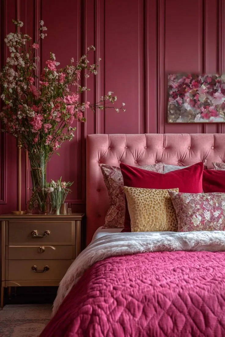
- Textiles: Focus on luxurious, natural fabrics. High-thread-count cotton, linen, velvet, and wool. The quality of materials elevates the entire feel. This approach is similar to the principles used in a moody pink design, where depth is key.
Scenario: Renting Without Painting
You love the look but can’t paint your walls. No problem. You build the palette from the furniture out.
- Start with the Bed: Your bed is the largest element. Choose a duvet cover or comforter in your chosen pale pink shade. This becomes your anchor color.
- Add Large Pink Textiles: Bring in a pink rug or a substantial pink throw blanket. Pink curtains can also frame the windows with color.
- Use Art and Accessories: A large piece of art with pink tones makes a statement. Pink vases, books, or lampshades on a neutral wall build up the color scheme without a drop of paint. For more ideas on working with a similar color when you can’t paint, check out ideas for a dusty pink bedroom.
Quick-Reference Guide: A Visual Checklist
Use this as a final walkthrough before you commit to any major purchases or painting.
Pre-Start: Things to Observe in Your Space
- What direction does your primary window face? (North, South, East, West)
- What is the undertone of your largest fixed element? (Flooring, built-in cabinetry)
- What color temperature are your existing light bulbs? (Swap to 2700-3000K if needed)
Mid-Process: Things to Check Before Committing
- Have you painted large sample boards and viewed them for 24+ hours?
- Do your paint samples harmonize with your bedding/furniture undertones?
- Does your furniture layout promote a clear, calm flow?
Final Layer: Things to Add for Cohesion
- Have you included at least three different textures (e.g., wood, metal, knit, velvet)?
- Is there a clear, intentional accent color present in at least two places?
- Is your artificial lighting layered (overhead + task + accent) and on warm-white bulbs?
Frequently Asked Questions
Does pale pink make a room look bigger or smaller?
Pale pink can make a room look bigger. Its high light reflectance value (LRV) helps bounce light around, making walls feel less imposing. This effect is strongest when paired with other light colors and minimal clutter.
A dark pink would have the opposite effect.
Can I use pale pink with dark furniture?
Absolutely. Dark furniture is one of the best ways to ground a pale pink room and give it a mature, designed look. The high contrast is visually striking.
Just ensure the undertones are compatible. A warm walnut looks great with a warm pink, while a black or charcoal finish is more universally flexible.
What if my pink looks too peachy or too purple?
This is an undertone issue revealed by your lighting. If it looks too peachy, your room’s light is amplifying the warm undertones. You might need a pink with a more neutral or cool base.
If it looks too purple, the light is cooling it down, and a warmer pink could balance it. This is why large-scale sampling is non-negotiable.
How do I keep it from feeling too feminine?
Focus on pairing and materials. Combine pale pink with masculine elements: dark woods, black iron, leather accents, graphic black-and-white art, or deep navy. Avoid overly ornate furniture and frilly textiles.
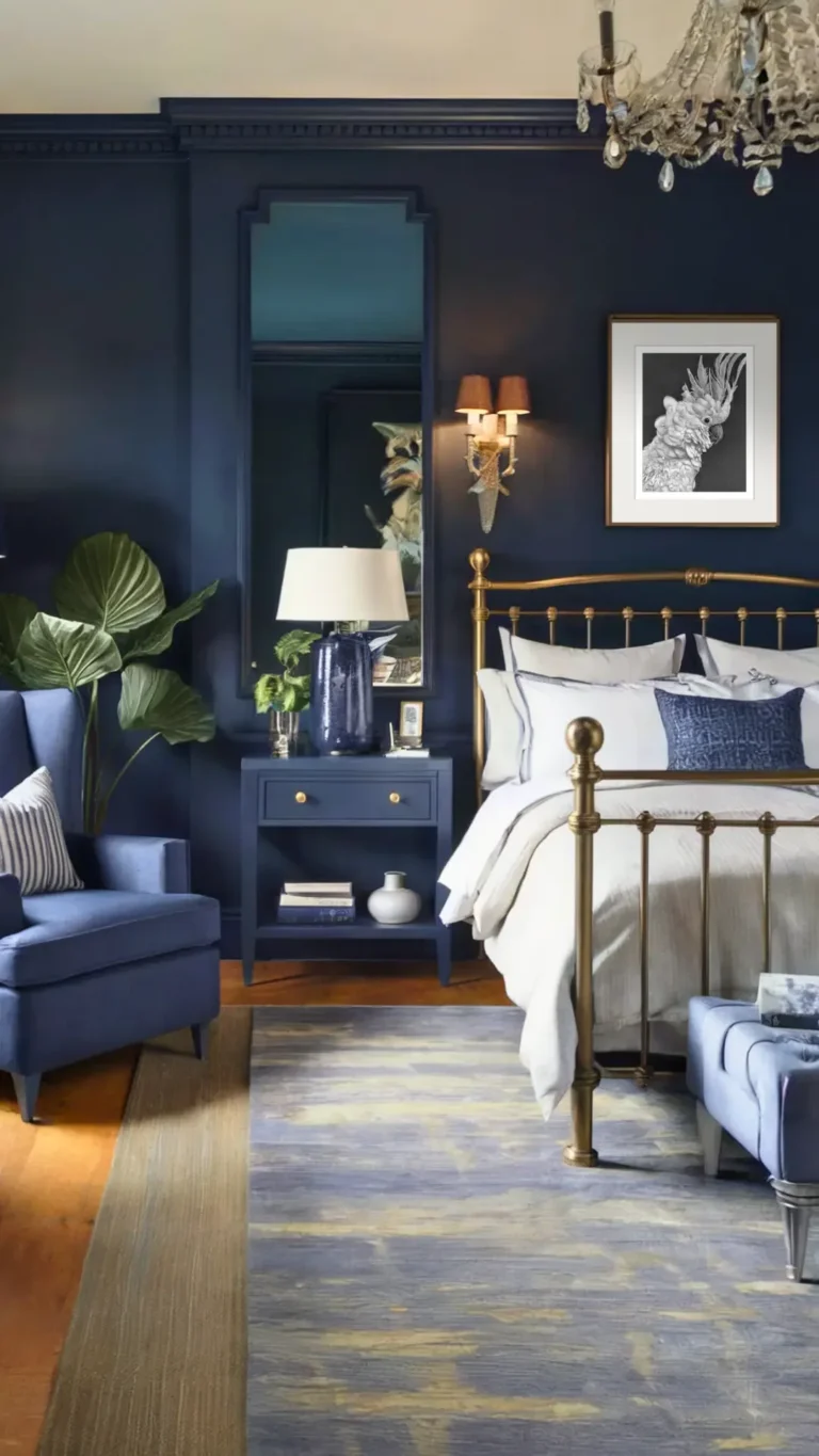
The goal is balance, not theme. For another take on balancing color with a strong mood, you can see how it’s done with moody blue or moody purple.