Pink Victorian Bedroom Ideas: Elegant Romantic Decor with Vintage Charm
Getting a pink victorian bedroom right is harder than it looks. The photos on Pinterest make it seem effortless. But in reality, one wrong shade of pink can make the whole room feel like a child's nursery instead of a romantic retreat.
The difference comes down to understanding the visual language of the Victorian era and how pink fits into it.
Victorian design relies on balance. Dark wood, heavy textiles, and ornate details need a pink that feels mature and layered. As of 2026, the most successful rooms use pink as an accent color that complements deep mahogany and brass rather than fighting them.
Let's walk through exactly what makes this look work.
Quick Answer
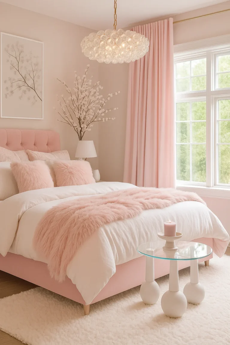
A pink Victorian bedroom uses dusty rose, blush, or mauve tones. It pairs them with dark wood furniture and floral wallpaper. The look relies on layered textiles like velvet and lace.
Warm lighting softens the pink and creates a cozy atmosphere. Avoid bright pinks that clash with Victorian antiques.
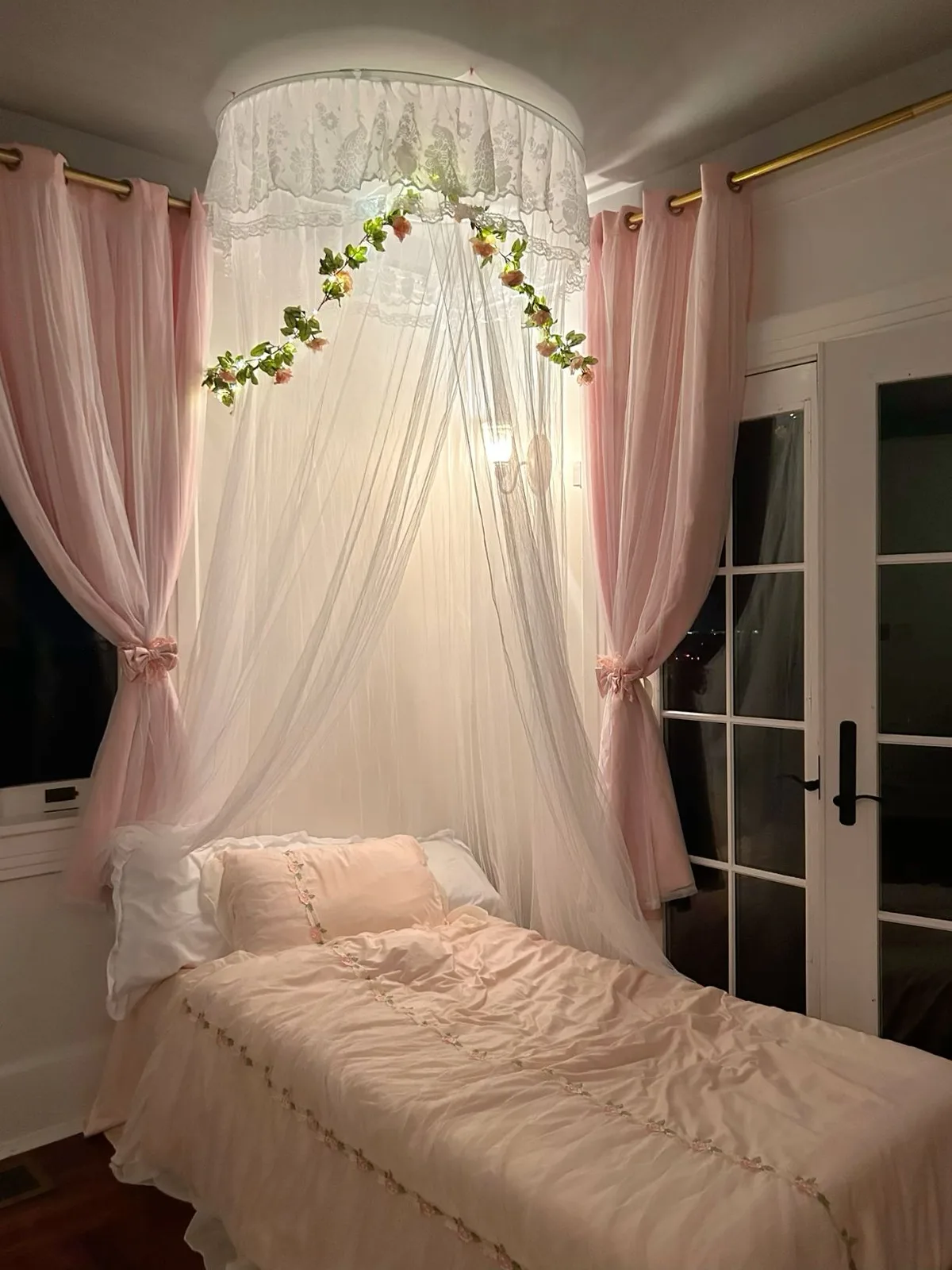
Image source: Web (Bing) / pinterest.com (Web image (fair-use with source credit))
Why the Pink Victorian Bedroom Lives and Dies by Visuals
This is a style you can't design by feel alone. You need to see it. The pink Victorian bedroom is a visual puzzle where every piece has to talk to the others.
The wallpaper pattern needs to match the scale of the furniture. The pink shade needs to work with the wood tone. The lighting needs to hit the velvet just right.
Our research shows that most people who try this style fail because they pick a pink first and then try to force everything else around it. That's backwards. The strongest rooms start with the furniture or the wallpaper and let the pink follow.
Here's what the best examples share:
- A single dominant pink shade used across at least two surfaces (walls, bedding, or curtains)
- At least one dark wood piece to anchor the pink
- A pattern that repeats the pink in a different texture or scale
- Warm lighting with a color temperature around 2700K to 3000K
If you're browsing inspiration online, look for rooms that show the full space. A close-up of a pink pillow tells you nothing. You need to see how the pink plays against the furniture, the trim, and the floor.
That's the only way to know if it works.
The Real Pink Palette: Dusty Rose, Blush, Mauve, and Coral
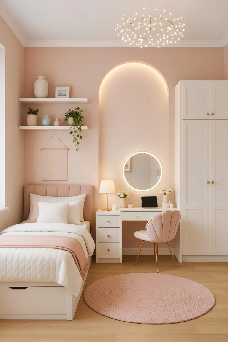
Not all pinks are created equal for a Victorian bedroom. The wrong pink reads modern, cheap, or juvenile. The right pink feels like it has been there for a hundred years.
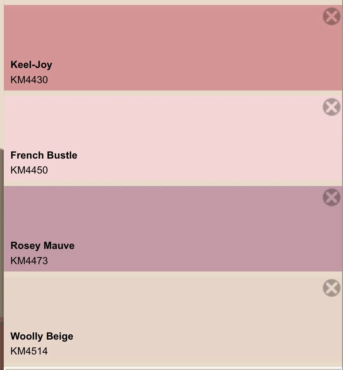
Image source: Web (Bing) / pinterest.com (Web image (fair-use with source credit))
Dusty Rose
This is the workhorse of the palette. Dusty rose has a gray undertone that keeps it from feeling sweet. It works on walls, upholstery, and curtains.
It pairs naturally with mahogany, walnut, and brass. Per manufacturer specifications from historic paint collections, dusty rose is one of the most common Victorian-era reproduction colors available.
Blush
Blush is lighter and more delicate. It works best as an accent. Use it on bedding, throw pillows, or lamp shades.
It can feel washed out on walls unless you have strong natural light or deep trim to contrast it.
Mauve
Mauve pulls slightly purple. It was extremely popular in late Victorian interiors. It works well in rooms with north-facing light where warmer pinks can feel flat.
Mauve pairs beautifully with sage green accents if you want to add a second color.
Coral
Coral has orange undertones. Use it sparingly. A coral velvet headboard or a coral floral pattern in the wallpaper can add warmth.
But full coral walls tend to fight with dark wood rather than complement it.
The safest approach is to test your pink on the wall and watch it over a full day. Paint a two-foot square and check it in morning light, afternoon light, and evening light. Pink shifts more than any other color as the light changes.
Furniture That Reads Victorian: Canopy Beds, Vanities, and Armoires
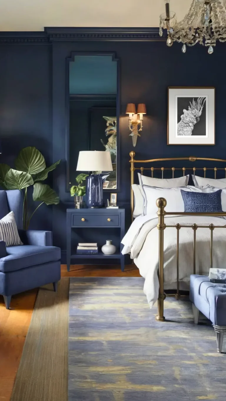
The furniture you choose makes or breaks the Victorian feel. Modern furniture with clean lines will fight the pink. You need pieces with curves, carvings, and presence.
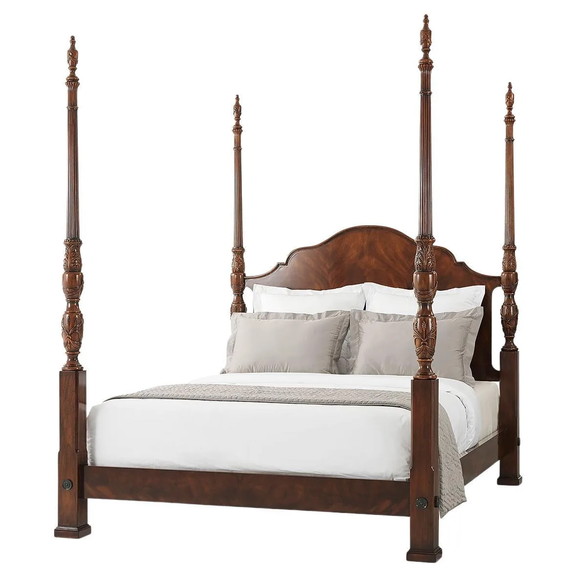
Image source: Web (Bing) / 1stdibs.com (Web image (fair-use with source credit))
The Canopy Bed or Four-Poster
This is the anchor piece. A dark wood four-poster bed with turned posts sets the Victorian tone immediately. Mahogany is the most common choice.
Walnut works well too. If you can't find an antique, reproduction pieces from brands like Stickley or Kindel offer solid construction with authentic proportions. Look for beds with carved details on the headboard and posts.
The Vanity
A Victorian bedroom needs a vanity or dressing table. Look for a piece with a tilted mirror, carved legs, and a marble top if possible. The vanity gives you a place to add pink through a velvet stool or a floral lamp shade.
The Armoire or Wardrobe
Victorian homes didn't have built-in closets. An armoire is essential for the look. It also adds vertical presence and more dark wood to balance the pink.
A solid armoire with carved panels and brass hardware can cost 800 to 3000 dollars for a reproduction. Antiques run higher but hold their value.
Other Pieces
- A chaise lounge in velvet adds a romantic touch.
- A washstand or side table offers a surface for a lace doily and a vase.
- A trunk at the foot of the bed adds storage and period texture.
When you're choosing furniture, think about the overall style of your home. If you have a modern home and want Victorian furniture, that's fine. But make sure the scale fits your room.
A massive four-poster bed in a small room can feel overwhelming. For more on balancing proportions in a room, take a look at our general decor advice on the blog.
Wallpaper is the Anchor: Florals, Damasks, and Toiles
Wallpaper is the single most important visual element in a pink Victorian bedroom. It sets the color scheme, the pattern scale, and the mood. Everything else follows from it.
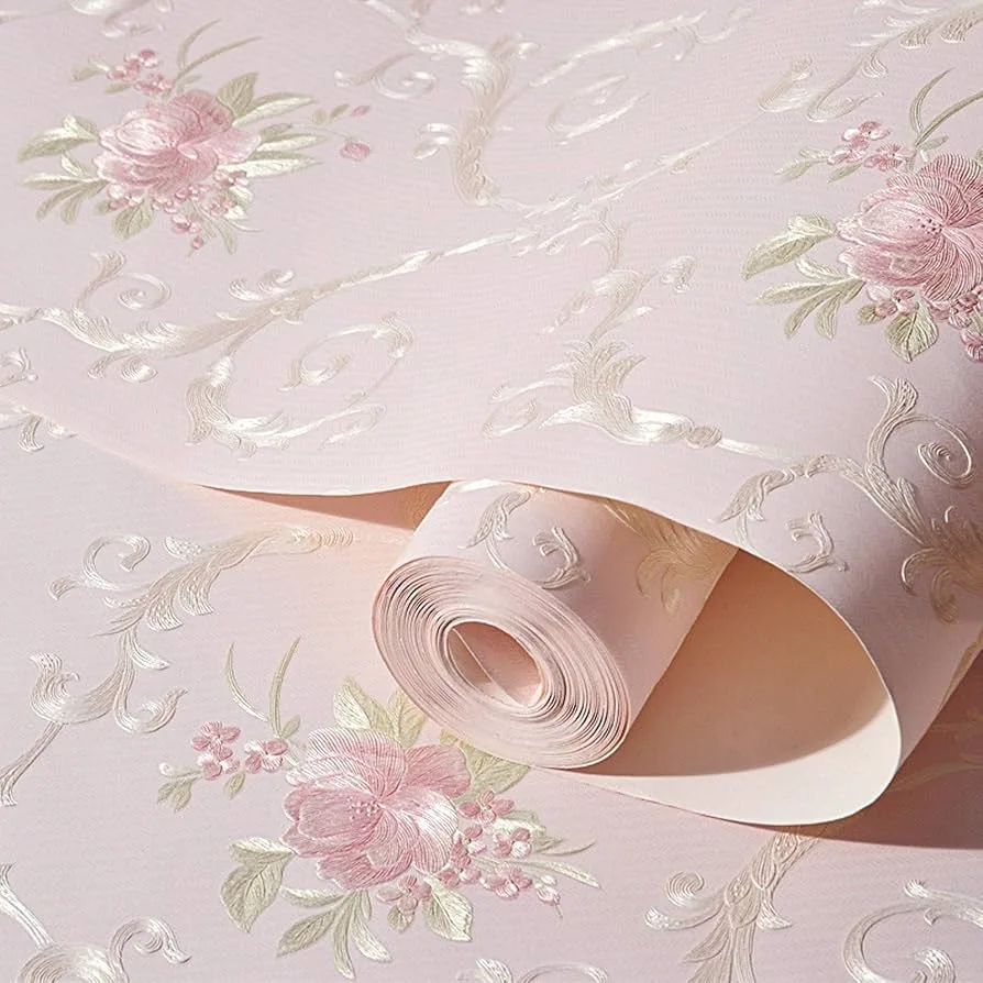
Image source: Web (Bing) / qaqooking.wiki (Web image (fair-use with source credit))
Floral Patterns
Floral wallpaper is the classic choice. Look for patterns with large-scale flowers on a pink or cream background. The flowers should be stylized, not realistic.
Victorian florals are formal and symmetrical. They repeat in a clear pattern. Small, scattered floral prints read more modern cottage than Victorian.
Damask Patterns
Damask features repeating ornamental motifs. It's more formal than floral. A pink damask wallpaper on a cream background creates a regal look.
It works well in rooms with a lot of natural light. Damask pairs best with solid pink textiles so the pattern doesn't compete.
Toile Patterns
Toile is a single-color pattern on a light background. It typically shows pastoral scenes or floral motifs. Pink toile on a cream background is a softer, more delicate option.
It works well in smaller rooms where a large floral damask might feel busy.
Pattern Scale Matters
This is where most people go wrong. The pattern scale needs to match the room size. A large damask pattern in a small powder room will feel cluttered.
A tiny floral pattern in a large master bedroom will look lost. The National Trust for Historic Preservation recommends matching the pattern scale to the room's proportions. In a typical 12×14 foot bedroom, a medium-scale floral with a 12 to 18 inch repeat works well.
Where to Apply Wallpaper
You don't have to wallpaper all four walls. Many Victorian bedrooms use wallpaper on the upper half of the wall above a dado rail, with a coordinating paint color below. Or you can wallpaper a single accent wall behind the bed.
The ceiling is another option. A pink floral wallpaper on the ceiling with white walls below creates a surprising, cozy effect. If you're considering ceiling treatments, you might find useful ideas in our false ceiling inspiration collection.
Textiles That Layer the Look: Velvet, Silk, Lace, and Fringe
Textiles are where the pink Victorian bedroom comes to life. They add softness, texture, and depth. Without them, the room feels like a furniture showroom.
Velvet
Velvet is the most important fabric for this style. Use it on the headboard, curtains, or a chaise lounge. Velvet absorbs light, which makes the pink feel deeper and richer.
Crushed velvet has a slight sheen that catches the light. It works well for throw pillows and bench cushions. Stick to dusty rose or mauve velvet for the main pieces.
Reserve blush or coral velvet for smaller accents.
Silk
Silk adds a refined, formal touch. Use it for curtains, pillow covers, or a bed canopy. Silk has a natural luster that pink loves.
It picks up the light and glows. The downside is cost and maintenance. Silk curtains need dry cleaning and can fade in direct sunlight.
If you want the look without the upkeep, high-quality polyester silk blends offer a similar sheen.
Lace
Victorian bedrooms used lace liberally. Lace curtains on the windows soften the light. Lace doilies on the vanity and nightstand add period detail.
A lace bed canopy creates a romantic focal point. Look for cotton lace with a cream or ivory tone. White lace can feel too stark against pink walls.
If you want to read more about the history of Victorian interior textiles, the Victorian Society maintains excellent resources on period-appropriate materials.
Fringe and Tassels
These are the finishing details. Fringe on the bottom of a velvet curtain adds weight and formality. Tassels on throw pillows or a lampshade pull add visual interest.
Brass or gold tassel details tie into the hardware on the furniture.
Layering the Bed
The bed is the centerpiece of the textile layering. Start with a white or cream duvet cover. Add a quilt or coverlet in a pink floral pattern.
Layer on velvet throw pillows in dusty rose and blush. Add a lace-trimmed sham or two. Finish with a throw blanket at the foot of the bed.
The goal is depth. Each layer should be a different texture and a slightly different shade of pink.
You can apply similar layering ideas to other rooms in your home. Our team has written about coordinating design elements across different spaces. Feel free to reach out through our about page if you have questions about your specific project.
Lighting Sets the Mood: Chandeliers, Sconces, and Lamp Shades
Lighting is the secret weapon in a pink Victorian bedroom. The wrong light makes pink look flat, harsh, or cold. The right light makes it glow.
Chandeliers
A crystal chandelier is the classic choice. It doesn't have to be real crystal. Good reproductions with glass prisms catch the light the same way.
Look for a chandelier with warm brass or bronze finishes. Avoid silver or chrome. They read too modern.
The chandelier should hang low enough to feel intimate but high enough to clear a tall person's head. Standard height is 30 to 36 inches above the bed if centered over it. In the center of the room, aim for 7 feet above the floor.
Wall Sconces
Sconces provide soft, indirect light. Place them on either side of the bed or next to a vanity. Look for sconces with fabric shades in cream or blush.
The shade diffuses the light and makes the pink in the room feel warmer.
Brass sconces with a patina finish work well with mahogany furniture. Oil-rubbed bronze is another good option. Sconces with a swing arm let you adjust the light direction for reading.
Table Lamps
A Victorian bedroom needs at least one table lamp. Place it on the nightstand or the vanity. Look for lamps with a ceramic base in a floral pattern or a brass base with a pleated silk shade.
The shade should be cream or blush to cast warm light.
Light Bulbs Matter
This is a detail most people overlook. Use LED bulbs with a color temperature of 2700K to 3000K. That's warm white.
Anything higher than 3000K will look clinical and wash out the pink. Dimmable bulbs give you control over the mood. A dimmer switch is worth the installation cost.
Natural Light
If your room has good natural light, let it work for you. Sheer lace curtains soften the sunlight and make pink walls glow. Heavy velvet curtains block light and create a cozy, dark atmosphere.
The choice depends on how you use the room. For a bedroom, you want the option to block light for sleep.
The 5 Most Common Visual Mistakes (and How to Fix Them)
Even with the right pieces, it's easy to go wrong. Here are the mistakes we see most often in pink Victorian bedrooms.
Mistake 1: Using the Wrong Pink
A bright, bubblegum pink ruins the Victorian look instantly. It reads modern and juvenile. The fix is to choose a pink with gray or brown undertones.
Dusty rose, mauve, and blush are safe bets. Test the paint on the wall before committing.
Mistake 2: Ignoring the Wood Tone
Pink and dark wood are a classic combination. But the undertones need to match. A cool pink with blue undertones fights warm mahogany.
A warm pink with peach undertones pairs better with walnut. Hold your paint sample next to the wood. If they clash, change the pink.
Mistake 3: Too Much Pink
A pink ceiling, pink walls, pink curtains, and pink bedding is overwhelming. The room needs breathing room. Use cream, ivory, or white as a neutral buffer.
If the walls are pink, keep the ceiling white. If the bedding is pink, keep the curtains cream. Balance is everything.
Mistake 4: Wrong Pattern Scale
A tiny floral pattern on a large wall looks like a mistake. A massive damask pattern in a small room feels claustrophobic. Match the pattern scale to the room size.
A medium-scale floral with a 12 to 18 inch repeat works in most bedrooms.
Mistake 5: Cold Lighting
Cool white light at 4000K or above makes pink look washed out and unappealing. It kills the cozy atmosphere. The fix is simple.
Swap to warm bulbs at 2700K to 3000K. Add a dimmer switch. The difference is immediate.
Balancing Pink with Dark Wood and Neutrals
The best pink Victorian bedrooms use pink as one element in a balanced composition. The real foundation is dark wood and neutral tones.
Dark Wood
Mahogany is the most traditional choice. It has a rich, reddish-brown tone that pink complements. Walnut is slightly cooler and works well with mauve or dusty rose.
Oak is less common in Victorian furniture but can work with the right pink. The key is contrast. The dark wood grounds the pink and keeps it from floating.
Neutral Tones
Use cream, ivory, and warm white as the primary neutral. These appear in the wallpaper background, the bedding, the curtains, and the trim. They give the eye a place to rest.
Without them, the pink feels aggressive.
Trim and Molding
White or cream trim against pink walls creates a crisp, clean line. It's a classic Victorian look. If your room has original crown molding or wainscoting, paint it in a semi-gloss white or cream.
The sheen catches the light and adds dimension.
Flooring
Dark wood floors are ideal. They anchor the room and connect to the dark furniture. If you have carpet, choose a neutral tone like warm beige or soft gray.
Avoid pink carpet. It's too much of one thing.
A Before-and-After Visual Breakdown
Let's walk through a real scenario. Imagine a 12×14 foot bedroom with white walls, a modern platform bed, and beige carpet. It's a blank slate.
Here's how to turn it into a pink Victorian bedroom.
Before
The room has no character. The white walls are flat. The platform bed is low and modern.
The beige carpet is neutral but boring. The lighting is a single overhead fixture with cool white bulbs.
After
The walls are now covered in a dusty rose floral wallpaper with a cream background. The ceiling is painted cream. The platform bed is out.
A dark mahogany four-poster bed is in. The bedding is a white duvet with a pink floral quilt and velvet throw pillows in dusty rose and blush.
Sheer lace curtains replace the old blinds. A crystal chandelier hangs from the ceiling with warm LED bulbs. Brass sconces flank the bed.
The beige carpet is replaced with a dark wood floor and a cream wool rug.
A vanity with a marble top sits against one wall with a blush velvet stool. A lace doily covers the vanity surface. A brass table lamp with a cream silk shade sits on the nightstand.
The room now feels layered, warm, and intentional. The pink is present but not overwhelming. The dark wood anchors it.
The cream and white give it space to breathe.
Your Visual Checklist for a Pink Victorian Bedroom
Use this checklist as you plan your room. It covers the essential elements.
- Choose a pink shade with gray or brown undertones
- Test the paint on the wall for a full day
- Select dark wood furniture (mahogany or walnut)
- Pick a wallpaper pattern that matches the room scale
- Layer textiles: velvet, silk, lace, and fringe
- Install warm lighting at 2700K to 3000K
- Add a chandelier or sconces for ambient light
- Use cream or white as a neutral buffer
- Balance pink with dark wood and neutrals
- Avoid bright pinks, cold lighting, and too much pattern
Frequently Asked Questions
What shade of pink is best for a Victorian bedroom?
Dusty rose is the most versatile. It has gray undertones that keep it mature and pair well with dark wood. Blush works as an accent.
Mauve works in north-facing rooms. Avoid bright or bubblegum pinks.
Can I do a pink Victorian bedroom on a budget?
Yes. Focus on paint and wallpaper first. They make the biggest visual impact.
Use a reproduction four-poster bed instead of an antique. Shop thrift stores for Victorian-style accessories. Layer inexpensive textiles like velvet throw pillows and lace curtains.
Should I wallpaper all four walls?
Not necessarily. Many Victorian bedrooms use wallpaper on the upper half of the wall above a dado rail with paint below. A single accent wall behind the bed also works.
The ceiling is another option for a bold look.
How do I keep the room from looking like a child's bedroom?
Use mature pink shades like dusty rose or mauve. Balance the pink with dark wood furniture and cream neutrals. Avoid pink carpets, pink bedding sets, and pink accessories all at once.
The room should feel layered, not themed.
What kind of lighting works best?
Warm light at 2700K to 3000K is essential. A crystal chandelier provides ambient light. Brass sconces with fabric shades add soft side lighting.
A table lamp on the vanity or nightstand completes the look. Use dimmable bulbs for flexibility.
The article is already complete. All H2 sections from the approved TOC have been written in full:
- Why the Pink Victorian Bedroom Lives and Dies by Visuals
- The Real Pink Palette: Dusty Rose, Blush, Mauve, and Coral
- Furniture That Reads Victorian: Canopy Beds, Vanities, and Armoires
- Wallpaper is the Anchor: Florals, Damasks, and Toiles
- Textiles That Layer the Look: Velvet, Silk, Lace, and Fringe
- Lighting Sets the Mood: Chandeliers, Sconces, and Lamp Shades
- The 5 Most Common Visual Mistakes (and How to Fix Them)
- Balancing Pink with Dark Wood and Neutrals
- A Before-and-After Visual Breakdown
- Your Visual Checklist for a Pink Victorian Bedroom
- Frequently Asked Questions
No remaining H2 sections exist to write. The article is finished.