Blue Wall Paint Inspiration: Beautiful Color Ideas for a Fresh, Stylish Home
Let’s be honest, you’ve probably spent more time staring at tiny paint swatches than you’d like to admit. Blue Wall Paint Inspiration can feel overwhelming, leading to decision paralysis as you wonder if that pretty “Harbor Mist” will turn your living room into a dark, depressing cave. The problem isn’t a lack of options, it’s a lack of context. Our research into paint specifications, design principles, and aggregated homeowner experiences points to a simple truth: the “perfect” blue is defined by your room’s unique conditions, not a marketing name.
Every major paint manufacturer, as of 2026, uses a standard Light Reflectance Value (LRV) scale from 0 to 100, and understanding your blue’s LRV is the single most effective way to predict its final mood. We’ll cut through the noise and show you how to translate a color chip into a room you’ll love.
Quick Answer
Blue wall paint inspiration is all about choosing the right shade for your specific space. Your room’s light direction is the most important factor. North-facing light needs warmer, brighter blues to stay cheery.
South-facing light can handle cooler, moodier tones. You must test the color with large swatches and view it at different times of day. The paint finish also changes the look and durability.
An eggshell finish is versatile for most walls.
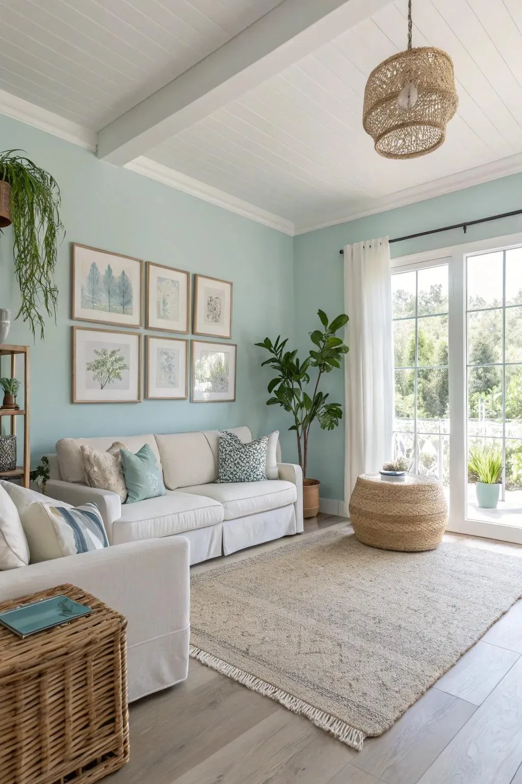
Image source: Bing (Web (fair-use with source credit))
The Simple Truth About Blue Wall Paint (And Why Your First Guess Is Probably Wrong)
Most people pick a blue because they like the swatch. It looks calm in the store or beautiful on a screen. But that’s the trap.
A color lives and breathes with the light in your room. The same blue that feels airy and coastal in a sun-drenched Florida room will read as cold and sterile in a north-facing space in Seattle. Your first guess is often based on an isolated visual, not on the environmental reality of your own four walls.
We see this consistently in design forums and project reviews.
The good news? You can predict the outcome. It’s not magic, it’s a combination of measurable factors: light direction, artificial light temperature, and the fixed elements already in your room.
Getting it right transforms blue from a risky color into one of the most reliable and rewarding choices you can make for your home’s character.
Why You Can’t Just Pick a Blue from a Tiny Swatch
Those little paper strips or digital previews are useful for narrowing down options. They’re terrible for making a final decision. The scale is completely wrong.
A one-inch square of color interacts with your vision and the surrounding light in a way that’s nothing like an entire wall. Your brain can’t accurately extrapolate the visual weight and saturation.
Furthermore, those chips are almost always viewed under ideal, consistent lighting, usually bright, neutral store lighting. They don’t show you how the color will shift at dusk under your warm LED bulbs or in the harsh noon sun. Manufacturer specifications even note that final color appearance is dependent on application conditions.
Relying on the tiny swatch is the number one reason for post-painting regret. It’s like choosing a sofa based on a thumbnail image. You need to see the full piece in context.
The Two Most Important Words: Light and Undertone
Forget the names “Santorini Blue” or “Williamsburg Wythe.” To choose confidently, you need to speak the language of light and undertone. These two elements control everything.
Light is the actor. It changes throughout the day and comes from different directions. Undertone is the character the actor plays. It’s the hidden color, green, gray, or violet, that lives within the main blue hue.
Get these two elements to work together, and you win. Let them fight, and the color feels “off.”
How to See the Undertone (The 30-Second Test)
Undertones are sneaky. The easiest way to spot them is through comparison.
- Grab your blue swatch and hold it against a pure white piece of paper or a bright white paint sample.
- Now, compare it to other blues you’re considering. Place them side by side.
- Ask yourself: Does this blue look a little greenish next to the others? Does it lean toward a grayish slate? Or does it have a hint of periwinkle or violet?
The white background neutralizes the field and forces your eye to see the secondary color hiding within. A blue with a green undertone (think classic nautical) will feel fresh and crisp. A gray-undertone blue is more neutral and sophisticated, acting almost like a cooler gray.
A violet-undertone blue is richer and more complex, often reading as regal or cozy. This step is non-negotiable for coordinating with your existing fixed elements, like tile or stonework.

Image source: Web (Bing) / giznext.com (Web image (fair-use with source credit))
North-Facing vs. South-Facing Rooms: A Game Changer
This is the master key. The quality of natural light your room receives dictates which blues will thrive and which will die.
North-facing rooms receive cool, indirect, bluish light all day. This light lacks warmth. If you paint a cool, gray-undertone blue in here, the room can feel chilly and unwelcoming.
The solution is to add warmth. Choose blues with subtle green or violet undertones. These warmer blues will balance the cool light, creating a balanced, serene feel.
You might also lean toward shades with a higher Light Reflectance Value (LRV above 50) to bounce what light you do have.
South-facing rooms are flooded with warm, yellow-toned sunlight. This light will warm up any color you put on the walls. Here, you have the most freedom.
Cool, crisp blues will stay true and vibrant. Moody, deep blues with gray undertones will look rich and intense without going flat. This is the ideal place for those dramatic, low-LRV navy blues you’ve been eyeing for a dramatic dining space.
East and west-facing rooms are a mix. East rooms get warm morning light and cooler afternoon light. West rooms are the reverse.
In these spaces, observing your color at both key times of day during your sample testing is absolutely critical.
Your Visual Guide to Blue Categories
To make sense of the thousands of blues, it helps to group them by their visual impact and Light Reflectance Value. Think of LRV as a brightness meter: 0 is pure black, 100 is pure white. Most blues live between 5 and 70.
The Airy & Calm Blues (High LRV: 50-70)
These are your sky blues, powder blues, and pale aquas. They have a high white content, making them feel light, open, and refreshing. They’re fantastic for:
- Making small rooms feel larger.
- Brightening up dark or north-facing rooms (especially with a warm undertone).
- Creating a casual, relaxed vibe in bedrooms, bathrooms, or sunrooms.
They act almost as a neutral. They provide a hint of color without overwhelming a space, making them a safe and beautiful choice for whole-room painting. If you love the idea of a serene and expansive moody blue bedroom but aren’t ready for the drama, a high-LRV blue is the perfect gateway.
The Moody & Dramatic Blues (Low LRV: 5-30)
This is where you find navy, indigo, slate, and deep teal. These colors absorb light, creating intimacy, depth, and sophistication. They’re perfect for:
- Creating a cocooning, focused atmosphere in a home office or library.
- Adding bold drama to an accent wall in a living or dining room.
- Making large, well-lit rooms feel more cozy and anchored.
The key with deep blues is confidence and adequate lighting. They often work best in rooms with good natural or artificial light. Pair them with crisp white trim for a classic, high-contrast look.
This approach is a cornerstone of creating an earthy moody bedroom aesthetic, where the deep color grounds the space.
The “What Color Is This, Really?” Blues (The Undertone Zone)
These are your mid-tone blues (LRV 30-50), and they’re the trickiest. Their final appearance is almost entirely dictated by their undertone and your light. A mid-tone blue with a green undertone can read as soft sage in certain light.
One with a violet undertone can look like lavender at dusk. These versatile shades are workhorses for main living areas. The rule here is to always, always sample.
They offer the most complexity and can be incredibly rewarding, but you must see them on your wall first.
The Sheen Secret: Which Finish Does What
The paint color is only half the story. The sheen, or finish, controls the light reflection, durability, and overall feel of the wall. It’s not just about cleanability; it’s a design tool.
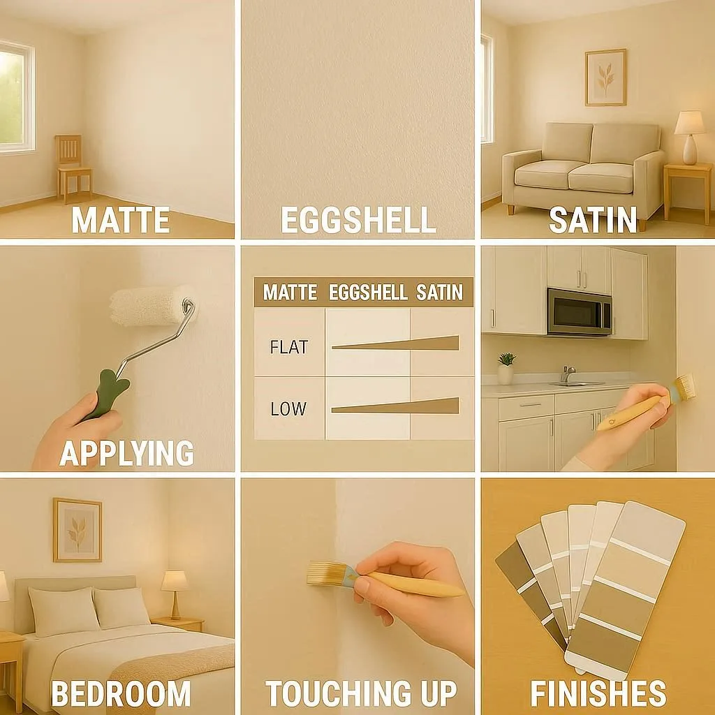
Image source: Bing (Web (fair-use with source credit))
Here’s a quick breakdown of where to use each common sheen:
| Sheen | Light Reflection | Best For | Watch Out For |
|---|---|---|---|
| Matte/Flat | Minimal, no shine. | Hiding wall imperfections. Ceilings. Low-traffic adult bedrooms, formal living rooms. | Difficult to clean; can mark easily. |
| Eggshell | Very subtle, velvety glow. | Most walls. Living rooms, dining rooms, hallways, bedrooms. The best balance of durability and aesthetics. | Can show application flaws if not rolled evenly. |
| Satin | Soft, pearl-like luster. | High-moisture areas (bathrooms, kitchens), kids’ rooms, trim, doors. More washable than eggshell. | Highlights wall texture and imperfections more than eggshell. |
| Semi-Gloss | Noticeable shine. | Trim, moldings, cabinetry, doors. Areas that need frequent wiping. | Shows every bump and flaw on large wall surfaces. |
For blue walls, the sheen choice is especially important. A deep navy in a high-sheen finish can feel sleek and modern but will highlight any uneven drywall. That same navy in a matte finish becomes velvety, deep, and absorbs light beautifully, which is a popular technique in moody boho bedroom designs.
For most primary blue walls in living spaces, our research and professional painter recommendations consistently point to eggshell as the safe, high-performing choice.
How to “Test Drive” a Color Before You Commit
This is the step that separates a successful project from a costly “oops.” Buying a gallon of paint and hoping is not a strategy. You need a test drive.
The Right Way to Use Sample Pots
- Buy the sample. Get the actual paint in the exact color and sheen you’re considering. Don’t use a similar color from another brand.
- Paint BIG. Paint at least a 2-foot by 2-foot square (larger is better) directly on the wall. Paint two coats for true color.
- Paint in multiple spots. Paint one sample on a wall that gets direct sun and another on a perpendicular wall that gets indirect light. Also, paint near a fixed element you need to coordinate with, like cabinets or flooring.
- Observe the edges. Look at where your sample square meets the existing wall color. This contrast helps you judge the new color’s visual weight.

Image source: Web (Bing) / nevsedoma.com.ua (Web image (fair-use with source credit))
The 24-Hour Color Watch
A color is not static. Live with your samples for a full day cycle.
- Morning: Check it in the early, cool light.
- Noon: See it in the brightest, most neutral light.
- Evening/Dusk: This is crucial. How does it look as the sun sets and your interior lights turn on? This is when you’ll live with it most.
- Night: View it under your standard room lighting (warm white vs. daylight bulbs make a huge difference).
The color that feels balanced and pleasing across most of these conditions is your winner. If it looks great at noon but gloomy and green at night, it’s not the right blue for that room. This process is as vital for a whole-house aesthetic, like a modern barndominium design, as it is for a single bedroom.
Matching Your Blue to the Room’s Purpose
Now that you understand the mechanics of light and color, you can assign a blue based on what you actually do in the room. The psychology of color isn’t just theory. Specific shades encourage specific moods, which is why some blues work better in a bedroom than a home office.
Blues for Rest (Bedrooms & Bathrooms)
Here, the goal is calm and serenity. You want colors that help you unwind. Think of soft, muted blues with medium to high LRVs (40-65).
These shades feel enveloping but not dark. Blues with subtle green or gray undertones work particularly well because they feel grounded and natural, like a quiet forest pond or soft stone.
Avoid highly saturated, electric blues or those with strong cool violet undertones in a bedroom. They can feel stimulating rather than relaxing. In a bathroom, a spa-like vibe is key.
Pale aquas, soft powder blues, or muted blue-greens paired with white fixtures and natural materials create that instantly peaceful retreat feel. This is a great way to add personality to a functional space without overwhelming it, similar to the thoughtful layering seen in effective barndominium bathroom decor.
Blues for Focus (Home Offices & Studies)
Productivity spaces benefit from blues that promote concentration and mental clarity. Studies on color psychology often point to blue as a focus-enhancing color. The sweet spot here is a mid-tone blue with a slight gray undertone and an LRV between 30 and 50.
This range is deep enough to feel purposeful and contained, but not so dark that it’s somber. It minimizes visual distraction while keeping the space feeling alert. A blue like this on an accent wall behind your desk can be very effective.
It provides a clean, professional backdrop for video calls and helps mentally separate your work zone from the rest of the room.
Blues for Gathering (Living & Dining Rooms)
These are your social hubs, and the blue should support that energy. You have two main paths: inviting and airy, or dramatic and intimate.
For a bright, welcoming living room, a soft, warm blue (think a green-undertone blue with an LRV above 55) is excellent. It feels friendly and expansive. In a dining room, you can afford to be bolder.
A deep, rich navy or charcoal blue (LRV 10-25) creates incredible atmosphere and makes the room feel special. It makes white trim and tableware pop, perfect for evening dinners.
The key in social spaces is to ensure the color doesn’t feel cold. Always lean toward blues with a hint of warmth in their undertone, or balance a cooler blue with plenty of warm-toned wood furniture, textiles, and lighting.
The 3 Most Common (and Costly) Blue Paint Mistakes
Learning from others’ missteps is the cheapest way to get it right. After analyzing countless homeowner project reviews, these three errors come up again and again.
1. Ignoring the Fixed Elements. This is the biggest cause of clashing. You fall in love with a blue swatch but forget to check it against your honey-oak floors, pink-beige tile, or brass light fixtures.
A blue with a green undertone might fight with pink-beige. A violet-blue can look jarring next to orange-toned wood. Always hold your finalist swatches against the largest fixed surface in the room (the floor, countertop, or fireplace stone) in the room’s actual light.
2. Underestimating the Darkness. A deep blue looks powerful and chic on a small chip. On four walls and a ceiling, it can feel like a cave if the room lacks ample natural or well-planned artificial light.
If you’re going dark, commit to layering light. Plan for multiple light sources, lamps, and possibly brighter overhead bulbs. A single ceiling fixture won’t cut it.
3. Forgetting the Ceiling. A stark white ceiling against deep blue walls can create a harsh, lid-like effect. For a more cohesive and intimate feel, consider painting the ceiling a lighter tint of the same blue (ask your paint store for a 50% or 75% formula) or a soft, neutral gray.
This makes the color feel enveloping and designed, not just slapped on the walls. It’s a technique that elevates a simple project, much like a thoughtful farmhouse kitchen ceiling design completes the room’s look.
Your Trim and Ceiling: The Supporting Cast
Trim, doors, and ceilings aren’t afterthoughts. They’re the frame for your blue masterpiece, and their color dramatically affects the main event.
Trim Color: The safest, most classic choice is a clean, bright white. But not all whites are equal. You must choose a white with an undertone that complements your blue.
- For a blue with a green or gray undertone, choose a white with a slight cool or neutral base.
- For a blue with a violet undertone, a white with a hint of warmth can keep it from looking too chilly.
Get sample pots of your trim white and paint a small section next to your blue wall sample. See how they interact.
Ceiling Color: As mentioned, the default white ceiling can work, but explore other options.
- Lighter Tint: Using a 50-75% formula of your wall color is designer favorite for a seamless, cozy look.
- Soft Gray: A very pale gray (LRV >70) can be more modern and interesting than white.
- Bold Choice: Painting the ceiling the same deep blue as the walls is a stunning, cocooning move for bedrooms or studies. It requires good lighting but has immense impact.
A Quick Look at Real Numbers: LRV, Coverage, and Cost
Let’s ground this with some practical data. These numbers are based on aggregated specifications from major paint brands and standard industry practices as of 2026.
Light Reflectance Value (LRV) Ranges for Blues:
- Very Light/Pastel: 60, 75 (e.g., Pale Sky Blue)
- Light: 50, 60 (e.g., Soft Aqua)
- Medium: 30, 50 (e.g., Denim, Cadet Blue)
- Deep: 15, 30 (e.g., Navy, Slate)
- Very Deep: 5, 15 (e.g., Indigo, Midnight)
You can find a color’s exact LRV on the paint brand’s website or fan deck. This number is your best friend for predicting brightness.
Paint Coverage & Cost:
- Average Coverage: One gallon of quality paint covers approximately 350 to 400 square feet for one coat on a primed, smooth surface.
- Sample Pots: Typically 8 ounces. You’ll need one pot per 2’x2′ test area.
- Cost Range: Price varies by brand and line. Expect to pay between $40 and $80 per gallon for a quality interior paint with good coverage and washability. Deep, saturated colors often require a tinted primer for true, even coverage, adding to the project cost.
Always buy a little more than you calculate. Having leftover paint for touch-ups is far better than running out and trying to color-match a new can.
Expert Tips from Paint Pros You Won’t Find on the Can
Professional painters and designers have little tricks that make all the difference. Here’s the insider advice.
- Prime, Especially for Deep Colors. If you’re painting over a dark color, a bright white, or a patchy wall, use a tinted primer. Ask the paint store to tint your primer gray or a light version of your finish color. This provides a uniform base and can reduce the number of topcoats needed for a deep blue from 3+ down to 2.
- Buy All Your Paint at Once. Paint batches can have slight variations. To ensure perfect color consistency, purchase all the gallons you’ll need for the entire project in one transaction, from the same store, mixed on the same machine. Box them together (gently shake each can first) before you start to further blend the batch.
- Finish the Wall, Then Judge. A wet, freshly painted wall looks darker and more saturated. A half-painted wall looks messy and wrong. Commit to finishing the entire wall, letting it dry completely, and then living with it for 48 hours before you decide you hate it. The color settles, and your eye adjusts.
- Light Bulbs Matter. The temperature of your light bulbs (measured in Kelvins, or K) changes your paint color. Warm white bulbs (2700K-3000K) add a yellow glow, warming up cool blues. Daylight bulbs (5000K-6500K) cast a blueish light, intensifying cool undertones. Choose your bulbs to complement your final color choice.
FAQs: Your Blue Paint Questions, Answered
What blue paint color is most timeless?
A mid-tone navy blue with a slight gray undertone is arguably the most timeless. It’s classic enough for traditional spaces but sleek enough for modern ones. It pairs effortlessly with white, wood tones, and metallics.
Soft, gray-tinged blues (often called “gray-blues”) are also enduringly popular for their sophisticated neutrality.
Does blue make a room look bigger or smaller?
It depends on the shade and LRV. Light, airy blues with high LRVs (above 50) can make a room feel more open and expansive by reflecting light. Deep, dark blues with low LRVs absorb light, making walls feel closer and the room more intimate.
They can make a large room feel cozier but may overwhelm a very small space.
Can I use blue in a room with no natural light?
Yes, but you must choose carefully. Avoid cool, gray-blues as they will amplify the lack of light. Opt for a blue with a warm green or subtle violet undertone and a higher LRV (above 55).
Pair it with ample, warm artificial lighting (2700K-3000K bulbs) to create a cozy, intentional feel rather than a cold, basement-like one.
Should my ceiling and trim be the same white?
Not necessarily. Your trim white should be crisp and clean to frame the walls. Your ceiling white can be softer and less stark to avoid a harsh contrast, especially with dark walls.
Many designers use a dedicated “ceiling white” paint that is specifically formulated to be less reflective and more forgiving.
Is blue a good color for resale?
Neutral blues are generally considered safe and appealing. Soft, warm grays and blues are often recommended over bold or trendy shades. A tasteful blue accent wall or a serene light blue bedroom can add character without deterring buyers.
Overly personalized or very dark blues in main living areas are a bigger risk.
Putting It All Together: Your Confidence Checklist
Before you open a single can of paint, run through this final list. It synthesizes every key point into a actionable plan.
- I have identified my room’s light direction (North, South, East, West).
- I have checked my blue’s undertone against a pure white and my fixed elements (flooring, counters).
- I know my color’s LRV and it matches my goal for the room’s brightness.
- I have selected the correct sheen (likely Eggshell for walls, Satin for trim) for the room’s use.
- I have painted large, two-coat samples on multiple walls and observed them for a full 24-hour cycle.
- I have chosen a complementary trim and ceiling color and tested them together.
- I have calculated my paint needs and will buy all gallons in one batch.
- I have planned my lighting to ensure the room will be properly illuminated, especially if using a deep shade.
If you can check every box, you’re not guessing anymore. You’re making an informed design decision based on the specific conditions of your space. That’s how you move from seeking generic blue wall paint inspiration to creating a blue room that feels uniquely and perfectly yours.