Purple Accent Wall Painting Tips for a Bold, Stylish Look
Choosing a purple accent wall is a move that feels either brilliant or terrifying. You’ve probably seen that gorgeous, moody plum wall on Pinterest and thought, “Yes, that.” But then you stare at a paint chip, and suddenly you’re paralyzed. Is that “Lavender Mist” going to look baby blue?
Will “Rhapsody” turn your living room into a grape jelly jar? That’s the exact moment most purple accent wall painting tips fall short. They tell you to pick a color you love, but they don’t show you how to see what that color will actually become in your light.
The secret isn’t in the brush or the brand. It’s in understanding two concrete variables: Light Reflectance Value (LRV) and undertone. The LRV, a standard measurement on every major paint brand’s spec sheet, tells you how much light a color bounces back.
A deep plum might have an LRV of 20, absorbing most light, while a soft lilac could be 70. Getting this wrong is the number one reason a purple feels “off.” As of 2026, the most common mistake we see in aggregate reviews is choosing a purple based on a tiny chip without testing its behavior in the actual room. Let’s walk through how to get it right, from the science of the color to the final stroke.
Quick Answer
Start by identifying the purple’s undertone with large swatches under your room’s light. Paint the wall you see first, often behind a bed or sofa. Always test samples in two-foot squares on the wall for 48 hours.
Use a tinted primer for deep purples to save on coats. Pair bold purples with crisp white trim for a classic, clean finish.
Why a Purple Accent Wall Isn’t Just About Painting
Think of an accent wall as a frame. It’s not just a splash of color; it’s a deliberate design tool that directs the eye and defines the space. A purple accent wall works because purple itself is a complex color, it’s a blend of calming blue and energetic red.
This gives you a huge range, from serene to dramatic, all within one color family. The goal isn’t to just paint one wall a different color. It’s to use that wall to solve a design problem or create a specific feeling.
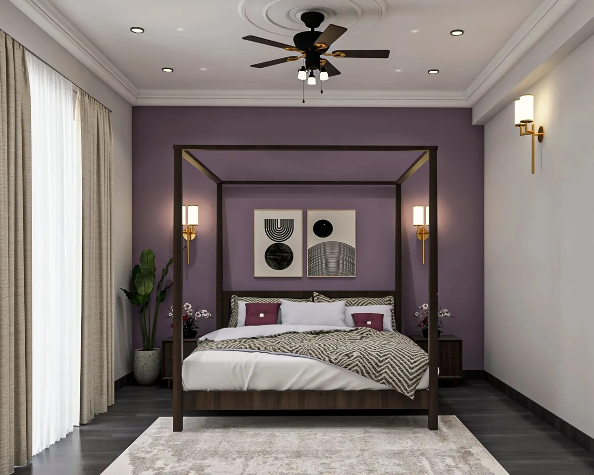
For example, in a long, narrow room, painting the shorter end wall a deep purple can visually bring it forward, making the space feel more square and cozy. In a bedroom, a lavender wall behind the headboard can create a soft, retreat-like atmosphere. This approach is why an accent wall can be more effective than painting all four walls.
It gives you that bold personality without the potential overwhelm of a fully saturated room. It’s a signature move in modern barndominium design where you want to balance rustic materials with a punch of contemporary color.
The mistake is treating it as a weekend project you jump into. In our research of common DIY regrets, the projects that fail are the ones that skip the “why.” Ask yourself: What is this wall’s job? Is it to be a dramatic backdrop for art?
A soothing headboard replacement? A way to zone part of an open-concept space? Nail that intent first, and every other choice, from shade to sheen, becomes much easier.
The Big Thing Everyone Misses: It’s All About the Undertone
You pick a purple you love at the store. You get it home, slap it on the wall, and it looks… pink. Or weirdly gray.
Or like a washed-out blue. What happened? You missed the undertone.
Every purple, from the lightest lilac to the darkest eggplant, leans toward another color. This is the hidden ingredient that changes in different light.

There are three main undertone families you need to know:
- Red-Blue Undertones: These purples lean a bit toward red. Think warm, plummy shades. They can read as berry or magenta in warm, south-facing light. They tend to feel cozier and more traditional.
- Blue-Red Undertones: These lean toward blue. They’re your cooler purples, like periwinkle or some lavenders. In north-facing light, they can feel icy or even slip into baby blue territory. They often feel more modern and airy.
- Gray (or Muted) Undertones: These are the “dusty” or “smoky” purples. They have a lot of gray mixed in, which desaturates the color. This is what makes a mauve or a heather gray-purple. These are incredibly versatile and act more like sophisticated neutrals, which is why they’re a staple in moody bedroom decor palettes.
How do you spot it? Don’t just look at the chip in isolation. Hold it next to a true, clean white piece of paper.
Does the purple suddenly look pinkish next to the white? That’s a red undertone. Does it look more like a blue?
That’s your clue. Manufacturer color decks often group families by undertone, but you have to be the final judge in your own space. This is the single most important visual check you can do before buying a drop of paint.
How to “Read” the Light in Your Room Before You Pick a Color
Light is the puppet master of paint. It will change your color throughout the day, and if you don’t understand your room’s light personality, you’re just guessing. You need to audit it.
First, figure out your room’s exposure. Stand in the room during the day and note which way the windows face.
- North-facing light is cool and bluish. It has a flattening effect. It can make warm purples (red undertones) look more true and rich, but it can drain the warmth out of them, sometimes making them look duller. It makes cool purples (blue undertones) feel even cooler.
- South-facing light is warm and yellow. It’s abundant and bright. It amplifies warmth, so a purple with a red undertone can look vibrant and lively, but it can also “bring out” the pink tones more than you might want.
- East and West-facing light are the trickiest. East rooms get bright, warm light in the morning and cooler light in the afternoon. West rooms are the reverse. Your purple will have a Jekyll and Hyde routine.
The test is simple but non-negotiable. Take your top two or three paint chips and tape them to the accent wall you’ve chosen. Look at them in the morning, at midday, and at night with your usual lamps on.
That warm, incandescent bulb in your bedside lamp will pull out yellow and red tones, while a cool LED can make things feel stark. If a color looks good in all three light conditions, you’ve found a winner. If it turns a weird color you hate in your evening light, that’s the color you’ll live with every night.
Cross it off the list.
Choosing Your Purple: A Quick Visual Guide to the Families
Let’s break down the main purple families so you can talk about what you want. Think of this as your cheat sheet before you even walk into a paint store.
Lilacs & Lavenders (Light & Airy)
These are your high-LRV purples (usually above 60). They reflect a lot of light and feel airy, soft, and calming. Perfect for creating a serene retreat in a bedroom or making a small room feel more open.
They often have blue or gray undertones. The risk? In poor light, they can look washed out or chalky.
They show wall imperfections less than darker colors but require a perfectly smooth finish to look their best. They pair beautifully with white, cream, and light wood tones for a look that’s fresh and inviting.
True Purples (The Bold Statement)
These are the medium-range purples, what you’d picture as a classic “purple.” They’re saturated and confident without being overly dark. They work well in spaces where you want a clear focal point and a dose of playful or creative energy, a home office, a playroom, or a dining nook. They can have either red or blue undertones.
The key here is balance. Since they’re so strong, keep the other walls and furnishings more neutral to let this star shine.
Plums & Eggplants (Deep & Dramatic)
These are the low-LRV champions (often between 15 and 30). They absorb light, creating intimacy, drama, and a sense of luxury. An eggplant wall behind a velvet sofa is a classic for a reason.
They are incredibly forgiving of imperfect walls. These almost always have strong red or brown (warm) undertones. The challenge is they can make a room feel smaller if it’s already dark or cramped.
They demand good artificial lighting planning. For a coordinated look, this deep, dramatic feel is a cornerstone of moody purple bedroom decor.
Mauves & Dusty Purples (The Sophisticated Neutrals)
This family is all about those gray, muted undertones. Think of them as neutral-plus. They provide color and depth but in a quiet, flexible way.
A mauve accent wall can serve as a warm, earthy backdrop that doesn’t compete with art or bold furniture. It’s a grown-up, timeless choice that works in almost any room. Because they’re less saturated, they are less sensitive to changing light and are easier to match with other colors.
They bridge the gap between bold color and safe neutrality beautifully.
Which Wall Should Be the Accent? (The Rule You Can Actually Trust)
The “right” wall isn’t about a random choice. It’s about visual logic. You want the accent wall to be the natural focal point of the room, the wall your eye lands on first when you walk in.
Painting the wrong wall can make a room feel unbalanced or just… odd.
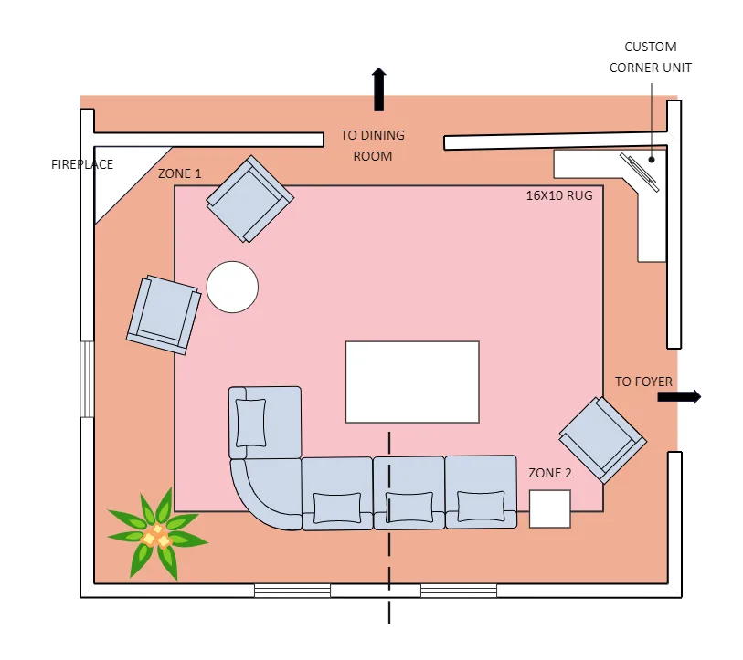
Follow this simple rule: Paint the wall you see first. In a bedroom, that’s almost always the wall behind the headboard. In a living room, it’s typically the wall behind the largest piece of seating, like the sofa. In a dining room, it might be the wall where the sideboard sits.
This creates a grounded, intentional look.
Other strong candidates are:
- The wall with architectural interest: A fireplace wall, a wall with built-in bookshelves, or the wall at the end of a hallway. The color highlights the feature.
- The longest uninterrupted wall: This gives the color space to breathe and makes a strong graphic statement.
- The wall that defines a “zone”: In an open floor plan, painting one wall of the living area can visually separate it from the dining area without a physical barrier.
What not to paint? Avoid walls that are broken up by too many doors, windows, or vents. All those interruptions chop up the color and kill the impact.
Also, don’t choose the wall opposite a large window, as the glare can wash the color out. The diagram shows the classic, most effective placement: the wall that anchors the room’s primary function. It’s a principle that works whether you’re crafting a cozy cabin barndominium decor or a sleek, contemporary space.
The Non-Negotiable Step: How to Test Paint Samples The Right Way
Those tiny paper chips are liars. The only way to know how a purple will look is to see it in a large format, on your actual wall, and in your actual light. This step is more important than buying the right brush or roller.
Paint sample pots are your best friend here. Don’t just dab a spot. Paint a two-foot by two-foot square directly on the wall you plan to paint.
Do this for your top two or three contenders.
Let the samples live for at least 48 hours. Check them in the morning, midday, and at night with your lamps on. This reveals the color’s true personality.
Does the plum turn muddy in daylight? Does the lilac glow nicely under your bedside lamp? This real-world test is cheap insurance against a gallon of regret.
It also shows you how many coats you’ll need for full coverage, which is critical for deep purples.
Gear You Actually Need (And What You Can Skip)
You don’t need a pro’s entire kit. You just need the right tools for a clean, fast job. Skimping on the wrong item will cost you more time and frustration.
The Must-Haves:
- Paint: One gallon is usually enough for a standard accent wall (approx. 130-150 sq ft). For deep purples, ask for a tinted primer (gray or deep base) to save on topcoat layers.
- Roller Frame and Sleeve: A 9-inch frame is standard. Use a 3/8-inch nap roller sleeve for smooth walls, a 1/2-inch nap for lightly textured walls. This holds more paint and gives a more even finish.
- Angled Sash Brush (2-inch): This is for cutting in along the ceiling, trim, and corners. The angled tip gives you precision.
- Painter’s Tape: High-quality tape like FrogTape for delicate surfaces. Apply it to clean, dry trim, press the edge down firmly, and remove it as soon as the paint is dry to the touch.
- Drop Cloths: Canvas is best. It absorbs drips and doesn’t slip like plastic.
- Paint Tray and Liner: The disposable plastic liners save you a massive cleanup headache.
What You Can Skip:
- A paint mixer attachment for your drill (the store will mix it for you).
- Fancy edging tools (a good angled brush and steady hand are better).
- Multiple roller trays (one with liners is fine).
The Painting Process: A Stress-Free, Step-by-Step Walkthrough
This is where it all comes together. Follow this order to avoid streaks, bleed-under, and that amateur look.
1. Prep the Wall.
Remove switch plates and outlet covers. Wash the wall with a damp sponge to remove dust. Fill any nail holes or dings with spackle, let it dry, and sand it smooth.
A clean, smooth surface is the foundation of a professional finish.
2. Tape Everything Off.
Run painter’s tape along the ceiling line, baseboards, and adjacent walls. Take your time here. Press the tape edge down firmly with a putty knife or your fingernail to seal it.
This prevents paint from seeping underneath.
3. Cut In First.
Use your angled brush to paint a 2-3 inch border along all taped edges and in the corners. Do not roll right up to the edge. Cutting in first creates a guide zone for your roller and ensures you get paint into all the tight spots.
4. Roll the Main Field.
Pour paint into your lined tray. Load the roller evenly, then roll it on the tray’s ramp to distribute the paint. Start in a top corner and roll a 2×3 foot “W” or “M” pattern on the wall.
Then fill it in with vertical strokes, always keeping a “wet edge” to avoid lap marks. Reload the roller before it starts to drag.
5. Apply the Second Coat.
Check the paint can for recoat time, usually 2-4 hours. A second coat is almost always necessary for rich, even color, especially with purples. Repeat the cut-in and roll process.
This coat will go on faster and look perfectly uniform.
6. The Tape Trick.
Remove the painter’s tape while the final coat is still slightly wet to the touch. Pull it off slowly at a 45-degree angle. If you wait until the paint is fully cured, you risk peeling off some of your fresh paint with the tape.
The Most Common Regret (And How to Avoid It)
The number one regret is a color that looks different than expected. You loved the swatch, but the finished wall feels off. Nine times out of ten, this is due to a failure in the testing phase or ignoring the room’s light.
You skipped the large sample squares, or you only looked at the color in one type of light.
The fix is proactive. If you’re staring at a wall you hate, first live with it for two full days. Your brain needs to adjust.
Often, it grows on you. If you still despise it, the solution isn’t always repainting. Sometimes, you can shift the perception of the color by changing what’s around it.
- If it looks too pink or red: Cool it down with furnishings and art that have blue, green, or gray tones. Silver metal accents and crisp white linen can neutralize warmth.
- If it looks too blue or cold: Warm it up with wood tones, gold or brass metals, and textiles in cream, terracotta, or warm gray.
- If it’s just too bold: Soften the impact by layering a large, neutral-colored rug in front of it and adding several plants. The greenery and neutral break up the large color field.
If you must repaint, use a high-quality primer to block the old color, especially if going to a lighter shade. This approach to adjusting a color’s feel is similar to the principles used in earthy moody bedroom decor, where balance is key.
Making It All Click: Choosing Your Trim and Decor
Your purple wall doesn’t live in a vacuum. What you put next to it makes or breaks the look. Your trim color is the first decision.
For almost every purple, a pure, bright white trim (like Sherwin-Williams “High Reflective White” or Benjamin Moore “Chantilly Lace”) is the safest, most classic choice. It creates a crisp, graphic contrast that makes the color pop and look intentional. Avoid off-whites with yellow or pink undertones, as they can clash.
For decor, you have two main paths: complementary or tonal. The complementary path uses colors opposite purple on the color wheel, like soft yellows or chartreuse greens. A mustard velvet pillow or a leafy green plant against a plum wall looks dynamic and designed.
The tonal path sticks within the purple family. Think a mauve throw on a charcoal sofa in front of a dusty lavender wall. This creates a serene, sophisticated, monochromatic look.
Metals matter too. Cool purples (blue undertones) pair beautifully with silver, chrome, and nickel. Warm purples (red undertones) sing alongside gold, brass, and copper.
Your lighting fixtures and hardware are an easy way to reinforce this. Finally, add texture. A smooth purple wall needs the contrast of a nubby wool blanket, a rough wood side table, or the softness of a velvet cushion.
This keeps the space feeling rich and layered, not flat.
How to Fix It If the Color Looks “Off” After Painting
First, don’t panic. Live with it for 48 hours. Your perception needs to adjust.
If it still feels wrong, identify the specific issue. Is it the wrong undertone, or is it just too intense? For a slightly wrong undertone, you can often correct the feel with your decor.
Add pillows, art, or a rug in a complementary color to pull the wall in a new direction.
If the color is simply too strong, glazing is a professional trick. A thin, translucent wash of a complementary color (like a gray or beige) over the purple can mute it. This requires skill.
The simpler DIY fix is to add large, neutral elements. A big cream-colored bookshelf against the wall or a substantial piece of light wood furniture can visually break up and soften the color field.
The Renter-Friendly Alternative (No Paint Required)
You can get the look without a drop of paint. Removable wallpaper is the top choice. Many brands offer peel-and-stick options in fantastic purple patterns or solid colors.
Apply it to your accent wall following the manufacturer’s instructions. It comes off cleanly when you move. Another option is a large tapestry or a series of oversized art pieces that cover most of the wall.
This creates a focal point with color and pattern without any permanent change. For a textural look, consider hanging a macramé wall hanging or a set of woven baskets in natural tones against a lighter wall.
Your Final Checklist Before You Start Rolling
Run through this list to ensure you’re ready for a smooth project.
- Wall is prepped: Clean, dry, patched, and sanded.
- Samples are tested: Large squares are up and observed for 48+ hours in all lights.
- Color is decided: You have your paint and tinted primer (if needed).
- Gear is ready: Brushes, rollers, tray, liners, drop cloths, and tape are on hand.
- Trim color is chosen: Pure white is standing by for touch-ups.
- Time is blocked: You have a clear weekend with good ventilation.
- Plan B is considered: You know how you’ll adjust decor if the color isn’t perfect.
Frequently Asked Questions
What sheen is best for a purple accent wall?
Eggshell or satin is ideal. It has a soft glow, hides minor wall imperfections better than flat paint, and is easy to clean. Avoid high-gloss, as it highlights every flaw.
Can I paint just one wall if the others are a different color?
Absolutely. That’s the definition of an accent wall. Ensure the other wall colors are true neutrals (white, cream, light gray) so they don’t compete.
How many coats of paint will I need?
Plan for two coats. Deep purples may need a tinted primer plus two topcoats for solid, even coverage without the old wall color showing through.
Will a purple accent wall make my room look smaller?
It can make a room feel cozier, which some perceive as smaller. To counter this, keep the other walls, ceiling, and trim light and bright. Ensure you have ample lighting.
Is purple a good color for a bedroom accent wall?
Yes. Lighter purples like lavender create serenity, while deeper plums add drama and intimacy. It’s a classic choice for adult bedrooms, moving beyond more traditional pink bedroom ideas for adult spaces.
How do I clean a painted accent wall?
Wait at least two weeks for the paint to fully cure. Then, dust with a soft cloth or use a mild soap and water solution on a sponge for marks. Avoid abrasive cleaners.