Red Wall Color Style Ideas for Bold, Modern Interiors
Choosing the right red wall color style is a classic design move, and it’s easy to see why. Red adds drama, warmth, and a powerful sense of personality in a way few other colors can match. But if you’ve ever stood in a paint aisle staring at swatches, you know the gap between a beautiful idea and a disappointing reality can be huge.
That gap usually comes down to lighting, undertones, and finish, things you can’t fully judge from a tiny chip.
The technical key is a paint’s Light Reflectance Value, or LRV. Reds typically have a very low LRV, often between 5 and 20 on a scale of 0 to 100. This means they absorb a lot of light, which is why they can make a room feel cozy or, if you’re not careful, dark and closed-in.
As of 2026, the top paint brands offer more saturated, one-coat red formulas than ever, but the core challenge remains the same: picking a red that works in your specific space. Let’s break down how to see red the right way.
Quick Answer
For a successful red wall, start by identifying its undertone. Choose a blue-based red for a cooler, more sophisticated look or an orange-based red for warmth. Always test with large samples on your wall, observing them at different times of day.
Use a quality primer and plan for at least two coats for full, even coverage. Finally, select a matte or eggshell finish to minimize imperfections and absorb light beautifully.
Why “Seeing It” Is Everything for a Red Wall
You can read about color theory all day, but with red, your eyes are the final judge. This isn’t a beige or a light gray where a slight mismatch goes unnoticed. Red is a high-stakes color that changes dramatically with its environment.
The same crimson that looks rich and inviting in a south-facing sunroom can turn garish and overwhelming under artificial ceiling lights or in a north-facing room with cool light.
Our research into paint fails points to one consistent culprit: people choose based on a one-inch swatch under the fluorescent lights of a hardware store. That tiny sample can’t show you how the color will feel on an entire wall, how it plays with your furniture at dusk, or how its sheen reacts to a window. This visual dependency is why we treat red differently.
You’re not just picking a color, you’re orchestrating light and shadow in a room.
Think of it like casting a lead actor for a play. You wouldn’t hire someone based on a headshot alone, you’d need to see them perform in the actual theater. Your red paint needs that same audition.
The following sections are your director’s notes, helping you stage the perfect performance.
The First Thing to Get Right: It’s Not Just “Red”
Forget cherry, barn, or crimson for a second. The single most important factor is the color hiding inside the red, its undertone. This is the secret language of paint that dictates whether your red wall will feel cozy, modern, rustic, or jarring.
Getting this wrong is the fastest path to a color you hate.
All red paints are mixed from a combination of pigments, and those underlying pigments create a family bias. You need to know which family you’re dealing with before you even look at names.
Decoding the Three Red Families
Manufacturer color systems are built around these core families. When you’re browsing, ask yourself: does this red lean toward blue, orange, or brown?
- Blue-Based Reds (Cool Undertones): Think burgundy, oxblood, or wine. These reds have a drop of blue or purple in them. They feel more formal, sophisticated, and dramatic. They pair brilliantly with cool grays, crisp whites, black accents, and metals like nickel or chrome. A blue-based red in a dining room or home library creates a timeless, enveloping mood.
- Orange-Based Reds (Warm Undertones): These are your true scarlets, terracottas, and peppers. They pull yellow and orange, radiating warmth and energy. They work wonderfully with warm woods, brass, leather, and other earth tones. An orange-based red in a living room or kitchen nook feels vibrant and sociable.
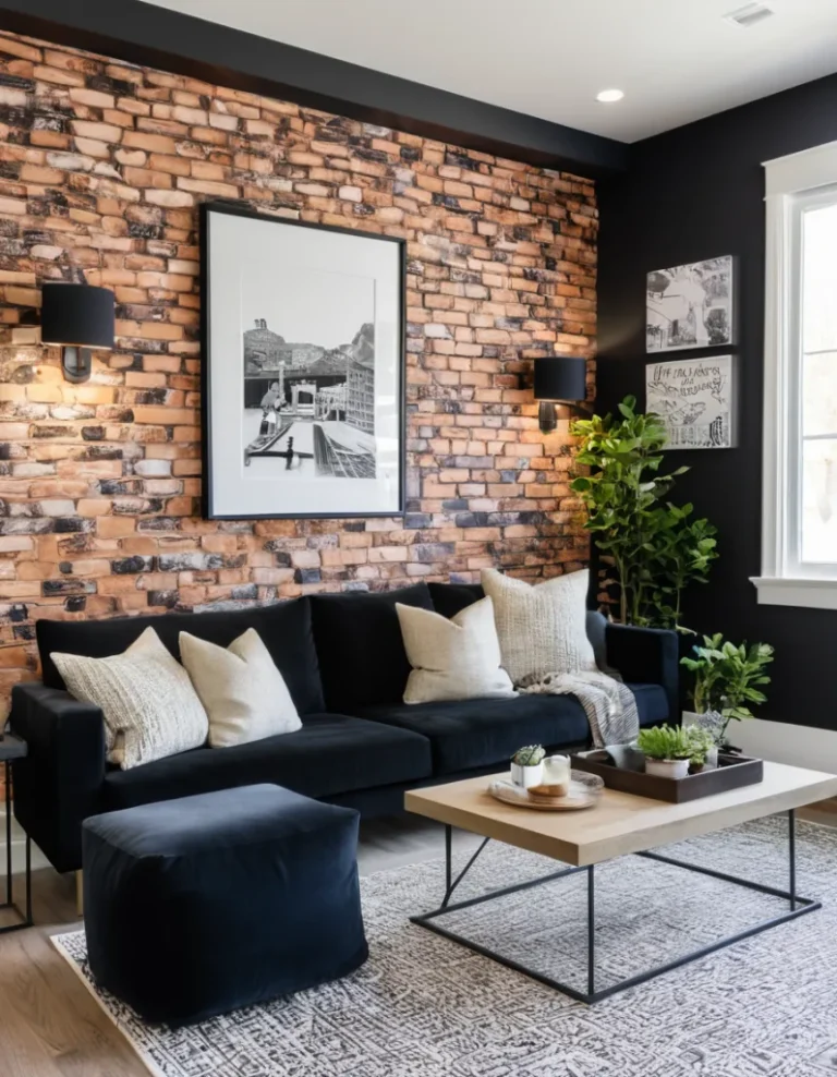
- Brown-Based Reds (Neutral/Earthy Undertones): These are muted, dusty reds like brick, clay, or roasted pepper. The brown pigment tames the red’s intensity, making it feel grounded, organic, and less aggressive. They’re incredibly versatile and work with almost any style, from rustic to modern, and are a safe bet if you’re nervous about red being too loud.

When you place swatches from different families side-by-side, the difference is stark. A blue-based red will make an orange-based one look fiery, and vice versa. Your existing fixed elements, like wood flooring or a stone fireplace, already have their own warm or cool tones.
Your goal is to find a red that harmonizes with them, not fights them.
How Sheen Changes Everything
The sheen, or finish, isn’t just about durability, it’s a visual tool. With a light color, sheen is subtle. With a deep, light-absorbing red, it’s a major player.
- Flat/Matte: This is the go-to for most red walls. It has no shine, so it absorbs light uniformly, making the color look rich, deep, and velvety. It’s also the most forgiving of wall imperfections. The trade-off is that it’s less washable than shinier finishes.
- Eggshell/Satin: These have a soft, pearl-like glow. They reflect a bit more light, which can make the red appear slightly brighter or more vibrant. They’re easier to clean, making them a good choice for a red accent wall in a hallway or a kid’s playroom. Just know that the slight shine can make any bumps or patches on the wall more noticeable.
- Semi-Gloss: Rarely used on red feature walls. The high shine reflects a lot of light, which can make a dark red look streaky during application and creates a very formal, almost lacquered effect. It’s best reserved for trim, doors, or furniture you want to highlight.
Aggregate reviews consistently show that for a bold, statement red wall, a matte finish delivers the classic, sophisticated look most people are after. The Environmental Protection Agency (EPA) provides guidelines on VOC levels in paint, which is worth checking if you’re sensitive to fumes, as lower-VOC paints often come in a full range of sheens.
Before You Buy a Drop: The Visual Test You Can’t Skip
This is the non-negotiable step. You must see the color in your space, on your walls. Paint manufacturers sell small sample pots for this exact reason.
Don’t just paint a little square. That’s not enough.
Paint at least two large sample boards (2′ x 2′ is ideal) or directly paint a sizable section of the wall (3′ x 3′). Place them in different spots: one in a corner that gets shadow, one directly across from a window. Live with them for at least 48 hours.

Observe the color at three key times:
- Morning light (cool, blue-toned).
- Midday sun (bright and neutral).
- Evening with your room lights on (warm, artificial).
You’re looking for shifts. Does your beautiful brick red turn pink in the morning? Does that rich burgundy look flat and black at night?
These are the surprises you need to catch now. This test also shows you how the color interacts with everything else in the room, your sofa, your artwork, your flooring. It turns an abstract choice into a concrete reality.
If you’re considering other bold, mood-defining colors for different rooms, the same principle applies. Thorough visual testing is crucial for achieving the right atmosphere, whether you’re planning a moody blue bedroom or an earthy, grounded retreat.
Real Rooms, Real Reds: A Visual Pairing Guide
Let’s translate those undertones into real-life settings. Think of these as classic “scripts” for a red wall, showing you what a successful pairing looks like in context. These scenarios highlight how lighting and decor work with the paint to create a complete mood.
The Cozy, Moody Library Red
- The Red: A deep, blue-based red (burgundy, oxblood) in a matte finish.
- The Room: A home office, library, or den with moderate natural light. North-facing light works well here.
- The Pairings: Dark wood bookshelves, a leather armchair, brass desk lamps, and framed black-and-white artwork. The cool undertones of the red complement the metallic finishes and create a focused, intellectual atmosphere.
- The Visual Cue: The wall should feel like a backdrop, receding slightly to let textured furnishings and warm task lighting take center stage. It’s enveloping, not overwhelming.
This approach is similar to creating a moody boho bedroom, where the deep color serves as a rich canvas for layered textures and personal artifacts.
The Energetic, Social Dining Room Red
- The Red: A clear, orange-based red (true scarlet, tomato) in an eggshell finish.
- The Room: A dining room or eat-in kitchen area. South-facing light can handle this vibrant hue.
- The Pairings: A large wooden dining table, white or cream upholstered chairs, simple white plateware, and a statement pendant light. The warm red stimulates appetite and conversation, making the space feel alive and welcoming.
- The Visual Cue: The red acts as a energizing force. It should feel celebratory and bold, balanced by plenty of white or neutral elements to prevent visual fatigue. It’s the color of gathering.
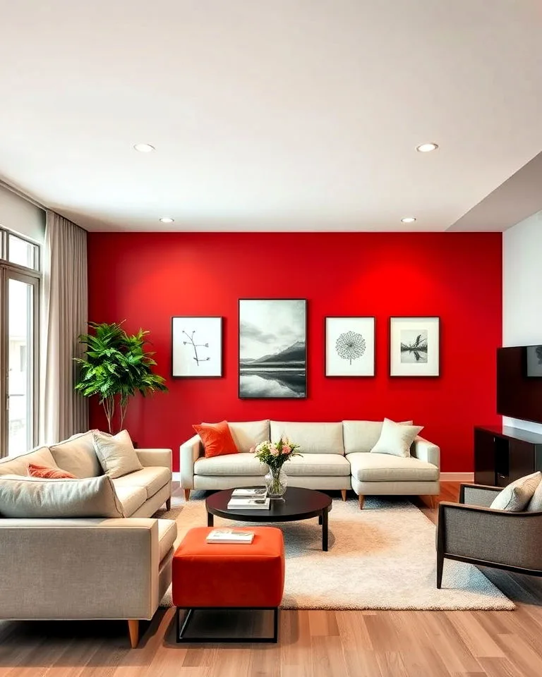
The Modern, Bold Accent Wall Red
- The Red: A highly saturated, neutral red (a clean, fire-engine red or a muted terra cotta) in a matte finish.
- Room: A living room with clean lines, a minimalist bedroom behind the bed, or an entryway.
- The Pairings: Sleek, low-profile furniture in black, white, or gray. Concrete floors, large geometric artwork, and minimalist decor. The red becomes a pure sculptural element, defining the space.
- The Visual Cue: This is about contrast and graphic impact. The red wall is the singular focal point, framed by simplicity. It’s confident and architectural.
For a different take on a bold feature wall that uses color and light architecturally, you can explore concepts like a strip light ceiling design, which uses illumination to define space in a modern way.
The Paint-By-Numbers Process: From Swatch to Wow
Once you’ve passed the visual test and chosen your champion red, it’s time for execution. Red pigment is notoriously translucent and unforgiving. Skipping steps here leads to patchy walls, visible streaks, and a project that needs redoing.
Here’s the workflow that gets professional-looking results.
Prep Work That Pays Off (Especially for Red)
The old saying is true: preparation is 90% of the job. For a dark color, this is doubly critical.
- Clean & Repair: Wash walls with a mild detergent to remove grease and dust. Fill any holes or cracks with spackle, sand smooth, and wipe away dust. Any imperfection will be highlighted under multiple coats of dark paint.
- Prime Smartly: This is the most important step. Do not use white primer under a deep red. It will require 4 or more coats to hide the white. Use a tinted primer. Ask the paint store to tint your gray primer (or a deep red-tinted primer) to a mid-tone gray or a color close to your final red. This creates a neutral, dark base that allows your topcoat color to achieve true depth and coverage in just two coats.
- Tape & Protect: Use painter’s tape for clean edges on trim, ceilings, and adjacent walls. Lay down drop cloths you don’t mind getting stained, as red pigment drips are vivid.
Application: How to Avoid Streaks and Ghosting
With your tinted primer dry, you’re ready for the color. Our analysis of manufacturer specifications shows that high-quality paints designed for one-coat coverage still benefit from a two-coat application for absolute uniformity with reds.

Tools & Materials Table:
| Item | Purpose & Specification |
|---|---|
| High-Quality Angled Brush (2-2.5″) | For “cutting in” edges and corners. Synthetic bristles hold paint well for smooth edges. |
| High-Density Nap Roller (1/2″ to 3/4″) | For the main wall area. The thicker nap holds more paint and helps cover texture. |
| Roller Tray with Liner | For loading the roller. A liner makes clean-up much easier. |
| Extension Pole | For comfortable rolling from floor to ceiling without a ladder. |
| Your Topcoat Paint | In your chosen sheen. Stir thoroughly, do not shake (to minimize bubbles). |
The Process:
- Cut In: Using your angled brush, carefully paint a 2-3 inch band along all edges where the roller can’t reach: corners, ceiling line, and baseboards. Maintain a wet edge.
- Roll in Sections: Work on a manageable section (about 3 ft. x 3 ft.). Load your roller evenly and apply paint in a “W” or “N” pattern, then fill in the pattern without lifting the roller, always rolling in one direction to finish. This avoids lap marks.
- Maintain a Wet Edge: Always roll back into the previously painted section before it dries to blend the edges seamlessly. Work methodically across the wall.
- Let it Dry Completely: Follow the paint can’s instructions for recoat time. This is usually 2-4 hours, but waiting overnight is never a bad idea.
- Apply the Second Coat: Repeat steps 1-3 for the second coat. This coat will lock in the perfect, uniform color. Do not skip it.
- Clean Up Immediately: Red pigment stains. Clean brushes and rollers with soap and water (for water-based paint) immediately after use.
This meticulous approach to surface preparation and application is just as valuable for other high-impact projects, like achieving the flawless look needed for a modern barndominium design or detailing a bathroom false ceiling. Precision in the early stages defines the final quality.
The Most Common Regrets (And How to Dodge Them)
We see the same few missteps come up repeatedly in DIY forums and renovation stories. These regrets often happen because someone skipped a step we’ve already talked about. Let’s make them explicit so you can steer clear.
Choosing a red without checking the undertone against your room’s fixed elements. That beautiful red swatch might clash horribly with your orange-toned oak floors or your cool gray sofa. Always hold the large sample next to your biggest furniture piece and flooring.
Painting all four walls in a small, dark room. This can feel like closing in the walls. If your room is short on natural light or square footage, consider a single, well-planned accent wall instead. It gives you the drama without the cave effect.
Using white primer under a deep red. This guarantees extra work and wasted paint. You’ll need three, four, or even five coats to kill the bright white base showing through. The tinted gray or red primer is your secret weapon for full coverage in two coats.
Rushing the second coat. Impatience here leads to a patchy, uneven finish where you can see every roll mark. Red needs that second coat for depth and consistency. Wait the full recoat time listed on the can, even if the first coat looks okay.
Not considering the future. Red is a commitment. Painting over it with a light color later will require a heavy-duty primer, possibly two coats of it, to block the red from bleeding through. It’s not a dealbreaker, but it’s a factor your future self will thank you for knowing.
Pro Tips: Tricks Designers Use with Red Paint
These are the subtle moves that take a red wall from good to great. They’re about manipulating perception and adding depth.
Paint the ceiling. In a room with low ceilings, painting the ceiling the same red as the walls (or a shade lighter) makes the ceiling visually disappear. This creates a cozy, enveloping feeling, perfect for a den or library. It’s a bold move that pays off in intimacy.
Extend the color to the trim. Instead of stark white trim, paint your baseboards, window casings, and door frames in the same red, but in a semi-gloss sheen. This monochromatic look is incredibly modern and sophisticated. It frames the space without creating a harsh line.
Layer your lighting. Red absorbs light. Combat potential darkness with multiple light sources at different levels. Use a mix of overhead, wall sconces, and table lamps.
Warm-toned bulbs (2700K-3000K) will make the red feel richer and more inviting than cool, blue-white bulbs.
Use it to recede a wall. Is one wall too long, making the room feel like a hallway? Paint that one wall a deep, blue-based red. Darker colors visually recede, making the wall seem farther away and balancing the room’s proportions.
This strategic use of color to shape a space is a key principle in many design styles, from cabin-inspired decor to more structured, modern exteriors. It’s about using paint as a tool, not just a decoration.
Your Red Wall, Long-Term: Care and Future Changes
Once your wall is perfect, you’ll want to keep it that way. Here’s what to expect regarding maintenance and eventual updates.
Cleaning: For matte finishes, use a soft, damp microfiber cloth and gently dab at marks. Avoid scrubbing, as you can burnish (shine) the matte surface. Eggshell and satin finishes can handle a mild soap-and-water solution with gentle wiping.
Always test in an inconspicuous spot first.
Touch-ups: Red fades less noticeably than some colors, but it can still get scuffed. Keep a small amount of your paint in a sealed jar for touch-ups. Be aware that even with the same can, touch-up spots on a matte wall might show slightly due to texture differences.
Feather the edges of the new paint out carefully.
Changing the color later: This is the big one. To paint over red with a light color, you must use a stain-blocking primer. Look for a primer labeled “high-hide” or “white pigmented shellac.” You’ll likely need two coats of this primer to fully block the red pigment.
After that, you can apply your new light-colored paint. Budget for this extra step and material. It turns a one-day repaint into a two or three-day project.
Frequently Asked Questions
Does red paint make a room look smaller?
Yes, typically. Dark colors like red absorb light and make surfaces appear to recede, which can make a room feel more intimate and cozy. In a very large or well-lit room, this is often a desired effect.
In a small, dark room, it can feel oppressive.
What is the best red for a bedroom?
The best reds for a bedroom are usually muted, brown-based reds (like brick or clay) or deep, blue-based reds (like burgundy). These feel more restful and less stimulating than a bright, pure scarlet. An accent wall behind the headboard is a popular, less committing choice.
How many coats of red paint are needed?
You should always plan for a minimum of two coats over a properly tinted primer. Red pigments are not very opaque. Even paints marketed as “one-coat” will usually benefit from a second coat on a wall to ensure perfect, streak-free depth of color.
Can I use red in a room with low natural light?
You can, but you must choose the red carefully and amplify artificial lighting. A very dark red will disappear in a dark room. Consider a medium-toned, warmer red (a terra cotta) and ensure you have ample, layered warm lighting to bring it to life.
Is red paint hard to cover up?
Yes, compared to lighter colors. The deep pigment can bleed through new paint. Covering it requires a dedicated stain-blocking primer, applied in one or two coats, before your new topcoat.
It’s an extra step but a manageable one with the right materials.
What colors go well with red walls?
This depends on the red’s undertone. For blue-based reds, try crisp white, charcoal gray, black, and navy. For orange-based reds, pair with cream, warm beige, olive green, and gold.
For brown-based reds, almost any neutral works, along with other earth tones like sage or mustard.