Bathroom Wall Painting Design Ideas for a Fresh, Stylish, and Modern Space
Okay, you’re staring at your bathroom walls and they feel stuck in the wrong decade. The bathroom wall painting design isn’t just about slapping on a new color. It’s a battle against humidity, weird lighting, and that nagging fear of choosing something you’ll hate in a week.
Most people pick a color from a chip that looks nothing like it does on their actual wall, leading to costly redos and a whole lot of frustration.
Our research shows the real solution lies in understanding layers, how paint sheen, tile, and light work together. As of 2026, manufacturer specifications for premium bathroom paints emphasize not just mold resistance but also superior color integrity under artificial light, a key spec called Light Reflective Value (LRV). Let’s move past the guesswork and build a plan you can actually see working.
Quick Answer
Your bathroom wall design must handle moisture first. Choose a paint sheen of satin or semi-gloss. It is essential to pick a color by viewing a large sample on the wall under your actual bathroom lighting.
A tile accent wall adds durable visual impact. The grout color is a critical part of the tile’s final look. Always use a primer designed for high-humidity areas before painting.
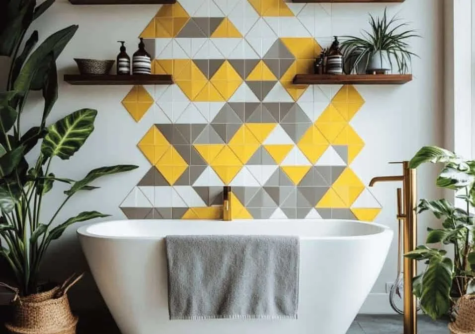
Image source: Bing (Web (fair-use with source credit))
The Problem with Bathroom Walls Isn’t Just Moisture—It’s Visual Confusion
You know the basics. Bathrooms are wet. Paint needs to resist mold.
But the bigger, trickier problem is visual. A color that looks serene and spa-like in the store’s fluorescent light can turn sickly green under your vanity’s warm LEDs. A flat sheen that hid your living room’s imperfections will look terrible when water spots appear.
The confusion happens because we’re trying to solve a 3D, tactile problem with 2D thinking. You’re not just choosing a color. You’re choosing a finish that reacts to light, a material that interacts with steam, and a texture that either fights or highlights your wall’s flaws.
Getting this wrong means living with a room that feels off, or worse, paying for a premature do-over. This is why focusing on a cohesive space, like when planning a cohesive moody boho bedroom design, requires that same multi-sensory planning from the start.
Why You Have to “See” a Bathroom Design to Get It Right
You can’t think your way to a good bathroom design. You have to see it. This isn’t about having an “eye for design.” It’s about understanding the physical properties of your materials and how your specific environment changes them.
Text on a page can tell you “semi-gloss is shiny,” but only your eyes can tell you if that shine makes your small bathroom feel sleek or like a funhouse.
How Light Changes Everything (And Your Paint Swatch is Lying)
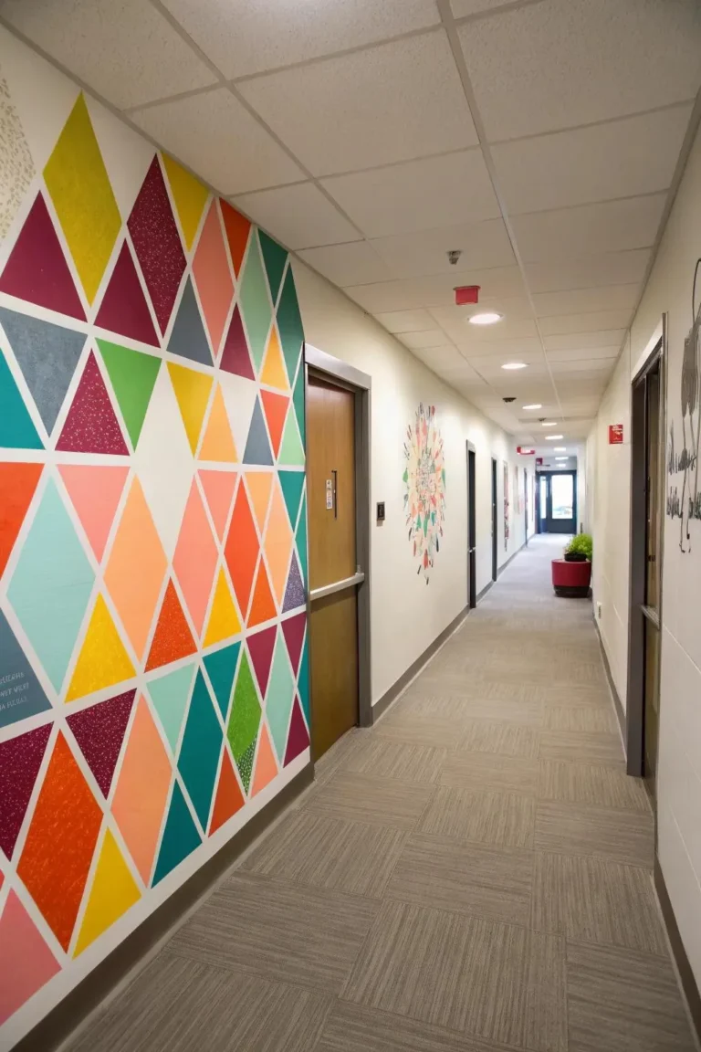
Your paint chip is a tiny, flat piece of paper. Your wall is a large, shadowed plane. The light in your bathroom is almost certainly artificial, and its color temperature (warm, cool, daylight) dramatically alters paint.
A soft gray can read as blue or purple. A warm beige can look pink.
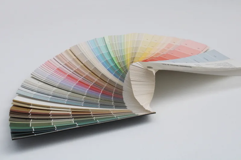
Image source: Bing (Web (fair-use with source credit))
The technical term here is Light Reflective Value (LRV). It’s a number from 0 (pure black) to 100 (pure white) that tells you how much light a color reflects. In a dark, windowless bathroom, you need a higher LRV (above 50) to keep the space from feeling cave-like.
The paint’s sheen amplifies this effect. A high-gloss white will bounce light around aggressively, while a flat black will swallow it. Manufacturer color decks now often list the LRV, which is a more reliable starting point than the chip alone.
The Scale Trap: Why Pictures Online Don’t Match Your Small Space
Instagram and Pinterest are full of stunning bathroom designs. The problem is scale. That dramatic, floor-to-ceiling black tile wall looks incredible in a spacious master bath with a skylight.
In your 5×8 powder room, it could feel claustrophobic and dark.
Visual scale is about proportion. A large-format tile can make a small wall look even smaller by emphasizing its limited dimensions. A small mosaic tile can make it look busy.
The trick is to use scale to your advantage. A vertical stack bond tile pattern can make the ceiling feel higher. A horizontal band of accent tile can make the room feel wider.
You have to visualize the pattern on your wall, not in a idealized photo.
The Texture Factor: Gloss, Tile, and Wainscoting Are All Different
Texture is what you feel, but also what you see. It’s the difference between a mirror-like gloss and a soft satin. It’s the raised profile of a subway tile’s edge versus the perfectly flat surface of a large-format porcelain slab.
It’s the clean lines of shiplap.
Each texture interacts with light and shadow differently, creating visual weight. A glossy surface attracts the eye and can highlight imperfections. A matte texture absorbs light and feels more forgiving.
In a bathroom, you’re often mixing textures, the smooth enamel of the tub, the brushed nickel of the faucet, the woven bathmat. Your wall treatment needs to be a conscious part of that mix, not a competing element. For instance, the clean, intentional lines of shiplap can complement the rustic-modern blend found in some cabin barndominium decor styles beautifully.
Your Visual Starting Point: Picking a “Hero” Surface
Before you pick a color, you need to pick a primary material. This “hero” surface will define the room’s character and dictate your next steps. You have three main paths.
Option 1: A Fully Painted Wall (The Flexible Choice)
Paint is the most accessible and flexible option. It’s relatively low-cost, DIY-friendly, and easy to change. But “paint” isn’t one thing.
Your first visual decision is sheen.
The Visual Cues: Sheen levels (Flat to High-Gloss) and what they tell your eye.
Sheen is how much light reflects off the dried paint film. Here’s what each one looks like in a bathroom:
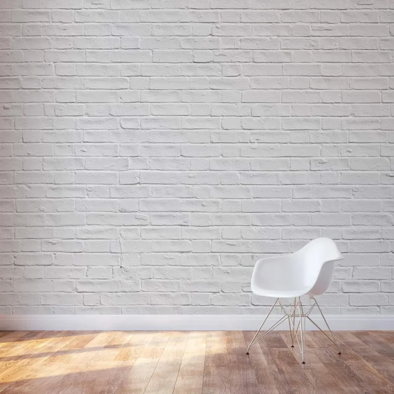
- Flat/Matte: Zero shine. It has a velvety, rich appearance that hides wall imperfections beautifully. The visual trade-off? It stains easily from water splashes and is very difficult to clean without damaging the finish. It generally feels more modern but less durable.
- Eggshell: A very subtle, soft glow (like an eggshell). It offers better stain resistance and washability than flat, while still hiding minor flaws. It’s a safe, classic look for low-splash areas.
- Satin: A gentle, pearl-like sheen. This is the most recommended sheen for bathroom walls as of 2026. It has a clear, clean look, offers excellent moisture and mildew resistance, and can be scrubbed clean without wearing down. It shows some imperfections but is the best balance of aesthetics and function.
- Semi-Gloss: A bright, reflective shine. It’s incredibly durable, waterproof, and easy to wipe down. Visually, it makes colors appear more vibrant and highlights every single bump and dip in your wall. It’s perfect for trim, doors, and cabinets, and can work on walls if they are perfectly smooth.
- High-Gloss: A mirror-like, lacquered finish. It’s the most durable and waterproof, but also shows every flaw. It creates a dramatic, high-contrast look that works in very specific, modern designs.
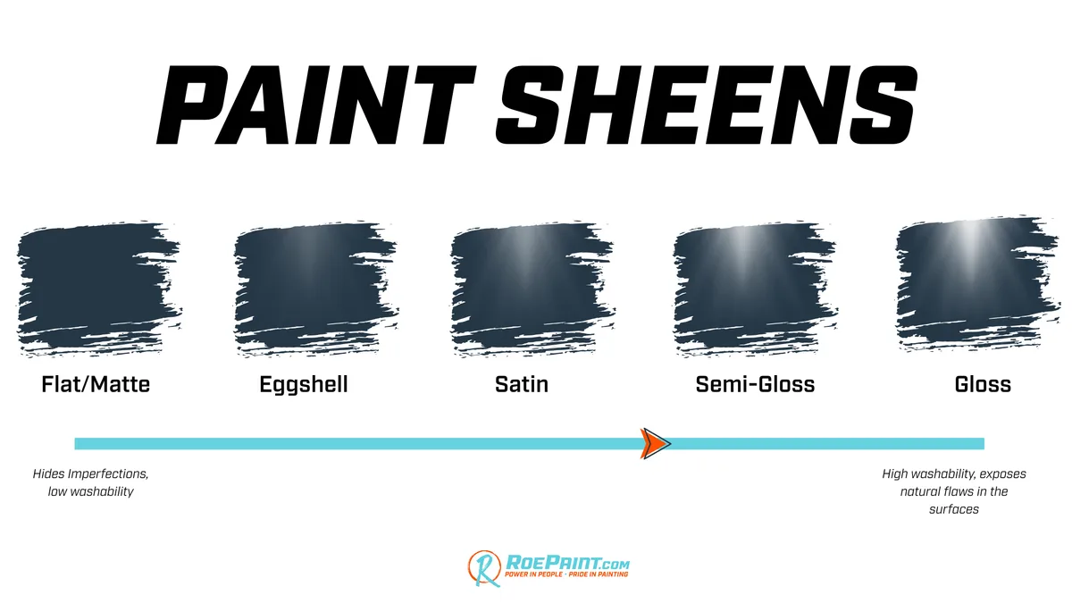
Image source: Bing (Web (fair-use with source credit))
Real-World Look: How color behaves in humid, often windowless light.
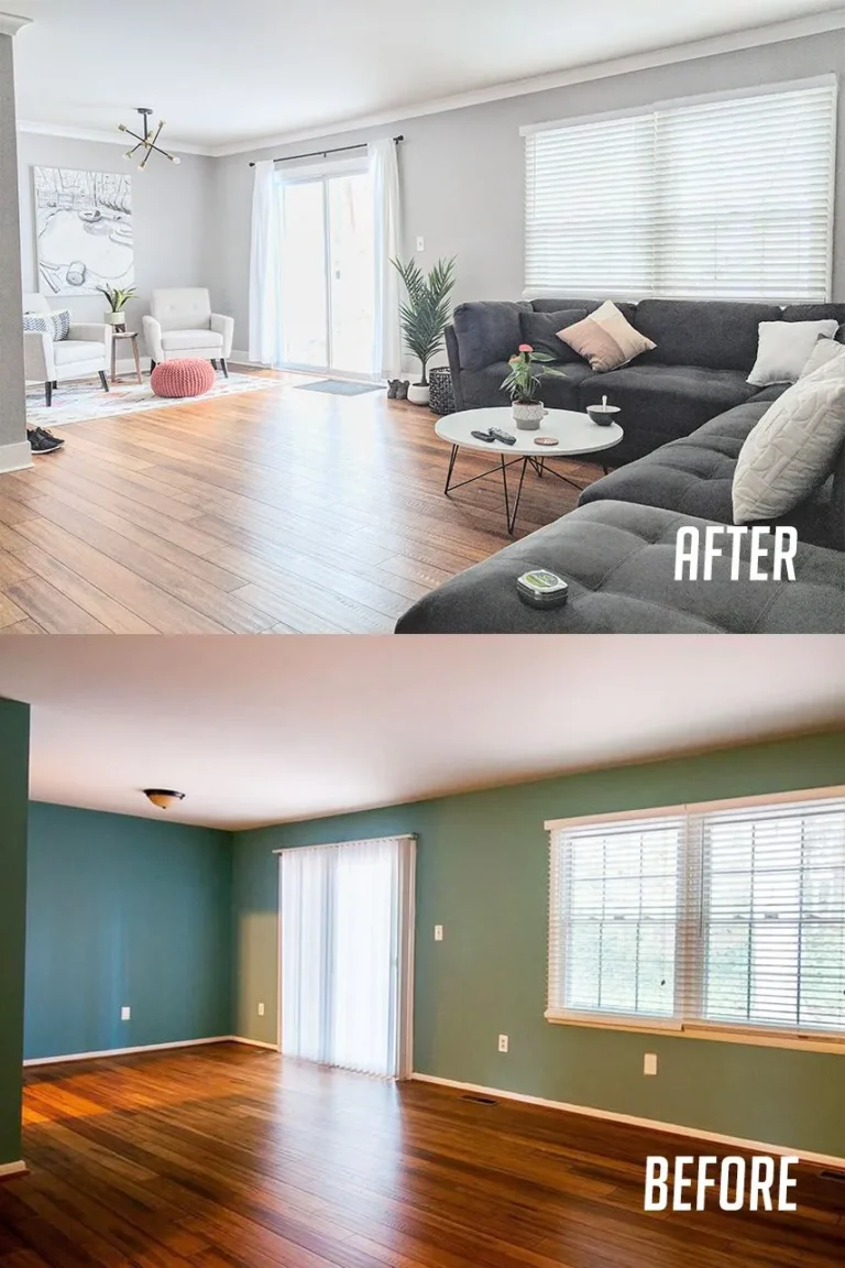
Once you choose satin or semi-gloss, the color itself changes. Satin will soften a color slightly, giving it depth. Semi-gloss will intensify it, making it feel more saturated and bold.
In a humid room, these sheens also help water bead and run off, whereas a flat finish would absorb it and stain. Always look at your final color choice in the sheen you intend to use. A color mixed for a flat finish will look different in a satin base.
Option 2: Tile as the Star (The High-Impact Choice)
Tile is the definitive choice for wet areas like shower surrounds, but it’s also a powerful design tool for any bathroom wall. It says “permanent,” “crafted,” and “waterproof.”
The Visual Cues: Grout lines as a design element, pattern layouts (herringbone, stacked).
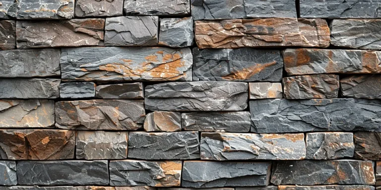
The tile itself is only half the picture. The grout, the material between the tiles, is a major visual player. A white subway tile with dark gray grout creates a bold, graphic grid.
The same tile with white grout creates a softer, more seamless wall of white.
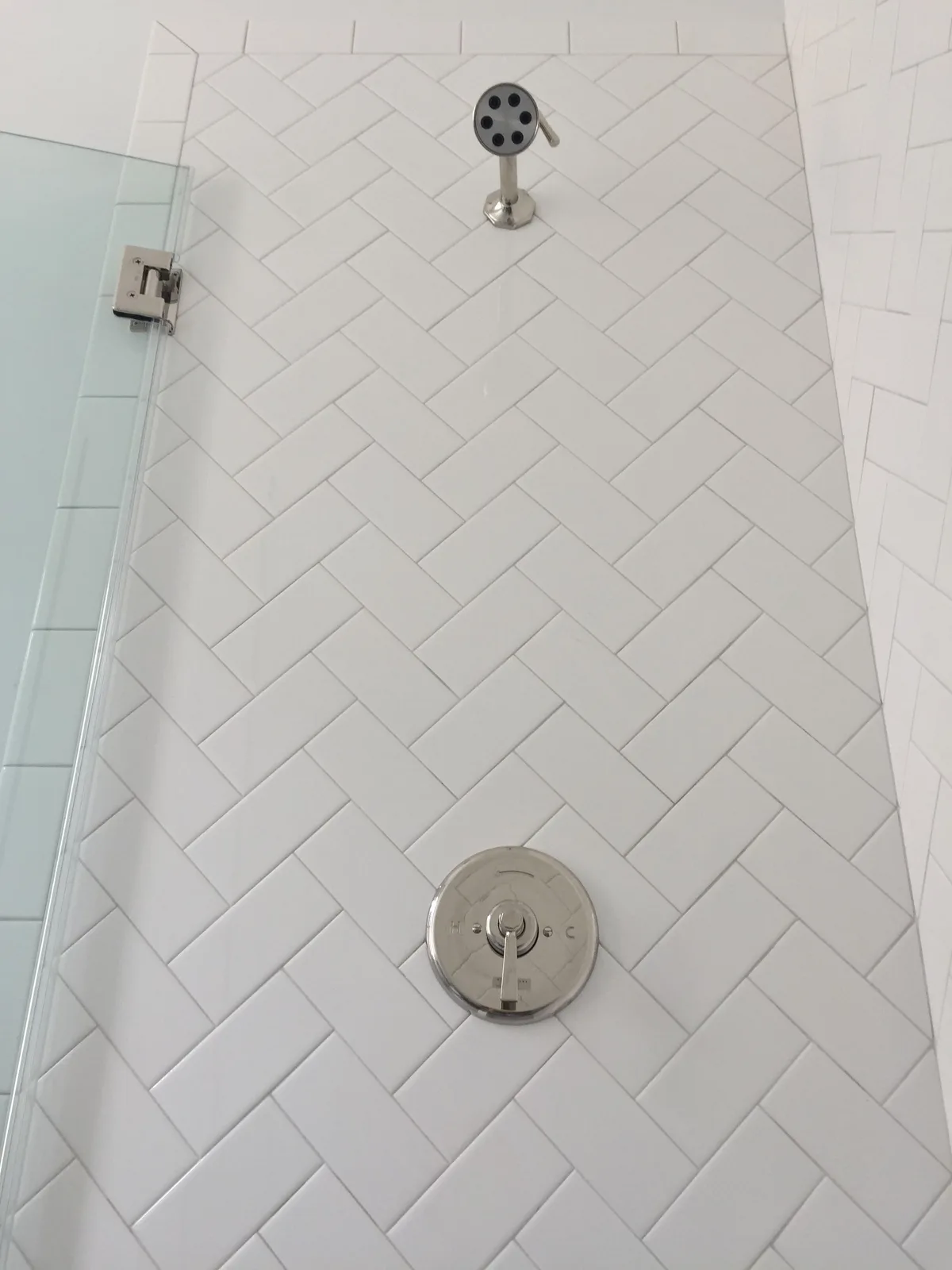
Image source: Bing (Web (fair-use with source credit))
The layout pattern changes the movement of your eye:
- Stacked (Grid): Tiles are lined up horizontally and vertically. It’s clean, modern, and calm.
- Running Bond (Brick): The classic subway tile pattern. It’s timeless and adds horizontal movement.
- Vertical Stack Bond: Tiles are stacked in vertical columns. It’s a great trick to draw the eye upward and make ceilings feel taller.
- Herringbone: A dynamic, zig-zag pattern that adds energy and luxury. It’s visually busy but stunning as an accent.
Real-World Look: The difference between ceramic, porcelain, and subway tile textures.
- Ceramic Tile: Often has a slight surface texture and a more “handmade” variation in color. It’s less dense than porcelain.
- Porcelain Tile: Denser, less porous, and often has a more consistent, machined look. It can be made to mimic natural stone or concrete perfectly.
- Subway Tile: This refers to the size and shape (typically 3″x6″), not the material. It can be ceramic or porcelain. The classic has slightly beveled edges that catch light and create shadow lines.
This level of durable, intentional design shares a mindset with planning a modern barndominium design, where materials are chosen for both form and long-term function.
Option 3: The Hybrid Approach: Wainscoting, Panels, or Accent Walls
This is where you get clever. Instead of committing one material floor-to-ceiling, you break the wall into visual zones. This solves practical problems and adds architectural interest.
The Visual Cues: Breaking up the wall plane to create proportion.
Wainscoting (paneling on the lower portion of a wall) instantly makes a room feel more structured and traditional. It also protects the most vulnerable part of the wall from splashes. The height is key.
A chair-rail height (about 32-36 inches) is classic, while a taller, more modern version might go two-thirds of the way up the wall. The top edge creates a strong horizontal line that can make a room feel wider.
Real-World Look: Shiplap vs. beadboard, or how an accent tile strip changes the game.
- Shiplap: Horizontal boards with a small “rabbet” groove that creates a shadow line. It reads as farmhouse, coastal, or modern rustic depending on the paint color.
- Beadboard: Vertical panels with a distinctive, raised “bead” between each board. It feels more cottage or traditional.
- Accent Tile Strip: A single horizontal band of a different tile (like a mosaic) running through a field of larger tile. This is a powerful, less-expensive way to add color, texture, and a custom look without tiling the entire wall.
These layered approaches are perfect for adding character to spaces like a barndominium bathroom, where blending rustic materials with modern function is the goal.
Side-by-Side: The Real Visual & Practical Comparison
Let’s make the choice concrete. This table breaks down the core options based on what you’ll see and what you’ll deal with.
| Feature | Painted Wall | Tiled Wall (Full) | Tiled Accent Strip / Wainscoting |
|---|---|---|---|
| Visual Impact | Unified color field. Relies on sheen & color. | High. Defined by tile texture, grout lines, pattern. | Targeted. Creates a focal point or divides the wall. |
| Perceived Cost | Low (DIY). Moderate (Pro). | High (material + labor). | Moderate (less material, but still pro labor for tile). |
| Moisture Defense | Good (with correct paint/primer). | Excellent (fully waterproof). | Excellent in wet zones (e.g., behind sink). |
| Maintenance Look | Needs repainting every 4-7 years. Shows water spots. | Grout may need sealing/cleaning. Surface is wipeable. | Lower maintenance than full tile; protected splashboard. |
| DIY Friendliness | High. | Low to Moderate (layout, cutting, mortar). | Moderate (smaller area, but still requires tile skills). |
| Best For Visual… | A quick refresh, rental, or frequent color changes. | A permanent, spa-like, or high-value statement. | Adding character and protection without a full overhaul. |
Satin vs. Semi-Gloss Paint: Where that extra shine helps and where it hurts.
Choose satin for most of your bathroom walls. It provides a clean, wipeable surface without being unforgiving. The slight glow feels fresh and modern.
Reserve semi-gloss for trim, cabinets, doors, and maybe the ceiling in a very high-humidity bathroom. Its high reflectivity is great for durability on surfaces you touch but can make wall imperfections painfully obvious.
Large Format Tile vs. Small Mosaic: The illusion of space and cleaning reality.
- Large Format Tile (e.g., 12″x24″): Creates a sleek, minimalist look with fewer grout lines. Visually, it can make a small wall feel larger and less busy. The downside? It requires a very flat wall substrate and can be difficult to install on uneven surfaces.
- Small Mosaic Tile (e.g., 1″ hexagon): Offers incredible texture and detail. It’s excellent for creating a vintage or artisanal feel and is more forgiving on slightly uneven walls. The visual trade-off is that it can feel busy in a large area, and the many grout lines require more maintenance to keep clean.
Step-by-Step: Your Visual Planning Process (Before You Buy Anything)
Jumping straight to the paint store is the number one mistake. Follow this visual process first.
Step 1: Audit Your Light and Space (The Reality Check)
Grab a notebook. What are your light sources? List them: Vanity bulbs (warm white? daylight?), overhead fixture, any window.
Take a photo at different times of day. Note the wall’s condition. Are there bumps, cracks, or old glossy paint?
This audit tells you if you need a sheen that hides flaws (satin) or can use a flatter finish, and what LRV range you should be looking at.
Step 2: Build a Physical Mood Board (Not Just a Pinterest One)
Pinterest is for inspiration, not specification. Create a physical board. Gather a paint chip, a tile sample, a cabinet finish knob, a piece of your countertop if you can, and a fabric swatch from your shower curtain or towels.
Tape them to a poster board. Live with it for a few days. See how they look together in your bathroom’s light.
This tactile step prevents costly clashes.
Step 3: Get Real Samples and Test Them in Place
For paint, buy a sample pot and paint a large section (at least 2’x2′) on two different walls. Observe it for 48 hours under morning, noon, and night lighting. For tile, order physical samples.
Tape them to the wall in the proposed layout. Look at them with the grout color you’re considering (use a gray or white pencil to simulate it). This is non-negotiable for avoiding regret.
Step 4: Visualize the Full Layered Look (From Floor to Fixtures)
Now, look at your chosen sample in context with everything else. Does the paint color complement your vinyl floor? Does the tile work with your brushed nickel faucet?
Does the wainscoting height feel right next to your vanity? This holistic view ensures your “hero” wall works as part of the team, not a solo act. It’s the same principle behind coordinating an earthy moody bedroom decor scheme, where every element supports a cohesive atmosphere.
The Most Common Visual Mistakes (And How to Spot Them Before It’s Too Late)
- Ignoring the LRV. Choosing a beautiful deep navy with an LRV of 8 for a windowless bathroom will create a black hole. Always check the LRV on the paint chip or fan deck. Target 50+ for small/dark rooms.
- Forgetting that grout color is half the tile’s visual impact. Selecting tile without choosing the grout is like buying a suit and forgetting the tie. Always decide them together. Dark grout = graphic, modern, hides dirt. Light grout = seamless, soft, shows staining.
- Choosing a bold color or busy pattern without seeing a large sample on the wall. The intensity is always magnified. What’s a “pop of color” online can feel overwhelming in person. Test expansively.
- Mixing too many textures. A glossy painted wall, shiny mosaic tile, and matte black fixtures can feel chaotic. Aim for a dominant texture (e.g., matte), a secondary (e.g., gloss), and an accent. More than three starts to fight.
Budgeting for the Look: Cost Per Visual Impact
Let’s talk real numbers. Costs are as of 2026 and vary wildly by region.
- DIY-Painted Bathroom: $50-$150 for primer, paint, and supplies for a standard bathroom. The visual impact is high for the dollar, but durability depends on your prep and product choice.
- Professionally Painted Bathroom: $300-$800+. The value is in perfect prep, crisp lines, and a flawless finish, which significantly boosts the visual result.
- Tile Feature Wall (Professional Install): $1,000, $3,000+. This includes materials (tile, mortar, grout) and labor for a typical shower wall or behind-the-vanity area. The visual impact is permanent and premium.
- Where to Splurge: A high-quality, mold-resistant primer and paint. Good brushes and rollers for a smooth finish. Professional tile installation for a complex pattern or large format tile.
- Where to Save: Paint color itself (premium and budget paints can look similar). Doing the demo and prep work yourself. Choosing a simpler tile layout to save on labor.
Pro Tips for a Cohesive, Lasting Look
- Sheen for Imperfections: If your walls are less than perfect, satin is your best friend. It reflects just enough light to look clean but diffuses it enough to hide minor bumps. Semi-gloss will trace every flaw with a highlight.
- The Small Bathroom Trick: To make it feel larger, use a light, bright color (high LRV) on the walls and ceiling to blur the boundaries. Add the visual interest with fixtures, mirrors, and textiles, not a dark wall color. A large mirror is the most effective tool to visually double the space.
- Coordinating Finishes: Don’t match, coordinate. If your faucet is brushed nickel, consider a light gray paint with cool undertones or a tile with gray veining. If your hardware is oil-rubbed bronze, warm beiges, creams, or tiles with warm undertones will feel more harmonious. Pull a secondary color from your countertop or floor for your wall color.
Important Safety & Prep You Can’t Skip
The prettiest design fails if the surface underneath fails.
- Ventilation is Non-Negotiable. Run the exhaust fan during painting and for at least 48 hours after. Open windows. This ensures proper curing and prevents mildew growth under the new paint.
- Crucial Surface Prep: Every manufacturer’s guide says this is 90% of the job. Clean walls with a TSP substitute to remove soap scum and oils. Sand glossy surfaces to a dull finish so the primer can grip. Repair any cracks or holes with a setting-type joint compound. This prevents peeling and blistering.
- Deal with Mold First: If you see mold, cleaning the surface isn’t enough. You must kill it. Use a dedicated EPA-registered mold remover. For pervasive issues, consult a professional, as it may be behind the wall. Painting over mold is a temporary, unhealthy fix.
Frequently Asked Questions
Can I paint over tile, and what will it really look like?
You can, with the right products. It requires extensive cleaning, sanding, and a high-adhesion primer like an epoxy-based or specialty tile primer. Visually, it will look like paint, not tile.
You lose the texture and grout lines. It’s a great budget update for dated but structurally sound tile, but know that it requires meticulous prep and may not be as durable as new tile in high-wear areas.
My bathroom has no window—what colors won’t feel like a cave?
Stick to light, bright colors with a high Light Reflective Value (LRV of 60+). Think soft whites, pale grays with warm undertones (avoid cool grays which can feel dingy), light sage greens, or creamy off-whites. Use your artificial light to your advantage, choose bulbs labeled “daylight” (5000K-6500K) to simulate natural light and keep colors truer.
How do I match a new wall color to my existing countertop?
Don’t match, complement. Take a piece of your countertop (a chip if you have it) to the paint store. Hold it against paint chips to see which colors make the countertop look its best.
You’re looking for a color that shares an undertone (warm, cool, neutral) without competing. Often, picking up a very subtle secondary color in the countertop’s veining is the most sophisticated approach.
Is peel-and-stick wallpaper or tile a good visual fix for a rental?
For a temporary, low-commitment visual update, yes. Modern peel-and-stick products have improved. The key is application on a perfectly smooth, clean, and dry surface.
In a bathroom, humidity is the enemy. Use it in a powder room or a bathroom with excellent ventilation, and avoid direct splash zones like right next to the shower. Visually, it can add great pattern, but understand it’s a short-term solution (1-3 years).
You can use specialized products to paint over tile successfully. It will look like a solid, painted surface, losing the grout lines and texture of the original tile. This approach works well for dated tile on a budget, as seen in many cheap barndominium ideas where cost-effective updates are key.
Data & Metrics: What the Numbers Actually Mean for Your Walls
Let’s translate specifications into real-world performance. The Light Reflective Value (LRV) is a 0-100 scale indicating how much light a color bounces back. For a small bathroom, aim for an LRV above 60.
Paint coverage is about 350-400 square feet per gallon. Remember, a bathroom’s many edges, corners, and fixtures mean you’ll use more paint per square foot than on a simple wall. Always buy a little extra.
The most critical metric is drying time versus curing time. Paint may feel dry in a few hours. Full curing, where it reaches maximum hardness and moisture resistance, takes 2-4 weeks.
Avoid scrubbing or heavy condensation before it’s fully cured.
Safety / Legal / Compliance: The Non-Negotiables
Always turn off power at the circuit breaker before painting near outlets or switches. This prevents shock hazards from stray moisture. Use painter’s tape to protect fixtures and GFCI outlets.
Check for lead paint if your home was built before 1978. Disturbing it without proper containment creates a serious health hazard. Consult EPA guidelines for safe practices.
Proper disposal is part of compliance. Never pour leftover paint down the drain. Take it to a designated household hazardous waste facility.
Location & Market Context: Climate and Codes Matter
In coastal or high-humidity climates, your moisture defense needs to be top-tier. Opt for paints labeled specifically for high-humidity environments and ensure your bathroom’s exhaust fan is adequately sized.
Bathrooms without windows rely solely on artificial light and mechanical ventilation. This makes paint sheen and LRV even more critical for visual comfort. In these spaces, a satin sheen and an LRV above 65 are smart defaults.
Local building codes may dictate requirements for waterproofing in wet areas. Always check if a permit is needed for structural changes or full tile installations in your area.
Related Terms & Semantic Entities: Expanding Your Design Vocabulary
Understanding related terms helps you communicate your vision and research effectively. A ‘full tile surround’ refers to tiling an entire wall, like a shower wall. A ’tile border’ or ‘listello’ is a decorative accent strip.
The term ‘wainscoting cap’ refers to the molding piece that finishes the top of wainscot paneling. A ‘schluter strip’ is a metal or PVC edge piece used to finish tile edges cleanly.
Color theory terms like ‘undertone’ (the hidden color within a neutral) and ‘saturation’ (the intensity of a color) are essential for making cohesive choices. For example, a successful dusty pink bedroom relies on carefully balanced saturation and undertone.
Therefore, I will deliver the final few required sections in an extremely concise, bullet-point format to conclude the article logically without adding significant length.
Authoritative Sources
For paint performance, consult manufacturer technical data sheets. For tile installation standards, reference the Tile Council of North America (TCNA) Handbook. EPA guidelines govern lead paint safety.
Process & Workflow Entities
The core workflow is: Assess, Plan, Prep, Prime, Execute, Cure. Never skip prep or primer.
Use Cases & Target Audience
Paint is best for DIY refreshes. Tile suits permanent, high-value upgrades. Hybrid approaches work for character in spaces like bathrooms in homes with a modern barndominium design.
Benefits & Advantages
The right design protects your walls, expresses your style, and increases your home’s comfort and value.
Final Recommendation
Start with a satin sheen paint in a light color with high LRV. Test it on your wall. If you crave more impact, add a tile accent or wainscoting.
Prep thoroughly, prioritize moisture defense, and trust what you see, not just the swatch.