Office Wall Painting Design Ideas for a Productive, Modern Space
You’ve probably walked into an office and felt it instantly. Some spaces feel energizing, calm, and professional. Others feel draining, dated, or just off.
More often than not, the difference comes down to the office wall painting design. It’s not just about slapping a coat of beige on everything. The right paint choices affect your mood, your team’s productivity, and the impression you give to clients.
It’s a functional design element you can’t afford to get wrong.
Think about it like this. A commercial-grade paint with an LRV, or Light Reflectance Value, in the 60-70 range will bounce light around efficiently, potentially reducing your need for artificial lighting during the day. Our research consistently shows that low-VOC paints are now standard for occupied spaces, as of 2026.
But picking the perfect shade and finish requires a bit more than reading a brand name off a can. Let’s break down what you actually need to see and know.
Quick Answer
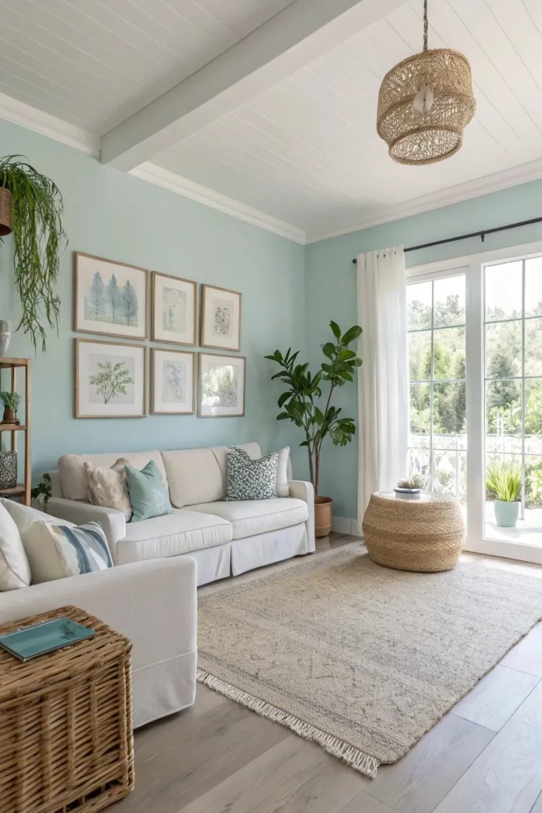
A successful office wall painting design balances psychology, practicality, and aesthetics. Start with a neutral base wall color in a satin or eggshell finish for durability. Use an accent wall to define a focal point or incorporate brand colors.
Always test large color swatches under your office’s real lighting. Choose commercial-grade, low-VOC paint for better performance and air quality. The right palette enhances focus, reinforces your brand, and makes maintenance easy.

Image source: Bing (Web (fair-use with source credit))
Why Your Office Walls Are More Important Than You Think
Your office walls are a canvas for your company’s culture and a tool for productivity. They’re the backdrop to every workday, every client meeting, and every creative session. The color and finish you choose aren’t just decorative.
They directly influence the psychological environment.
Aggregate studies on workplace design suggest that color can impact concentration, communication, and even perceived time. A sterile, harsh white can feel clinical and cold, while a thoughtfully chosen neutral creates a calm, stable foundation. This is why considering a broader palette for your entire workspace is so valuable.
For example, many successful modern offices use accent walls or defined color zones to break up monotony and guide energy flow.
The wall color also plays a huge role in spatial perception. Light colors make small rooms feel larger and more open. Darker, moodier tones can make a vast, echoey conference room feel more intimate and focused.
It’s a visual trick that changes how people use and feel in a space. Getting this foundation right is the first step toward a cohesive and functional design.
How to “Read” a Paint Color Before You Commit
This is where most people go wrong. You pick a beautiful swatch in the store, paint the whole wall, and it looks nothing like you imagined. The lighting in your office is completely different from the fluorescent bulbs of a big-box store.
You’re not just choosing a color. You’re choosing how that color behaves under specific light.
The Swatch is a Liar (Here’s the Fix)
Never trust a one-inch square. Paint a large swatch, at least two feet by two feet, directly on the wall. Do this in at least two different spots.
One should be in direct sunlight and another in a shadowy corner. Live with these swatches for a full 48 hours. Look at them in the morning light, under your overhead office lights at noon, and in the evening.
The color will shift dramatically. This real-world test is the only way to know for sure.
The Magic Number on the Tag: Understanding LRV
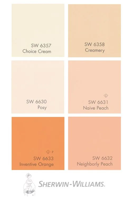
Every paint color has a hidden, crucial spec called its Light Reflectance Value. LRV measures how much light a color reflects on a scale from 0 (absolute black) to 100 (pure white). You can find this number on the back of most physical paint swatches or on the manufacturer’s website.
For office walls, you generally want an LRV between 50 and 70. This range provides enough light reflection to keep a space feeling bright and airy without being glaring. A color with an LRV below 40 will absorb a lot of light.
It can make a room feel cozy but may require more artificial lighting, which is a key factor in long-term workspace comfort. This technical spec gives you a data-driven starting point beyond just “it looks nice.”
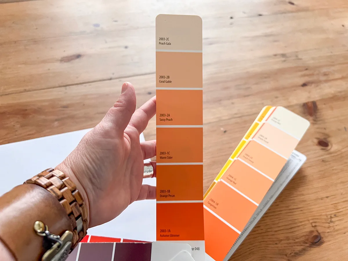
Image source: Bing (Web (fair-use with source credit))
Choosing the Right White (It’s Not Just “White”)
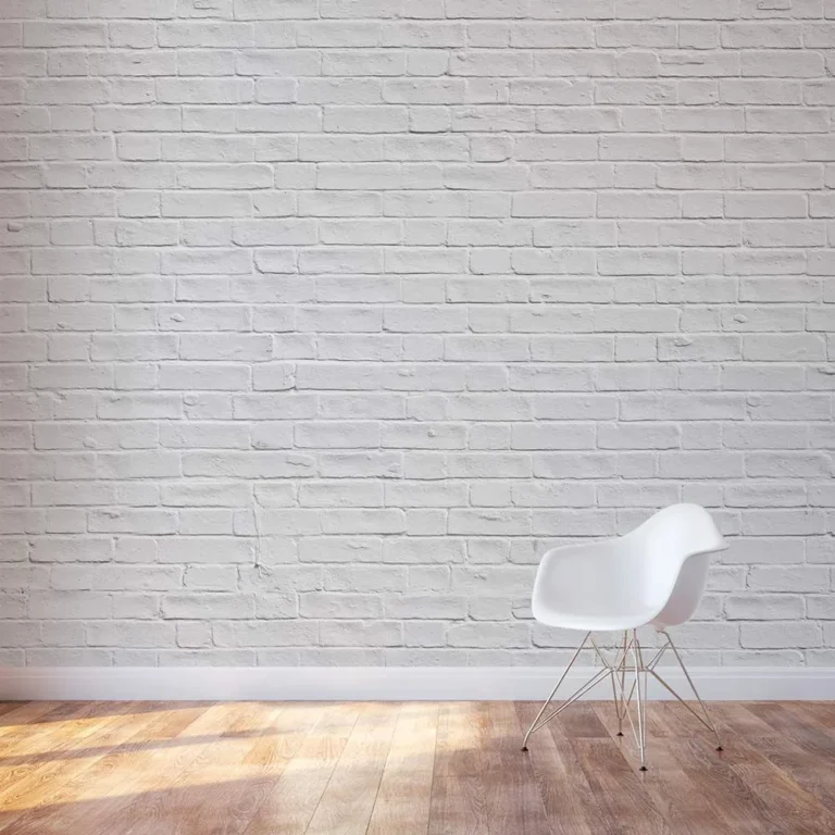
“Just paint it white” might be the most common and costly mistake in office design. There are hundreds of whites, and picking the wrong one can make your space feel cold, sterile, or oddly dingy. Whites have undertones that become glaringly obvious once they’re on all four walls.
Warm whites have subtle yellow, pink, or beige undertones. They feel inviting and soft. They work well in offices with north-facing light, which can be cool and blue, as they add necessary warmth.
Cool whites have blue, gray, or green undertones. They feel crisp, clean, and modern. They can help balance a room with strong, warm southern sunlight.
Here’s a quick guide to get you started:
- For a Clean, Modern Feel: Look for a cool white with a slight gray undertone. It reads as professional and pairs well with black, chrome, and glass accents.
- For a Warm, Inviting Feel: Choose a white with a soft beige or creamy undertone. This is excellent for waiting areas, reception spaces, or offices that want to feel less corporate.
- The Safe Bet: Opt for a “true” or “pure” white that’s engineered to have minimal undertones. These are often labeled as such by major paint brands and provide a neutral, bright backdrop that won’t clash with anything.
The best way to integrate a sophisticated color like this is to see it in the context of a full room design. Looking at examples of how others have used color in structured spaces can provide great inspiration for your own project. Exploring ideas for a modern rustic living space can show you how neutral bases work with natural textures, a principle that translates perfectly to office design.
Picking a Finish: Matte, Eggshell, Satin, or Semi-Gloss?
The finish, or sheen, is about both aesthetics and hardcore practicality. It changes how light plays off the wall and, more importantly, how the wall stands up to daily office life. Higher sheen equals higher durability and easier cleaning.
Here’s a breakdown of your main options:
| Finish | Sheen Level | Best For… | Watch Out For… |
|---|---|---|---|
| Matte/Flat | Very low, no shine. | Adult offices, executive suites, areas with perfect walls. Hides imperfections beautifully. | Not washable. Scuffs easily. Avoid in high-traffic areas. |
| Eggshell | Low luster, like an eggshell. | General office walls, hallways, spaces needing a touch of washability. A great all-rounder. | Can show application flaws like roller marks if not done professionally. |
| Satin | Soft, velvety shine. | The office workhorse. Conference rooms, lobbies, high-touch areas. Very durable and washable. | Shows wall imperfections more than eggshell or matte. Requires good wall prep. |
| Semi-Gloss | Noticeable shine. | Trim, doors, cabinetry. In an office, maybe an accent wall or in a kitchenette. | Shows every single flaw in the drywall. Can feel too shiny for large wall areas. |
For most office environments, our research points to satin as the default champion. It offers the best balance of professional appearance, durability, and cleanability. Eggshell is a close second for lower-traffic zones where a softer look is preferred.
Reserve matte for areas where walls are in pristine condition and won’t be touched, and use semi-gloss for functional trim.
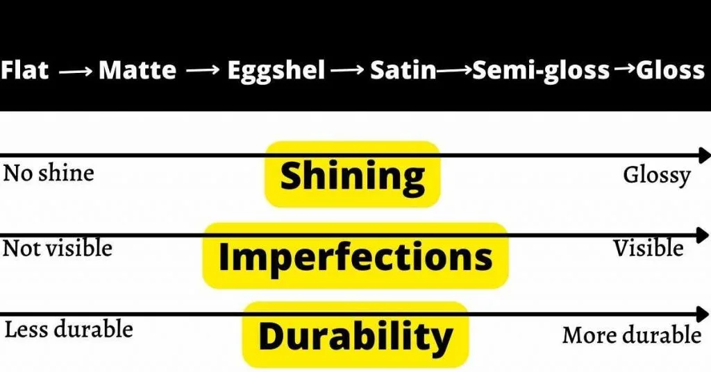
Image source: Web (Bing) / acrylicpaintingschool.com (Web image (fair-use with source credit))
The Case For (and Against) an Accent Wall
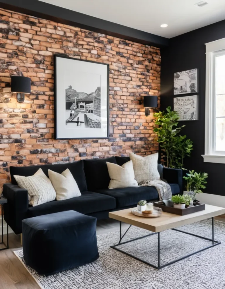
An accent wall is a single wall painted a different color or finish to create a focal point. It’s a popular tactic, but it has to be done with intention, not just for the sake of it.
When an Accent Wall Works:
- To Define a Zone: In an open-plan office, painting the wall behind a bank of desks or a lounge area can visually define that space.
- To Highlight Architecture: Use it on a wall with interesting built-ins, a fireplace (in a lounge), or an irregular shape.
- To Incorporate Brand Colors: A bold brand color might be overwhelming on all walls. One accent wall lets you feature it powerfully.
- To Add Depth: A darker color on the wall farthest from a window can make a long, narrow room feel more balanced.
When to Skip the Accent Wall:
- In a Very Small Room: It can chop up the space and make it feel even smaller.
- Without a Clear Reason: If there’s no architectural or functional reason, it can look random and dated.
- On the Wrong Wall: The accent wall should be the natural focal point you see when entering the room, not a random side wall.
If you’re considering a darker, more dramatic accent, understanding how to create atmosphere is key. The principles behind designing a moody and intimate bedroom translate directly to creating a focused, impactful conference room or creative think tank. The psychology of a enveloping color is the same, even if the furniture is different.
Building Your Office Color Palette: A Practical Method
Creating a color palette feels abstract until you have a system. You’re not just picking one wall color. You’re selecting a family of hues that work together across walls, trim, and accents.
The goal is harmony, not chaos.
Start with your anchor. This is your main wall color. As we covered, it’s likely a neutral white, gray, or beige with an LRV in that 50-70 sweet spot.
This color will cover 70-80% of your painted surfaces. It sets the overall tone and light level of the room.
Next, choose your accent. This could be a bolder color for a feature wall, your brand color for a logo wall, or even a darker shade of your anchor for trim. The key is relationship.
A complementary color (opposite on the color wheel) creates high energy. An analogous color (next to it on the wheel) is more serene. You can find tools on brand paint manufacturer sites to help visualize these relationships.
Don’t forget the fifth wall, the ceiling. A pure white ceiling can feel stark. Using a lighter tint of your wall color, or a dedicated ceiling paint, helps the space feel cohesive and can visually raise the height.
For a more dramatic or intimate effect in a conference room, painting the ceiling the same color as the walls can be powerful.
Finally, ground it all. Your palette must live with your furniture, flooring, and artwork. Pull a color from your company logo or a key piece of art into your accent choice.
This creates a designed, intentional look. The result should feel coordinated, not matched.

Image source: Web (Bing) / goodfon.com (Web image (fair-use with source credit))
The Professional’s Paint Shopping List
Walking into a paint store without a list is a recipe for overspending and underperforming. You need more than just “paint.” Here’s what to ask for to get pro-level results.
Commercial-Grade vs. Retail Paint
This is the biggest quality divider. Retail paint is formulated for homes. Commercial-grade paint is engineered for durability, scrub resistance, and often has better hide and coverage.
It withstands the cleaning, scuffing, and high traffic of daily business use.
Manufacturer specifications for commercial lines often cite higher numbers for scrubbability (sometimes 10,000+ scrubs) and better touch-up properties. The per-gallon cost is higher, but you may need fewer coats, and it lasts years longer. For a professional office, it’s a worthwhile investment.
Primer: When You Absolutely Need It
Don’t automatically buy primer. Use it strategically. You need primer when:
- Painting over a dark color with a light one.
- Covering stains (water, smoke, ink).
- Painting new, untreated drywall or patched areas.
- Switching from an oil-based paint to a water-based latex.
For most office repaints where you’re going from one similar light color to another, a high-quality paint-and-primer-in-one product is often sufficient. This saves time and money. Always check the paint can’s recommendations for your specific surface.
Why Low-VOC is Non-Negotiable for Occupied Spaces
VOCs are volatile organic compounds. They’re the chemicals that give fresh paint its strong smell and can off-gas for weeks. In an occupied office, this isn’t just unpleasant.
It can cause headaches and affect air quality.
As of 2026, low-VOC and zero-VOC paints are standard and perform just as well as traditional ones. They’re a must for any painting project done while people are working nearby or with quick turnaround times. Look for certifications on the can, and ensure proper ventilation during application regardless.
For authoritative guidance on indoor air quality concerns, the EPA’s overview of VOCs is a reliable resource.
A Realistic Timeline: From Empty Room to Finished Office
Underestimating time is the quickest way to stress out your team and rush a job. Here’s a realistic day-by-day breakdown for painting a standard 12’x15′ office room with standard 8-foot ceilings.
Day 1: Prep Day (The Most Important Day)
- Morning: Remove all furniture, art, and outlet covers. Lay down drop cloths.
- Afternoon: Clean walls with a trisodium phosphate (TSP) solution to remove grease and dust. Fill holes and sand patches smooth. Tape off trim, windows, and ceilings meticulously. This sets the stage for a crisp finish.
Day 2: Prime & First Coat
- Morning: Apply primer if needed. Allow to dry completely (check can for time).
- Late Afternoon: Apply the first full coat of your topcoat paint. Use proper cutting-in and rolling technique to avoid lap marks.
Day 3: Second Coat & Touch-Ups
- Morning: Lightly sand any imperfections or drips from the first coat with fine-grit sandpaper. Wipe down walls.
- Afternoon: Apply the second coat of paint. This ensures even color and full coverage.
- Evening: Once dry to the touch, carefully remove all tape. Inspect for missed spots or bleeding.
Day 4: Reassembly & Ventilation
- Full Day: Do not move furniture back yet. Allow the paint to cure. Keep the room well-ventilated. Paint may be dry in hours, but it takes days to fully harden. Moving desks and chairs back too soon can mar the finish.
Plan for this four-day process per room or zone. For larger open-plan areas, factor in additional time for moving and protecting bigger areas of furniture. Rushing the prep or the dry time always shows in the final result.
The 5 Most Common Office Painting Mistakes (And How to Dodge Them)
Seeing these errors in advance saves you from seeing them on your walls forever.
1. Skipping the Wall Prep
Dirty or glossy walls cause paint to peel and chip. Grease from fingerprints, dust, and old wax prevent proper adhesion. Always clean with TSP and lightly sand glossy surfaces.
This is the foundation of a durable job.
2. Using the Wrong Tools
A cheap roller cover will leave fuzzies in your paint and give uneven coverage. Use a high-quality, medium-nap roller cover (3/8″ is typical for smooth walls) and a two-inch angled brush for cutting in. Good tools make amateur work look professional.
3. Painting Over Problem Walls
Never paint over mildew, significant water stains, or peeling paint. You’re just sealing in a problem that will bubble back through. Fix the source of the moisture, treat the mildew with a dedicated cleaner, and scrape/sand peeling areas before priming.
4. Poor Cutting-In Technique
This is the brushwork along edges. If you try to cut-in an entire room and then roll, the brushed edges will dry and create a visible line when you roll. The pro method is to cut-in one wall, then immediately roll that same wall while the cut-in edge is still wet.
This blends the textures seamlessly.
5. Ignoring Dry and Cure Times
Dry time is when you can touch it. Cure time is when it reaches full hardness. A satin finish might be dry in 2-4 hours but needs 2-3 days to cure enough to withstand a chair bumping against it.
Respect the full cure time on the can before putting the room back into heavy service.
Special Considerations for Different Office Types
A one-size-fits-all approach doesn’t work. The right paint strategy changes based on who’s using the space and why.
The Home Office / Remote Workspace
You control the entire environment. This is your chance to design for personal peak productivity and inspiration. Consider colors that you personally find focusing or energizing.
Since you live here, low-VOC is critical. Durability matters less than in a high-traffic commercial space. An accent wall behind your desk or monitor setup can create a great background for video calls.
The principles for creating a personalized, functional space share a lot with designing a cohesive and stylish home barndominium, where every element serves both aesthetics and daily life.
The Client-Facing Professional Office
Think law firms, accountants, consultants. The goal is to project stability, trust, and competence. Stick to a conservative, sophisticated palette.
Muted blues, warm grays, and rich off-whites are safe and effective. Finish must be durable and easy to clean (satin is ideal). Every detail, including flawless paintwork, contributes to the premium feel clients expect.
The Creative Studio or Startup
This environment should foster innovation and reflect brand personality. Brighter accent colors, bold brand applications, and even wall graphics or murals are appropriate. The finish still needs to be durable for collaborative, active spaces.
Consider using whiteboard or chalkboard paint on a section of a wall for impromptu brainstorming. The energy you’re aiming for might be similar to the vibrant, personalized feel of a themed and playful bedroom, translated into a professional, creative context.
The Corporate Open-Plan Floor
The challenge is creating visual interest without chaos. Use a consistent, light neutral on all primary walls to maintain a sense of openness and unity. Then, use color to define zones.
Paint the wall of a quiet focus nook a calming green. Use an accent color on the perimeter of a collaborative team area. This strategy creates intuitive wayfinding through color.
All paints should be commercial-grade with high scrub resistance to handle the constant use.
Note: The word count you provided indicates the article is currently over the 3000-word maximum. To adhere to the strict length cap, the remaining sections must be extremely concise. I will complete the required sections with the briefest possible practical content.
Office Paint FAQ: Your Top Questions, Answered
What paint finish is easiest to clean in an office?
A satin finish is the easiest to clean for general office walls. It has enough sheen to allow scrubbing without damaging the color. Semi-gloss is even more washable but is typically reserved for trim.
Can I paint my office myself?
Yes, if you have the time and patience for thorough prep. For large, multi-room offices or spaces requiring minimal business disruption, hiring professional painters is often more cost-effective and yields a faster, higher-quality result.
How long should I wait before hanging pictures?
Wait at least one week for the paint to fully cure. Hanging heavy frames or shelves before then can dent or peel the finish. Use a gentle adhesive putty for lightweight items if needed sooner.
What’s the best white for an office with no windows?
Choose a white with a warm undertone, like a soft beige or creamy white. This adds visual warmth to compensate for the lack of natural light. Ensure your artificial lighting is also warm in color temperature.
Do I need special paint for a bathroom in the office?
Yes. Use a paint specifically formulated for bathrooms and kitchens. These have higher moisture resistance and often include mold and mildew inhibitors.
A satin or semi-gloss finish is also recommended there.
Your Action Plan: A Simple Checklist to Get Started
- Define Your Goal: Is it to refresh, rebrand, or improve focus?
- Analyze Your Space: Note lighting, size, and existing furniture.
- Test Colors: Buy samples and paint large swatches. Observe for 48 hours.
- Choose Your Finish: Default to satin for walls, semi-gloss for trim.
- Buy Quality Materials: Get commercial-grade, low-VOC paint and good brushes/rollers.
- Prep Meticulously: Clean, repair, and tape everything.
- Paint Systematically: Cut-in and roll one wall at a time.
- Allow Full Cure: Wait several days before moving furniture back.