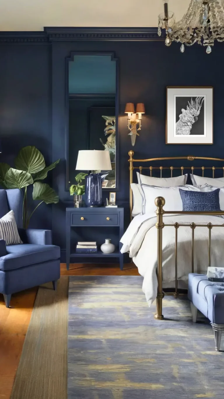
Pink Bedroom Ideas for Adults: Elegant Designs Beyond the Girly Look
Pink bedrooms for adults don't have to look like a marshmallow exploded. If you've been searching for pink bedroom ideas for adult spaces, you've probably noticed how easy it is to cross the line from chic to childish. The trick is all in the undertones, the textures, and the balance with more grounded colors.
Whether you're drawn to blush, dusty rose, or mauve, there's a version of pink that feels calm, cozy, and distinctly grown-up.
We've dug deep into color science, paint chemistry, and real bedroom makeovers to find out what actually works. As of 2026, the best pink rooms rely on muted, toned-down pinks with a light reflectance value (LRV) above 50 for daytime spaces, and warmer lighting below 3000K to keep things cozy at night. That's the kind of data that separates a designer look from a toy store.
Let's walk you through it.
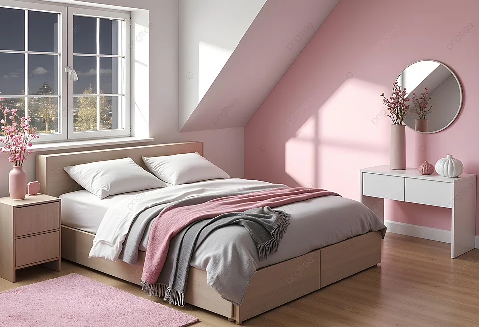
Quick Answer
Pink bedroom ideas for adult spaces focus on muted shades, layered textures, and neutral pairings. Choose warm blushes or dusty roses over bright pink. Balance pink with cream, wood, or black accents.
Use the 60-30-10 rule to keep the room grounded. The result is calm, sophisticated, and anything but childish.
Why Adult Pink Bedrooms Fail (and How to Get It Right)
Most pink bedrooms go wrong for the same reason: there's too much pink. When everything matches, the room loses depth. It reads as a theme, not a living space.
Here are the biggest culprits we see in our research:
- Candy pink walls. Bright, saturated pinks work for toys, not sleeping spaces.
- Pink on every surface. Pink walls, pink bedding, pink rug, pink curtains. It's overwhelming.
- Wrong undertones. A cool pink in a warm room clashes badly.
- No grounding elements. Without wood, black, or cream, pink floats in space.
- Poor lighting. Harsh overhead lights make pink look chalky or washed out.
The good news? Every single one of these is fixable. A pink bedroom can look expensive and private when you treat pink as a nuanced color rather than a theme.
Think of it as a canvas, not the whole painting.
If you want a deeper dive into a very different pink aesthetic, our Victorian-style take on the color might surprise you. Same hue, completely different mood.
Decoding Pink: Warm vs. Cool Undertones
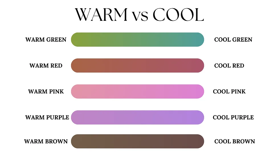
Before you buy anything, you need to understand undertones. Pink is never just pink. Every shade has a base that leans either warm (yellow or peach), cool (blue or violet), or neutral.
- Warm pinks feel earthy and cozy. Think salmon, terracotta, and coral. They pair beautifully with walnut wood and brass.
- Cool pinks feel crisp and modern. Think raspberry, rose, and mauve. They work well with gray, chrome, and white marble.
- Neutral pinks sit in between. Dusty rose and blush usually land here. They're the safest starting point.
Why does this matter? Put a warm pink next to a cool gray, and you'll see the pink turn almost orange. Put a cool pink next to warm oak, and it will look purple and cold.
The easiest way to tell what you're working with is to hold a swatch next to a pure white paper. If the pink throws off a golden glow, it's warm. If it looks slightly blue or lavender, it's cool.
Light also changes everything. A pink that looks soft and muted in the store can look garish in a north-facing room. That's why you should always test swatches on your actual wall and live with them for a couple of days.
Our bedroom inspiration collection has examples of both warm and cool staging if you need visual references.
The 60-30-10 Rule for a Balanced Pink Bedroom
If you want a room that feels pulled together, use the 60-30-10 color rule. It's an interior design classic, and it works perfectly for pink.
Here's how it breaks down:
- 60% dominant color. This is usually the walls or large area rug. In a pink bedroom, you can make pink the dominant color, or keep the walls neutral and let a soft pink rug carry the weight.
- 30% secondary color. This is the upholstery, bedding, and curtains. Think cream, beige, warm white, or soft gray.
- 10% accent color. This is the pop. It could be deep forest green, black, terracotta, or a darker blush.
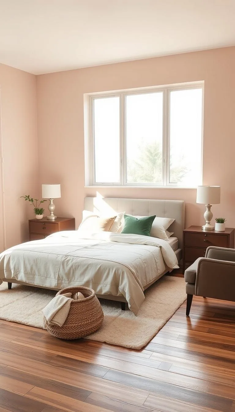
So a balanced pink room could be: warm white walls (60%), dusty pink duvet and curtains (30%), and black metal lamp bases plus a walnut nightstand (10%). That tiny bit of dark contrast is what prevents the room from feeling washed out.
Another way to think about it: pink should never fight for attention. It should invite you in. If you're not sure where to start, use the 60-30-10 framework before you buy a single thing.
How to Pick Pink Paint That Won't Look Childish
Paint is where most people get stuck. Here's the honest truth: the pink you loved on a tiny swatch can look completely different on a full wall. That's why the selection process matters so much.
Start with light reflectance value, or LRV. This number tells you how much light a color reflects. For an adult pink bedroom, you want:
- Blush or soft pinks: LRV 55 to 70. These feel airy and calm during the day.
- Dusty rose or mauve: LRV 30 to 50. These read cozier and more intimate, but they need good natural light.
- Deep berry pinks: LRV below 30. These act like moody neutrals. Use them on an accent wall, not all four walls.
Matt and eggshell finishes are your friends. Glossy paint amplifies any color, and glossy pink can look very 1980s. A flat or matte finish absorbs light and makes the pink look more sophisticated.
If you're worried about indoor air quality, look for low-VOC or zero-VOC paints. The Environmental Protection Agency has clear guidance on volatile organic compounds and how they affect indoor air. That's a simple way to keep your bedroom healthier.
Also, sample three shades at a time. Paint each on a large piece of foam board and lean it against the wall. Check them in morning light, afternoon sun, and evening lamp light.
The one that feels calm in all three is your winner. And yes, that extra day of testing is worth it.
Pairing Pink with Neutrals, Wood Tones, and Metal Finishes
Pink rarely works alone. It needs a partner to feel grounded. The right pairings turn a pink accent into something intentional.
Here are our favorite combinations:
- Pink + cream. The easiest pairing. Cream softens pink and makes it look more neutral. Use cream bedding, a cream headboard, or creamy white curtains.
- Pink + walnut or oak. Wood adds warmth and depth. Walnut brings a rich, masculine edge. Oak keeps things light and Scandinavian.
- Pink + black. Black is surprisingly good with pink. A black picture frame, black lamp base, or black metal bed frame adds instant contrast.
- Pink + brass or gold. Metallic accents give pink a touch of luxury. Think brass sconces, gold drawer pulls, or a gold-framed mirror.
- Pink + green. Sage green and eucalyptus tones are a natural match for dusty rose. Add a potted plant or two.
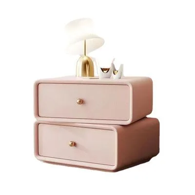
When you're shopping, think about texture too. Pink velvet reads romantic. Pink linen reads casual and relaxed.
Pink bouclé reads modern and cozy. Mixing textures keeps the room interesting even if all the colors are soft.
And don't forget the ceiling. A subtle pink ceiling can make a room feel taller and more intimate. If that feels like too much, consider warm cove lighting instead.
Our strip light ceiling design guide has some clever ways to make a bedroom glow without a single bright bulb in sight.
Pink Bedding and Texture Layers: The Fastest Way to Change a Room
If you're not ready to commit to pink walls, bedding is your best friend. Swapping a duvet cover and a few throw pillows transforms a neutral room in minutes. The best part?
You can change your mind without repainting.
Here's what to look for when you shop:
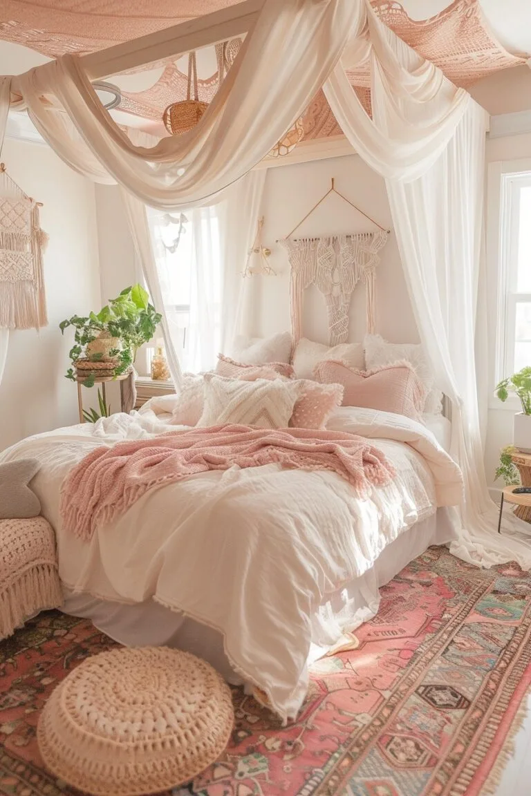
- Duvet covers in washed linen. Linen has a relaxed, rumpled look that instantly feels grown-up. It also breathes better than cotton, which helps with temperature regulation.
- Velvet accent pillows. A couple of velvet pillows in dusty rose add depth. Velvet catches light differently than flat cotton, so the pink shifts as you move around the room.
- Knitted or chunky throws. A cable-knit throw in blush or mauve adds texture and warmth. It looks expensive even when it's from a budget brand.
- Cotton percale sheets. Keep the base layer neutral. White or cream sheets let the pink bedding pop without overwhelming.
Aim for at least three texture layers on the bed. Flat sheet, duvet, and a throw blanket is a solid start. Add two or three pillows of different sizes, and you've got a bed that looks styled without much effort.
Pink Furniture and Upholstery Pieces Worth Investing In
If bedding feels too temporary, consider a pink furniture piece. One solid item anchors the room and gives you a foundation to build around.
The best options for adult spaces:
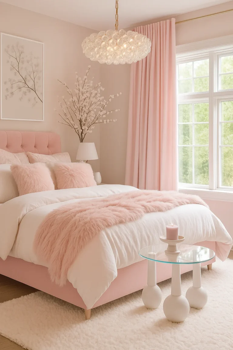
- Upholstered headboard. A dusty pink velvet headboard is the single most effective pink furniture piece. It adds softness behind the bed and reads instantly sophisticated. Pair it with neutral bedding.
- Bed frame with fabric panels. Some bed frames come with upholstered side panels. Pink on a bed frame is bold but manageable if the walls stay neutral.
- Accent armchair. A single pink chair in the corner creates a cozy reading nook. Look for bouclé or textured wool to keep it from looking overly feminine.
- Dresser with cane or rattan details. Pink paint on a dresser with natural woven accents feels modern and grounded.
Quality matters here. A cheap pink finish can look plasticky. Check the furniture specs for solid wood construction and stain-resistant fabric.
The Environmental Protection Agency's guidance on indoor air quality also applies to upholstered furniture, so look for low-emission certifications if that's a concern.
Pink Wallpaper, Textured Walls, and Accent Walls
Paint is not your only option. Wallpaper and textured finishes give you more depth and visual interest.
Wallpaper is the fastest way to make a pink bedroom feel intentional. Look for:
- Floral prints in muted tones. Big, faded roses against a dusty pink background feel vintage, not childish.
- Geometric or stripe patterns. These add structure and keep pink from feeling too soft.
- Peel-and-stick wallpaper. Perfect for renters or anyone who wants a temporary change. Modern peel-and-stick holds up surprisingly well.
If wallpaper feels like too much, try a textured wall treatment. Limewash paint creates a soft, mottled effect that makes pink look like natural stone. It's a popular choice for a reason.
An accent wall is another compromise. Paint just the wall behind your bed in a deeper mauve or berry pink. Keep the other walls neutral.
This concentrates the color where your eye naturally lands without saturating the whole room.
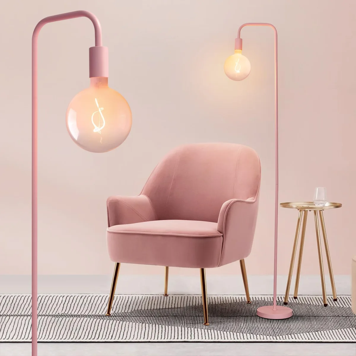
Lighting: How to Make Pink Look Expensive at Night
Lighting makes or breaks a pink bedroom. The same pink wall that looks lovely at noon can look flat and sickly under the wrong bulb. The fix is simple: use warm, dimmable lights.
Here are the numbers to remember:
- Bulb color temperature: Aim for 2700K to 3000K. This range casts a warm, golden glow.
- Brightness: Keep bedside lamps around 400 to 600 lumens. Bright enough to read, soft enough to relax.
- Layering: Use three light sources. Overhead, task, and accent lighting give you control.
Avoid cool daylight bulbs. They turn pink gray and cold. Instead, use warm LED bulbs in your lamps.
Add a dimmer switch so you can adjust the mood from bright and functional to dim and intimate.
A floor lamp with a linen shade casts soft, diffused light. Wall sconces on either side of the bed create a hotel feel. If you want to highlight a textured wall or art piece, use a small picture light.
Renter-Friendly Pink Bedroom Ideas (No Paint Required)
Not everyone can paint. If you rent, the lease usually says no wall color changes. That's fine.
There are plenty of ways to bring pink in without a brush.
Stick to removable and temporary options:
- Peel-and-stick wallpaper. Use it on a single accent wall or the back of a bookshelf. It peels off cleanly when you move.
- Temporary decals or wall art. Large canvas prints with pink abstract art add color without damaging walls.
- Area rugs. A pink rug instantly changes the room's center of gravity. It's also easy to roll up and take with you.
- Curtains. Floor-to-ceiling pink curtains draw the eye up and make windows feel bigger.
- Bedding, throws, and pillows. Already covered above, but these are the backbone of a no-paint pink room.
- Lampshades. Swap a plain white shade for a blush linen one. It changes the whole lighting vibe.
The key is thinking in layers you can move. A coordinated mix of bedding, rug, curtains, and art reads just as intentional as a painted wall. And when you move out?
Everything comes with you.
Before you hang anything, check your lease for rules about nails and adhesive hooks. Many landlords allow removable damage-free strips, but some don't. Also, check fire safety labels on curtains and textiles.
Most upholstered furniture and drapery sold in the US carries a label certifying compliance with flammability standards. That's a small detail that matters for safety and insurance.
Mistakes to Avoid When Designing a Pink Bedroom
The number one mistake is buying everything in the same shade of pink. Matchy-matchy rooms feel flat and staged. Mix a few pinks with different undertones and textures instead.
Another common error is ignoring the room's natural light. North-facing rooms make cool pinks look gray and dull. South-facing rooms handle them fine.
Test your swatches in the actual space before committing.
Don't forget the 60-30-10 rule. Pink works best in balance. Saturating every surface leaves no room for your eye to rest.
Also, skip the glossy paint. Shiny finishes amplify pink and make it look cheap. Matte or eggshell keeps things muted and grown-up.
The Quick Verdict: How to Start Your Pink Bedroom Today
Here's a simple plan to get you from indecision to finished room.
- Pick your shade. Start with blush, dusty rose, or mauve. These are the most forgiving for adults.
- Choose your entry point. Bedding is the easiest start. Paint is the boldest.
- Apply the 60-30-10 rule. One dominant color, one secondary, one accent.
- Add texture. Velvet, linen, wood, and metal keep pink from feeling flat.
- Light it warmly. Swap bulbs to 2700K or 3000K. Add a dimmer if you can.
Start with one step. You don't need to buy everything at once. Build the room gradually and adjust as you go.
If you're planning a bigger overhaul, our false ceiling inspiration can add another layer of polish to the finished look.
Frequently Asked Questions
Will pink make my bedroom feel smaller?
Yes, if you use a deep pink on every wall. Light blushes with a high LRV reflect more light and keep the room feeling open. Darker berry pinks work better as an accent wall.
What colors go with pink walls in a bedroom?
Cream, warm white, walnut wood, black, brass, sage green, and beige all pair well. Stick to warm neutrals to avoid a cold contrast. Use the 60-30-10 rule to keep the balance.
Is pink a bad color for a man's bedroom?
Not at all, when it's the right pink. Muted terracotta, dusty rose, and muddied mauve read neutral and sophisticated. Pair them with dark wood and black metal accents for a masculine mood.
Can I do a pink bedroom on a budget?
Absolutely. A duvet cover, throw pillows, and a rug make a huge difference for under $200. Curtains and lampshades also add pink without a big investment.
Save paint for later if you're unsure.