Pink Cottage Bedroom Ideas for a Charming, Cozy Look
Ever scrolled through dreamy pictures of a pink cottage bedroom, only to wonder how on earth you’d translate that feeling into your own four walls? It’s more than just a color on a wall. Getting it right means walking a fine line between a timeless, cozy retreat and a space that accidentally looks like a toddler’s nursery or a candy shop.
The difference lies in a clear visual strategy. A successful design, as of 2026, hinges on three things: your specific shade of pink, your master pattern, and your textural layers. By starting with these visual anchors, you can build a room that feels collected over time, not decorated in a weekend.
Let’s break down exactly how to do it.
Quick Answer
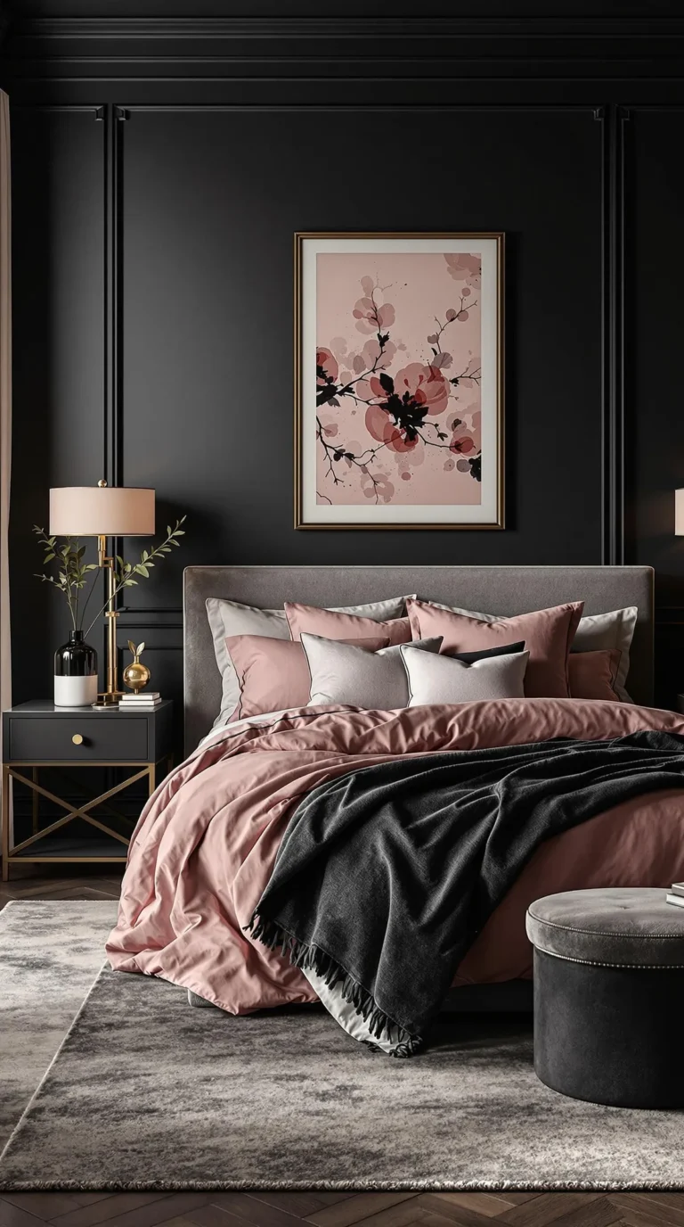
A pink cottage bedroom is a cozy, vintage-inspired space centered on layered textures and curated patterns. Avoid baby pink by choosing muted shades like dusty rose or blush with warm undertones. Start your design with the bed and a large rug as your visual anchors.
The look is completed with floral or toile patterns, natural materials like wood and linen, and warm, ambient lighting. The goal is a room that feels serene and personal, not overly sweet or trendy.
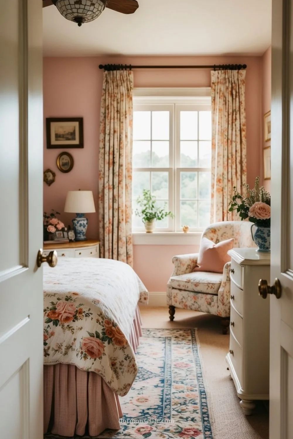
Image source: Bing (Web (fair-use with source credit))
Why a Pink Cottage Bedroom Can Go So Wrong (And How to Nail It)
We’ve all seen the Pinterest fails. The room where pink feels aggressive, or the decor seems like a themed birthday party that never ended. The core problem isn’t the color itself, it’s a lack of contrast and grounding.
A pink cottage bedroom works when pink is the mood, not the mandate. It’s the soft glow in a room filled with other stories. The mistakes happen when every single item is some variation of pink, or when the pink chosen is too cool and bright, fighting with the warm, lived-in feeling you’re after.
It can also feel flat if you skip texture, relying solely on flat paint and smooth fabrics.
Think of it like a painting. You need light, shadow, and different materials to give it depth. A room needs the same.
Your pink walls or bedding are the light. You then add “shadow” with darker wood tones, black metal accents, or a deep green from a plant. The “materials” are your textures: nubby linen, a chunky knit throw, the slight sheen of a ceramic lamp.
When you balance these elements, the pink settles into the background as a feeling, not a shout.
The One Rule: It’s a Feeling, Not Just a Color
Forget trying to match a hex code perfectly. The “cottage” part of this equation is more important than the “pink.” You’re not designing a monochromatic statement. You’re creating a space that feels gently worn, welcoming, and quietly romantic.
This aesthetic pulls from a few key styles. There’s a bit of English Cottage style with its floral chintz and overflowing gardens. There’s the relaxed, imperfect vibe of Shabby Chic.
And there’s the modern nod to tradition found in Grandmillennial style. What ties them all together is a sense of comfort and history. Nothing is too new, too shiny, or too perfect.
Your job is to evoke that feeling through curation. It means choosing pieces that look like they have a past. A painted dresser with slight distressing, a rug with a faded pattern, a quilt that looks handmade.
This approach is forgiving and personal. It allows you to mix that one perfect vintage find with a new, well-made bed frame. The room tells a story, and pink is just the first chapter.
Start With Your Pink: A Visual Guide to Shades and Undertones
This is the most critical visual decision you’ll make. Getting the pink wrong will force you to fight the room’s entire color scheme. The right pink acts as a harmonious base.
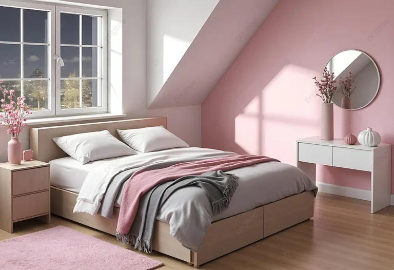
Pink paint colors have undertones, just like any other hue. They can lean warm (hinting at peach, coral, or yellow) or cool (veering toward blue or purple). For a cottage feel, you almost always want a warm undertone.
Cool pinks can feel sterile and modern, which clashes with the cozy, traditional vibe.
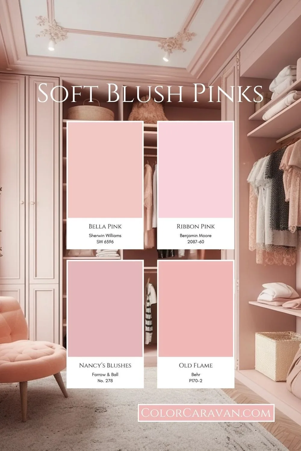
Image source: Bing (Web (fair-use with source credit))
Here’s a breakdown of the most successful pink families for this look:
- Dusty Rose / Muted Blush: This is your safest, most versatile bet. It’s a pink that’s been grayed down or browned slightly. It feels sophisticated, quiet, and works beautifully with creams, warm woods, and slate blue. It’s a great choice for walls.
- Peachy Pink / Salmon: These are warm, sunny pinks. They create an incredibly inviting and cheerful atmosphere, especially in rooms with good natural light. Pair them with butter yellow, sage green, and lots of white.
- Ballet Slipper / Soft Blush: A very light, neutral pink. It’s almost a whisper of color and works well if you’re nervous about commitment. It reads as a soft, warm white in certain lights and is perfect for creating an airy, dreamy base.
How to Choose:
- Get real samples. Order physical swatches or sample pots from brands like Farrow & Ball or Benjamin Moore. Paint a 2×2 foot square on your wall.
- Look at it for 48 hours. See it in morning light, afternoon sun, and with your lamps on at night. The color will change.
- Test it with your stuff. Hold your favorite linen, a wood sample, or a picture frame next to it. Does it feel harmonious or does it clash?
Your chosen pink will influence every other color in the room. A dusty rose loves slate and cream. A peachy pink sings next to sage.
Choose your pink first, and let it guide the palette for your larger textiles and furniture, which you can explore further in our look at adult-friendly pink spaces.
Your Visual Anchor: Choosing the Right Bed and Rug First
With your pink selected, it’s time to build the room’s skeleton. In design, you start with the largest elements. For a bedroom, that’s almost always the bed and the rug.
These two pieces establish the scale, style, and color foundation for everything else.
The Bed: Style and Substance
Your bed frame is the room’s focal point. The style you choose sets the entire tone.
- Wrought Iron or Brass: A metal bed frame, especially in a curvy, traditional design, is a classic cottage choice. It adds elegant lines without visual weight, making the room feel airy. A black or dark bronze finish adds that crucial grounding element.
- Upholstered Headboard: For ultimate softness and texture. Choose a fabric like linen, velvet, or a neutral-toned channel tufted design. This is a great way to introduce a second texture and color.
- Painted Wood: A white or lightly distressed wooden bed (think a sleigh bed or a simple panel bed) feels timeless. The painted finish keeps it light and works with any pink undertone.
The Rug: Grounding the Space
The rug defines the seating area and adds another massive layer of pattern and texture. It’s also a key tool for balancing a light pink palette.
- Size is non-negotiable. For a queen bed, an 8’x10′ rug is ideal. It should extend at least 18-24 inches beyond the sides and foot of the bed. A too-small rug will make the room feel cheap and disjointed.
- Pattern is your friend. Don’t be afraid of a patterned rug. A vintage-style Persian with soft reds and blues, a braided jute rug for texture, or a hooked wool rug with a floral motif all work beautifully. The pattern should relate to your other choices. If your curtains are a large floral, maybe choose a rug with a smaller geometric or a tone-on-tone texture.
- Color should connect. Pull one of the secondary colors from your palette. If your room is blush, cream, and sage, a rug with those same tones (even if it has a hit of navy) will tie everything together.
Choosing these two anchor pieces first prevents the common mistake of building a room around small decor. It ensures the big-ticket items work in harmony before you add a single throw pillow. This foundational approach is just as important in other rustic-inspired spaces, like when planning the core structure of a barndominium.
The Layering Playbook: Textiles, Patterns, and Texture
This is where the cottage magic happens. A flat, one-layer bed looks like a hotel. A bed with curated layers looks inviting, cozy, and personal.
It’s all about building visual interest through variation.
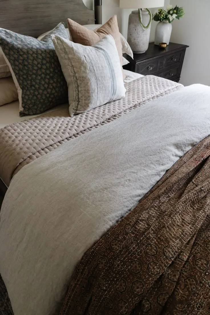
Image source: Bing (Web (fair-use with source credit))
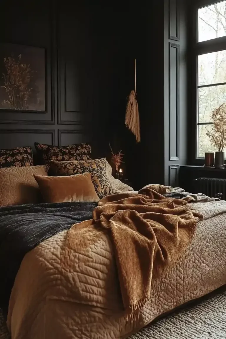
Think of your bed like an outfit. You have a base layer, a middle layer for warmth/style, and a top layer for finishing touches.
The Base Layer: Start with simple, high-quality sheets in a neutral like white, cream, or light gray. A subtle stripe or simple hemstitch detail adds texture.
The Middle Layer: This is your duvet or quilt. For the cottage look, avoid shiny, solid-color comforters. Opt for:
- A linen duvet cover (the crinkly texture is perfect)
- A cotton matelassé or quilted coverlet
- A vintage-style quilt with a faded pattern
The Top Layers: This is where you add personality and that “thrown together” charm.
- A knit throw folded at the foot of the bed.
- A coverlet or lighter blanket in a contrasting color or pattern, layered under the duvet so a bit peeks out.
- Pillows in varying sizes and textures: Two standard sleeping pillows, two Euro shams in a pattern, and two smaller accent pillows in a different fabric (like velvet or a small-scale print).
The Power of Your Dominant Pattern
You need one pattern to lead the visual orchestra. This is usually your largest-scale pattern and it often goes on the curtains or the duvet cover.
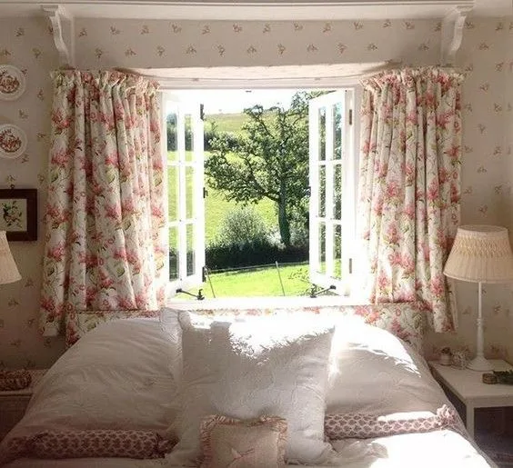
Image source: Bing (Web (fair-use with source credit))
- Floral Chintz or Toile: The ultimate cottage choice. A medium-to-large scale floral on curtains instantly sets the romantic, garden-inspired mood.
- Gingham or Ticking Stripe: For a more casual, farmhouse feel. These are smaller-scale patterns that read as texture from a distance.
- Paisley or Damask: Adds a slightly more formal, vintage touch.
Once you have your dominant pattern, your other patterns should complement it, not compete. If your curtains are a large floral, your rug could be a smaller geometric or a solid with texture. Your throw pillows could pick up one of the accent colors from the floral in a simpler stripe or a woven fabric.
The key is varying the scale.
Building Texture with Bedding and Curtains
Texture is what makes a room feel tactile and expensive, even on a budget. Aim for a mix of at least three different textures. For example:
- Smooth: Cotton sheets, ceramic lamp base.
- Nubby/Rough: Linen duvet, jute rug, basket.
- Soft/Knit: Velvet pillow, wool throw, fluffy rug.
Your window treatments are a major texture opportunity. Linen curtains, Roman shades made from a natural weave, or even simple wooden blinds add a crucial textural layer that plain polyester blinds never can.
Adding the “Grounding” Layer
This is the secret sauce. To prevent the room from feeling like a pink cloud, you need elements that visually “weigh it down.” This creates balance and sophistication.
- Dark Wood: A walnut nightstand, a mahogany picture frame, or a cherrywood dressing table.
- Black Metal: The legs of your bed, a picture light, the base of a lamp.
- Wrought Iron: A chandelier or wall sconce.
- Deep Green: From live plants like a fiddle leaf fig or a trailing pothos.
These darker, richer elements provide contrast. They give your eye a place to rest and keep the overall palette from feeling saccharine. It’s the same principle used in darker, more intimate spaces like a moody boho bedroom, where deep tones create depth and comfort.
Furniture That Builds the Story: Wood, Paint, and Metal
Your furniture is the supporting cast. It should add to the narrative without stealing the show. The goal is a collected look, as if pieces were gathered over decades.
Avoid matching bedroom sets. Instead, mix materials. A painted white dresser can go with a walnut nightstand.
A wrought iron bed frame pairs well with a rustic wood bench. This intentional mismatch creates character.
Focus on pieces with a sense of history. Look for items with turned legs, simple carvings, or time-worn finishes. A dressing table with a hinged mirror, a small upholstered chair, or a simple wooden chest all fit the cottage ethos.
Their purpose is functional beauty.
Lighting That Feels Like Sunset (Not a Showroom)
Overhead can lights are the enemy of coziness. Cottage lighting is all about creating pools of warm, ambient light. You want the room to glow, not be brightly illuminated.
Layer your light sources at different heights.
- Overhead: A crystal chandelier, a simple pendant, or a lantern-style fixture. Always put it on a dimmer.
- Bedside: Ceramic table lamps with linen shades, or wall-mounted swing-arm sconces. This frees up nightstand space.
- Ambient: A floor lamp in a corner, or small picture lights over artwork.
The color temperature is critical. Always choose bulbs labeled “warm white” or “soft white,” typically 2700 Kelvin. This replicates the golden hue of sunset or candlelight.
It makes pinks feel warmer and woods richer.
Styling Surfaces: Nightstands, Dressers, and Walls
This is the final edit. It’s where you add personal touches without creating clutter. Think of each surface as a small vignette.
For nightstands and dressers, follow the rule of threes. Group items in odd numbers for visual interest. A typical grouping might be: a lamp, a stack of two books, and a small vase or tray.
Leave plenty of empty surface area. It makes the styled items feel intentional.
Wall decor should feel organic. Avoid symmetrical gallery walls of identical frames. Instead, mix frame styles (wood, brass, painted) and art types.
A vintage botanical print, a simple mirror, and a small woven tapestry can hang together comfortably. Leave breathing room between pieces.
Common Visual Mistakes and How to Fix Them
Even with the best plan, small missteps can throw off the whole look. Here are the most frequent issues and their straightforward fixes.
Mistake 1: The Room Feels Too Sweet
You’ve used only pink and white, and it’s giving birthday cake.
Fix: Immediately add your grounding elements. Bring in a dark wood stool, a black metal lamp, or several lush green plants. Swap one pink throw pillow for one in a deep green or navy.
Mistake 2: Patterns Are Fighting
The room feels busy and chaotic instead of cozy.
Fix: Identify your dominant pattern. Then, remove or replace any other pattern that is a similar scale. Substitute it with a textured solid or a much smaller, simpler print.
Mistake 3: Everything Looks Too New
The room feels like a showroom, lacking the lived-in charm.
Fix: Incorporate one or two genuinely vintage items. A framed antique postcard, a well-loved quilt, or a secondhand wooden box. Their imperfections add authenticity.
If vintage isn’t an option, gently distress a painted piece with sandpaper or choose new items made from natural, un-lacquered materials.
Mistake 4: The Lighting Is Too Harsh
The space feels cold and unwelcoming at night.
Fix: This is an easy one. Replace all bulbs with 2700K warm white LEDs. Ensure you have at least three light sources (overhead, two bedside) and use the dimmer.
Add a plug-in wall sconce if wiring is a problem.
Putting It All Together: A Side-by-Side Look at Two Budgets
You don’t need a bottomless budget. The cottage style is inherently thrifty. Let’s compare how to approach the room with different financial plans.
| Element | Moderate Budget Plan (Invest) | Thrifty Budget Plan (Save & Source) |
|---|---|---|
| Bed Frame | New, quality upholstered or metal frame. | Secondhand wooden frame, painted or stripped. |
| Rug | New, large-scale vintage-look wool rug. | Secondhand oriental rug, or a large natural fiber jute/seagrass rug. |
| Bedding | New linen duvet cover and quality pillows. | Vintage quilt or coverlet as top layer, with simpler sheets underneath. |
| Curtains | Custom-length linen curtains. | Secondhand floral curtains altered to fit, or simple ready-made panels. |
| Nightstands | One new, one vintage for a mixed look. | A pair of mismatched small dressers or tables from flea markets. |
| Lighting | New ceramic base table lamps. | Secondhand lamps with new linen shades. |
| Decor | A few new art prints in vintage frames. | Entirely thrifted art, frames, vases, and books. |
The moderate budget invests in the big, hard-to-change items you use daily: the bed, a good rug, and comfortable bedding. The thrifty plan puts money into paint and DIY labor, then sources character from secondhand finds. Both paths can create a beautiful result.
The key is allocating funds intentionally, a principle that applies whether you’re decorating a bedroom or planning a budget-friendly barndominium build.
The Thrifter’s Guide to Authentic Finds
Thrifting is your best tool for authentic character. Skip big-box decor aisles. Focus on local flea markets, estate sales, and online auctions.
Look for items with good bones, not perfect finishes. A solid wood dresser with outdated hardware is a gem. A chipped but ornate picture frame has charm.
You can paint, polish, or simply leave them as is.
Prioritize natural materials. Hunt for vintage linen, cotton tablecloths to make into pillows, wool blankets, real wood frames, and ceramic vases. These items have a patina that new stuff can’t fake.
Your Final Walkthrough: The Edit Before You Call It Done
Step back and look at the whole room. Does it feel peaceful, or is it visually noisy? This is your final edit.
Remove one or two decorative items from every surface. Leave more empty space. Check that your grounding elements are present.
Ensure your lighting is warm and layered.
Live with it for a week. You’ll notice if something feels off. The cottage style isn’t about perfection.
It’s about creating a space that feels genuinely restful and personal.
Frequently Asked Questions
Can a pink cottage bedroom work for an adult?
Absolutely. The key is choosing muted, sophisticated pink tones like dusty rose. Pair them with ample grounding elements like dark wood and black metal.
This creates a serene, mature retreat far from a nursery.
What’s the best white to pair with pink walls?
Choose a warm white with creamy or peachy undertones. Avoid stark, cool whites. Colors like Swiss Coffee, White Dove, or Simply White from major brands work well.
They keep the palette cohesive and cozy.
How do I add cottage style if I’m renting?
Focus on changeable layers. Use removable floral wallpaper decals. Layer rugs over existing flooring.
Add character with vintage-inspired bedding, curtains, and thrifted decor. Your furniture and lighting choices will do most of the work.
Is floral wallpaper necessary?
No, it’s not necessary. While a classic choice, you can achieve the look with painted walls and floral patterns on your textiles instead. This is a more flexible and often budget-friendly approach.
How can I keep the room from looking too cluttered?
Edit ruthlessly. Use closed storage like dressers and baskets. Limit surface decor to a few intentional groups.
Ensure every item has a purpose, either functional or deeply decorative. Negative space is your friend.