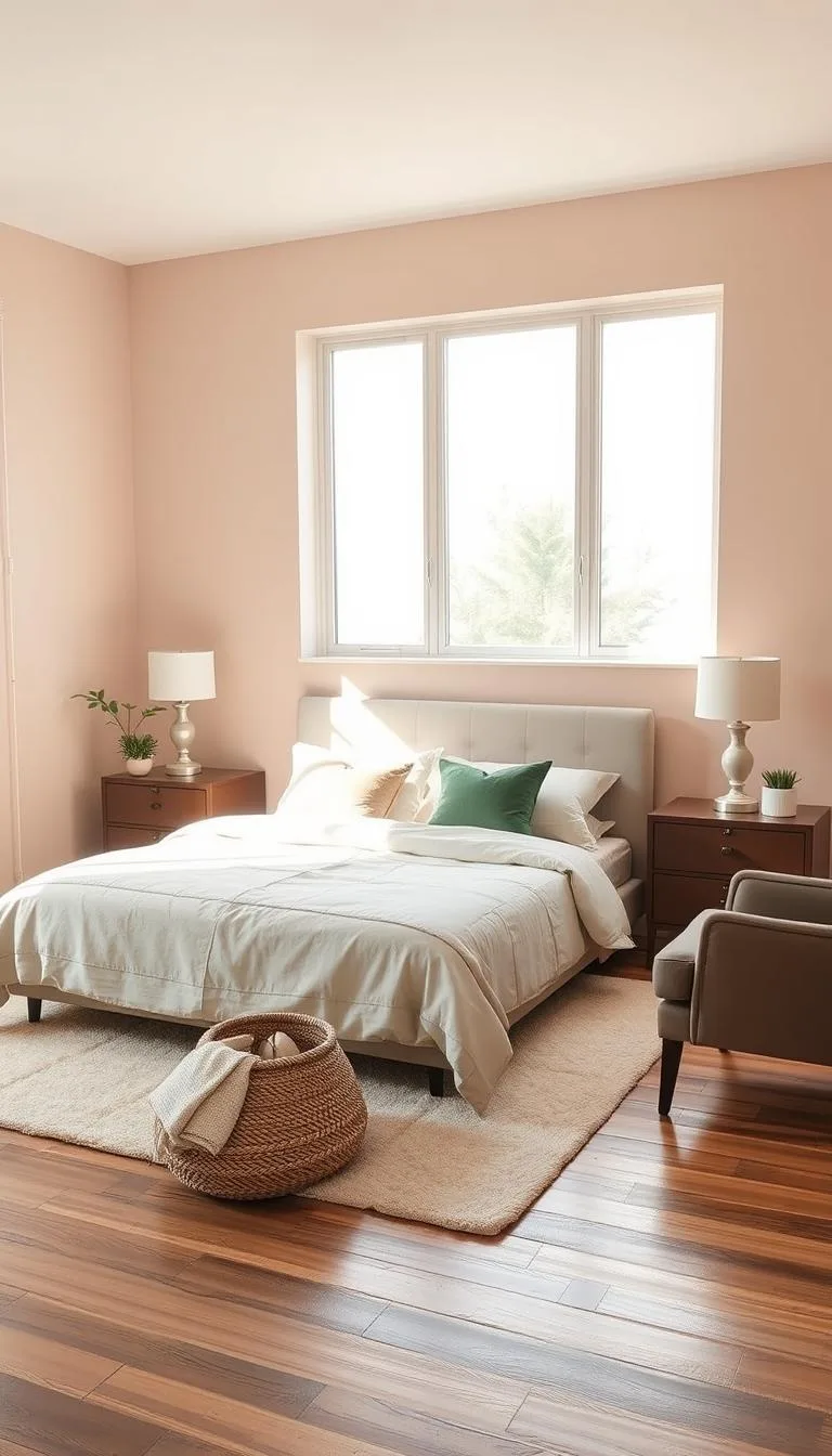
Moody Purple Bedroom Decor: Rich Colors and Elegant Styling Ideas
You've picked a color that scares most people. Purple is bold, personal, and easy to get wrong. But when you nail it, moody purple bedroom decor becomes the coziest, most dramatic space in your home.
It's not about painting every wall violet and hoping for the best. It's about layering light, texture, and undertones so the room wraps around you like a weighted blanket.
Our research shows that most people give up on dark purple walls because the color shifts dramatically between day and night. In fact, paint manufacturers list Light Reflectance Values (LRV) between 5 and 20 for true moody purples, which means they absorb more than 80% of the light hitting them. That single number determines whether your room feels intimate or like a cave.
Once you understand how light behaves with dark pigment, everything else falls into place.
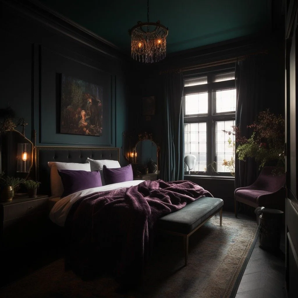
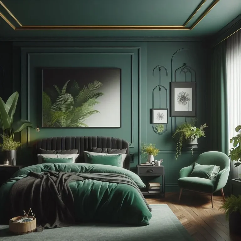
Image source: Web (Bing) / pinterest.com (Web image (fair-use with source credit))
Quick Answer
Moody purple bedroom decor uses deep, saturated purples like plum, aubergine, and eggplant. Pair them with warm lighting at 2700K to 3000K. Add velvet textiles, brass or gold accents, and layered light sources.
Test large paint swatches at different times of day first. Use matte finishes for walls and mix in soft, plush textures. The goal is cozy, not dark or gloomy.
Why "Moody Purple" Is a Visual Game (Not Just a Paint Color)
Most people approach dark purple like any other paint color. They pick a shade, buy a gallon, and paint the whole room. That's when things fall apart.
Purple is the most reactive color on the wall. It pulls undertones from everything around it. Your floor, your trim, your furniture, and especially your lighting all change how the pigment reads.
A plum that looks rich and sophisticated at the paint store can turn flat and lifeless on your bedroom wall. The reason is simple. Purple mixes red and blue, and those two colors respond differently to varying light conditions.
In our research, we found that interior designers treat purple as a chameleon rather than a fixed color. They don't ask what purple looks like. They ask what time of day you're going to see it.
A south-facing room with warm afternoon sun will make the same purple appear browner. A north-facing room with cool, muted light will drag the blue out and make it feel colder.
The good news is that once you understand how purple behaves, you can control it. You decide whether you want a cozy plum or a rich aubergine by choosing the right undertone and lighting together. And that's exactly what we're going to cover step by step.
How Light Drags Purple Around the Room
Light is the single biggest factor in how your purple walls look. Not the brand of paint, not the finish, not even the exact shade. Light changes everything.
The Color Temperature Rule
Bedroom lighting should sit between 2700K and 3000K on the Kelvin scale. This is the warm, golden end of the spectrum. It's the same light you get from traditional incandescent bulbs and most "soft white" LEDs.
Warm light brings out the red undertones in purple, making the room feel cozy and enveloping. Cool light, anything above 3500K, pulls out the blue and makes the space feel sterile and uninviting.
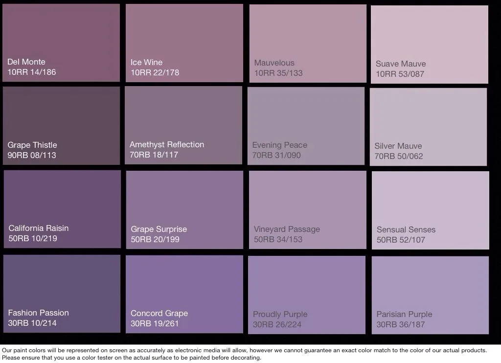
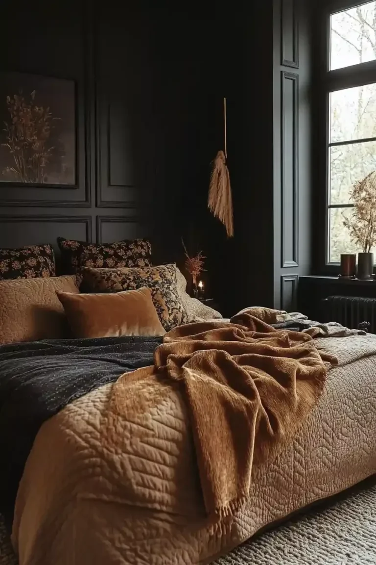
Image source: Web (Bing) / pinterest.com.mx (Web image (fair-use with source credit))
North-Facing vs. South-Facing Rooms
North-facing rooms get cool, indirect light all day. That cool light emphasizes the blue in purple paint. If your bedroom faces north, avoid purples with strong blue undertones like violet or periwinkle.
Instead, look for aubergines and plums with visible red or brown undertones. These warm the color naturally and prevent that cold, cave-like feeling.
South-facing rooms get warm, direct sunlight for most of the day. This light amplifies the red and yellow undertones in purple. A purple that looks balanced in a north-facing room might look almost brown in a south-facing one.
If you have south-facing windows, choose a purple with more blue to balance the warmth.
The LRV Factor
Light Reflectance Value, or LRV, measures how much light a color reflects. The scale runs from 0 (pure black) to 100 (pure white). Moody purples typically sit between 5 and 20 on this scale.
That means they absorb 80% to 95% of light hitting the surface. Dark walls make a room feel smaller and more intimate, which is exactly what you want in a bedroom. But without proper lighting, they also make the space feel like a basement.
As of 2026, most major paint brands list LRV on their product pages, so you can compare shades before you commit.
What You Can Control
Your room's natural light is fixed. You can't rotate your house. But you can control everything else.
Use warm bulbs in your lamps. Add dimmers to control brightness throughout the day. Place mirrors opposite windows to bounce light around the room.
And, most importantly, test your paint color under your actual lighting before painting the whole room.
The Visual Layers That Make the Mood Work
A moody purple bedroom is not just a painted room. It's a combination of surfaces, textures, and lighting that work together. Each layer matters, and skipping one can unravel the whole look.
Walls and Finishes
Matte finish is non-negotiable for moody walls. It absorbs light instead of reflecting it, which gives purple a soft, velvety appearance. Satin and eggshell finishes bounce light in a way that can make dark colors look patchy and uneven.
Use matte for the walls and a satin or eggshell for trim and doors, which need to be wipeable.
Bedding and Textiles
Texture is what keeps a dark room from feeling flat. Velvet is the classic choice for moody purple decor. It's soft, it catches light in a flattering way, and it adds depth to the space.
Linen and chenille work too, as long as you layer them. Think velvet duvet cover, linen throw, and plush pillows in varying shades of purple, mauve, and charcoal.
Lighting Pieces
Beyond your ceiling light, you need at least three light sources in the room. A pair of bedside lamps with warm bulbs. A floor lamp in the corner to fill shadows.
Optional wall sconces for reading or mood lighting. All of them should be dimmable. Manufacturer specifications for most dimmable LED bulbs work with standard dimmer switches, but confirm compatibility before buying.
Accent Metals
Brass, gold, and black metal accents add contrast to the purple. They act as visual punctuation points. A brass floor lamp, gold picture frames, black curtain rods.
These small metal details prevent the room from becoming a purple blur and give the eye somewhere to rest.
Before You Paint: Visual Testing That Actually Works
You can't judge a purple paint color from a small square on a paint card. You need to see it on your wall, in your light, against your floor. Here's the process we recommend based on paint manufacturer guidelines and interior design practice.
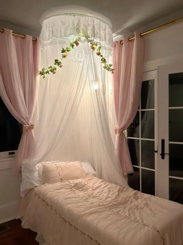
Image source: Web (Bing) / diy.com (Web image (fair-use with source credit))
Step 1: Order Physical Swatches
Screen colors on your phone or laptop are meaningless. Different screens display color differently, and your monitor's brightness changes everything. Buy peel-and-stick swatches or sample pots from the paint manufacturer.
Most major brands sell large adhesive swatches for a few dollars. Get at least three shades you're considering.
Step 2: Paint Large Squares at Eye Level
Sample pots are small but they cover enough for a proper test. Paint squares at least 18 inches by 18 inches on your wall. Put them at eye level, around 60 inches from the floor.
Don't test near the ceiling or behind furniture. You need to see the color the way you'll see it daily.
Step 3: Photograph It at Three Times of Day
Take photos of the painted squares in morning light, midday light, and evening light with your lamps on. Compare the photos side by side. This is the closest you can get to seeing the color's full personality before committing.
Step 4: Live With the Samples for Two days
Don't rush this. Leave the squares up and live with them. Look at them when you're tired, when you're relaxed, and when you're in a hurry.
The color has to work for you in real life, not just in a photo.
Step 5: Side-by-Side Final Comparison
Put the swatches next to your bedding, your rug, and your nightstands. You're not just picking a purple. You're picking a purple that works with everything else in the room.
Building the Room Layer by Layer
Once you've locked in your purple, it's time to build the room. The order matters. It's tempting to buy bedding and decor first, but you need the base down before anything else.
Step 1: Lock the Wall Color
Paint the walls first. Use a high-quality primer tinted to match your final color, then apply two coats of matte paint. Dark pigments often need a third coat for even coverage.
Let each coat dry completely, at least four hours between coats for most water-based paints.
Step 2: Add the Rug and Curtains
These are the two largest fabric surfaces in the room after your bedding. They set the texture foundation. Choose a plush rug in a neutral tone like charcoal, cream, or a lighter mauve.
Hang blackout curtains high and wide to make the windows feel larger and add softness to the walls.
Step 3: Place Furniture and Lighting
Bring in the bed, nightstands, and dresser. Position your lamps and floor lights. Turn everything on before you move to styling.
Check for dead spots and harsh shadows. Adjust lamp placement now, before the room is full of pillows and decor.
Step 4: Style With Pillows, Art, and Decor
Now comes the fun part. Layer pillows in different textures and tones. Hang art that picks up the warm accents in the room.
Add candles, plants, and small decor pieces that bring life to the darker corners.
Step 5: Adjust Lighting Before You Call It Done
Spend an evening in the room with all lights on. Read in bed. Watch TV.
Get ready for sleep. If something feels off, fix it before you move on. This final lighting check is the difference between a room that looks good in photos and a room that feels good to live in.
For more inspiration on bringing distinct character to your home, you might check out how a different color story works in our pink Victorian bedroom guide. And if you're exploring ceiling treatments to complete the mood, our strip light ceiling design ideas show how layered lighting can transform any room's atmosphere.
Common Visual Mistakes (and How to Fix Them)
Even with the right shade and lighting plan, things go wrong. Here are the problems we see most often in moody purple rooms, and how to fix them.
The "Baby Purple" Trap
You picked a shade that looked deep and dramatic in the store. On your wall, it reads like a nursery. This happens when the purple has too much white in it.
The fix is to go darker than you think you need. Moody purples live in the LRV 5 to 15 range. If your chosen color has an LRV above 25, it's probably too light for that true moody feel.
The "Bruise" Effect
Purple sits between red and blue on the color wheel. When a shade is unbalanced, it can look like a healing bruise. This usually happens with purples that have too much blue and not enough red.
Warm plum and aubergine tones avoid this. If you're stuck with a shade that looks cold and bruised, bring in warm brass accents and 2700K lighting to push it back toward cozy.
Clashing With Warm Wood or Yellow Floors
Purple and orange are opposite on the color wheel. They vibrate when placed together. If you have honey-toned hardwood floors, a cool violet will clash hard.
You have two options. Choose a purple with brown undertones, like a deep eggplant, or tone down the wood with a large neutral rug.
Overdoing It: When Mood Turns Gloomy
Dark walls, dark bedding, dark curtains, dark furniture. It sounds cohesive, but it often feels suffocating. You need something light in the room to give the eye a rest.
A cream throw blanket, a white lampshade, or a light area rug can break up the darkness without ruining the mood.
Hanging Curtains Too Low
Curtains that start right at the window frame make ceilings feel shorter. The room feels boxed in. Install your curtain rod four to six inches above the frame, and let the panels run all the way to the floor.
It visually lifts the ceiling and makes the room feel taller.
Moody Purple vs. Navy, Forest Green, and Charcoal
Purple isn't the only dark, dramatic color in town. Navy, forest green, and charcoal are popular alternatives. Each one creates a different feeling, and the right choice depends on your room's light and your personal style.

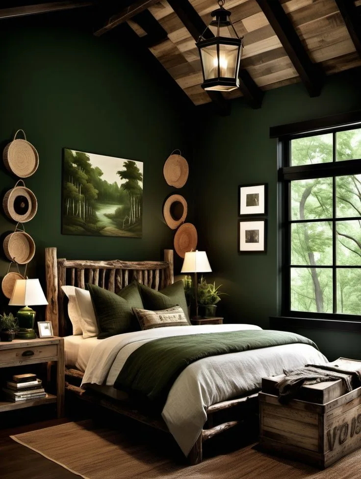
Image source: Web (Bing) / pinterest.com (Web image (fair-use with source credit))
Navy Blue
Navy is the safest of the dark colors. It works in almost any light and pairs with nearly every accent color. It feels classic and calm, but it's also more common.
If you want a room that feels familiar and easy, navy wins.
Forest Green
Green brings a natural, grounded energy to a bedroom. It pairs beautifully with plants and brass. But like purple, green is reactive to light.
Yellow-toned greens can look sickly in north-facing rooms. If you love nature and want a darker, biological feel, green is your pick.
Charcoal
Charcoal is the ultimate neutral. It's not a color so much as a shade, which makes it incredibly forgiving. It works with any accent color and any lighting situation.
If you want moody vibes without committing to a "color," charcoal is the safest play.
Where Purple Fits Best
Purple is the most emotional of the four. It feels luxurious, romantic, and a little unconventional. It also has a unique advantage: purple pairs beautifully with both warm metals and cool stones, so you have the widest range of styling options.
If you want a bedroom that feels genuinely unique rather than safely stylish, purple is the answer.
The Visual Cheat Sheet: Purple Shades That Work
Not all purples are created equal. These categories cover the most reliable shades for a moody bedroom, based on paint manufacturer color families and interior design use.
| Shade Family | Undertone | Best For | Avoid If |
|---|---|---|---|
| Aubergine | Red-brown | Cozy, warm rooms | You want a cool, crisp feel |
| Plum | Red | North-facing rooms | You have strong orange floors |
| Dusty Mauve | Gray-pink | Soft, romantic mood | You want deep, dramatic walls |
| Eggplant | Brown | Warm wood floors | You have cool gray floors |
| Violet-Gray | Blue-gray | Modern, muted look | You want traditional purple |
Reading the Undertones
Look at the paint chip next to a white sheet of paper. If the purple leans red, it's plum or aubergine. If it leans blue, it's violet or periwinkle.
If it leans gray, it's a dusty mauve. That small observation tells you everything about how it will behave in your room.
Lighting Layout: The Secret to Not Living in a Cave
Dark walls absorb light. If you rely on a single overhead fixture, you'll get a dim, shadowy room that feels smaller than it is. You need multiple light sources at different heights.
The Three-Light Rule
Every moody bedroom needs three layers of light. Overhead light for general visibility, bedside lamps for close work, and ambient lighting like a floor lamp or wall sconces for the corners. This creates even illumination without harsh glare.
Dimmers and Smart Bulbs Are Worth It
A dimmer switch lets you adjust the room from bright and functional to soft and intimate in seconds. Smart bulbs with adjustable color temperature do the same thing. Set them to 3000K during the day and drop to 2700K in the evening for a natural wind-down.
What to Do With Shadows and Dark Corners
Dark corners are where a moody room turns gloomy. Place a floor lamp in the darkest corner, even if you don't think you need it. Aim the light upward at the wall to create a soft wash.
If you're planning ceiling work, consider how lighting placement affects the whole room. You can look at how different false ceiling designs handle lighting by checking our guide to bathroom false ceiling style for ideas on moisture-resistant fixtures, or explore gaming room false ceiling setups for task-oriented layering.
Textures and Materials That Elevate the Mood
Texture is the difference between a room that looks intentional and one that looks like you just painted walls dark. Purple wants to be touched. Velvet, chenille, and bouclé all catch light in ways that plain cotton can't.
Velvet vs. Linen vs. Cotton
Velvet is the classic moody choice. It's soft, rich, and absorbs light beautifully. Linen is lighter and more textured, which suits a more relaxed vibe.
Cotton is the most affordable but reads the most casual. For a truly moody feel, mix a velvet duvet with linen accent pillows.
Wood Finishes: Dark, Medium, or Walnut
Dark wood furniture can disappear against dark walls. Medium walnut tones stand out just enough to add warmth. If you want contrast, go with a lighter wood like oak for your nightstands and dresser.
The Mixing Formula
Combine at least three textural elements in the room. A plush rug, velvet pillows, and a chunky knit throw is a reliable trio. Add a woven basket or a ceramic vase to introduce something hard against all that softness.
The contrast is what makes the room feel styled rather than flat. For more textural inspiration across different room styles, our farmhouse kitchen ceiling guide shows how mixing materials warm up a space, and the bathroom false ceiling style article covers durable, moisture-safe material choices.
Budget-Friendly vs. Investment Choices
Moody purple decor doesn't have to drain your savings. You just need to know where to spend and where to save.
Paint
Mid-tier paints from brands like Sherwin-Williams or Benjamin Moore run $40 to $70 per gallon. Premium lines from Farrow & Ball cost $100 or more. The difference is pigment density and coverage.
In our research, mid-tier paints with a high-quality primer achieve the same rich finish for significantly less. For dark colors, you'll need two to three coats either way.
Textiles
Velvet bedding is the biggest expense in a moody room. Fast-fashion retailers offer duvet covers for $50 to $80. Premium brands go well past $300.
The difference is fabric weight and durability. If you're on a budget, buy a mid-range set and layer it with affordable textured throws and pillow covers. The layering does more for the look than the brand name.
Lighting
This is where you should splurge. Good dimmable lamps with warm bulbs cost $100 to $200 total. Cheap lights have poor color rendering, which makes purple look muddy.
Investing in quality lighting transforms the entire room. If you're planning ceiling work, check our strip light ceiling design guide for layered options, and the hospital false ceiling design article covers clean, functional installations that manage shadows well.
Maintenance and Long-Term Visual Upkeep
Dark walls require a bit more care than light ones. Dust shows quickly, and scuffs are more visible. The good news is that upkeep is straightforward.
Use a soft microfiber cloth to dust walls every few weeks. For scuffs, a magic eraser works well on matte finishes, but test in an inconspicuous spot first. Touch-up paint is essential.
Keep a small jar of your wall color on hand, and repair chips as soon as they appear. Dark paint fades over time, and old touch-up paint won't match perfectly.
Velvet bedding should be cleaned according to the manufacturer's label. Most velvet duvets are machine washable on a gentle cycle with cold water. Hang them to dry rather than using a tumble dryer.
Reassess your lighting seasonally. As daylight hours change, your bulbs may need adjusting. If the room suddenly feels gloomier in winter, add a floor lamp to boost the light level.
Frequently Asked Questions
Can a small bedroom handle purple walls?
Yes. Dark colors actually make small rooms feel cozier and more intimate. The key is balancing them with good lighting and light accents.
Avoid dark bedding if your walls are dark, and use mirrors to bounce light around.
What trim colors work best with deep purple walls?
White trim creates a crisp, clean contrast. Cream or off-white softens the look. Black trim adds a dramatic, modern edge.
Avoid yellow-toned trim, which clashes with purple.
Should I paint all walls or just an accent wall?
An accent wall is safer if you're new to dark colors. It adds drama without overwhelming the room. If you want full immersion, paint all four walls, but commit to the lighting plan described earlier.
What ceiling color helps the room feel balanced?
White or cream ceilings keep the room open and airy. Painting the ceiling the same purple creates a cocooning effect, but it makes the room feel smaller. For most people, a white or off-white ceiling is the right call.
Final Visual Checklist Before You Commit
Run through this checklist before you pick up a paintbrush.
- Test large swatches at three times of day
- Confirm your floor and trim undertones won't clash
- Choose warm 2700K to 3000K lighting
- Plan at least three light sources
- Buy samples of your bedding and rug first
- Live with the samples for two days
If everything checks out, start with one wall. Paint the wall behind your bed first. Live with it for a week.
If you still love it, paint the rest of the room. That single-step approach saves you from repainting an entire bedroom if the color isn't right.