Moody Pink Bedroom Ideas: Rich Color Combinations for a Romantic Space
That moody pink bedroom you've been saving to Pinterest isn't really about pink. It's about how the color absorbs light, plays with shadows, and sits against velvet and dark wood. Nail those three things and the room looks intentional.
Miss them, and you're back to Pepto-Bismol.
Manufacturer specifications confirm that depth is the real game-changer. Paint shades with a Light Reflectance Value (LRV) between 20 and 35 read as moody and sophisticated, while anything above 40 drifts straight into nursery territory. As of 2026, most quality interior paints cost between $50 and $90 per gallon, and that LRV number is printed right on the color card.
Understanding it is the first step toward a room that actually looks like the photo.
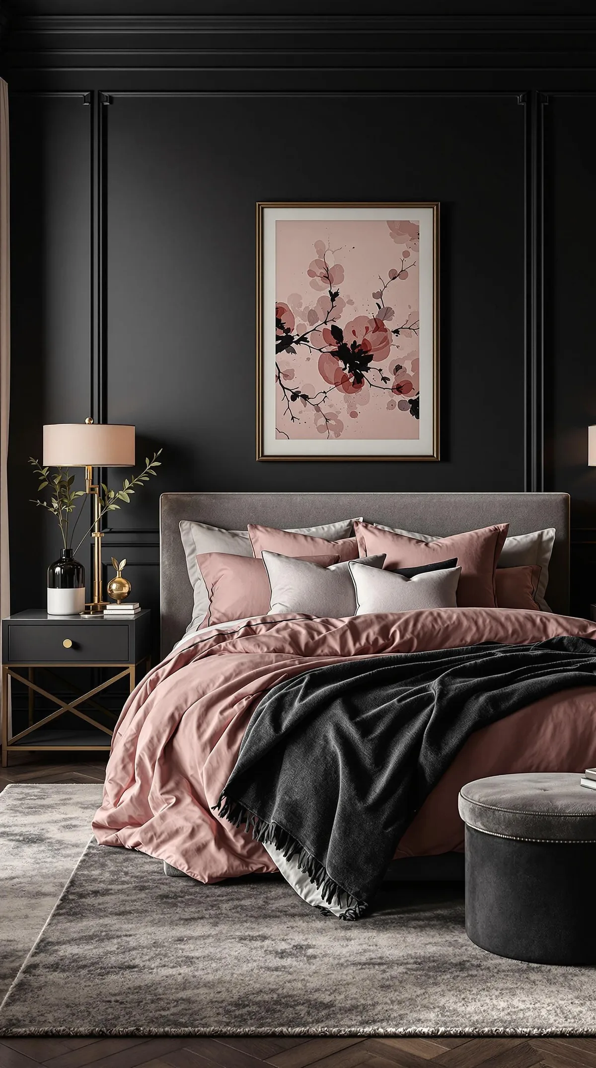
Image source: Web (Bing) / pinterest.com (Web image (fair-use with source credit))
Quick Answer
A moody pink bedroom uses deep, muted pink walls with low light reflectance. Target an LRV between 20 and 35. Pair them with warm 2700K lighting and dark textures like velvet or black metal.
Avoid bright blush tones and cool daylight bulbs. Contrast is what separates moody from childish.
Why Visuals Rule When Designing a Moody Pink Bedroom
Pink is the hardest color to shop for remotely. A shade named "Smoky Rose" can look like bubblegum in one room and dried blood in another. That's because pink sits on a knife's edge between warm and cool, and the tiniest shift in undertone changes everything.
This is a topic where you genuinely need to see it. The photos in this guide show real painted walls, real lighting conditions, and real texture pairings. We reference them throughout because describing "dusty mauve" with words is like describing a song without playing it.
The other reason visuals matter? Paint chips lie. A 2-inch square of color on a paper card tells you almost nothing about how that pigment behaves across a 12-foot wall.
The same pink that looks soft and romantic on a chip can look chalky and flat when it stretches floor to ceiling.
If you're drawn to the layered, romantic look of a thoughtfully decorated space, you might also appreciate how a traditional pink bedroom styling approach handles ornate details. The principles overlap more than you'd expect.
The Core Problem: Why Most Pink Bedrooms Look Like a Toddler's Nursery
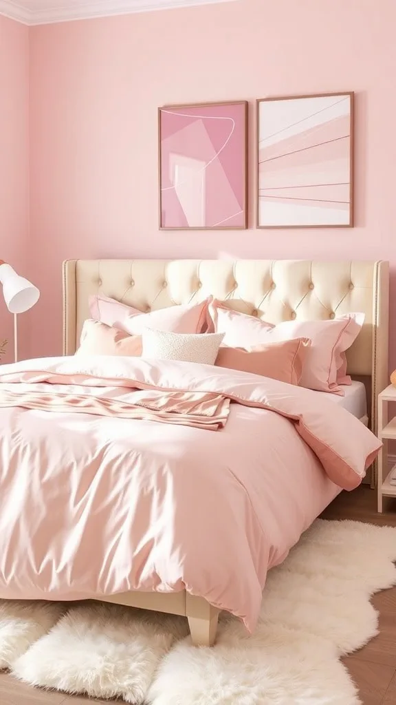
Walk into a pink bedroom that feels childish, and you can usually name the culprit in five seconds. The walls are too bright. The pink is too clean, too saturated, too close to what you'd find on a Barbie dollhouse.
It bounces light everywhere and makes the room feel like a pastel box.
The technical issue is light reflectance. High-LRV pink paints, typically anything above 45, throw daylight back into the room. That sounds nice, but it flattens shadows and washes out depth.
The result is a space that feels sterile and young, regardless of how expensive your bedding is.
The other mistake? Treating pink as a single color. It's not.
The pink family includes mauve, terracotta, dusty rose, blush, rosewood, and crushed berry. Each behaves differently, and most of the "childish" failures come from defaulting to bright blush because it's the safest option.
The fix is counterintuitive. You go darker. You pick a pink that's been muted with brown, purple, or red, and you let it absorb light instead of reflecting it.
That's the whole moody trick. If you're exploring other ways to make a room feel intentional, our broader bedroom design ideas cover the same principle from other angles.
The Key Identifiers of a Moody Palette: Undertones, LRV, and Depth
Three technical specs separate a moody pink from a nursery pink. Learn these and you'll stop guessing.
Undertones are the base pigments mixed into the pink. A pink with a purple undertone reads cool and slightly moody. One with a brown undertone reads earthy and grounded.
One with an orange or red undertone reads warm and romantic. This is the first filter when you're narrowing down paint chips.
Light Reflectance Value (LRV) measures how much light a color bounces back. The scale runs from zero (pure black) to 100 (pure white). For a moody pink, you want between 20 and 35.
That's dark enough to create depth, but light enough that the room doesn't feel like a cave.
Depth is simpler. It's just how dark the color looks on the wall. A deep rosewood at LRV 22 will feel dramatically different from a blush at LRV 55, even though both are technically "pink."
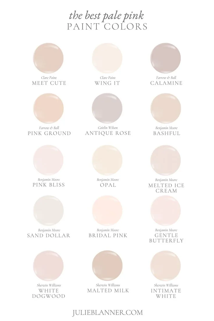
Image source: Web (Bing) / pinterest.com (Web image (fair-use with source credit))
Here's a quick reference table for common moody pinks and their approximate LRV values:
| Shade family | Typical LRV | Vibe |
|---|---|---|
| Dusty rose | 30–35 | Soft, romantic, safe |
| Smoky mauve | 25–30 | Cool, slightly mysterious |
| Terracotta pink | 22–28 | Warm, earthy, grounded |
| Deep rosewood | 18–24 | Dramatic, close to burgundy |
If you're also thinking about the ceiling, ceiling treatment options can shift how the whole room reads. A dark pink wall with a lighter ceiling adds height, while a matching painted ceiling creates a cocoon effect.
Pick Your Shade: The Best Moody Pinks by Natural Light Exposure
Natural light is the variable that ruins more paint choices than anything else. The same gallon of paint will look completely different on a north-facing wall versus a south-facing one. So pick your shade based on your room's orientation, not just the color card.
North-Facing Rooms (Grey, Cool Light)
North-facing rooms get indirect, cool light all day. It has a grey-blue cast that can make pinks look flatter and colder than they are. If you choose a pink with too much purple undertone here, it can slide into lavender or even grey.
For these rooms, lean toward pinks with red or brown undertones. Terracotta pink and dusty rose are your safest bets. They carry enough warmth to counteract the cool light.
Avoid anything described as "mauve" or "orchid" unless you genuinely want a purple-leaning room.
South-Facing Rooms (Warm, Strong Sun)
South-facing rooms get direct, warm light for most of the day. That sounds ideal, but it has a downside. Strong sun can wash out lighter pinks and make them look pale and washed out, like a color that's been left in the sun too long.
Here, you can go deeper. Darker shades like deep rosewood or crushed berry hold their intensity even in bright daylight. The key is to test your paint at noon, when the sun is harshest, and see if the color still holds.
If it fades into a pale shell, you need to go one shade darker.
Regardless of orientation, always paint a large sample square and live with it for a few days. Sun moves, and so does the mood of the room. For more inspiration across different styles, browse our full design library for real-world examples.
Paint Sheen: The Unspoken Game-Changer
Most people pick a paint color and never think about sheen. That's a mistake. Sheen controls how much light the surface reflects, which directly affects whether your pink looks moody or cheap.
The three sheens that matter for interior walls are matte, eggshell, and satin.
Matte has almost no reflection. It absorbs light and hides wall imperfections beautifully. For a moody pink bedroom, this is usually the best choice.
It gives the wall that soft, velvety, expensive look that makes dark colors feel deep and rich.
Eggshell has a slight, low-level glow. It's more durable than matte and easier to wipe down, which matters if you have kids or pets. The tradeoff is that the subtle sheen can make a dark pink look slightly shiny in direct light, which breaks the moody illusion.
Satin is noticeably reflective. It's great for trim and doors, but on a full wall of dark pink, it can look glossy and commercial. Unless you're going for a lacquered, high-glamour look, skip satin for the walls.
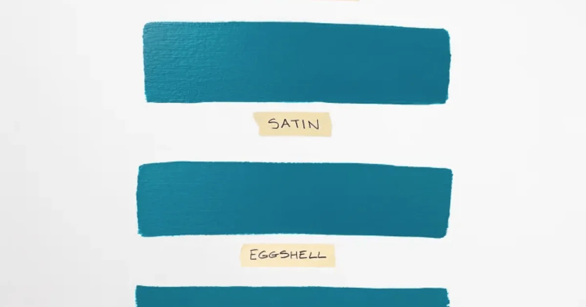
Image source: Web (Bing) / storage.googleapis.com (Web image (fair-use with source credit))
The rule of thumb? Use matte for walls, eggshell if you must have washability, and satin only for trim and millwork. This also affects your paint's longevity, so check the manufacturer's durability specs before you commit.
For similar guidance on layered ceiling lighting, sheen plays a role there too, since glossier ceilings reflect light in ways that change the whole room.
One more note on finish. Darker pinks in matte sheen are more forgiving of texture and drywall flaws. If your walls are older or patched, matte is your friend.
And if you're worried about indoor air quality, the EPA's indoor air quality guidance covers low-VOC paint options that still deliver rich color without the harsh fumes.
Lighting Layers: Keeping the Mood Alive at 8 AM and 9 PM
Paint does the heavy lifting, but lighting decides whether the mood survives past sunset. A deep pink wall under a single harsh overhead bulb just looks like a dark room. Add warm, layered light and the same wall turns into a cozy, intimate retreat.
The goal is to never rely on one ceiling light. You want multiple sources at different heights, all set to a warm color temperature. Manufacturer specs confirm that 2700K to 3000K bulbs are the sweet spot for that amber, candlelit glow.
Anything at 4000K or above will cool your pink down and kill the vibe.
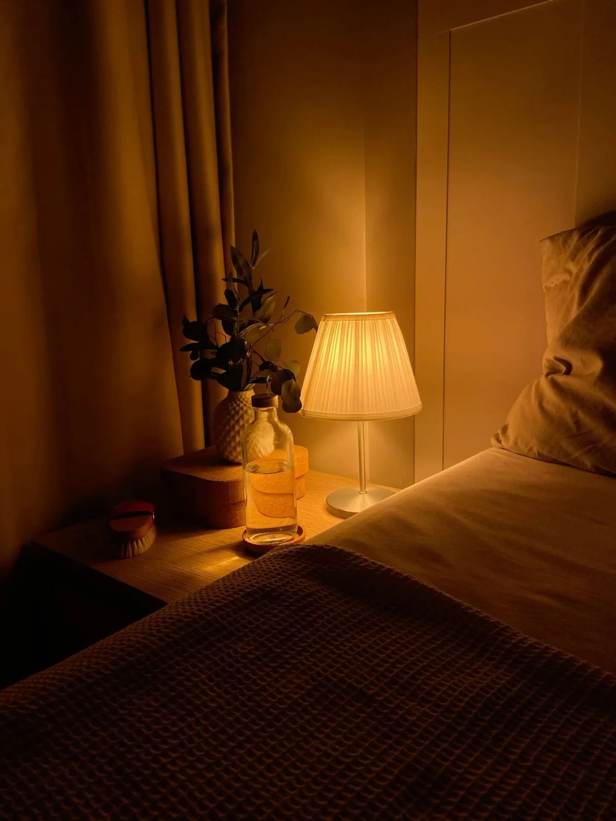
Image source: Web (Bing) / pinterest.com (Web image (fair-use with source credit))
Here's the practical setup that works in most rooms:
- Bedside table lamps at eye level when you're sitting up in bed
- A floor lamp in the corner to fill the middle of the room
- Wall sconces on either side of the bed for a soft, symmetrical wash
- Dimmer switches on everything so you can shift from bright to barely-there
The key is to bounce light off the walls, not down onto the floor. Uplighting from a floor lamp against a dark pink wall creates that soft, diffuse glow that makes the room feel like a candlelit space. And a dimmer switch is non-negotiable.
It costs about $15 to $30 and takes ten minutes to install. If you're also planning ceiling lighting, our layered ceiling strip ideas show how indirect glow can change a room's whole personality.
Texture Stacking: Velvet, Linen, Grasscloth, and Dark Wood
Color gets all the credit, but texture makes a moody pink bedroom feel finished. A flat pink wall with a plain white bed is just a painted room. Layer in velvet, dark wood, and natural fibers, and suddenly it feels designed.
The trick is contrast. You want a mix of rich, heavy textures and light, breathable ones. Velvet is the workhorse of the moody look.
A deep plum or charcoal velvet headboard against a dusty rose wall is the single most effective pairing you can make. The fabric absorbs light and adds a sense of softness that flat paint can't.
Dark wood anchors the room. Walnut or ebony nightstands, a dark dresser, even a black metal bed frame. These darker elements give the pink something to push against.
Without them, the room can float away into sweetness.
Balance it with lighter, natural textures. Linen curtains, a jute or wool rug, a chunky knit throw. These keep the room from feeling like a velvet cave.
The goal is a mix that feels collected over time, not styled in one afternoon. For a more ornate take on this same layering idea, a Victorian-inspired pink bedroom shows how far you can push the drama.
The Step-by-Step Visual Process: From Primer to Final Styling
Getting the paint on the wall is only half the project. The full process, from empty room to styled retreat, follows a logical order. Skip a step and you'll be redoing work later.
Step 1: Prime the walls. Use a tinted primer that matches your pink. This prevents the old wall color from bleeding through and gives your top coat a uniform base. It's an extra $30 to $40, but it saves you a coat of paint.
Step 2: Paint two coats. Dark colors need two coats minimum. Sometimes three, depending on the pigment and the color underneath. Wait the full recoat time listed on the can, usually two to four hours.
Step 3: Let it cure. Paint looks done after a day, but it takes about two weeks to fully cure. Don't hang heavy art or lean furniture against fresh walls during that window.
Step 4: Bring in the big furniture. The bed, dresser, and rug go in first. This is when you see the room actually come together.
Step 5: Layer the lighting. Install lamps, sconces, and dimmers. Test everything at night before you arrange the decor.
Step 6: Style the details. Curtains, throw pillows, art, and personal objects go last. This is the fun part, but it's also where people overdo it. Edit aggressively.
Throughout the process, keep checking your paint sample in different light. The wall will look different at noon than it does at midnight. That's expected.
The question is whether it looks good in both.
Common Visual Mistakes and How to Fix Them
Even with the right shade, small errors can derail the whole room. Here are the most common ones we see, and how to course-correct.
Going too light. The biggest mistake is picking a pink that looks safe on the chip but reads as nursery on the wall. Fix it by going one shade darker than you think you need. Moody pinks almost always look better a step deeper.
Using cool white bedding. Crisp white sheets with a cool blue undertone will clash with a warm pink wall. Fix it by choosing warm white, cream, or ivory linens. The undertone matters more than the color.
Matching everything. A pink bed, pink walls, and pink curtains is a monochrome nightmare. Fix it by bringing in contrast. Black metal, dark wood, and deep green accents all break up the pink and make it look intentional.
Forgetting the ceiling. A stark white ceiling above a dark pink wall can feel jarring. Fix it by painting the ceiling a soft cream or a lighter version of your wall color. For a true cocoon effect, paint the ceiling the same pink and watch the room wrap around you.
Moody Pink vs. the Alternatives: Terracotta, Mauve, and Deep Blush
Not every dark pink is the same, and the differences matter more than you'd think. If you're stuck between shades, here's a direct comparison.
Terracotta pink is the warmest of the group. It carries a strong brown-orange undertone, which makes it feel earthy and grounded. It's the best pick for north-facing rooms that need warmth.
It can edge into "desert sunset" if you layer too much orange with it, so balance it with cool neutrals.
Smoky mauve is the coolest. It has a purple undertone that makes it feel slightly mysterious and romantic. It's gorgeous in south-facing rooms with strong light.
In a darker room, it can slide into looking like a grey-purple, so test it carefully.
Deep blush is the safest. It's darker than a baby pink but still clearly pink, with very little brown or purple. It reads as sophisticated without being dramatic.
The downside is that it can feel familiar, almost safe. If you want real mood, go one step darker toward rosewood.
Still torn? Go with the one that looks best at dusk. That's when the moody effect matters most.
Who Actually Pulls Off This Look? (Primary Bedrooms, Small Apartments, Renters)
This look thrives in primary bedrooms. The deep tones create a retreat that feels private and calming after a long day.
It also works well in small apartments. Darker walls add a cozy, nook-like intimacy instead of making the space feel cramped. Renters can make it work too, as long as they stick to temporary methods.
South-facing rooms are the most forgiving canvas because strong sunlight keeps the pink warm and rich. North-facing rooms need a pink with red or brown undertones to fight the cool grey light.
Renter-Friendly Routes to Moody Pink (No Paint Required)
No paint? No problem. Peel-and-stick wallpaper is the most popular route.
Choose a matte, textured pink rather than a glossy finish to keep the moody feel.
Fabric panels are another clever workaround. Stretch linen or velvet over large canvas frames and lean them against the walls. Large artwork with deep pink backgrounds works as an anchor too.
Pair those with a velvet headboard, a dark rug, and warm lamps, and the room reads fully designed without a single drop of paint.
What It Actually Costs: Paint, Materials, and Lighting Budget
Here's a realistic breakdown for a standard 12×12 bedroom.
| Item | Estimated Cost |
|---|---|
| Quality matte paint (2 gallons) | $100–$180 |
| Tinted primer (1 gallon) | $35–$50 |
| Peel-and-stick wallpaper | $2–$4 per sq ft |
| Dimmer switch | $15–$30 |
| Velvet headboard | $300–$700 |
| Lighting (lamps and bulbs) | $150–$400 |
Total, you're looking at $600 to $1,400 depending on what you already own. Paint and primer are the cheapest part. The headboard and lighting are where costs quickly add up.
Frequently Asked Questions
What's the best pink for a moody bedroom?
Dusty rose with a brown undertone. It reads sophisticated in warm light and never tips into purple.
Can I do a moody pink bedroom in a small room?
Yes. Darker walls make small spaces feel more intimate, not smaller. Keep lighting layered and decor minimal.
Do I need a matte finish?
Matte is best for walls. It absorbs light and hides imperfections. If you need washability, choose eggshell.
How do I stop it looking like a nursery?
Go one shade darker than feels safe. Add black metal or dark wood accents. Skip pastel bedding and matching pink decor.