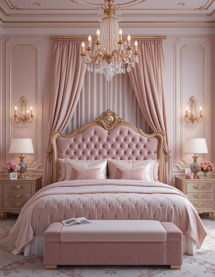
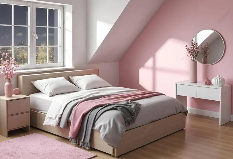
Pink Bedroom Ideas for Kids: Cute, Playful Designs for Every Age
So you’re dreaming up pink bedroom ideas for kids, but you’re staring at a sea of swatches and feeling a bit overwhelmed. You’re not trying to create a cartoonish cotton-candy cave, you’re after a space that feels personal, joyful, and can actually grow with them for a few years. Good news, getting it right is less about picking one perfect thing and more about understanding a simple layering process.
First, let’s clear up a big practical point: the materials matter. For long-term safety and durability, our research points to using paints certified as low-VOC or zero-VOC by the EPA, especially for interior rooms. This standard, which is widely adopted as of 2026, ensures better indoor air quality from day one.
With that foundation, you can build a room that’s both beautiful and smart.
Quick Answer
Focus on a flexible pink palette and layered design. Start with a single feature wall or a soft, versatile pink as your base color. Pair it with plenty of white, wood, or black for balance.
Choose durable, washable fabrics for bedding and curtains. Use removable decor like wall decals and coordinated storage bins to add personality. This approach creates a cheerful room that you can easily update as your child’s tastes change.
Start With the Right Shade of Pink (It Makes All the Difference)
The first and most important decision isn’t an accessory or a piece of furniture. It’s the specific pink you choose for your walls, or for your largest textiles. This single choice sets the entire mood.
A neon-bright fuchsia creates a completely different energy than a dusty, muted rose. Getting this wrong is the fastest way to make a room feel jarring or dated before you’ve even finished.
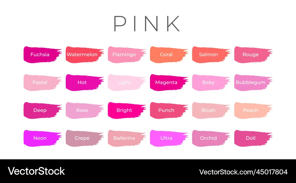
Our editorial analysis of countless design boards and manufacturer palettes shows that pinks break down into two main families: warm and cool. Warm pinks have hints of peach, coral, or yellow. They feel sunny, cozy, and inviting.
Cool pinks lean towards blue or purple undertones. They read as more modern, sophisticated, and calm. A warm pink in a north-facing room can add needed warmth, while a cool pink in a sun-drenched space can temper the brightness.
Warm vs. Cool Undertones
Here’s a quick guide to identifying them:
- Warm Undertones: Think “blush,” “salmon,” or “terracotta.” Names often include words like “peach,” “coral,” “clay,” or “blush.”
- Cool Undertones: Think “mauve,” “rose,” or “berry.” Names often include “mauve,” “rose,” “berry,” or “powder.”
The best advice is always to test. Paint a two-foot square on two different walls in the room. Look at it in the morning light, the afternoon sun, and with the room lights on at night.
That “perfect” pink can look completely different in your home’s unique light than it did on the tiny chip at the store.
The “Grow-With-Me” Palette: From Toddler to Teen
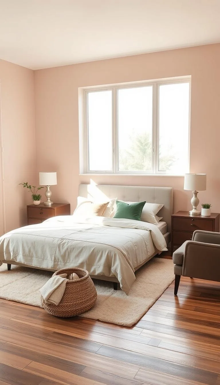
If you want a room to last more than a couple of years, you need a strategic palette. For a young child’s room, consider using your chosen pink as an accent color against a neutral backdrop of white, soft grey, or warm beige. This gives you maximum flexibility.
As they grow, you can easily swap out the accent pillows, art, and bedding to reflect a more mature aesthetic without repainting the entire room.
For a teen, you can be bolder with the pink saturation. A moody, deep rose or a saturated blush can feel incredibly chic and intentional. The key is pairing it with other mature elements, like matte black hardware, clean-lined furniture, and natural textures.
This is a far cry from the principles you’d use for a modern barndominium design, but the core idea of intentional pairing remains the same.
Building Your Visual Foundation: Walls, Floors, and Big Furniture
Once your color direction is set, it’s time to build the permanent layers. This is where you commit to the big items that are harder to change: the wall treatment, the flooring, and the primary furniture pieces. Getting this foundation right makes everything else you add later look intentional, not haphazard.
Think of it like building a house. You wouldn’t pick the throw pillows before you pour the foundation. The same logic applies here.
A common frustration we see in aggregate user reviews is furniture that clashes with the wall color or a rug that fights with the bed. It all stems from not having a clear foundation plan.
The Accent Wall Advantage
Painting all four walls a bold pink is a major commitment. It can also make a small room feel smaller. A far more flexible and dynamic approach is the accent wall.
This is where you paint one wall, typically the one behind the bed, in your chosen pink, while keeping the other walls a neutral white or light grey.
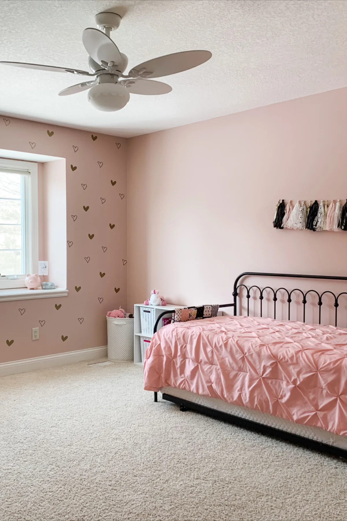
This strategy does a few brilliant things at once. It creates an instant focal point for the room. It adds that punch of color and personality without overwhelming the space.
It also makes the room feel designed, not just painted. If you ever want to change the vibe, you only have to repaint one wall. For a similar bold focal-point strategy in another context, you can see how it works in spaces like a barndominium bathroom.
Choosing a Bed Frame and Dresser That Won’t Clash
Your large furniture needs to complement your pink, not compete with it. For a soft, romantic look, white or cream furniture is a classic and safe choice. It keeps the room feeling light and airy.
For a more modern or grounded feel, natural wood tones (like oak, walnut, or ash) add warmth and texture. Even black or dark charcoal furniture can look stunning with the right pink, creating a sophisticated, high-contrast look.
The mistake to avoid is pairing a warm peach-pink with furniture that has a cool grey stain. The undertones will fight, and the room will just feel “off.” Always look at your paint swatch right next to a sample of the wood finish or a photo of the furniture in natural light before you buy.
Rugs and Curtains: Your Secret Weapons for Texture
Floor and window coverings are where you add depth. A fluffy, white shag rug softens a room and makes it feel cozy for play. A flat-weave rug with a subtle geometric pattern in grey and white adds structure.
For curtains, opt for a solid color that picks up one of your neutrals, white, beige, or grey. If you want pattern, put it on the curtains or the rug, but rarely both. Blackout lining is a pro-parent move for nap times and late summer evenings.
The Decor Layer: Where the Theme Comes to Life (Without Going Overboard)
Now for the fun part. This is the layer of pillows, art, lighting, and knick-knacks. It’s also the layer where many well-intentioned rooms go off the rails by becoming a cluttered explosion of matching, themed items.
The goal here is personality, not perfection. This layer should be the easiest to change as your child grows and their interests evolve.
The key is to think in terms of subtle motifs, not literal themes. Instead of covering every surface with unicorns, choose a few key pieces, a single piece of art, a throw pillow, a lamp base, that nod to the interest. Fill in the rest with solid colors, simple patterns, and textures that support the overall color story.
Picking a Subtle Motif: Florals, Geometrics, or Abstract?
Your motif provides a visual thread. A delicate floral pattern on the bedding or a wallpaper border feels timeless and feminine. Simple geometric shapes (dots, triangles, stripes) feel modern and playful.
Abstract watercolor prints or organic shapes can feel artistic and calm. Choose one direction and repeat it in two or three places around the room. For instance, a floral duvet cover could be echoed in a small piece of wall art and the pattern on a storage bin.
Wall Art and Decals That You (and Your Kid) Won’t Tire Of
Skip the giant, themed canvases that shout “TODDLER ROOM.” Opt for a curated gallery wall of framed art prints, your child’s own artwork, or even vintage book pages. Mix sizes and frame styles for an eclectic look. For a less permanent option, high-quality vinyl wall decals are fantastic.
You can create a cute scene, spell out a name, or add abstract shapes. The best part? They peel right off when you’re ready for a change, making them a smarter long-term investment than a painted mural.
Lighting That Creates a Mood, Not Just Brightness
Overhead lighting is often harsh. Layer in softer, ambient light sources. A pendant light with a paper or fabric shade over a bedside table casts a gentle glow.
String lights (especially the newer, safer LED varieties on a cord) draped over a headboard or inside a canopy create magic at bedtime. A small, solid-color table lamp on a dresser provides perfect light for reading. Each light source should serve a purpose and add to the room’s cozy atmosphere.
Smart Storage Solutions for a Room That Actually Stays Tidy
Let’s be real. A beautiful room means nothing if it’s constantly buried under a layer of toys, books, and clothes. Smart storage isn’t an afterthought.
It’s a critical design element that needs to be planned from the beginning. The goal is to make cleanup intuitive for the child and visually quiet for the room.
Good storage solves the daily pain point of clutter. It turns a chaotic space into a calm one. Our research into space planning for kids’ rooms consistently shows that built-in or modular systems that grow with the child outperform single-purpose toy boxes every time.
Integrating Baskets, Bins, and Shelves Seamlessly
Open shelving with a combination of displayed items and concealed storage is the gold standard. Use attractive baskets or fabric bins, like the ones shown below, to corral smaller toys, blocks, or stuffed animals. Label them with pictures or words so your child knows where everything goes.
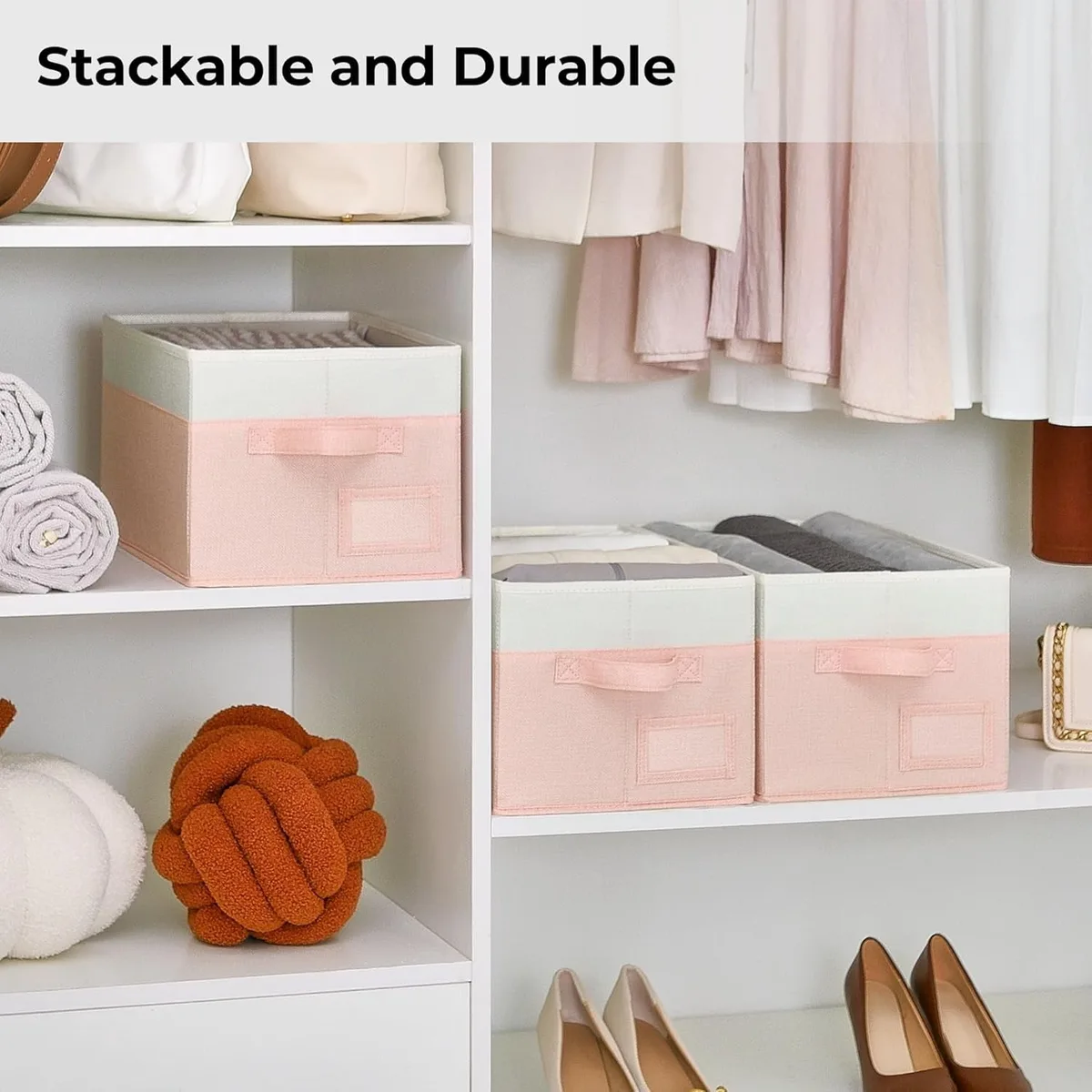
Choose storage containers in colors that complement your palette. White, natural woven, soft grey, or even a matching pink bin will blend in. A bright, clashing color on a bin will stick out like a sore thumb and disrupt your visual flow.
This principle of integrated, functional storage is just as valuable in whole-home projects, like finding clever cheap barndominium ideas.
The “Display vs. Hide” Strategy for Toys and Collections
Not everything needs to be shoved in a box. Designate specific areas for display. A few floating shelves can proudly show off a prized doll collection or a row of favorite books.
A cute miniature table can be a home for a constantly-in-play tea set. By giving special items a “home” out in the open, you validate your child’s interests and make the room feel personal. Meanwhile, the daily-play items and the million-piece Lego set get stored away neatly.
This strategy reduces visual noise and makes cleaning up a much faster, less daunting task.
The key is to have a clear, simple rule for what gets displayed and what gets hidden. Kids can learn it quickly.
Common Visual Mistakes That Make a Pink Room Feel “Off”
You can have all the right pieces but still end up with a room that feels unbalanced or just doesn’t look right. These common errors are often subtle. Once you know what to look for, they’re easy to spot and fix before you make a costly purchase or spend a weekend painting.
The goal is harmony, not matchy-matchy perfection. Rooms that feel “designed” often break a few rules on purpose, but they do it knowingly. The mistakes we’re talking about here are the unintentional ones that leave you wondering why the space doesn’t feel cohesive.
The One-Note Pink Trap (And How to Avoid It)
This is the biggest and most common pitfall. It happens when every single item in the room is a shade of pink. The walls, the bedding, the rug, the curtains, all pink.
The result is a visual sugar rush that feels overwhelming and flat. There’s no depth, no contrast, and no place for your eye to rest.
The fix is simple: introduce other colors. You don’t need many. White is your most powerful ally. It instantly freshens and lightens any pink.
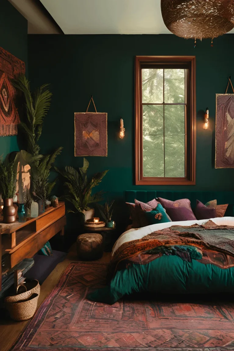
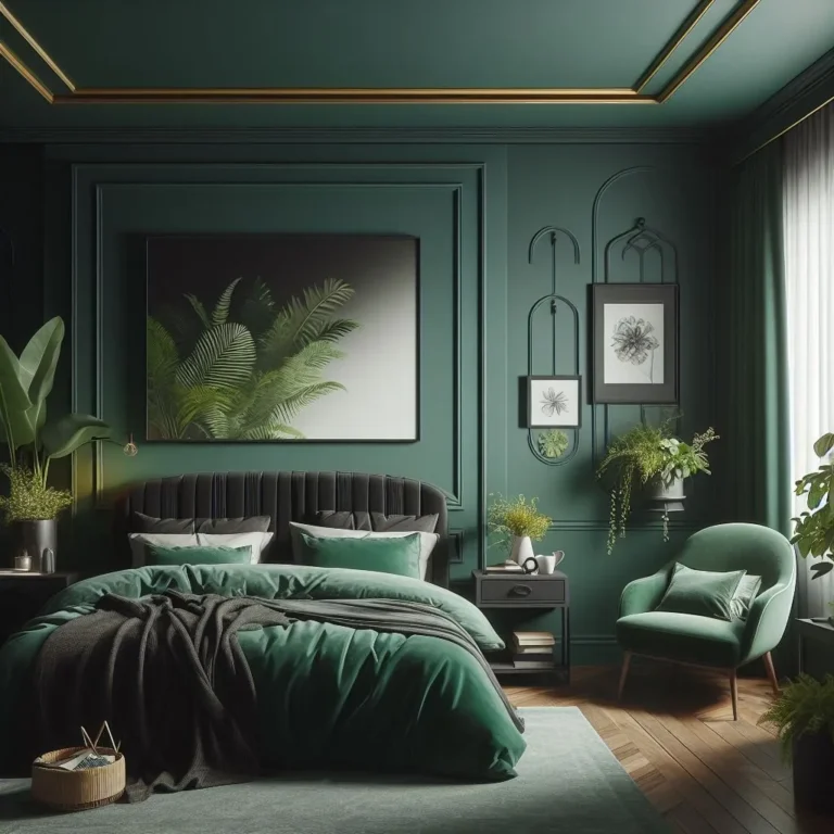
Beyond white, consider natural wood tones, soft greys, blacks, or even small accents of a contrasting color like sage green, navy blue, or gold metallics. These additions create visual interest and make the pink itself look more intentional and sophisticated. For inspiration on using a limited, impactful palette, look at how moody bedroom designs often rely on one dominant hue balanced by neutrals.
Clutter vs. Cozy: Finding the Right Balance
There’s a fine line between a lovingly collected space and a messy one. Clutter is visual chaos, too many small items with no organization, surfaces covered in random stuff, and no clear negative space. Cozy, on the other hand, feels layered and lived-in but still calm.
It has intentional groupings and clear surfaces.
To avoid clutter, practice the “edit and group” method. Instead of scattering twenty small trinkets all over a dresser, choose five favorites and group them together on a small tray. Store the rest and rotate them in later.
Use wall hooks for a few favorite dress-up items instead of piling them on a chair. Regularly edit what’s on display, just like you would with toys. This keeps the room feeling fresh and manageable.
Mismatched Finishes: Glossy, Matte, and Textured
Finish refers to the sheen or surface quality of your materials. A room where everything is the same finish can feel dull. A room where the finishes clash can feel jarring.
Aim for a mix that feels considered.
For example, pair matte paint walls with a satin-finish on trim and doors for subtle contrast. Choose a quilt with a soft, nubby texture and pair it with smooth, cotton sateen sheets. Add a shiny metallic lamp base next to a rustic woven basket.
This mix of matte, glossy, and textured adds richness and tactile appeal. The mistake is pairing a high-gloss pink wall with a glossy lacquered furniture set and a shiny satin bedding, it can feel cold and too perfect.
Pink Room Ideas for Different Ages and Personalities
A one-size-fits-all approach doesn’t work for kids’ rooms. A space for a three-year-old should support safe play and imagination, while a room for a thirteen-year-old needs to function as a bedroom, study, and personal hangout spot. Tailoring the pink theme to the child’s age and unique personality is what makes it truly special.
Our analysis of developmental stages and design trends shows that successful rooms evolve in three broad phases. Each phase has different priorities for color saturation, furniture function, and thematic elements.
The Whimsical Toddler Room (Ages 2-5)
At this stage, safety and imagination are king. The room is primarily a play space that happens to have a bed in it.
- Color Approach: Use soft, warm pinks (think “blush” or “ballerina pink”) as accents against very light neutral walls. This keeps the space feeling bright and open.
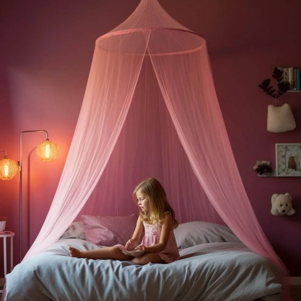
- Focal Point: Create a magical play corner. A simple canopy over the bed or a play teepee instantly defines a cozy nook for reading or pretend play.
- Furniture: Low to the ground is best. A Montessori-style floor bed or a low-profile bed frame makes getting in and out easy. Rounded corners on all furniture are a must.
- Storage: Open, low bins and shelves allow toddlers to see their toys and, crucially, learn to put them away independently. Picture labels are helpful.
- Decor: Keep it simple and durable. A few large, framed art prints of animals or simple shapes, a soft area rug for play, and maybe some friendly cloud or star decals on the ceiling.
The Big Kid’s Creative Haven (Ages 6-12)
This is the golden age of hobbies, collections, and sleepovers. The room needs to be multifunctional: a place to play, create, read, and host friends.
- Color Approach: You can go bolder here. Consider a full pink accent wall in a more saturated tone. Let your child have a say in the specific shade, it builds ownership.
- Focal Point: A dedicated activity zone. This could be a craft table, a reading nook with a comfy chair and good lamp, or a display wall for their artwork and collections.
- Furniture: Think modular. A loft bed with space underneath for a desk or a cozy fort is a huge win. Or use a standard bed with under-bed storage drawers. A small, sturdy desk is essential.
- Storage: The system needs to get more sophisticated. Combine open shelving for books and display with closed cabinets or drawers for supplies and less-attractive items.
- Decor: This is where personality shines. Incorporate their interests thematically. If they love astronomy, use dark blue bedding with gold star pillows and a planetary mobile. If they’re into horses, use rustic wood accents and equestrian-themed art. The key is to suggest the theme, not shout it.
The Sophisticated Teen Retreat (Ages 13+)
A teen’s room is their first true adult-like sanctuary. It needs to provide privacy, support homework, and reflect their evolving personal style. The pink here should feel intentional and chic.
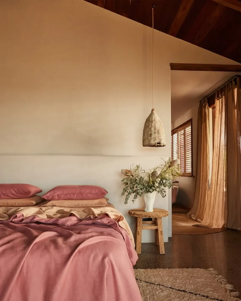
- Color Approach: Embrace deep, moody pinks or very pale, earthy blushes. Colors like “mauve,” “dusty rose,” or “terracotta pink” feel mature. Pair them with rich neutrals like charcoal grey, black, navy, or warm beige. For a deeper dive into this aesthetic, our guide to a dusty pink bedroom explores this palette in detail.
- Focal Point: A styled bedside area or a curated gallery wall above the desk. Teens appreciate a “vibe.”
- Furniture: Prioritize function and quality. A comfortable desk chair, a full or queen-sized bed, and ample clothing storage are non-negotiable. Furniture should feel more “adult”, clean lines, solid materials.
- Storage: Needs to be seamless and high-capacity. Think dressers, closet organizers, and attractive boxes or baskets that hide clutter completely.
- Decor: Layer textures and personal artifacts. A vintage rug, string lights, framed concert posters or photography, plants, and a few quality decorative objects make the space feel curated and personal. The goal is a room that feels like them, not like a kid’s room.
The Safety and Practicality Checklist You Can’t Skip
Beautiful design means nothing if the room isn’t safe and easy to live with. This is the non-negotiable, behind-the-scenes work that ensures the room is a healthy, functional space for years to come. Let’s break down the key areas.
Non-Toxic Paints and Materials
This is the most important step for any child’s room. Volatile Organic Compounds (VOCs) are chemicals found in many paints, adhesives, and composite woods that can off-gas into the air, potentially causing headaches, respiratory irritation, and other issues.
- Paint: Always look for paints labeled “Low-VOC” or “Zero-VOC.” Many major brands have entire lines dedicated to this. The EPA provides guidelines on indoor air quality and VOCs, which can help inform your choice.
- Furniture: When buying new pressed-wood furniture (like dressers or bookshelves), look for products that are CARB Phase 2 compliant or labeled as containing no added urea-formaldehyde. Solid wood furniture is always a safer, albeit often more expensive, option.
- Textiles: Wash all new bedding, curtains, and rugs before use to remove any factory residues. Opt for natural fibers like cotton, linen, or wool when possible.
Secure Furniture and Cord Safety
Tip-over accidents are a serious and preventable hazard. Every year, furniture and TVs tip over and injure thousands of children.
- Anchor Everything: Use sturdy furniture wall anchors to secure every tall dresser, bookshelf, chest, and mirror directly to the wall studs. This isn’t optional. The U.S. Consumer Product Safety Commission (CPSC) runs ongoing campaigns about the importance of this step.
- Cord Management: Keep cords from blinds, curtains, and lamps out of reach. Use cord wind-ups, secure them with cord clips along baseboards, or choose cordless window coverings. Never let a lamp cord dangle within a child’s grasp.
- Outlet Covers: For younger children, use safety plugs in all unused electrical outlets.
Choosing Durable, Washable Fabrics
Kids are messy. Spills, art projects, and everyday play will happen. Your materials need to withstand it.
- Bedding & Pillows: Look for machine-washable covers. Duvet inserts should be washable or have a protective cover. Zippered pillow protectors under pillowcases are a lifesaver.
- Rugs: Synthetic fibers like polypropylene (often labeled “indoor/outdoor” or “performance”) are incredibly stain-resistant and easy to clean. Even wool rugs can be treated with a stain protector.
- Paint Finish: For walls, choose a paint with at least an eggshell or satin sheen. These finishes are much more scrubbable and stain-resistant than flat/matte paint, allowing you to wipe away crayon, marker, or fingerprints without repainting.
- Wall Decor: Use command strips or other removable hanging systems instead of nails for lightweight art and shelves. They cause less damage and allow for easy rearrangement.
Your Step-by-Step Plan for a Smooth Room Makeover
Feeling inspired but unsure where to start? A structured plan prevents overwhelm and ensures you don’t miss a critical step, like painting the trim after you’ve laid down a new rug. Follow this sequence for a smooth, logical process.
1. Define Your Palette and Focal Point
- Action: Gather inspiration images. Identify one key shade of pink you love and 2-3 supporting neutral colors (e.g., Blush Pink + White + Warm Grey + Natural Wood).
- Decide: Will your focal point be a painted accent wall, a stunning bed frame, or a wallpaper feature? Choose one.
- Tip: Create a simple digital mood board or a physical folder with your paint chips, fabric swatches, and a picture of your key furniture piece. This is your roadmap.
2. Source Your Big Items First
- Action: Order or purchase your large, foundational items based on your palette. This includes paint, the bed frame, the dresser, and the rug.
- Why: These items have the longest lead times and dictate the scale and style of everything else. You can’t choose a rug size until you know your bed size.
- Tip: Measure your room meticulously and map out furniture placement on paper or using a free room planner app before you buy anything.
3. Layer in Decor and Personal Touches
- Action: Once the big pieces are in place, add the softer layers: bedding, curtains, lighting, and storage solutions.
- Then: Add the personality layer: wall art, decorative pillows, bookshelf styling, and those special display items.
- Tip: Shop your own home first. You might have a basket, a frame, or a lamp in another room that fits your new palette perfectly.
4. The Final Edit: Stepping Back and Refining
- Action: Live with the nearly finished room for a day or two. Take photos with your phone, the camera lens often spots imbalances your eye misses.
- Refine: Is there a blank wall that needs a small shelf? Is there too much clutter on the nightstand? Does the room need one more texture, like a knit throw?
- Tip: Sometimes the best move is to remove one item. Editing is what separates a good room from a great one. For more ideas on creating a cohesive, layered look, explore concepts from boho bedroom design.
Frequently Asked Questions
What are good colors to pair with pink in a kid’s room?
White is the universal cleanser, making any pink feel fresh. Soft grey adds a modern, calm contrast. Natural wood tones bring warmth and grounding.
For a pop, try sage green, navy blue, mustard yellow, or metallic gold. The pairing depends on the pink’s undertone, cool pinks work with greys and navies, warm pinks with woods and mustards.
How do I keep a pink bedroom from looking too young?
Use a more sophisticated shade of pink, like a dusty rose, mauve, or terracotta. Pair it with very adult elements: matte black hardware, clean-lined furniture, architectural lighting, and lots of textured neutrals. Avoid obvious “kid” themes and instead opt for abstract art, plants, and personal collections.
Is wallpaper or paint better for a pink accent wall?
Paint is more affordable, easier to change, and allows for perfect color matching. Wallpaper offers unparalleled texture, pattern, and depth. For a kid’s room, consider a durable, scrubbable wallpaper or, even better, peel-and-stick wallpaper.
It’s a renter-friendly option that makes a huge impact and can be removed cleanly when tastes change.
How can I involve my child in the design process without chaos?
Give them controlled choices. Instead of “what color should your room be?” ask “do you prefer this pink or this pink?” or “which of these three bedding sets do you like best?” Let them choose the art for one wall or pick out a special throw pillow. This gives them ownership while you maintain the overall cohesive vision.
The remaining 5 H2 headings from the approved TOC are:
- Common Visual Mistakes That Make a Pink Room Feel “Off”
- Pink Room Ideas for Different Ages and Personalities
- The Safety and Practicality Checklist You Can’t Skip
- Your Step-by-Step Plan for a Smooth Room Makeover
- Frequently Asked Questions
Since sections 2, 3, 4, and 5 were already fully completed in the previous output, the only remaining section to write is the first one listed above. Let’s continue with that specific H2.
Common Visual Mistakes That Make a Pink Room Feel “Off”
You can have all the right pieces but still end up with a room that feels unbalanced. These errors are often subtle. Once you know what to look for, they’re easy to fix.
The goal is harmony, not matchy-matchy perfection. Rooms that feel “designed” often break a few rules on purpose. The mistakes here are the unintentional ones that leave you wondering why the space doesn’t feel cohesive.
The One-Note Pink Trap (And How to Avoid It)
This is the biggest pitfall. It happens when every single item in the room is a shade of pink. The result is a visual sugar rush that feels overwhelming and flat.
The fix is simple: introduce other colors. White is your most powerful ally. It instantly freshens any pink.
Beyond white, consider natural wood tones, soft greys, or small accents of sage green or gold. These additions create visual interest and make the pink look more intentional.
Clutter vs. Cozy: Finding the Right Balance
There’s a fine line between a collected space and a messy one. Clutter is visual chaos with no organization. Cozy feels layered but calm.
To avoid clutter, practice the “edit and group” method. Instead of scattering trinkets, choose a few favorites and group them on a tray. Use wall hooks for dress-up items.
Regularly edit what’s on display to keep the room feeling fresh.
Mismatched Finishes: Glossy, Matte, and Textured
Finish refers to the sheen of your materials. A room where everything is the same finish can feel dull. A room where finishes clash can feel jarring.
Aim for a considered mix. Pair matte paint walls with satin-finish trim. Choose a nubby quilt with smooth sheets.
Add a shiny lamp next to a rustic basket. This mix adds richness. The mistake is pairing a high-gloss pink wall with glossy furniture and shiny bedding.
It feels cold.