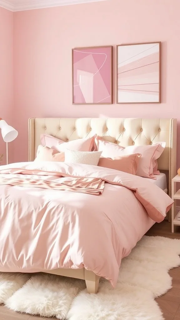
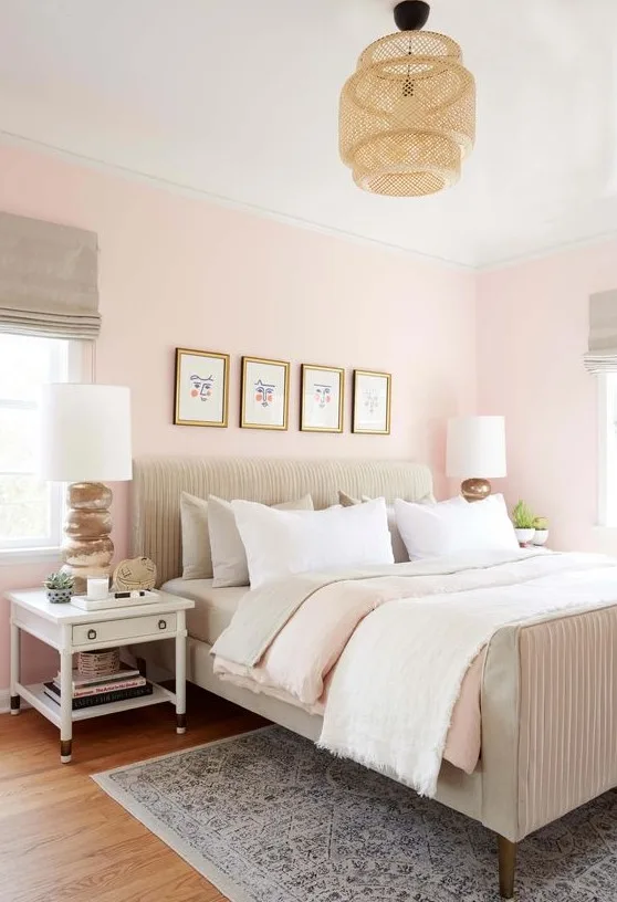
Dusty Pink Bedroom Ideas: Soft Decor for a Warm, Elegant Space
A dusty pink bedroom can look calm and sophisticated in one photo, then flat or babyish in another. The difference usually comes down to lighting, undertone, and the textures you pair with the color. Most people don't realize that dusty pink isn't a single shade.
It's a whole family of muted pinks with very different personalities.
In our research, the most forgiving dusty pinks sit between 30 and 60 on the Light Reflectance Value scale. That means they absorb enough light to feel moody without turning into a dark cave. As of 2026, nearly every major paint brand offers at least one dusty pink in its standard palette, so finding the color isn't the hard part.
Understanding how it behaves in your space is. Let's work through that, starting with why photos lie to you.
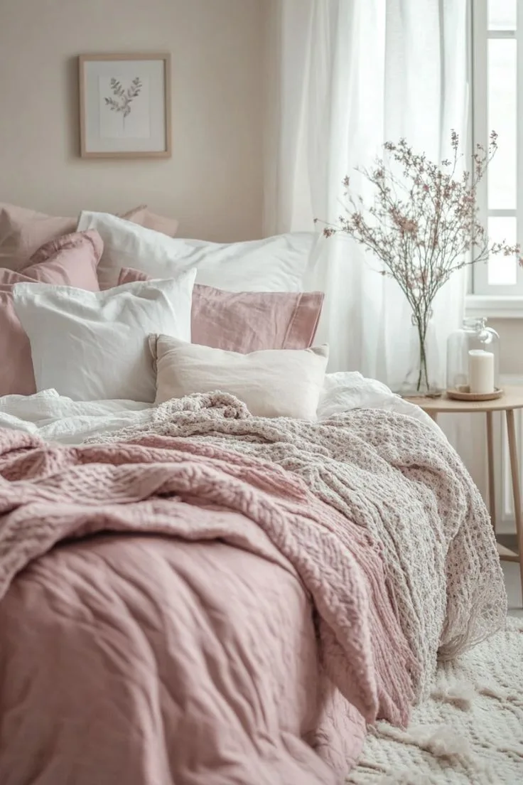
Quick Answer
A dusty pink bedroom is a calm, warm space when the undertone and lighting match. Choose a pink with gray or beige undertones. Pair it with cream, sage, or charcoal accents.
Test paint samples on your wall before committing.
Why Dusty Pink Is a Visual Game
Dusty pink is one of those colors that looks completely different depending on where and how you see it. A bedroom photographed at noon by a south-facing window will glow with warm apricot tones. The same room at night under a single warm lamp can shift into a muted mauve.
That's not a flaw in the paint. It's the color being a reflection of its environment.
The trick is that your eye takes in the whole scene, not just the wall color. When designers talk about a dusty pink bedroom, they're also talking about the bedding, the rug, the curtain fabric, and the way light bounces off all of them. Take those elements away, and the pink can look completely ordinary.
Before you buy anything, look at dusty pink the way a photographer would. Consider the room's orientation. North-facing rooms get cool, even light that can make pink look grayer.
South-facing rooms get warm, direct light that brings out the peachy side of the pigment. East- and west-facing rooms change dramatically throughout the day, which means the color you see in the morning might not be the color you see at dinner.
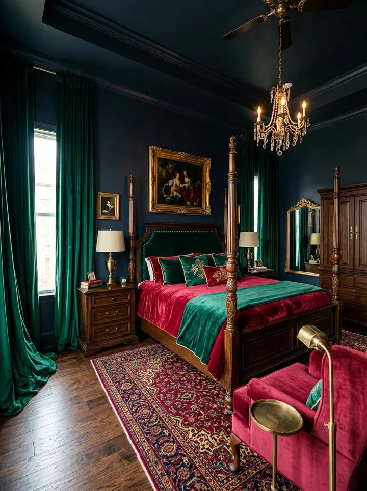
That's why a dusty pink bedroom works best when you pick the shade after watching your room's light cycle. A one-day test with paint samples will tell you more than any online photo ever could. And if you're after a more dramatic, historically rich pink room, a deeper dusty rose can carry the same principles, just with a moodier finish.
See how that plays out in a period-inspired pink setting for reference.
How to Spot a True Dusty Pink
Dusty pink sits between blush and mauve, but it's not simply a lighter version of either. The "dusty" part comes from gray or beige added to the pigment, which dulls the saturation and gives the color that slightly faded, vintage feel. Strip the gray away, and you're heading toward bubblegum territory.
The easiest way to identify a true dusty pink is to look at its undertone. Hold the swatch next to a pure white sheet of paper. If you see purple, you're looking at a mauve-leaning pink.
If you see peach, it's leaning terracotta. If you see a faint greenish or brownish haze, you've found the muted, neutral dusty pink that's easiest to live with.
Paint brands list this differently. Some call it dusty rose, others call it antique pink or old pink. The name matters less than the LRV.
Most dusty pink wall colors fall between 30 and 60 on the Light Reflectance Value scale, with 50 being a good middle ground for a full bedroom. Below 35, the walls will feel moody and cocoon-like. Above 60, you're creeping back toward a brighter pink that reads more playful than sophisticated.

The finish also changes how the color reads. A matte finish absorbs light and makes the pink look chalkier and softer. Eggshell and satin reflect a little more light, which brings out the warmth of the undertone.
If you're painting a small bedroom, a satin finish can help the walls feel less closed-in. Just know that shinier finishes show roller marks and wall imperfections more easily.
The Light Test: How Dusty Pink Shifts from Morning to Night
You can't judge a dusty pink from a single glance at a paint chip. You need to see it under the actual light sources in your bedroom. That means running a 24-hour light test before you commit.
Here's what to watch for:
- Morning light: Cool and bright. Pink will look its grayer, more muted self.
- Midday light: Neutral and strong. This is when the true color shows up.
- Late afternoon: Warm and golden. The pink will pick up a peachy or apricot glow.
- Night with lamps: Warm bulbs bring out the terracotta side. Cool LED bulbs make it look more mauve.
Light bulb color temperature matters as much as natural daylight. Most standard warm-white bulbs sit around 2700K, and they flatter dusty pink nicely. Cool daylight bulbs, usually 4000K and above, wash out the warmth and make the pink feel flat.
If you already have cool bulbs in your bedroom, either swap them out or choose a pink with more beige in it to compensate.
The size of the room matters too. In a small bedroom, a darker dusty pink can feel like a cozy cocoon. In a large room, the same color can feel heavy and a little lifeless.
If your bedroom is on the bigger side, consider using dusty pink as an accent wall and keeping the other walls a soft cream or greige. That gives you the color without overwhelming the space.
Paint, Wallpaper, or Fabric Walls: Seeing the Options Side by Side
Once you've narrowed down the undertone, you have to decide how to bring dusty pink into the room. Paint is the obvious option, but it's not the only one. Wallpaper and fabric treatments each have their own strengths, and the right choice depends on your walls, your budget, and how long you plan to stay.
Here's a quick comparison:
| Option | Best For | Considerations |
|---|---|---|
| Paint | Classic full-color coverage | Most affordable; requires 2 to 3 coats for deep tones |
| Peel-and-stick wallpaper | Renters and quick changes | Removable but can peel at seams in humid rooms |
| Paste wallpaper | A long-term, textured finish | Harder to remove; more expensive to install |
| Fabric wall panels | Softness and acoustics | High cost; makes the room feel upholstered |
Paint is the most straightforward route, and it gives you the exact color control that dusty pink demands. You can test samples, mix custom shades, and adjust the finish. For most people, a good quality interior paint in eggshell or matte is the right call.
If you choose low-VOC paint, you're also limiting the fumes, which aligns with the EPA's indoor air quality guidance.
Peel-and-stick wallpaper has become a serious option as of 2026, especially for renters who can't paint. The trick is matching the dusty pink pattern to the scale of your room. A small floral or muted abstract print can add depth without making the space feel busy.
Solid-color peel-and-stick is riskier, because any seam or air bubble shows up more clearly than it would on a painted wall.
Fabric wall panels are the high-end choice. They soften the room acoustically and give the pink a tactile, luxurious feel. But they're expensive, hard to clean, and best left to a professional installer.
If you love the look, start with a fabric headboard or upholstered bed frame instead, then build the rest of the dusty pink palette around that.
Building a Visual Mood Board Before You Buy Anything
Resist the urge to buy paint first. The surest way to create a dusty pink bedroom you love is to build a mood board before you spend money on a single can. This forces you to see the pink in context, alongside the bedding, rug, and furniture it will share space with.
Start with the largest anchor piece in the room. That's usually the bed, so pick the headboard and bedding first. If your headboard is a warm walnut wood, lean toward a dusty pink with beige or peach undertones.
If your headboard is black metal or a cool gray, choose a pink with a touch of mauve. The anchor piece sets the temperature for everything else.
Then gather physical samples. This is where a dusty pink bedroom really comes together, because texture matters as much as color. Pull paint swatches, a few yards of linen or velvet, a rug sample, and even a piece of wallpaper.
Lay them all out on a table in natural light and live with the combination for a couple of days.
You're looking for one thing: harmony. The pink shouldn't compete with the other materials. It should sit quietly between them and make the room feel cohesive.
If you're short on inspiration, browse through different bedroom ideas to see how other people balance dusty pink with wood tones, whites, and accent colors.
A good mood board also includes the small details: throw pillows, curtains, artwork, and a mirror. Those pieces will carry the pink beyond the walls and keep the palette from feeling one-note. Once the board feels balanced, you can move to testing paint samples with confidence.
The Textures That Make Dusty Pink Look Expensive
Dusty pink needs tactile contrast to feel grown-up. On its own, a flat pink wall can look a little lifeless. Add velvet, linen, or boucle, and the whole room suddenly feels layered and intentional.
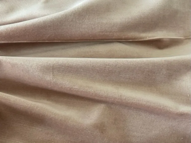
In our research, the dusty pink bedrooms that photograph best mix at least three textures. A smooth velvet headboard reads rich against rough linen curtains. A chunky wool throw adds warmth and depth.
The fabric texture changes how the pink pigment reflects light, which is why two rooms painted the exact same color can look completely different.
- Velvet absorbs light, making the pink feel deeper and more luxe.
- Linen catches daylight softly and adds a relaxed, lived-in feel.
- Boucle brings a nubby, modern texture that breaks up large color blocks.
- Wool adds weight and warmth, especially in a chunky knit throw.
Layer them from the bed outward. Start with the headboard, then the duvet, then the throws and pillows. If everything is the same material, the room will feel flat and overly matched.
Dusty Pink Pairing Palettes That Actually Work
The wall color is only half the story. What you place next to dusty pink decides whether it reads sophisticated or saccharine. These four palettes have the best track record in real rooms.
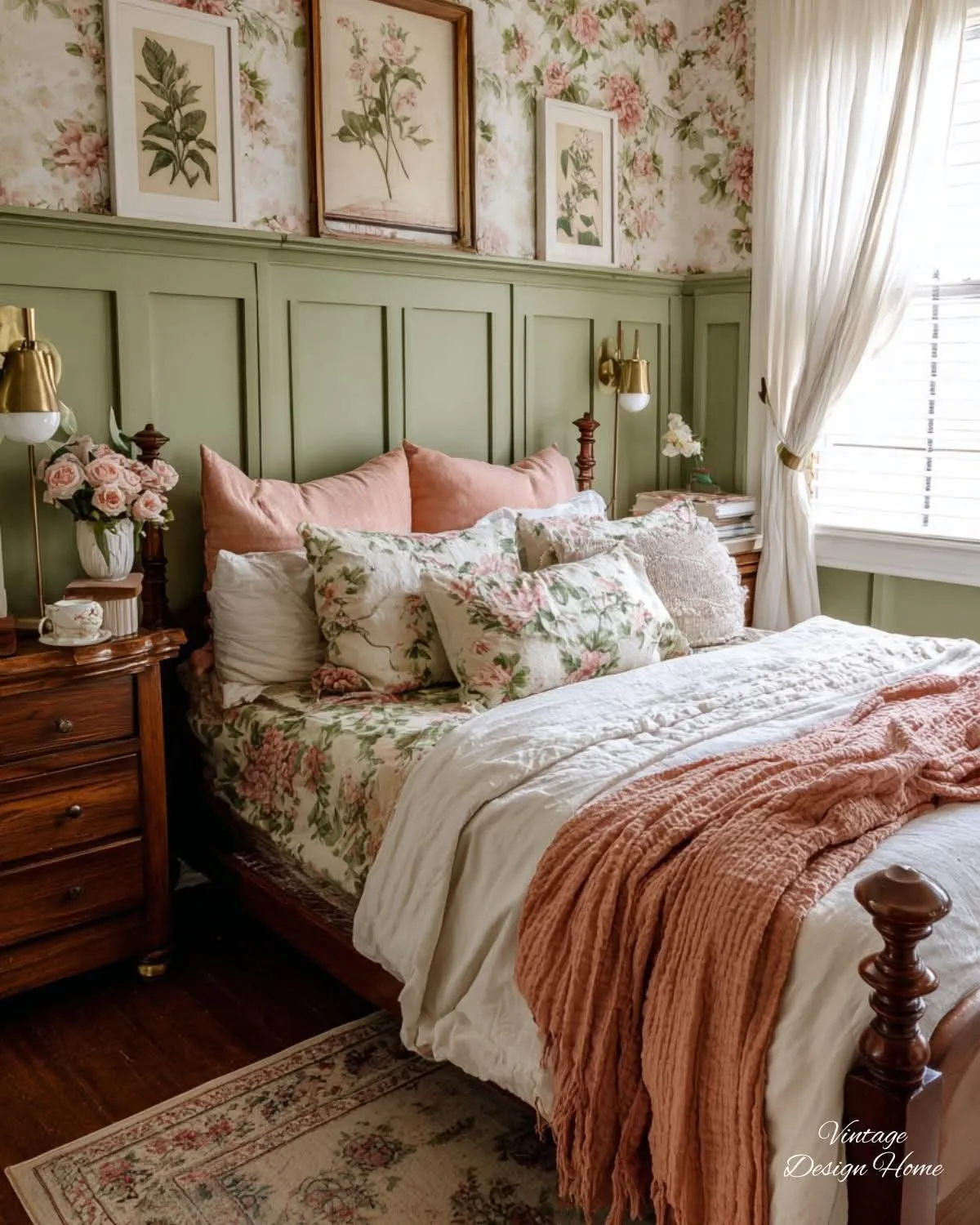
Pink + Sage Green is the most reliable pairing. The green brings earthy contrast and stops the pink from reading too sweet. Use sage in linen bedding, a painted nightstand, or ceramic planters. Our editorial analysis of countless room photos shows this pairing works in both Scandinavian and boho settings.
Pink + Cream and Warm White is the softest approach. It keeps the room calm and airy. Cream prevents the pink from looking stark and babyish. Choose a warm off-white for the ceiling, window trim, and large furniture pieces to let the pink walls stay the star.
Pink + Charcoal or Navy adds a serious, grounded edge. Deep, dark accents anchor the pink with structure. A navy bed frame, charcoal throw pillows, or black-framed art all work. This palette suits modern, moody bedrooms that need warmth without going full romantic.
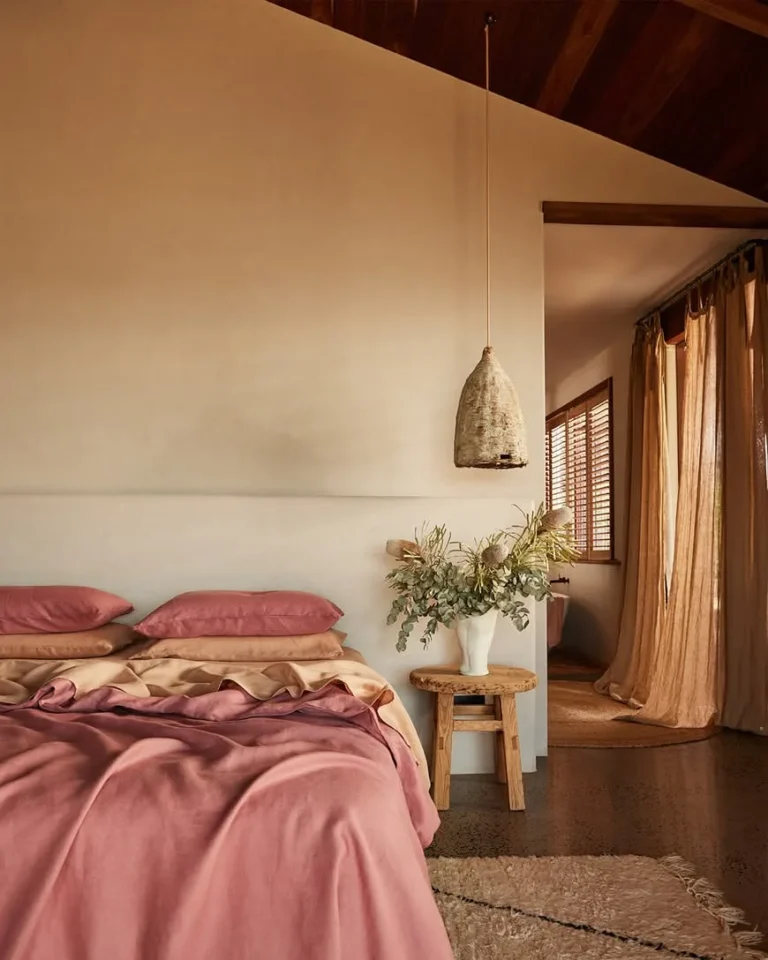
Pink + Terracotta and Ochre leans into warm, earthy bohemian style. These orange-adjacent tones pull out the peachy undertones in dusty pink. Imagine terracotta pots, ochre cushions, and a woven jute rug. It feels sun-baked, unhurried, and very natural.
Common Visual Mistakes (and How to Fix Them)
Even a beautiful dusty pink can go wrong. Here are the most common mistakes we see in bedrooms, and the fixes that turn them around.
Over-pinking the room. When every surface is pink, the space loses its contrast and feels like a bottle of bubblegum. Fix it by keeping the ceiling, trim, and at least one large furniture piece in a neutral color. White, cream, or warm gray works best.
Wrong white trim. A pure, cool white against dusty pink looks surgical and harsh. The pink suddenly feels dirty. Switch to a warm off-white like a soft cream or greige.
The same applies to your ceiling color. If you are exploring ceiling treatments, the right white or near-white finish makes pink walls look intentional rather than accidental. Many ceiling inspiration galleries make this point clear.
Clashing wood tones. Orange-toned oak floors can fight with dusty pink walls. The result is muddy and a little sickly. You don't need to rip up the floors.
Anchor the wood with a large jute rug, or choose a pink with a more beige undertone to sit comfortably with the warmth. If your trim is a warm wood, keep that in mind when picking the pink shade.
Choosing a shade that reads baby pink. If the color has too little gray or beige, it doesn't look dusty at all. It looks like a nursery. Before you paint a whole wall, paint a two-foot square and live with it for a day or two.
If it reads pink rather than muted pink, move to a deeper or grayer shade.
Reference Guide: Dusty Pink in Different Bedroom Styles
Dusty pink is a chameleon. It looks completely different depending on the style around it. Here's how to adapt it to four common bedroom aesthetics.
| Style | Key Elements | How Dusty Pink Fits |
|---|---|---|
| Scandinavian Minimalist | Light wood, white walls, clean lines | Use pink as an accent wall or in bedding, keep everything else pale and uncluttered |
| Boho and Layered | Rattan, plants, textiles, mixed patterns | Pink becomes the warm base; pair it with terracotta, ochre, and natural fibers |
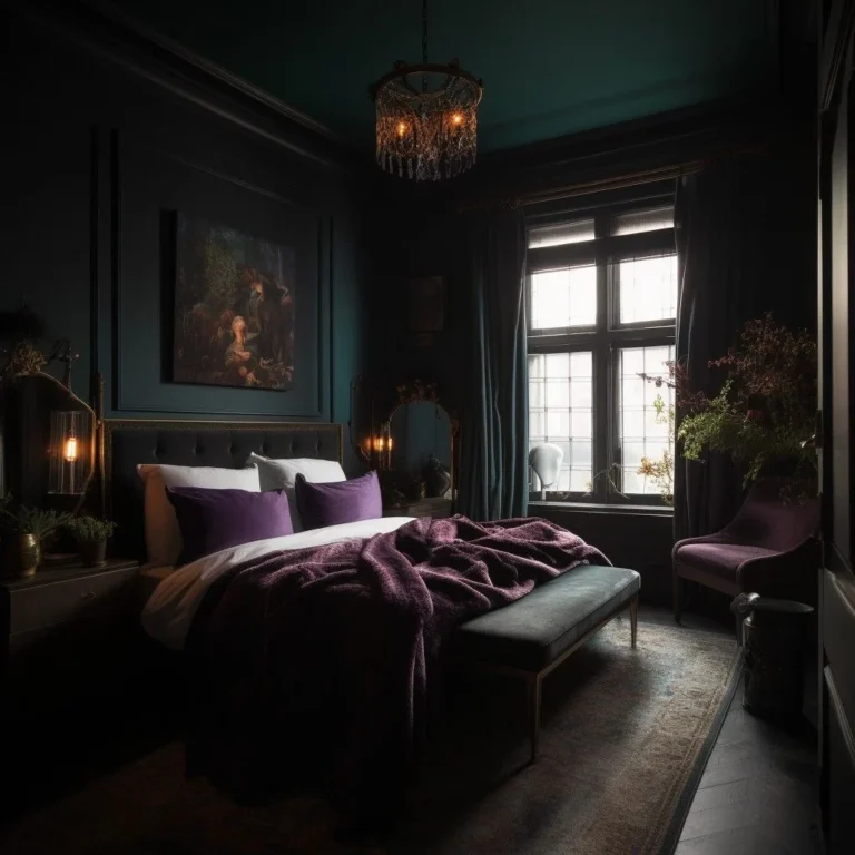
| Modern and Moody | Dark woods, black accents, low lighting | Choose a deeper dusty rose and pair it with charcoal, navy, brushed brass |
| Classic Traditional | Molding, antique furniture, rich fabrics | Pink works on walls or in upholstery; pair with cream, ivory, and soft floral details |
Keep the style in mind before you choose the exact shade. A pale, chalky dusty pink suits a Scandinavian room better than a moody one. Meanwhile, darker dusty roses with mauve undertones hold their own in traditional and modern spaces.
If you're drawn to more ornate, period-inspired looks, a dusty pink room with vintage touches can feel very at home. For broader design inspiration, our blog covers plenty of room-by-room approaches.
Testing Dusty Pink at Home Like a Designer
Testing at home is the step most people skip, and it's the step that saves the most money. Paint samples cost a few dollars each. Repainting an entire bedroom costs much more.
Start with sample pots from two or three shades that fit your undertone direction.
Paint a large, 24-inch square on the wall. The key is to paint directly on the wall, not on a piece of paper. The wall's texture and the surrounding light change how the color reads.
Paint two coats over the sample area so the color is fully opaque.
Check the samples at three key moments: morning, midday, and evening. Use a flashlight or a lamp with your actual bedroom bulb to see the effect of artificial light at night. The pink will shift in each situation.
If one shade looks pink rather than dusty even in warm evening light, discard it.
Lighting is half the battle. The bulbs you choose and the way your ceiling light casts across the walls matter as much as the paint. If you're planning a lighting update, look at how a strip light ceiling design spreads warm illumination across a room.
That kind of overhead glow can change pink walls from dull to delightful.
Finally, when you've picked your color, plan for two coats as a baseline. Deep dusty pinks may need a third, especially over white primer. Check coverage after the second coat dries.
If you see streaks or patchiness, roll on another coat. Ventilate the room while painting, and keep that in mind for indoor air quality. Low-VOC paints are a solid choice, and the EPA's indoor air quality guidance recommends ventilation and low-emission finishes for good reason.
Frequently Asked Questions
Is Dusty Pink Gender-Neutral?
Yes, when balanced with grounded neutrals. Pair it with sage, charcoal, or cream instead of frilly accents. The right undertone and styling make it feel sophisticated rather than gendered.
Does Dusty Pink Work in a Small Bedroom?
It does, if you keep the shade lighter. Choose a dusty pink with an LRV around 50 or higher. Use a satin finish to reflect light, and keep the ceiling and trim in a warm white.
What Ceiling White Goes with Pink Walls?
A warm off-white or greige. Pure white looks harsh next to dusty pink. A soft cream keeps the room cohesive and prevents the pink from reading muddy.
Your Final Visual Checklist Before You Commit
You've done the research. Now trust the process you've set up.
- Confirm the undertone matches your room's light.
- Test large paint samples on the wall for at least 24 hours.
- Gather texture swatches alongside the paint.
- Pick one pairing palette and stick to it.
- Plan for two to three coats and proper ventilation.
A dusty pink bedroom works when the color, light, and texture feel like one calm space. Test first, then commit. You'll get it right.