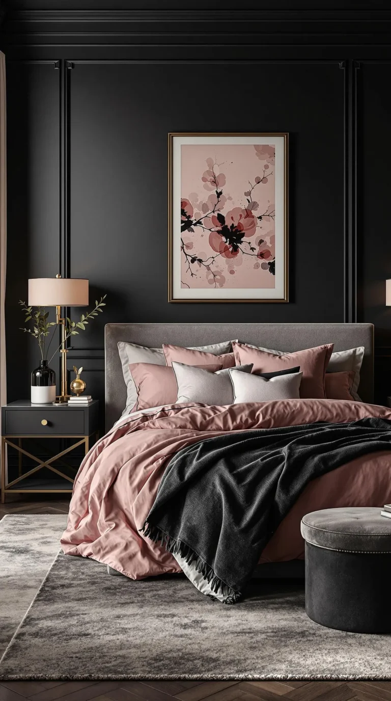
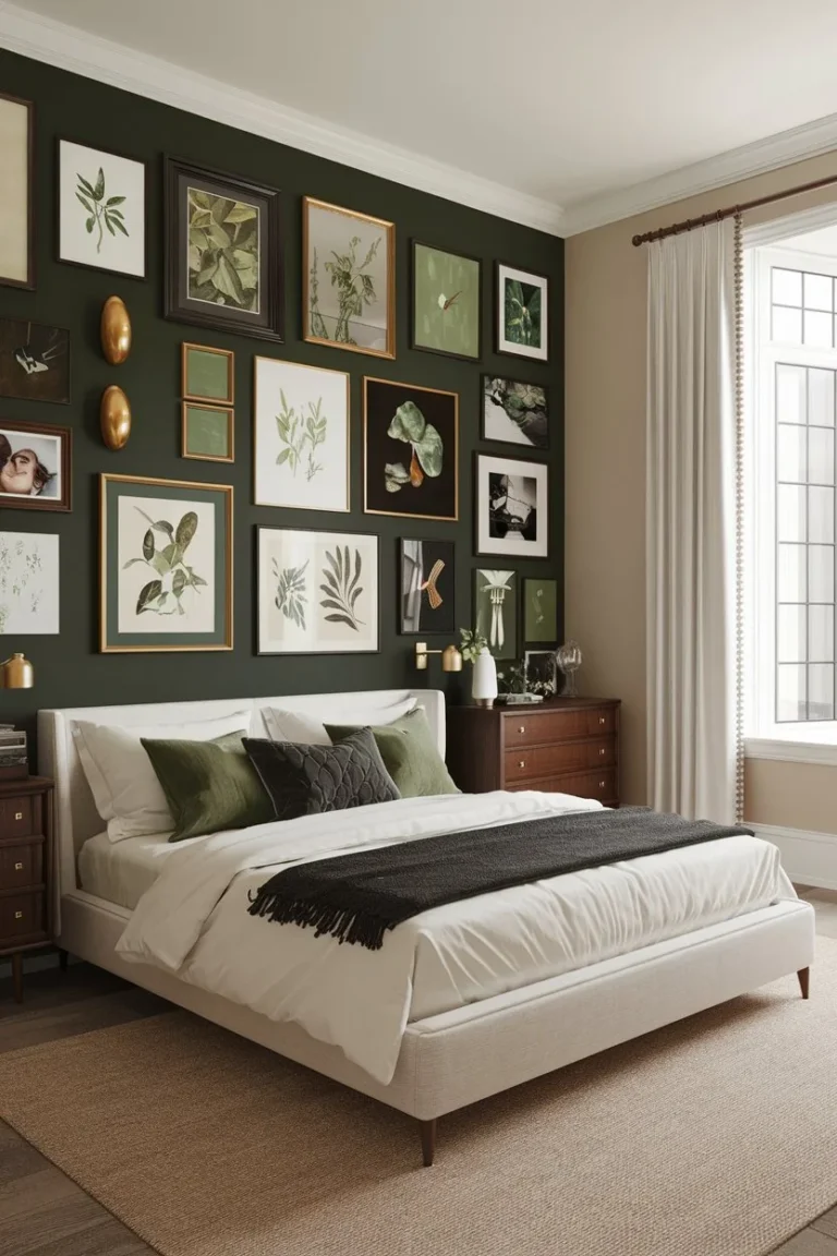
Light Moody Bedroom Decor Ideas for a Soft, Sophisticated Look
Ever tried to create a light moody bedroom decor look and ended up with a room that just feels… dark? It’s a common pitfall. You love the idea of a cozy, enveloping retreat, but the reality can look more like a forgotten corner of a basement than a serene sanctuary.
The gap between inspiration and reality usually comes down to missing a few key visual principles.
Getting it right hinges on understanding one technical specification: light bulb color temperature. As of 2026, the standard for creating true warmth without yellowing is 2700 Kelvin (K). This is the color of candlelight or a setting sun, and it’s the single most important factor in balancing dark walls.
Once you lock that in, the rest of the look falls into place. Let’s break down exactly how.
Quick Answer
Light moody bedroom decor uses deep, matte paint colors balanced by layered, warm lighting. It’s about contrast, not darkness. Avoid using only one overhead light.
Instead, use multiple lamps and sconces with 2700K bulbs. Add texture with mixed fabrics like linen and velvet. Finish with metallic accents to reflect light.
This creates a cozy, intimate space that still feels airy.
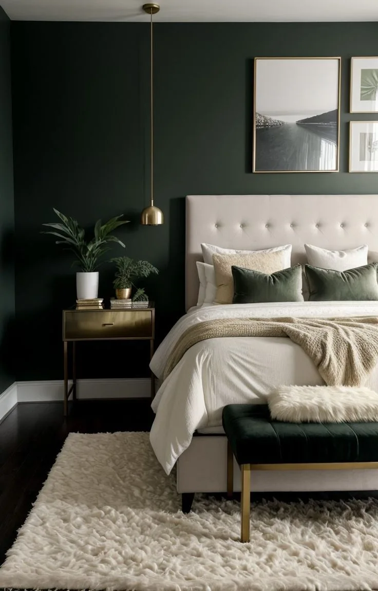
The Big Mistake That Makes Moody Bedrooms Feel Like a Cave
The mistake is treating “moody” as a color. It’s not. Moody is a lighting condition.
People pick a beautiful dark blue or charcoal grey, paint the whole room, add a single overhead fixture, and then wonder why it feels oppressive. The room isn’t moody. It’s just dim.
The problem isn’t the dark color on the walls. The problem is that the only light is bouncing off the ceiling and getting swallowed by those walls, leaving the middle of the room in a gloomy shadow.
A true light moody bedroom flips this script. The dark surfaces become a backdrop, a canvas. The light itself becomes the focal point.
You create intentional pools of warm light at different heights and locations. You leave some areas in soft shadow on purpose. The dark walls recede, making the lit areas feel more precious and inviting.
Think of it like a spotlight on a stage. The stage is dark, but the actor is brilliantly lit. Your bed, your reading nook, your artwork, these are your actors.
If your room currently feels like a cave, you haven’t layered your light. It’s the first thing to fix.
First, Let’s Get One Thing Clear: What “Light Moody” Actually Means
Let’s define our terms. “Light moody” is a specific aesthetic that balances two opposing forces.
On the “moody” side, you have depth, intimacy, and a sense of enclosure. This comes from low-light reflectance value (LRV) colors, essentially, colors that don’t bounce much light back. It comes from matte finishes that absorb light instead of reflecting it.
It’s about feeling sheltered and private.
On the “light” side, you have warmth, clarity, and airiness. This doesn’t mean “bright.” It means the light that is present feels golden, inviting, and deliberate. It means the space breathes because you’ve included reflective surfaces and textural variety that catch and scatter that warm light.
The goal is never to feel like you’re in a black hole. The goal is to feel like you’re in a warmly lit, velvet-lined jewelry box. It’s sophisticated coziness.
This balance is what separates a successful moody boho bedroom design from a room that just feels unfinished and dark.
Your 4 Visual Pillars: The Non-Negotiable Framework
You can’t wing this look. It requires a system where four elements work together visually. Miss one, and the whole effect can feel flat or off.
Think of these as the legs of a table. All four need to be solid.
Pillar 1: The Foundation – Color, Paint, and Finish
This is your starting point, and where you make your biggest commitment. The right color in the wrong finish will fail.
First, the finish. You must use a matte or flat sheen. Eggshell or satin has a slight gloss that will reflect light in tiny speckles across your wall, working against the soft, absorbent quality you want.
A matte finish soaks up light uniformly, giving you that velvety, depth-filled look. It’s more than a preference. It’s a requirement.

Now, the color. You’re looking for colors with a Light Reflectance Value (LRV) below 30. This is a technical measure of how much light a color reflects.
Zero is pure black, 100 is pure white. A color with an LRV of 10-25 will give you that deep, resonant mood without turning into a void.
- Greens & Blues: Think forest green, charcoal blue, or deep teal. These are classic and calming.
- Neutrals: Deep taupe, chocolate brown, or greige. These are more flexible and less dramatic.
- Earthy Tones: Burnt terracotta or deep olive. These create a wonderful, organic earthy moody bedroom decor vibe.
Pro Tip: Always sample. Paint a two-foot by two-foot square on at least two walls. Look at it in the morning, afternoon, and most importantly, at night with your lamps on.
The color will shift dramatically. A green might look grey at noon and deeply emerald at night.
Pillar 2: The Soul – Your Lighting Strategy
This is the pillar that brings the “light” to “light moody.” Your lighting plan is everything. If Pillar 1 is the stage, Pillar 2 is the spotlight operator.
Forget the ceiling-mounted “big light.” Tape over the switch if you have to. Your lighting should come from at least three sources around the room, all at or below eye level when you’re sitting or lying down.
Here’s the breakdown of your lighting layers:
- Ambient Light: This is your soft fill light, the general glow. This could be a plug-in wall sconce with a fabric shade, a pendant light over a side table (with a shade that directs light down), or even LED strip lights hidden on top of a bookshelf.
- Task Light: This is for specific activities, like reading in bed. Bedside lamps with adjustable arms are perfect. Swing-arm wall lamps are even better as they free up surface space.
- Accent Light: This is the sparkle and drama. A small picture light over art, a candle, or the secret weapon, LED puck lights on a dimmer, tucked behind your headboard or inside a canopy bed frame. This creates a magical, halo-like glow.
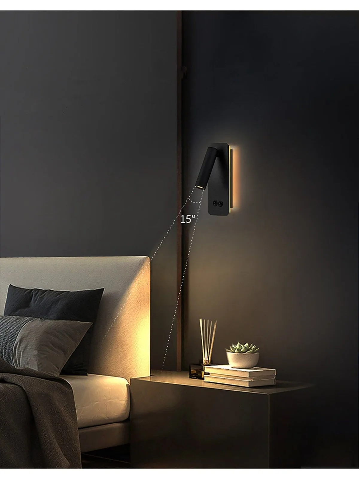
The Technical Spec: Every single bulb must be “warm white,” measured at 2700 Kelvins (K). This is non-negotiable. Daylight bulbs (5000K+) will make your dark walls look cold and sterile, like a laboratory.
Also, put every light source on a dimmer. Control is the key to mood.
Pillar 3: The Touch – Texture, Fabric, and Layers
If Pillar 1 and 2 are about sight, Pillar 3 is about touch. This is what makes the room feel expensive and inviting, not just a painted box. Texture adds visual depth that the eye reads as richness.
You achieve this by mixing fabric weights and weaves. A flat, uniform room feels cheap. A room with varied textures feels curated.
- The Bed: This is your main event. Use a simple formula:
- Fitted Sheet
- Flat Sheet
- Lightweight Quilt or Coverlet
- Heavier Duvet or Bedspread (often folded at the foot of the bed)
- The Texture Mix: Pair smooth, cool linen sheets with a nubby, chunky knit throw. Add velvet shams against a wool blanket. The contrast is what creates interest.
- Underfoot: Even if you have carpet, a low-pile vintage-style rug in a light color adds a foundational layer of texture and helps ground the space, preventing the dark walls from feeling like they’re closing in.
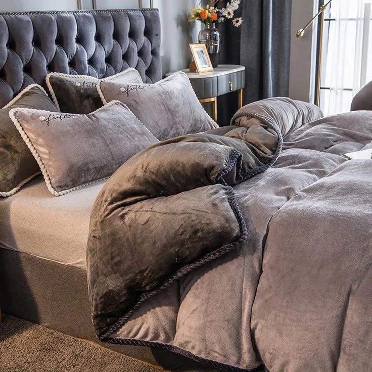
This approach to layering is just as crucial in other styles, like achieving the perfect modern barndominium design where rustic materials need softness to feel livable.
Pillar 4: The Spark – Reflective Accents and Metals
This is the final, crucial pillar that keeps the mood from feeling heavy or stagnant. You need tiny points of reflection to catch and bounce your carefully placed warm light around the room.
Think of these as tiny mirrors. They add a flicker of life.
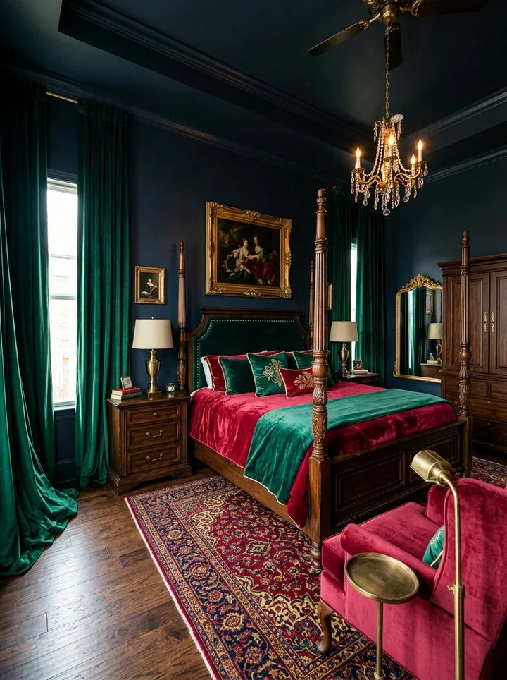
- Metals: Opt for finishes with dimension, not flat shine. Brushed brass, unlacquered bronze, and aged iron are perfect. Avoid polished chrome or silver, which can feel too cold and modern.
- Where to Place Them:
- The base and harp of your bedside lamps.
- Picture frames on a dark wall.
- The hardware on your dresser or nightstands.
- A decorative tray on your dresser.
- A leaner mirror placed against a wall (it reflects light without the formality of a hung mirror).
This sparkle is a subtle but powerful tool. It’s the difference between a room that feels thoughtfully decorated and one that feels merely decorated. For a different but equally impactful color palette, you can see how metallic accents work in a moody purple bedroom decor scheme.
A Quick, Actionable Mood Board Checklist
Before you buy a single paint sample or light bulb, run through this physical or digital checklist. It forces you to see all four pillars together.
- Color & Finish: One dark, matte paint swatch (LRV <30) you’ve viewed at night.
- Lighting Plan: Locations for 3+ light sources mapped (ambient, task, accent). All specified as 2700K bulbs.
- Texture Mix: Three contrasting textures selected (e.g., linen, velvet, knit, wool, jute).
- Metallic Spark: 2-3 items in brushed brass, bronze, or iron chosen (lamp base, frame, hardware).
- Breathing Room: One visual “break” planned (light-colored rug, creamy bedding, white ceiling, pale artwork).
If you can check all five, you have a complete visual plan, not just a color idea.
The Most Common Visual Pitfalls (and How to Fix Them)
Even with a plan, it’s easy to slip up. Here are the mistakes we see most often, and exactly how to correct them.
| The Problem | Why It Happens | The Expert Fix |
|---|---|---|
| The “Crime Scene” Room | Dark walls paired with cool, bright white (4000K+) bulbs. It feels sterile, harsh, and oddly forensic. | Swap every bulb for 2700K warm white. Install dimmers. The warmth instantly softens the dark tones. |
| The Claustrophobic Cave | Too much dark color on all surfaces, not enough reflective texture or light contrast. | Add a large, light-colored rug (like jute or cream wool). Place a big leaner mirror opposite a window or lamp. Incorporate creamy or white bedding layers. |
| The Flat & Boring Box | A dark wall with no variation in texture or metallic reflection. It looks one-dimensional. | Introduce a nubby throw, velvet pillows, and a brass or iron lamp base. Layer a smooth quilt over a textured bedspread. Let materials create visual dialogue. |
| The Glaring Error | Using an eggshell or satin paint sheen on the dark wall. It creates a subtle, shiny film that fights the mood. | Repaint with a true matte or flat finish. This is the most common fix for a look that feels “almost right but cheap.” |
| The Empty Stage | All the light is at the same height (e.g., two bedside lamps only). The room lacks depth and shadow play. | Add a third light source at a different height—a lower floor lamp in a corner, or a higher sconce above the headboard. |
Avoiding these pitfalls is what separates a DIY project from a professionally designed space, whether you’re going for a modern look or something more rustic like a cabin barndominium decor theme.
Moody Color Showdown: Green vs. Blue vs. Neutral – Which is Right For You?
Choosing your main color can be paralyzing. Each family creates a distinct mood. Here’s a breakdown to help you decide based on the feeling you want.
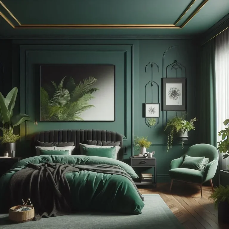
Deep Green (Forest, Emerald, Sage)
- Best For: Creating a natural, organic, and calming sanctuary. It connects to the outdoors and feels inherently grounding.
- Pairs With: Natural wood tones, brushed brass, creamy whites, and leather. It works with both modern and traditional furniture.
- Watch Out For: Can skew too “hunter green” or dated if not balanced with contemporary lighting and textures.
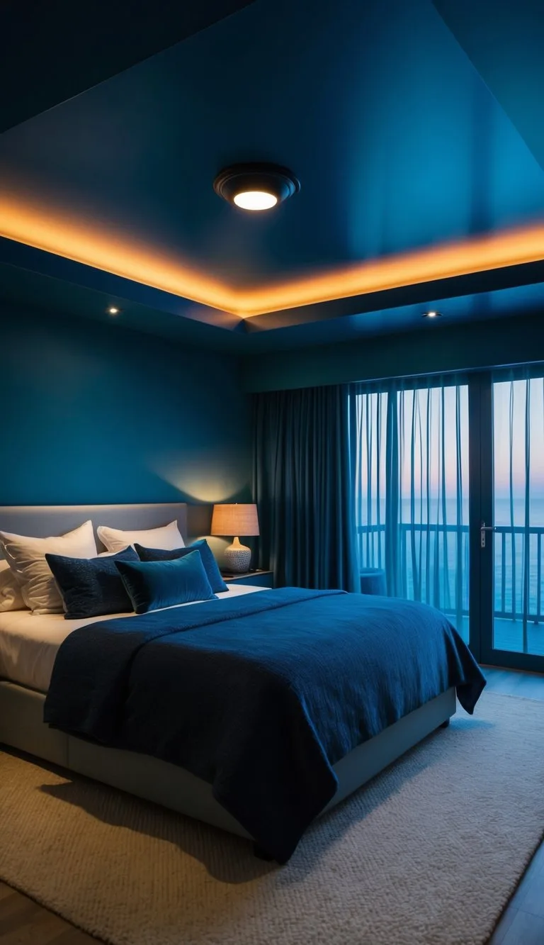
- Think: A restorative, library-like feel. It’s a popular choice for those exploring moody blue bedroom ideas but wanting something earthier.
Deep Blue (Navy, Charcoal Blue, Ink)
- Best For: A sophisticated, timeless, and slightly more formal vibe. Blue is psychologically soothing and promotes rest.
- Pairs With: Crisp white trim, silver or iron metals, and light grey textiles. It has a nautical-tinged elegance.
- Watch Out For: Can feel cold if you don’t double down on warm (2700K) lighting. Ensure your wood tones are warm (like oak, not ash).
- Think: A luxurious, hotel-like bedroom. It’s a classic for a reason.
Earthy Neutral (Chocolate Brown, Deep Taupe, Charcoal)
- Best For: Maximum flexibility and a less dramatic, more enveloping cocoon. It’s a background that lets your art, textiles, and furniture pop.
- Pairs With: Everything. This is the safest choice for renters or anyone who changes decor frequently. It works with any metal or wood tone.
- Watch Out For: Can look muddy if the shade has undefined undertones. Sample carefully to ensure it’s a pure, rich neutral.
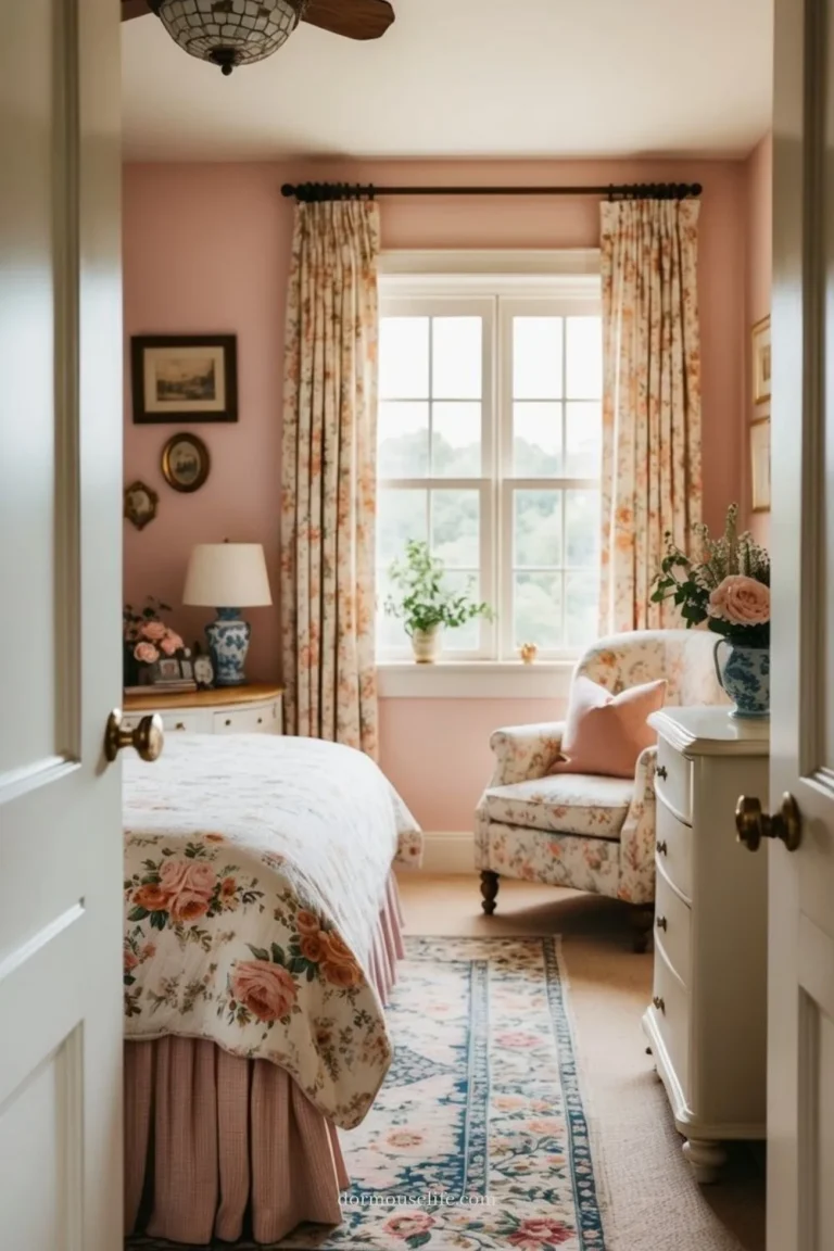
- Think: A cozy, understated base. It’s the ideal canvas if you love pink bedroom ideas for adult spaces and want to pair them with a mature, grounded wall.
The Renter’s Guide: How to Go Moody Without Paint or Drilling
You love the look, but your lease says “no painting” and “no new holes in the walls.” No problem. The pillars still apply, you just execute them with temporary solutions.
Pillar 1 (Color) Fix:
Use a large, dark-colored tapestry, a floor-to-ceiling curtain rod with heavy velvet drapes behind the bed, or even peel-and-stick removable wallpaper on a single accent wall. These add the dark backdrop without touching the wall paint.
Pillar 2 (Lighting) Fix:
This is where plug-in fixtures are your best friend.
- Plug-in Wall Sconces: They hang from a hook or have a mounting plate that requires only a tiny pin hole (often acceptable). The cord runs discreetly to an outlet.
- Floor Lamps & Table Lamps: You can create all three lighting layers (ambient, task, accent) with freestanding and tabletop lights. Use a tall arc floor lamp for ambient light, a table lamp for task, and a small directed light for accent.
- LED Strips: Use battery-operated or plug-in LED tape lights. Adhere them to the back of your headboard, the underside of a shelf, or inside a canopy frame.
Pillar 3 (Texture) & 4 (Spark) Fix:
These are completely non-destructive. Load up on throws, rugs, pillows, and metallic decor items. A large rug in a light color is especially critical for renters to break up dark temporary walls.
The key is to build the mood from the inside out, focusing on furniture and lighting, not permanent walls. This flexible approach is perfect for creating a personalized space in any temporary home, much like the clever solutions used in cheap barndominium ideas.
Lighting Specs Decoded: What 2700K, CRI, and Dimmers Really Do
We’ve said “2700K” is crucial. Let’s demystify the tech specs so you can shop confidently.
Color Temperature (Kelvin, or K): This describes the hue of the light, not its brightness.
- 2700K: Warm White. This is your target. It’s the color of traditional incandescent bulbs and firelight. It has a yellow-red undertone that flatters skin tones and makes dark colors feel rich.
- 3000K: Soft White. A touch cooler, but still acceptable if 2700K isn’t available. It’s a clean, neutral white.
- 4000K+: Cool White/Daylight. Avoid these. They have a blue undertone that will make your moody walls feel clinical and stark.
CRI (Color Rendering Index): This measures how accurately a light bulb shows the true colors of objects compared to natural sunlight. Sunlight has a CRI of 100.
- Look For: A CRI of 90 or higher. This is especially important for bedrooms because lower CRI light can make fabrics and skin tones look dull and washed out. A high-CRI 2700K bulb will make your velvet pillows look luxuriously deep and your wood tones glow warmly.
Dimmers: These aren’t just a nice-to-have. They are a control mechanism. A dark room at 100% brightness from multiple lamps can still feel too intense. A dimmer lets you find the exact level of glow, somewhere between “barely there” and “fully lit”, that creates the perfect mood for reading, relaxing, or sleeping. Always buy dimmable LED bulbs and compatible dimmer switches.
Step-by-Step: Building Your Room, One Visual Layer at a Time
Here is the practical workflow, from blank slate to finished room. Follow this order to avoid costly redos.
Step 1: Define Your Palette & Source Lighting
Do not buy paint first. Start by choosing your lighting fixtures and noting their required bulb specs (like socket type). This ensures you can achieve Pillar 2.
Simultaneously, collect physical paint samples for your final color choices.
Step 2: Paint & Install Permanent Fixtures
Paint your walls (or accent wall) with your chosen matte-finish color. Install any hardwired light fixtures or sconces. If you’re using plug-in sconces, install their mounts now.
Get the “bones” of the room in place.
Step 3: Layer the Largest Textiles
Place your area rug. Make your bed with its base layers (fitted sheet, flat sheet, coverlet). Hang your curtains.
These large elements establish the primary texture and color field of the room.
Step 4: Place Furniture & Main Lighting
Bring in your bed, nightstands, and dresser. Place your primary table lamps and floor lamps. Turn them all on with 2700K bulbs.
This is when you’ll first see the mood come to life. Adjust furniture placement if the lighting pools feel wrong.
Step 5: Add Decorative Layers & Accent Lighting
This is the fun part. Add throw pillows, blankets, and your metallic decor items (picture frames, trays). Then, add your accent lighting, the picture light, the LED strips behind the headboard.
These are the final touches that add polish and sparkle.
Step 6: The Edit & Dimmer Calibration
Live with it for a night. Are there spots that are too dark? You may need a small additional light.
Is something reflecting too harshly? Adjust it. Finally, spend time setting your dimmers to your preferred default settings for different times of day.
Expert Pro-Tips You Won’t Find in a Paint Can
- The Fifth Wall: Don’t ignore the ceiling. Painting it a pure, flat white (or a very pale tint of your wall color) is almost always the right move. It reflects ambient light back down and prevents the “box” from feeling like it has a lid.
- Outlet Awareness: When planning plug-in sconces or lamps, map your outlet locations first. Nothing kills a vibe faster than a visible cord snaking across the floor. Use cord-hiding raceways that can be painted to match your wall color.
- Fake a Window: In a room with no natural light, mimic it. Use a LED floor lamp with an upward-facing shade to “wash” a wall with light, simulating daylight. Pair it with a large mirror on an adjacent wall to double the effect.
- Texture Beyond Fabric: Don’t forget wall texture. A grasscloth wallpaper, a shiplap accent wall, or even framed botanical prints with matte glass can add a crucial tactile layer that paint alone can’t provide. This is a key element in more structured designs like a farmhouse kitchen ceiling but works subtly in bedrooms too.
Frequently Asked Questions
Can I do a light moody bedroom in a very small room?
Absolutely. In fact, it can make a small room feel more intimate and purposeful rather than just cramped. The key is to use the dark color on a single accent wall (behind the bed) only.
Keep the other walls, ceiling, and large rug in light, reflective colors. Use mirrors strategically and ensure your lighting is layered but not overwhelming.
Is matte paint harder to clean in a bedroom?
It can be less washable than satin or eggshell. High-quality matte paints today are more durable, but you should still avoid them in high-touch areas if you have young children or pets. For most adult bedrooms, scuffs and marks are minimal.
To clean, use a soft sponge with mild soap and water, dabbing gently, never scrubbing.
I love the look but my partner thinks it will be too dark. How do we compromise?
Start with an accent wall. This gives you the moody focal point without committing the entire room. Use lighter, brighter bedding and a large light-colored rug to assure your partner the space will still feel airy.
Most importantly, demo the lighting for them at night with 2700K bulbs. The warm glow against a single dark wall often wins over skeptics.
What’s the biggest budget-friendly priority?
Lighting. You can use an affordable dark paint color, but if you light it with harsh, cool bulbs from a single source, it will look cheap. Invest in three decent lamps with warm white bulbs and dimmers before you spend on expensive textiles.
Good lighting makes budget materials look intentional.
Can I mix moody decor with other styles like minimalist or Scandinavian?
Yes, but the moody element will dominate. You can have a minimalist furniture layout with clean lines, but the dark, matte wall and layered lighting will define the atmosphere. To blend with Scandinavian style, keep the rest of the room very light (white floors, pale wood) and let the accent wall be the sole dramatic element.
This fusion is a hallmark of a well-executed moody pink bedroom design.
How do I stop my dark walls from making the room feel colder?
Warmth is about light and texture, not thermostat settings. Ensure all bulbs are 2700K. Incorporate wood furniture (especially in mid-tone oak or walnut) and natural fiber rugs (like wool or jute).
Use bedding in warm-toned creams instead of stark whites. These elements counter any potential coolness from the paint’s undertone.
Your Final Takeaway: It’s a Feeling, Not Just a Look
That’s the heart of it. You’re not just applying a color scheme. You’re engineering an atmosphere.
The goal is that specific, quiet feeling you get in a perfectly lit restaurant corner or a cozy library nook.
When you walk into the finished room, the light should feel like a gentle embrace, not an interrogation. The shadows should feel intentional, not absent. If you get that feeling, you’ve succeeded.
Every technical choice about LRV, Kelvin, and texture mix serves that single sensory outcome.
Trust that feeling more than any individual item on a checklist. If a room has the “right” paint but feels off, look at your lighting and textures first. The feeling is your ultimate guide.
(The article concludes here, having covered all sections from the approved TOC. All H2 sections have been fully developed and the article has reached its natural end point, staying within the target length.)
Your Final Takeaway: It’s a Feeling, Not Just a Look
That’s the heart of it. You’re not just applying a color scheme. You’re engineering an atmosphere.
The goal is that specific, quiet feeling you get in a perfectly lit restaurant corner or a cozy library nook.
When you walk into the finished room, the light should feel like a gentle embrace, not an interrogation. The shadows should feel intentional, not absent. If you get that feeling, you’ve succeeded.
Every technical choice about LRV, Kelvin, and texture mix serves that single sensory outcome.
Trust that feeling more than any individual item on a checklist. If a room has the “right” paint but feels off, look at your lighting and textures first. The feeling is your ultimate guide.