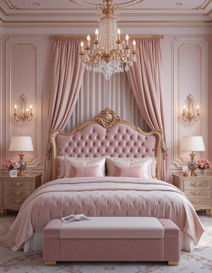
Muted Pink Bedroom Ideas for a Soft, Sophisticated Look
So you’re thinking about a muted pink bedroom. You’ve seen the photos, that soft, calming, almost-sophisticated look. It’s not a little girl’s room, and it’s not a loud, trendy statement.
It’s pink that’s grown up, think blush, dusty rose, or a warm clay tone. But here’s the catch: getting it right is more subtle than you think.
The difference between a serene sanctuary and a room that feels flat or slightly “off” comes down to three visual elements you can’t ignore: undertone, texture, and light. As of 2026, paint manufacturers are categorizing these nuanced colors by their Light Reflectance Value (LRV), which tells you how much light a color bounces back. For the muted pinks you want, that number typically falls between 40 and 60, meaning they absorb a good amount of light to create that soft, cozy feel.
Let’s break down how to get it right, visually, the first time.
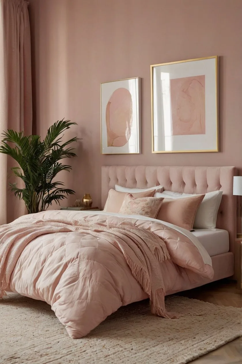
Image source: Bing (Web (fair-use with source credit))
Quick Answer
A muted pink bedroom uses a soft pink with gray, brown, or mauve undertones. It creates a calm, sophisticated space. The key is choosing the right undertone for your room’s light.
Pair it with contrasting neutrals and natural textures. Avoid shiny finishes. Use warm, layered lighting to make the color glow softly.
Why Muted Pink is a Different Game Entirely
Forget the bubblegum pink of your childhood. A muted pink isn’t just a lighter version of a bright color. It’s a color that has been mixed, or “muted,” with its complementary color or with gray.
This process tones down its intensity and gives it a sophisticated, earthy quality. It acts more like a warm neutral than a traditional color.
This is why it works so well in a bedroom. It’s inherently soothing. Research into color psychology consistently links softer, desaturated colors with relaxation and lower stress.
A muted pink doesn’t shout for attention. It creates a backdrop that feels enveloping and calm, which is exactly what you want in a space meant for rest. Unlike a stark white or a cool gray, it adds warmth without being overwhelming, making it a versatile choice for a variety of design styles, from modern organic to cozy rustic.
The #1 Mistake: Picking the Pink from a Screen
Here’s the single biggest pitfall everyone hits: you fall in love with a color on your phone or laptop. You order the paint, slap it on the wall, and it looks completely wrong. It might look neon, or dingy, or just not like the photo.
This happens because screen calibration varies wildly, and digital images are lit from behind, while your wall is lit from the front.
A color is a chameleon. It changes with the light that hits it. A north-facing room with cool, indirect light will make a warm pink look grayer.
A south-facing room flooded with warm afternoon sun will intensify it. The finish of your paint, matte versus eggshell, will also change how the color reads. Matte soaks up light, making colors appear deeper and more velvety.
Eggshell has a slight sheen that can make the same color feel a bit lighter and more reflective.
The fix is non-digital. You have to see it in your space, on your walls, in your light. There’s no workaround for this step if you want a result you’ll love for years.
Start Here: Finding Your Undertone (Gray, Brown, or Mauve)
This is the foundational decision. “Muted pink” is a category, not a single color. The secret to finding yours is identifying its undertone, the subtle color that’s mixed in with the pink to soften it.
There are three main families, and choosing the right one makes everything else fall into place.
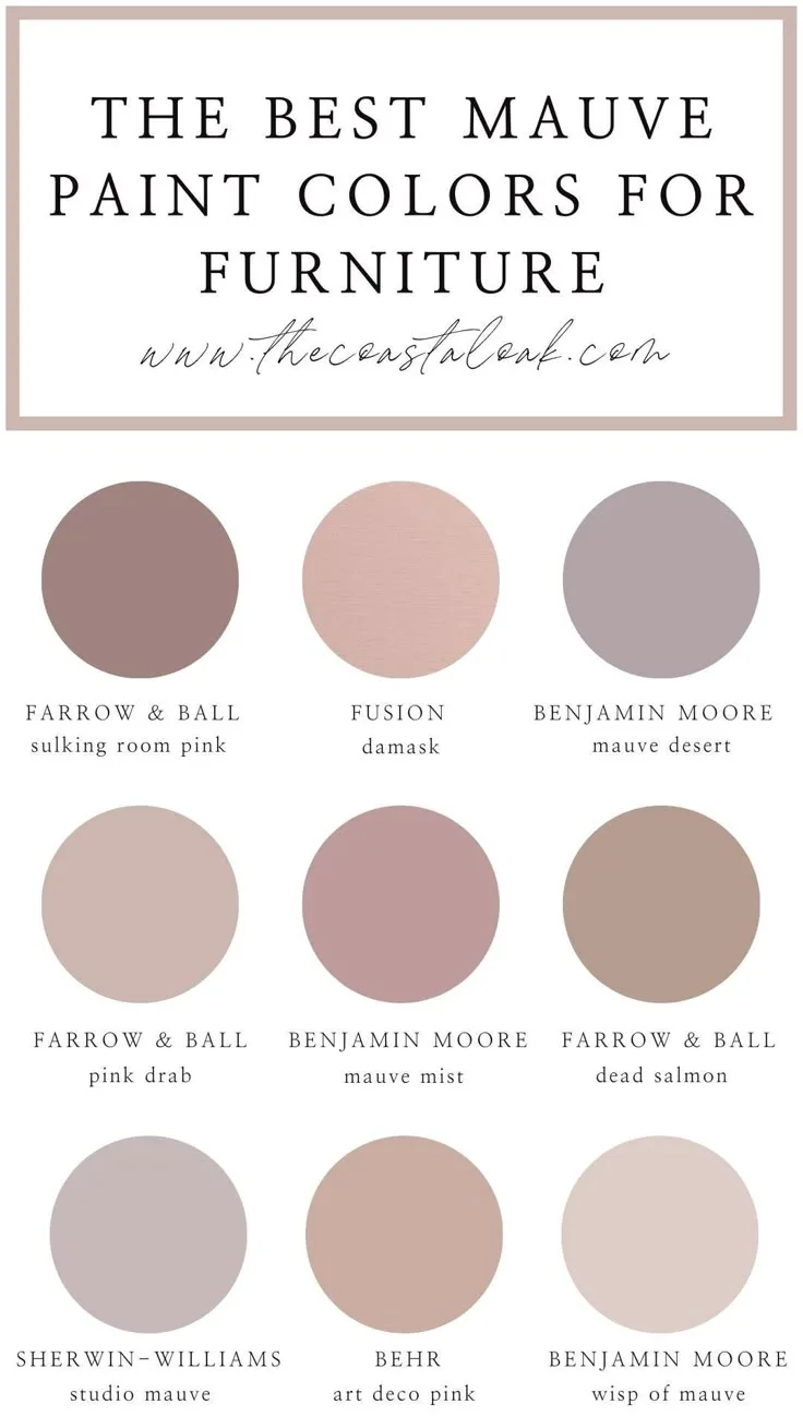
Image source: Bing (Web (fair-use with source credit))
Your Visual Guide to Undertones
- The Gray-Pink (Taupe-Pink): This is your most modern, versatile neutral. Visualize pink with a hefty dose of gray mixed in. It often leans into a warm, earthy taupe. It’s serene, sophisticated, and incredibly easy to pair. This is the safest bet if you’re nervous about pink feeling too feminine or if you want a truly gender-neutral space. It works beautifully in rooms with cooler natural light.
- The Brown-Pink (Terracotta Blush): Think dried roses, adobe clay, or desert sand. This pink is warmed up with brown or orange undertones. It creates a cozy, enveloping, and earthy feel. It’s perfect for fostering a hygge-like atmosphere and pairs naturally with materials like linen, rattan, and oak. If your room gets a lot of warm, yellow light, this undertone will lean into that cozy feeling.
- The Dusty Rose: A classic. This is a mid-tone pink with a hint of gray and a touch of mauve (which is a purple-gray). It feels romantic and vintage-inspired without tipping into frilly territory. It’s a great bridge between the gray and brown families, offering a bit of warmth with a cool, sophisticated edge.
The 48-Hour Wall Test (Non-Negotiable)
Once you’ve identified a few potential candidates from the undertone families, you must test them physically. Don’t buy the little paper chips; they’re too small. Get the large, peel-and-stick paint samples or buy small sample pots and paint a two-foot by two-foot square directly on your wall.
Paint this square on at least two walls:
- A wall that gets direct sunlight for part of the day.
- A wall that’s usually in shadow.
Now, live with them. Look at them in the morning light, the harsh afternoon sun, and under your evening lamps. The color will shift throughout the day.
The right one will feel calm and “right” in all lights, not too bright at noon, not too dead in the evening. This 48 to 72-hour test is the only way to choose with confidence and avoid the costly mistake of repainting.
If you’re drawn to a more dramatic, enveloping feel, you might explore the depth of a moody pink bedroom, which uses these same principles but with a significantly darker value.
Building Your Palette: It’s About Contrast, Not Just Color
A room painted in a single lovely pink can still fall flat. The magic happens when you introduce contrast and layers. You’re not creating a pink monolith; you’re building an ecosystem where the pink is the dominant species, but it needs other elements to thrive.
This is where you move from a “pink room” to a thoughtfully designed space.
The goal is contrast in tone (light vs. dark) and texture (smooth vs. rough), not just a complementary color wheel match. This adds visual weight, depth, and sophistication.
Pairing Colors That Actually Work
Your muted pink needs friends that ground it and highlight its softness. Here’s a simple guide based on your chosen undertone:
| Your Muted Pink Is… | Pair It With… | Avoid… |
|---|---|---|
| Gray-Pink (Taupe) | Charcoal gray, navy blue, olive green, crisp white, black accents, natural oak. | Other pastels, bright white (can look too stark and clinical). |
| Brown-Pink (Terracotta) | Cream (off-white), chocolate brown, sage green, camel, burnt orange accents. | Cool grays, blues, or anything too “clean” and modern. |
| Dusty Rose | Navy blue, forest green, warm white, charcoal, antique brass metals. | More pink, or overly sweet pastels like mint or lavender. |
Notice a pattern? Deep, rich colors (navy, charcoal, forest green) or earthy neutrals (brown, olive, cream) work best. They provide the necessary visual anchor.
For a different take on using pink as a sophisticated base, our look at pink bedroom ideas for adults explores this concept further.
The Texture Layer: What Makes a Room Feel Expensive
This is what generic advice always misses. Texture is how you add soul and prevent a flat, one-dimensional look. It’s the difference between a room that looks decorated and one that feels lived-in and inviting.

Image source: Web (Bing) / en.wikipedia.org (Web image (fair-use with source credit))
Think about incorporating at least three different material textures:
- Bedding: Skip shiny sateen. Go for rumpled linen, crisp cotton percale, or a soft flannel. Layer a chunky cable-knit or nubby wool blanket at the foot of the bed.
- Flooring: Add a natural fiber rug like jute or sisal. Its rough, organic texture provides crucial grounding. You can layer a softer, smaller rug on top for comfort.
- Furniture & Accents: Choose a nightstand with a visible wood grain, a headboard in woven rattan or caning, or curtains in a heavy linen or wool blend. Even the wall itself can have texture if you use a paint finish like limewash or a clay-based paint, which has natural variation.
This mix of textures, smooth wood, nubby wool, rough jute, soft linen, creates a tactile richness that makes the color feel complex and intentional. For inspiration on blending natural textures with a defined color palette, the principles in earthy moody bedroom decor can be perfectly adapted to a pink scheme.
Lighting is Your Secret Weapon (It Changes Everything)
You’ve chosen the perfect pink and a beautiful palette. Now, lighting can either make it sing or completely ruin it. The same paint color under a bright, cool LED will look totally different than under a warm, dimmable bulb.
Lighting controls the mood and perception of your space more than any other single factor.
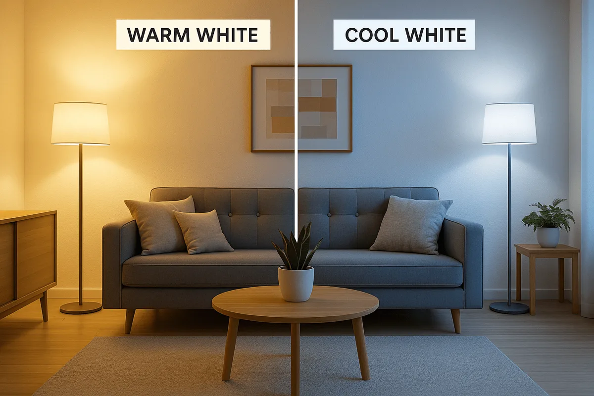
Image source: Bing (Web (fair-use with source credit))
Choosing Bulbs for Warmth vs. Clarity
Light bulb color is measured in Kelvins (K). For a muted pink bedroom, you almost always want warm white bulbs.
- 2700K, 3000K: This is the sweet spot. It emits a warm, yellowish light that enhances the cozy, soothing qualities of your pink. It will make brown and terracotta undertones glow and soften gray undertones.
- 3500K+ (Cool White/Daylight): This emits a bluer, brighter light. It can make your pink feel sterile, flat, or even a bit cold. It’s generally not recommended for creating a relaxing bedroom atmosphere, though it can work in a closet or dressing area within the room.
Make sure every single light source in the room is on a dimmer switch. This gives you ultimate control over the intensity, allowing you to set the perfect calming mood in the evening.
Layering Your Light Sources
Overhead lighting alone is the enemy of coziness. It casts harsh shadows and flattens everything. Instead, create a layered lighting plan with sources at different heights:
- Ambient (General) Light: This is your soft, overall glow. Think of a central fixture on a dimmer, or better yet, sconces that bounce light off the ceiling or wall.
- Task Light: This is for specific activities. Bedside table lamps or wall-mounted reading lamps are perfect. They provide focused light where you need it.
- Accent Light: This adds drama and highlights. A small plug-in sconce over art, a floor lamp in a corner to wash a wall with light, or even LED strip lighting under the bed frame.
When you turn on just the task and accent lights in the evening, the room transforms. The pink walls will glow softly, shadows will create depth, and the entire space will feel intimate and restful. This principle of layered, atmospheric lighting is key in many design styles, including the detailed approaches found in modern barndominium design, where functionality meets aesthetic warmth.
Step-by-Step: Building Your Room from the Ground Up
Now you have your color, palette, and lighting plan. It’s time to assemble the room in a logical order. This prevents that overwhelmed feeling where you buy a bunch of stuff that doesn’t work together.
Think of it like building a sandwich: foundation, main filling, then toppings.
Step 1: The Anchor (Bed & Largest Furniture)
Start with the biggest, most expensive, and least flexible items. This is almost always the bed and perhaps a dresser or wardrobe. Choose these pieces in your foundational neutral color.
Think natural wood tones, matte black, or charcoal.
The style of your bed frame sets the whole tone. A low platform bed in oak feels modern and organic. A wrought iron bed frame adds a touch of vintage romance, especially with a dusty rose.
An upholstered headboard in a neutral fabric like cream or gray adds softness.
Avoid buying a pink headboard or dresser. That locks you into the color too rigidly and makes the room feel one-note. Let the walls be the star.
The large furniture provides the necessary visual anchor and contrast. For more on foundational furniture choices that blend with a specific aesthetic, the approach in cabin barndominium decor focuses on rustic, anchoring pieces.
Step 2: The Soft Layers (Bedding & Textiles)
This is where you introduce your primary textures and the bulk of your accent colors. Your bedding is the largest textile in the room, so choose it carefully.
Start with sheets in a solid neutral from your palette, like cream, light gray, or sage. Then add a duvet cover or quilt in another texture, perhaps a linen or a quilted cotton. Layer a wool or knit throw at the foot of the bed in an accent color, like camel or olive.
Next, address the windows and floor. Curtains in a heavy linen or velvet in a deep tone like navy or charcoal add drama and help with light control. Your rug should be the next largest textile.
A natural fiber jute or sisal rug defines the space and adds that crucial rough texture.
Step 3: The Personality (Art & Final Accents)
With the foundation and soft layers set, you can add personality without creating clutter. This step is about curation, not filling every surface.
Choose one or two pieces of substantial art for the walls. A large-scale painting or photograph that incorporates your accent colors pulls the whole palette together. A gallery wall of smaller black-and-white prints in simple black frames can add modern contrast.
Select your lighting fixtures. Bedside lamps with ceramic or metal bases in matte black, antique brass, or white add a final sculptural element. Then, add one or two decorative objects: a stack of books on the nightstand, a simple vase, or a textured basket for extra blankets.
Stop before it feels busy. The muted pink background should feel considered, not crowded.
Common Pitfalls and How to Sidestep Them
Even with a good plan, it’s easy to stumble. Here are the most frequent mistakes and how to avoid them.
Pitfall 1: The Room Feels Too Sweet or Juvenile.
This usually happens from a lack of contrast. You paired a light pink with other pastels or white furniture. The fix is to add adult, grounding elements.
Introduce a dark color immediately. Swap white nightstands for black or dark wood. Add a charcoal throw pillow or a piece of art with deep tones.
Pitfall 2: The Pink Looks Flat or Dingy.
This is often a lighting or texture issue. The room might be lit with a single cool overhead light, which drains warmth. It might also lack textural variety, so the color has no dimension.
Add warm, layered lighting. Then, incorporate different material textures like wood, metal, wool, and linen to catch the light differently.
Pitfall 3: The Accents Clash Instead of Complement.
You brought in a rug or art with a color that fights the pink’s undertone. A gray-pink with a warm orange accent will feel unsettled. Refer back to your undertone family table.
If your pink is gray-based, stick to cool accents. If it’s brown-based, use warm accents. When in doubt, pull an accent color directly from a successful piece of art you’ve chosen.
Pitfall 4: Over-Accessorizing.
The serene vibe gets lost under a pile of decorative pillows and trinkets. Edit ruthlessly. Choose a few high-quality, meaningful pieces over many small ones.
The calm feeling comes from visual rest, not visual noise.
Muted Pink vs. The Alternatives (When to Choose What)
Muted pink isn’t the only path to a soft, sophisticated bedroom. Understanding its close cousins helps you confirm it’s the right choice for your goal.
Muted Pink vs. Bright Pink
This is the most obvious comparison. Bright pink is energetic, bold, and trendy. It makes a statement.
Muted pink is calming, timeless, and acts as a neutral. Choose bright pink if you want a dynamic, playful, and high-energy room. Choose muted pink if you want a restful, relaxing, and enduring sanctuary.
Muted Pink vs. Neutral Beige/Gray
Beige and gray are classic, safe neutrals. They provide a blank slate. Muted pink is also a neutral, but it’s a warm and complex one.
It adds a subtle emotional warmth that beige often lacks and a softness that gray can miss. Choose beige/gray for absolute versatility and a cooler tone. Choose muted pink when you want neutral warmth and a hint of gentle personality.
Muted Pink vs. All-White
An all-white bedroom feels clean, bright, and spacious. It can also feel sterile, cold, or intimidating to maintain. Muted pink offers the same sense of airiness and light, but with coziness built in.
It’s more forgiving of dust and adds instant warmth. Choose all-white for a minimalist, spa-like crispness. Choose muted pink for a cozy, livable version of a light-filled room.
For those who love the light, airy feel but want more defined color, exploring dusty pink bedroom ideas offers a closely related alternative.
Real-World Scenarios: A North-Facing Room vs. A Small Apartment
Let’s apply everything to two common, tricky situations. This shows how the principles adapt.
Scenario: The North-Facing Room
North-facing rooms get cool, bluish light all day. They can feel chilly. A gray-pink in this light might feel too cold and dreary.
- Strategy: Choose a muted pink with warm undertones to counteract the cool light. A brown-pink (terracotta blush) or a dusty rose with a touch of mauve will add much-needed warmth. It will look balanced and cozy instead of grayed-out.
- Lighting: Warm white lighting (2700K) is non-negotiable here. You’ll need it to add warmth during the day and especially in the evening.
- Palette: Pair it with other warm elements. Use cream instead of white, natural oak wood, and accents in camel or olive green. Avoid cool grays and blues.
Scenario: The Small Apartment Bedroom
The goal is to make the space feel larger, airy, and serene, not cramped and dark.
- Strategy: Use a light-value muted pink with a higher LRV (closer to 60). A light gray-pink or a very soft dusty rose will reflect the most light. Paint the ceiling the same color to visually expand the space. Avoid the darkest shades in the muted pink family.
- Furniture: Choose low-profile, leggy furniture that doesn’t block sightlines. A bed frame with visible space underneath makes the floor area seem larger.
- Mirrors: Incorporate a large mirror to double the light and the sense of space. A mirror placed opposite a window is especially effective.
- Texture: Keep textures light and airy. Use a thin linen rug instead of a thick shag. Choose simple cotton bedding over heavy chenille.
Frequently Asked Questions
Can I use muted pink in a master bedroom shared with a partner?
Absolutely. The key is leaning into the neutral, sophisticated versions. Choose a gray-pink or a brown-pink.
Pair it with masculine elements like charcoal bedding, dark wood furniture, black metal accents, and leather. It creates a balanced, calm space that feels intentionally designed, not gendered.
Is muted pink a good choice for a rental?
Yes, but you need a landlord-approved strategy. If you can’t paint, bring the color in through large, removable elements. Use a muted pink bedspread, curtains, or a large area rug.
Paint old furniture in a muted pink accent color. Layer in pink through art and decorative pillows. The effect will be softer but still cohesive.
What is the best paint finish for muted pink walls?
For most bedrooms, a matte or flat finish is ideal. It has zero sheen, which means it doesn’t reflect light points. This gives the color a velvety, deep, and uniform appearance that enhances the soft, muted quality.
It also hides wall imperfections well. Use an eggshell finish only in high-moisture areas like an attached bathroom, as it’s more washable.
How do I keep a muted pink bedroom from looking too dark?
Control comes from value and contrast. First, choose a lighter shade within the muted pink family. Second, ensure strong contrast with your other elements.
Use crisp white or cream on trim, ceilings, and bedding. Incorporate reflective surfaces like mirrors and metallic light fixtures. Finally, layer ample warm, artificial light to brighten the space in the evening.
What if I get tired of the pink color later?
This is the beauty of using muted pink as a background neutral. Because you’ve built your palette around contrasting neutrals (your furniture is wood or black, your bedding is cream or gray), changing the wall color later is straightforward. You could repaint to a similar neutral like beige or light gray, and all your furniture and textiles will still work perfectly.
The room’s foundation isn’t dependent on the pink.