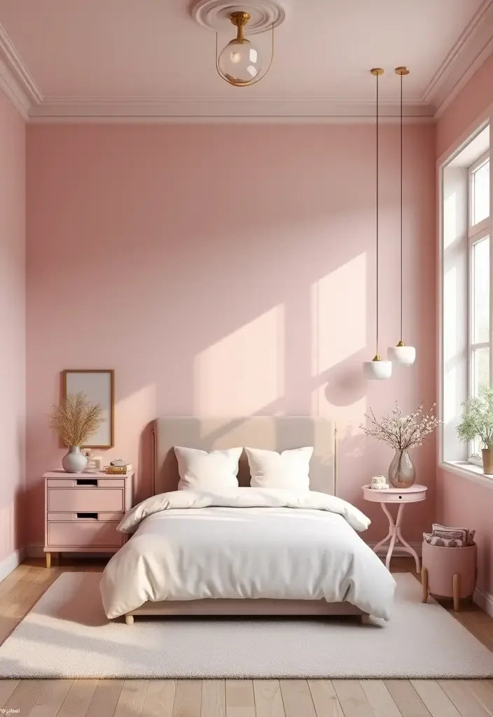
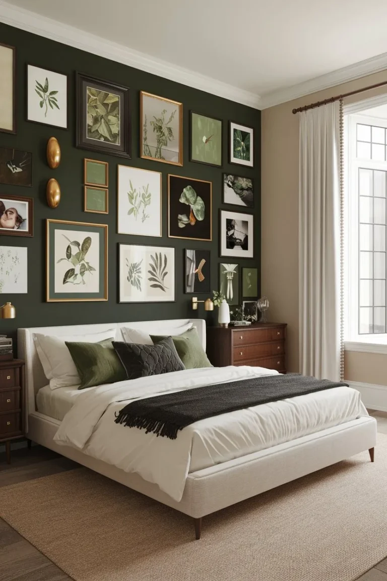
Earthy Pink Bedroom Ideas for a Warm, Natural Look
Let’s get real for a second. You’ve likely pinned a dozen beautiful images of an earthy pink bedroom, but when you try to replicate it, something feels off. The color looks too sweet, the room feels flat, or it just doesn’t have that grounded, sophisticated calm you were after.
The problem isn’t the idea. The idea is fantastic. The problem is that “earthy” isn’t a color you buy, it’s a feeling you build with context.
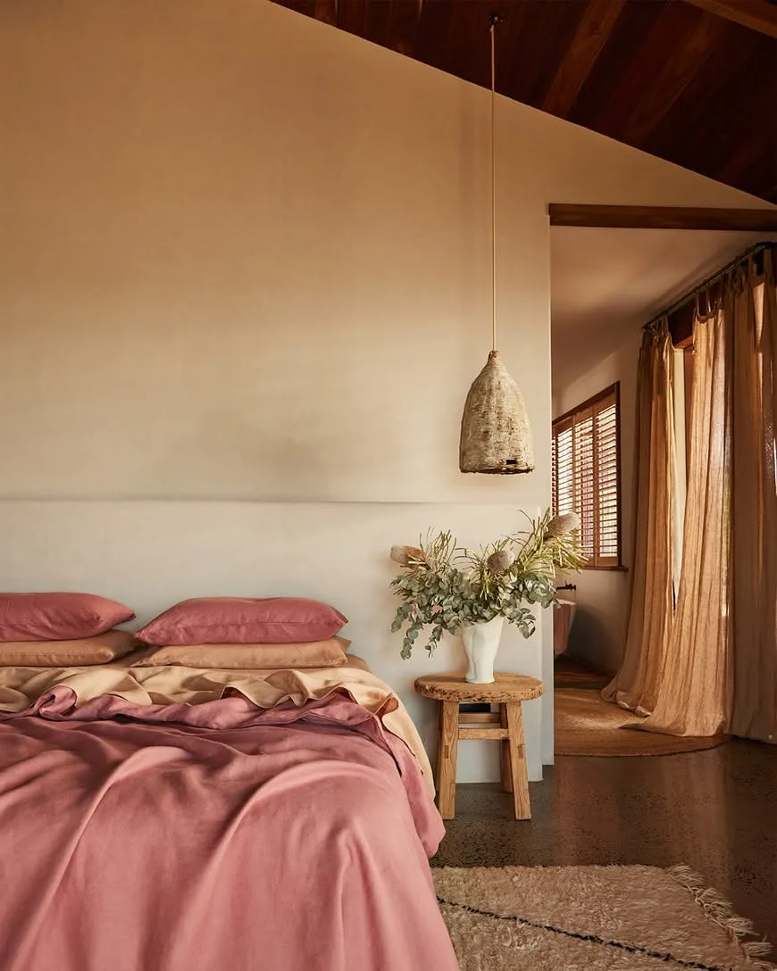
Our research into design trends and aggregated feedback from professional decorators shows this look thrives on a specific combination of muted color, natural material, and intentional light. Getting it right means understanding that the pink itself is just the starting point. The real magic happens in the layers you put with it.
Quick Answer
An earthy pink bedroom uses muted pink with brown or gray undertones, not bright or cool tones. Pair it with raw textures like linen, wood, and clay. Avoid matching everything perfectly.
Use warm artificial light under 3000 Kelvin to keep the color cozy. This creates a calm, grounded, and sophisticated retreat, not a childish space. It works in any room with thoughtful contrast.
Why Your Pink Bedroom Probably Isn’t Feeling “Earthy”
If your pink room feels more like a birthday party than a sanctuary, you’re probably missing one of three key elements: undertone, texture, or light. An earthy pink bedroom is defined by its lack of vibrancy. It’s a pink that’s been softened, almost dulled, by the influence of other natural colors.
Think of it this way. A bright, clean pink stands alone. An earthy pink looks like it belongs with something else, like the blush inside a clay pot or the faint hue of dried roses.
The most common mistake is choosing a pink that’s too pure or too cool. These pinks have blue or white bases, and they’ll fight against the natural, warm elements you try to pair them with.
Manufacturer color collections as of 2026 are full of these nuanced shades, with names like “Terracotta Blush” or “Dusky Clay,” which tells you everything about their intent. If your pink feels separate from your wood furniture or your jute rug, the undertone is the likely culprit. It’s not playing well with others.
Earthy Pink, Explained: It’s Not About the Color, It’s About the Context
This is the core concept. Earthy pink isn’t a single paint chip. It’s a role that a color plays within a specific environment.
Its job is to feel warm, organic, and grounded. To do that, it must have visible warmth (brown) or softness (gray) mixed into it.
In visual terms, you’re looking for pinks that sit next to beiges, taupes, and warm grays on a paint fan deck. They often fall into what’s called a “tertiary” color zone, meaning they’re a mix of primary and secondary colors. In this case, it’s typically a red base softened with its complement (green) or with a neutral (brown/gray), which knocks down the intensity.
This is why seeing the color in context is non-negotiable. A swatch that looks perfect on a white card can look entirely different next to your oak floors or your brass lamp. The context of your room’s fixed elements dictates which family of earthy pink will work.
A north-facing room with cool light may need a pink with more brown warmth to compensate, while a south-facing sun-drenched room can handle a pink with more gray to keep it from feeling too hot.
Before You Buy a Drop of Paint: The Two-Minute Room Audit
This step prevents 90% of regrets. Before you even look at a paint sample, you need to know what you’re working with. Grab your phone and take two quick notes.
Assessing Your Natural Light
What direction do your windows face? Stand in the room during the day.
- North-facing light: This light is cooler and bluer. It will make colors appear grayer and can suck warmth out of a room. You’ll need to choose a pink with stronger, warmer undertones (think clay) to fight the cool light.
- South-facing light: This is warm, yellow light. It amplifies warmth. Here, you can use a pink with more gray or muted tones (dusky rose) without the room feeling cold. This light can also make colors appear brighter.
- East/West-facing light: You get a mix. East rooms have bright, warm morning light. West rooms get intense, warm evening light. Note what time of day you use the room most, as the color will shift dramatically.
Taking Inventory of Your “Fixed” Furniture
What in the room is staying, no matter what? This is your “fixed palette.”
- Flooring: Is it warm orange-toned oak, cool gray laminate, or a medium walnut?
- Bed Frame & Large Furniture: Are they black metal, white laminate, cherry wood, or pine?
- Window Trim & Doors: Are they bright white, cream, or stained wood?
These elements have their own color temperature. A pink with gray undertones might clash with orange-toned pine, creating a discordant feel. Your goal is to choose a pink that harmonizes with these fixed items, not one that matches them perfectly.
Think of them as the chorus, and your pink as the lead vocalist, they need to be in the same key.
For instance, if you’re working with the rustic warmth of a cabin barndominium decor style, you’d lean into the clay-family pinks. If your room has more of a modern barndominium design with cooler metals and tones, a dusky rose might integrate better.
Choosing Your Shade of Earthy Pink: A Visual Guide
Now for the fun part. With your room audit in hand, you can navigate the two main families of earthy pink. Seeing them side-by-side is the only way to understand the difference.

The Clay Family (Warm, Red-Brown Undertones)
These pinks look like they have a bit of terra cotta or dried earth mixed in. They read as incredibly warm, cozy, and organic.
- Best for: Rooms with cool natural light (north-facing), spaces with warm wood tones (oak, pine, walnut), and creating a enveloping, snug atmosphere. They pair beautifully with leather, rattan, and brass.
- Visual Cue: Imagine the color of a wet clay pot or the inside of a seashell. It’s pink, but it’s a pink that’s been sunbaked.
- If this family works for your space, you might also enjoy the warm, enveloping feel of earthy moody bedroom decor, which uses a similar principle with deeper tones.
The Dusky Rose Family (Cool, Gray-Brown Undertones)
These pinks have a gray or muted lavender base softening them. They feel more sophisticated, serene, and slightly more modern.
- Best for: Rooms with abundant warm light (south-facing), spaces with cooler fixtures (black metal, gray wood, white trim), and achieving a calm, airy vibe. They work well with marble, bleached woods, and nickel finishes.
- Visual Cue: Think of the color of a faded rose petal or dried lavender. It’s soft and quiet.
- If this family is your match, the subtle, nuanced color play is similar to what you’d find in some moody blue bedroom ideas, just in a different part of the color wheel.
How to Test It So It Doesn’t Turn Bubblegum on You
Never trust a tiny chip. Buy sample pots and paint a large poster board (at least 2’x2′). Move this board around the room.
- Look at it on different walls.
- View it in morning, noon, and evening light.
- Place it next to your bed frame and flooring.
- Live with it for two full days.
Does it turn neon at noon? Does it look dirty or drab at night? The right shade will feel consistent and pleasant in most lighting conditions in your room.
This process moves you from guesswork to confidence. It’s the difference between a pink that feels intentional and one that feels like a mistake.
Your Textural Toolkit: The 5 Non-Negotiables
Color sets the mood, but texture creates the soul. This is where “earthy” truly comes to life. A flat, smooth room in earthy pink will still feel sterile.
You need to introduce a variety of organic, tactile surfaces that catch the light differently and invite touch.
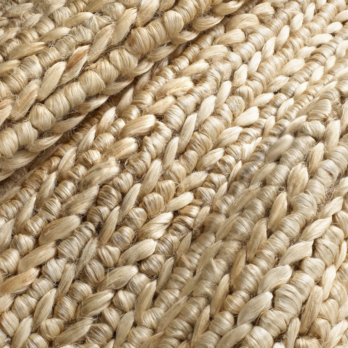
Think of texture as visual weight and pattern. The goal is a mix of rough and smooth, nubby and sleek, woven and solid. Here are the five layers you should aim to include.
The Bedding Foundation: Weight and Weave
Your bed is the largest textural surface. Avoid high-thread-count, sateen sheets that are shiny and smooth. Instead, opt for fabrics with a visible, irregular weave.
- Linen: The undisputed champion for this look. It’s breathable, gets softer with time, and has a beautiful, relaxed drape and nubby texture. Look for heavyweight linen for maximum cozy effect.
- Organic Cotton Percale: A crisp, matte finish that provides a cleaner counterpoint to other textures.
- Knit or Waffle Weave: Adds wonderful depth and coziness, perfect for a throw blanket or bedspread.
The Grounding Layer: Your Rug Choice
This is your second-largest texture. It literally grounds the color scheme.
- Jute, Sisal, Seagrass: Natural fiber rugs are ideal. They’re neutral, incredibly textured, and immediately signal an organic vibe. A modern barndominium design often uses these for exactly this reason.
- Wool with a Low Pile: If you need more softness underfoot, a wool rug in a simple, natural hue (cream, oat, taupe) works. Avoid high-pile shags or anything with a synthetic sheen.
The Furniture Factor: Wood Tones and Finishes
Wood should look like wood, not plastic.
- Raw, Live-Edge, or Brushed Finishes: These show the natural grain and variation. A nightstand with a live-edge top adds immense organic character.
- Matte or Oiled Finishes: Avoid high-gloss lacquers. A matte finish absorbs light and feels more authentic.
- Mix Your Woods: Don’t worry about matching your oak floors to your walnut bed frame. Slight variations in wood tone add depth and a collected-over-time feel.
The Soft Accents: Baskets, Throws, and Curtains
These are your medium and small-scale textures.
- Rattan & Wicker Baskets: For storage, plant pots, or purely as decor. The woven pattern is pure texture.
- Chunky Knit or Woven Throws: Drape one over the corner of your bed or a chair.
- Linen or Cotton Canvas Curtains: Choose a natural, undyed shade or a lighter/darker tone of your wall color. Hang them high and wide to frame the window, and let them pool slightly on the floor for a soft, relaxed look.
The Living Element: Plants and Dried Botanicals
This is non-negotiable for breath and life.
- Real Plants: A large floor plant (like a fiddle-leaf fig or monstera) or a few trailing pothos on a shelf. The green provides the perfect complementary color pop to pink.
- Dried Branches, Pampas Grass, or Lavender: These add height, movement, and a beautiful, muted color palette that complements the pink perfectly. They require no maintenance and last for years.
When you layer these five elements, the pink becomes a backdrop for a rich, tactile landscape. It stops being “a pink room” and starts being a sensory experience. This layered, organic approach is a cornerstone of styles like moody boho bedroom design, which takes textural contrast to an even more expressive level.
Step-by-Step: Building the Room Around Your Pink
Now it’s time to assemble the layers in a logical order. Think of it like painting a picture, you start with the background and work forward. Jumping straight to accessories is like trying to draw the eyebrows before you’ve sketched the face.
Step 1: Start with the Walls (or the Biggest Fabric)
This is your foundational layer. If you’re painting, do this first. If you’re a renter using peel-and-stick wallpaper or committing with a large duvet cover instead of paint, that’s your “wall.”
Apply your chosen earthy pink. Use a matte or flat finish. Glossy paint reflects light in a hard, modern way that fights the organic feel.
A matte finish absorbs light softly, which is exactly what you want.
Let it dry completely. Live with just this color for a day. Get used to the new base tone in your space before adding anything else.
This pause helps you see what the room actually needs next.
Step 2: Bring in Your Largest Textures (Rug, Bedding)
Next, lay down your natural fiber rug. This immediately grounds the space and defines the area. Then, make your bed with your linen or textured bedding.
Don’t use a matching pink bedspread. Choose a neutral like cream, oat, or a lighter/darker shade of your wall’s undertone. For example, a clay pink wall looks incredible with a sand-colored linen duvet.
At this point, you have a cohesive but simple base. The pink walls, neutral textured bedding, and natural rug are already working together. The room should feel calm and intentional, not empty.
Step 3: Anchor with Contrast (Black Metal, Dark Wood, Crisp White)
This step prevents the room from feeling washed out or one-note. You need elements that define edges and add depth.
Introduce your furniture. A black metal bed frame or dark stained wood nightstands work perfectly. If your walls are a dusky rose, try furniture in a rich, chocolate brown wood.
Add crisp white in small, intentional doses. This could be the trim around a piece of art, the pages of books on a shelf, or a simple ceramic lamp base. White acts as a visual refresh, keeping the palette from feeling too heavy or monochromatic.
Step 4: Add Personal, Collected Layers (Art, Books, Ceramics)
Finally, add the soul. This is where your personality comes in, and it should feel gathered, not bought as a set.
Hang art with muted tones or simple black and white line drawings. Stack a few books with neutral covers on your nightstand. Place a hand-thrown clay vase or bowl on a dresser.
The key is variety in material and a sense of history. A vintage wood frame, a modern metal sculpture, a stack of hardcover books, and a living plant all together create that rich, layered look. This collected feel is a hallmark of moody purple bedroom decor and other nuanced styles.
The Lighting Trap: How to Keep Your Pink Warm and Cozy at Night
Your perfect earthy pink can turn cold and uninviting the moment you flip the switch. Artificial light is color temperature, measured in Kelvins (K). Get this wrong, and you undo all your hard work.
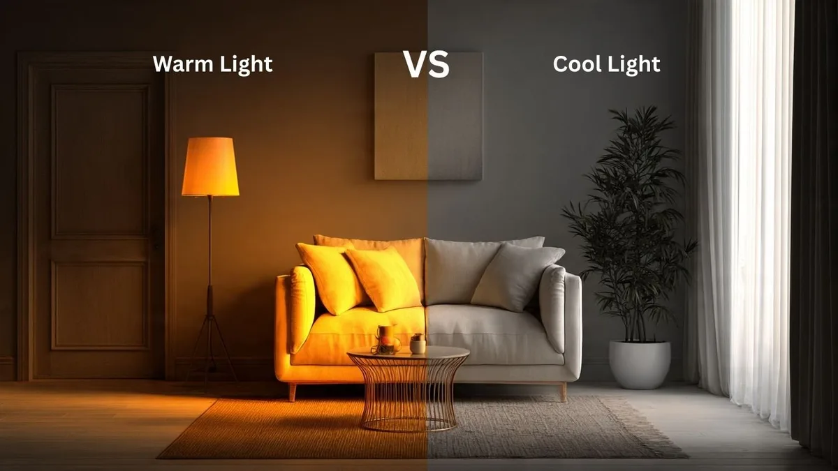
Warm white light, around 2700K to 3000K, is your best friend. It emits a soft, yellow glow that enhances the warmth in your earthy pink and makes wood tones glow. This is the temperature of classic incandescent bulbs and most “soft white” LEDs.
Cool white or daylight bulbs (4000K and above) emit a blue-white light. This light will drain the warmth from your pink, making it look grayish, flat, and sterile. It can make the room feel like a clinic instead of a retreat.
Always check the Kelvin rating on bulb packaging. For bedside lamps, floor lamps, and overhead fixtures you use at night, stick to 2700K-3000K. Consider using dimmers to adjust the intensity.
Layer your lighting, too. A combination of overhead, task (bedside), and accent (a small lamp on a dresser) creates a soft, inviting ambiance that shows off your palette perfectly.
Common Visual Mistakes (And How to Fix Them)
Even with the right pieces, a few missteps can throw the whole look off balance. Here are the most frequent pitfalls we see.
Mistake 1: Too Much Matching
The goal is harmony, not matchy-matchy. A room where the throw pillows are the exact same pink as the walls, on a bed with a pink blanket, feels overdesigned and lacks depth.
The Fix: Use your pink as the unifying hue, but vary the saturation and material. Let the walls be the main statement. Choose bedding in a neutral from your palette.
Add pillows in a complementary texture (like a woven mudcloth) or a pattern that includes your pink plus other colors. Introduce other muted colors like sage green, ochre, or slate blue in very small doses.
Mistake 2: Shiny Finishes
High-gloss furniture, metallic bedding, or acrylic accessories reflect light in sharp, modern ways. This clashes with the soft, matte, organic feel you’re building.
The Fix: Opt for matte, oiled, or brushed finishes on furniture and decor. If you love metallics, choose unlacquered brass or blackened steel, which develop a soft patina over time. Keep them as accents, not primary materials.
This principle of matte finishes is just as crucial in other detailed spaces, like achieving the right look for a bathroom false ceiling style.
Mistake 3: Ignoring the Fifth Wall (The Ceiling)
A bright white ceiling can create a harsh line that visually “lifts” the color off the walls, making the room feel less cozy and enveloping.
The Fix: Consider painting your ceiling. The most elegant and cohesive option is to paint it the same color as the walls. This makes the room feel like a serene, cocooning box.
If that’s too bold, paint it a much lighter tint of your wall color (ask for a 50% or 75% formula at the paint store). Even a soft, warm white like “Navajo White” is better than a stark, cool white.
Earthy Pink vs. The Alternatives: When to Choose What
Earthy pink isn’t the only path to a serene bedroom. Knowing the alternatives helps you confirm it’s the right choice for your goal and style.
| Feature | Earthy Pink | Sage Green | Warm Beige |
|---|---|---|---|
| Core Vibe | Warm, softly romantic, grounded | Cool, tranquil, restorative | Neutral, quiet, minimalist |
| Best For | Adding gentle personality without boldness, pairing with warm woods & clay | Creating a spa-like calm, complementing white & gray schemes, cooler light rooms | A foolproof neutral backdrop, maximizing light in small rooms, high-contrast decor |
| Texture Need | High – needs texture to feel earthy | Medium – texture enhances the natural feel | Medium to High – can feel flat without it |
| Lighting | Needs warm light (2700K-3000K) | Works with both warm and cool light | Very flexible with lighting |
Choose Earthy Pink if: You want warmth and a hint of soft color but find beige too safe and brighter pinks too loud. It’s perfect if you have warm wood tones and love a collected, organic feel.
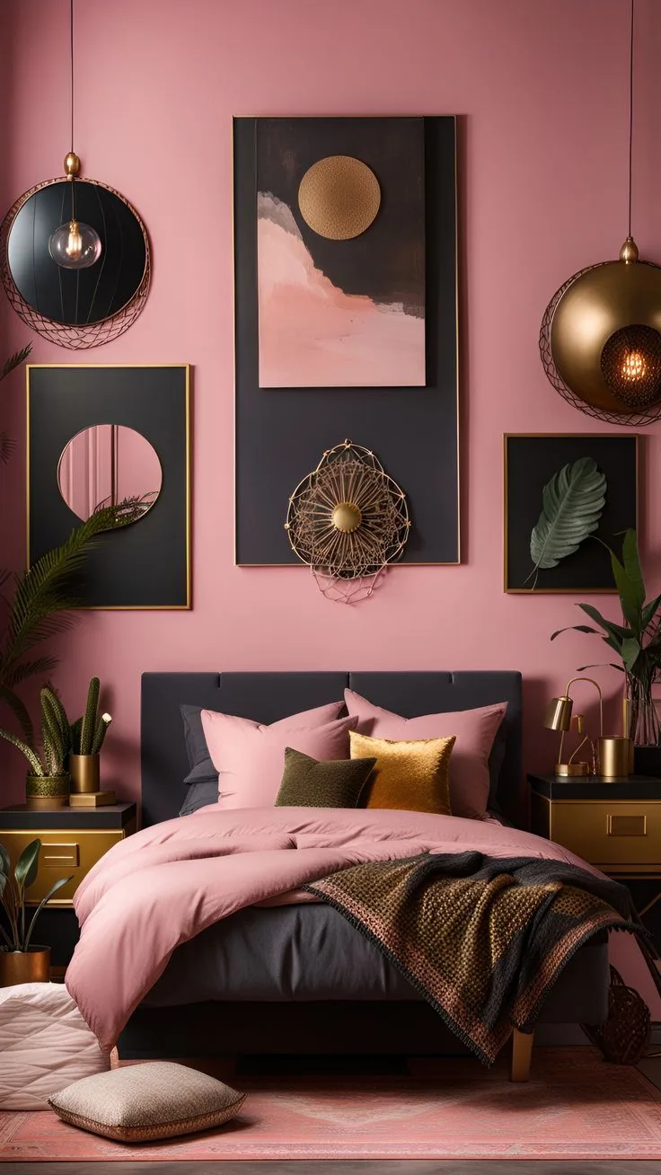
Choose an Alternative if: You want absolute calm with no color hint (go beige), or you prefer a cooler, more botanical tranquility (go sage). For a more dramatic take on color, look at the depth in a dusty pink bedroom or the intensity of a moody pink bedroom design.
FAQs for the Nervous Decorator
Let’s address the final practical hurdles.
Can I do this if I’m a renter?
Absolutely. Your commitment level just changes. Instead of paint, use your pink in your largest textiles.
A dusky pink linen duvet cover or a large clay-colored area rug can set the tone. Use peel-and-stick wallpaper on a single accent wall behind the bed. Add texture with baskets, a rattan headboard, and lots of plants.
All these elements can come with you when you leave.
What if my room gets almost no natural light?
This is a common challenge in apartments. First, embrace it. Lean into the cozy, cocooning potential.
Choose a pink from the warmer “clay family” to inject warmth that the sun doesn’t provide. Then, be militant about your artificial lighting. Use multiple warm (2700K) light sources at different heights.
A floor lamp, a bedside lamp, and even plug-in wall sconces can create a beautiful, layered glow that makes the room feel intentional, not dark.
Will this color scheme feel dated quickly?
Earthy pink is part of the move toward muted, nature-inspired palettes. Unlike the bright, cool millennial pink of the 2010s, its connection to terracotta, clay, and raw materials gives it a timeless quality. These are colors found in nature and historical pigments.
By focusing on classic textures (linen, wood, wool) and avoiding trendy furniture shapes, your room will feel current for years, not just this season.
How do I keep it from looking too feminine or masculine?
This look is about sensibility, not gender. The “earthy” modifier does the heavy lifting. Avoid frilly, lacy, or overtly floral patterns.
Stick to geometric, striped, or organic mudcloth-inspired patterns. Incorporate robust materials like blackened steel, leather straps on baskets, and chunky, raw wood. Balance delicate dried florals with a substantial stone bookend.
It’s all about contrast and weight. The result feels sophisticated and personal, not themed. For more ideas on creating a balanced, adult pink space, our guide on pink bedroom ideas for adult offers additional perspectives.
Your Final Checklist Before You Start
Run through this list to ensure you have all the pieces in place before you begin your transformation.
- Undertone Confirmed: You’ve sampled your pink on a large board and viewed it in your room’s light at different times of day.
- Paint Finish Selected: You’ve chosen a matte or flat finish for your walls, not a gloss.
- Texture Layers Sourced: You have at least three different organic textures planned (e.g., linen bedding, jute rug, rattan basket).
- Lighting Checked: Your bulb purchases are for warm white light, 2700K-3000K.
- Contrast Planned: You’ve identified where black, dark wood, or crisp white will be introduced for definition.
- Fixed Elements Harmonized: Your chosen pink works with the color temperature of your existing flooring and large furniture.
- Ceiling Considered: You’ve decided on a color for the fifth wall, whether it’s the same as the walls, a lighter tint, or a warm white.
- Plants or Dried Elements: You’ve selected at least one living or dried botanical element to add life and breath.
Crossing these off means you’re not just decorating, you’re designing with intention. You’re building a room, not just painting one.
Frequently Asked Questions
We’ll address a few more specific queries that come up often.
What’s the best white trim color with earthy pink walls?
Choose a white with warm undertones. Avoid stark, blue-based whites like “Pure White.” Look for names like “Alabaster,” “Navajo White,” or “White Dove.” These have subtle yellow or cream bases that complement the warmth in the pink without clashing.
Can I use earthy pink in a small bedroom?
Yes, but consider using it on a single accent wall behind the bed. Paint the other walls a warm, light neutral from the same undertone family. This gives you the color and mood without making the space feel too enclosed.
Keep other elements light and airy.
Is this a good color for a child’s room?
It can be, especially if you want to move away from stereotypical bright pinks or blues. It creates a wonderfully calm and soothing environment. Just incorporate playful elements through art, more colorful bedding, or fun textures rather than through the wall color itself.
How do I clean and maintain the textured fabrics?
Regular maintenance is key. Vacuum natural fiber rugs frequently to prevent dirt buildup. Spot clean linen bedding as needed.
Most high-quality linen is machine washable, but always check care labels. Shake out woven baskets and fluff wool throws to keep them looking fresh.