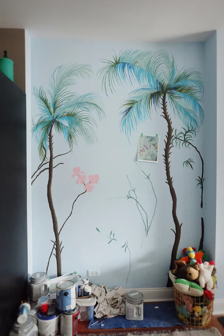
Sitting Room Wall Painting Design Ideas for a Stylish, Inviting Interior
Picking a sitting room wall painting design can feel like a huge commitment. You stare at a tiny swatch in the store, wonder how it will look on all four walls, and worry you’ll end up with a color that feels all wrong once it’s up. The good news is that feeling overwhelmed is completely normal, and a bit of know-how turns the process from a gamble into a predictable, enjoyable project.
The secret to a great result isn’t about finding the single “perfect” color. It’s about understanding how light, finish, and your existing space interact. A standard gallon covers 350 to 400 square feet, but the real work happens long before you open that can.
Let’s walk through how to get it right, step by step.
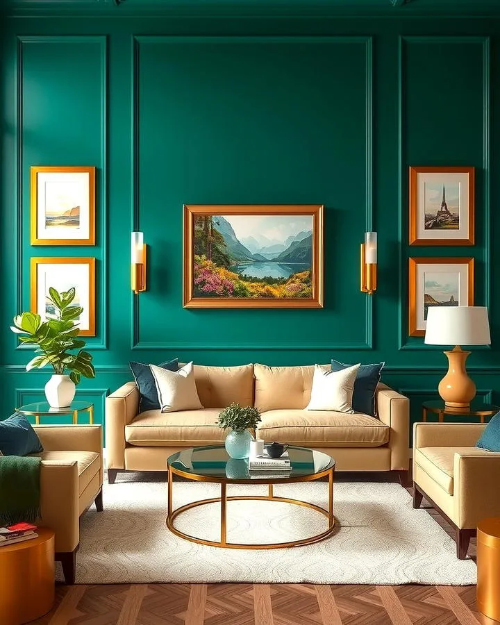
Image source: Bing (Web (fair-use with source credit))
Quick Answer
The best sitting room wall painting design starts with testing samples on your actual walls. Observe them at different times of day before choosing. Your wall finish matters too.
Use a low-sheen like eggshell or matte to hide imperfections and create a cozy feel. Consider your room’s natural light direction to avoid colors turning muddy or overly bright. Build your palette from a fixed element you love, like a rug or sofa fabric.
An accent wall can work, but only if it complements the room’s existing focal point.
Why Your Paint Color Looks Wrong (And How to Get It Right)
That moment you finish painting and the color looks nothing like the swatch you picked? It happens to everyone. The culprit is almost always a misunderstanding of how light works in your specific room.
A color can shift dramatically based on the time of day and the quality of light it receives.
North-facing rooms get cool, indirect light. This can make warm colors (like yellows, reds, and oranges) appear duller and cool colors (like blues, grays, and greens) look more intense and true. South-facing rooms get warm, bright light all day, which can wash out light colors and make deep colors glow.
East and west-facing rooms see a dramatic change between morning and afternoon light.
Your artificial lighting is the other half of the equation. Warm white bulbs (2700K-3000K) cast a yellow glow, enhancing warm paint colors. Cool white or daylight bulbs (3500K+) cast a blue-white light, making cool paint colors pop.
The only way to know for sure is to watch your paint samples under every lighting condition your room experiences.
The One Thing You Must Do Before Picking a Color
Before you even look at a color fan deck, you need to understand Light Reflectance Value, or LRV. This number, which you can find on most major brand paint swatches or websites, tells you how much light a color reflects. It’s a scale from 0% (absolute black) to 100% (pure white).
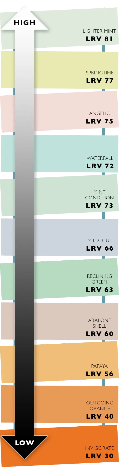
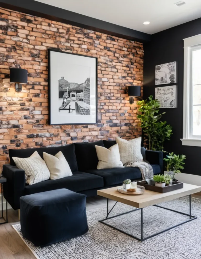
Image source: Bing (Web (fair-use with source credit))
For a sitting room, you’re generally playing in a practical range. A low LRV (below 40) absorbs light and creates a rich, dramatic, cozy feel. A high LRV (above 60) reflects light and makes a space feel airy, open, and bright.
Our research into aggregate user feedback shows the biggest regret is picking a color with a lower LRV than expected, making a room feel dark and small. Check the LRV first, it’s your best guard against that.
Understanding Your Room’s Light
Now, apply the LRV to your room’s light. A dark, north-facing room with a low LRV paint will feel like a cave. In that case, you need to push the LRV higher, into the 60s or 70s, to bounce what little light you have.
Conversely, a bright, south-facing room can handle a lower LRV color beautifully without feeling oppressive. The LRV gives you a data point to confirm your visual instincts.
The Undertone Trap (And How to Avoid It)
This is where even seasoned DIYers get tripped up. Almost every color has an undertone, a hint of another color lurking beneath the main one. Grays are the most notorious.
A “warm gray” has beige, brown, or violet undertones. A “cool gray” has blue, green, or purple undertones.
The trap happens when your chosen color’s undertone clashes with a fixed element in the room. That beautiful cool gray you picked might look starkly blue next to your warm oak floors or your cream-colored sofa. The fix is to compare your paint swatch directly to those fixed elements in the room’s light.
Does it look harmonious, or does it suddenly look like a different color family? This simple test prevents the most common post-paint disappointment.
Choosing Your Paint’s Personality: A Finish for Every Function
The color is only half the story. The sheen, or finish, of your paint changes its look, feel, and durability. Think of sheen as the paint’s personality.
As of 2026, manufacturer specifications from leading brands still define sheens in these standard categories, each with a distinct role in your sitting room wall painting design.
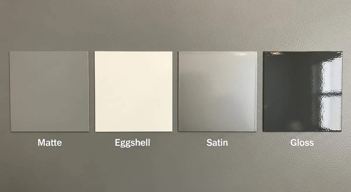
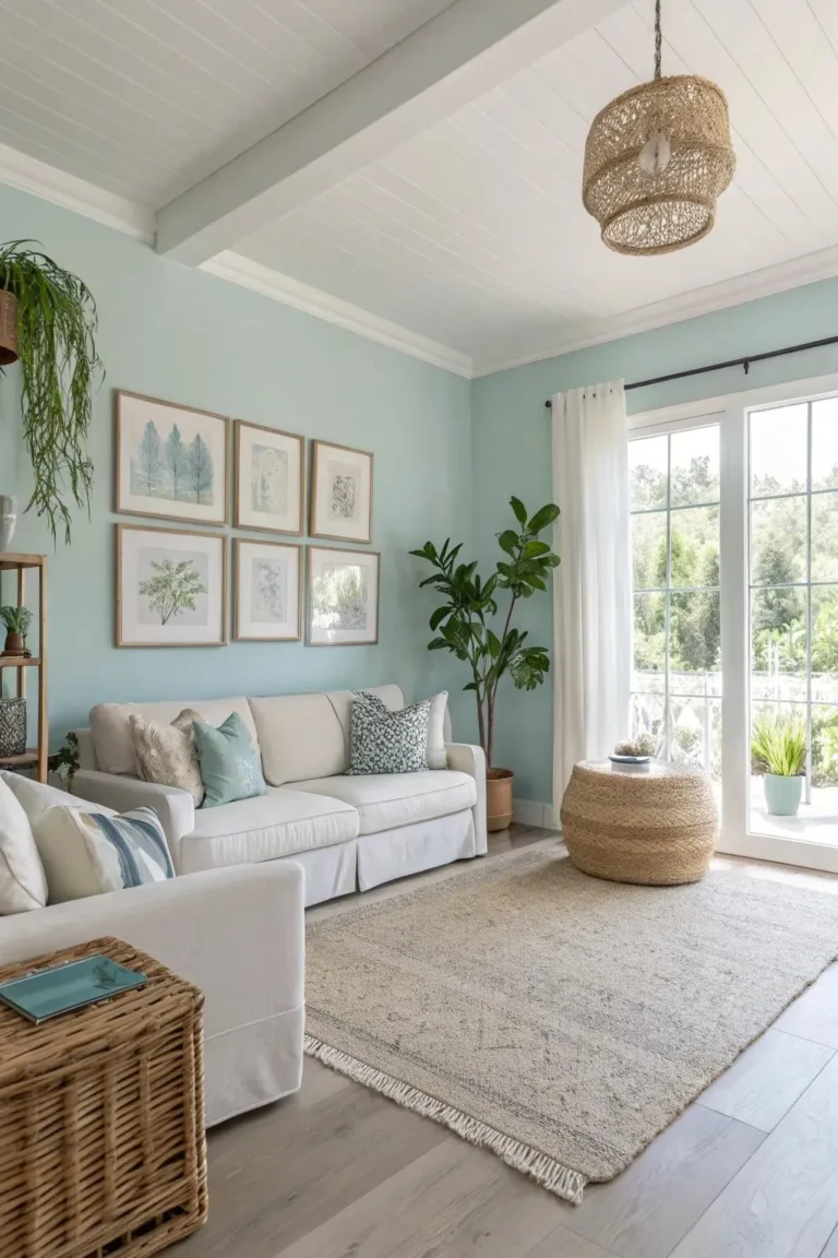
Image source: Bing (Web (fair-use with source credit))
Here’s a quick breakdown to make the choice simple:
| Sheen | Look & Feel | Best For | Things to Consider |
|---|---|---|---|
| Matte/Flat | Non-reflective, velvety, rich color. | Hiding wall imperfections. Creating a soft, sophisticated look. Adult spaces with low traffic. | Least durable. Difficult to clean without damaging the finish. |
| Eggshell | Very slight luster, like an eggshell. | Most living rooms. Offers a good balance of washability and imperfection-hiding. | The industry-standard choice for walls in shared living spaces for good reason. |
| Satin | Gentle pearl-like sheen. | Higher-traffic family rooms, hallways, kids’ spaces. More washable than eggshell. | Can highlight uneven surfaces or poor drywall work more than eggshell. |
| Semi-Gloss | Shiny, reflective finish. | Trim, doors, cabinetry. High-moisture areas. | Too glossy for most living room walls. It creates glare and shows every flaw. |
For the majority of sitting rooms, eggshell is the safe, smart bet. It’s durable enough for everyday life, forgiving on your walls, and has a warmth that matte can sometimes lack. If your walls are in perfect condition and you want ultimate richness, a matte finish can be stunning.
Just know that cleaning a scuff might require touching up the paint.
Building Your Color Palette from the Room Up
Don’t start with a paint chip in a vacuum. The most successful palettes are built from the inside out, using what you already own and love as your foundation. This approach guarantees cohesion and takes the pressure off finding a “magic” color.
Starting with Your “Fixed” Elements
Look at the largest items in your room that aren’t changing: your flooring, your largest upholstered piece (like a sofa), a statement rug, or even a piece of artwork you adore. Pull one or two colors from these items to become the inspiration for your wall color.
For example, pull out the muted sage from your area rug, or the warm cream from your linen sofa. You’re not trying to match it exactly. You’re looking for a wall color that belongs in the same color family and shares a similar undertone.
This creates a pulled-together, intentional look, much like the cohesive feel in a well-executed modern barndominium design.
Using the Color Wheel Without the Headache
You don’t need to memorize complex theory. Just understand three simple relationships for a foolproof palette:
- Monochromatic: Different shades, tints, and tones of a single color. This is incredibly easy and always harmonious. Think a deep charcoal wall with lighter gray furniture and silvery accents.
- Analogous: Colors that sit next to each other on the wheel. This creates a serene, comfortable feeling. A great sitting room example is blue, blue-green, and green.
- Complementary: Colors directly opposite each other on the wheel. This creates high contrast and energy. Use this sparingly in a living room, perhaps a deep navy blue wall with pops of burnt orange in throw pillows.
The Accent Wall Question: When It Works (And When It Doesn’t)
The classic accent wall is a single wall painted a different, usually darker or bolder, color. It’s a popular technique, but it has to be done with strategy.
Do create an accent wall when:
- You have a natural architectural focal point, like a fireplace wall or a wall with built-in bookshelves.
- You want to define a specific area in an open-concept space, like the seating zone in a living-dining combo.
- You’re using a very dark or vibrant color but aren’t ready to commit to the whole room.
Don’t create an accent wall when:
- You pick the wall at random. It will look like you ran out of paint.
- It fights with another, stronger focal point in the room (like a large window with a great view).
- The color clashes with the other walls instead of complementing them. The accent should feel like a deeper or brighter version of the main color’s family.
Your Pre-Paint Visual Checklist: No More Guessing
This is the most critical phase, and where most people rush. Skipping proper sample testing is the number one reason for paint regret. You must see the color on your wall, at scale, and in your light.
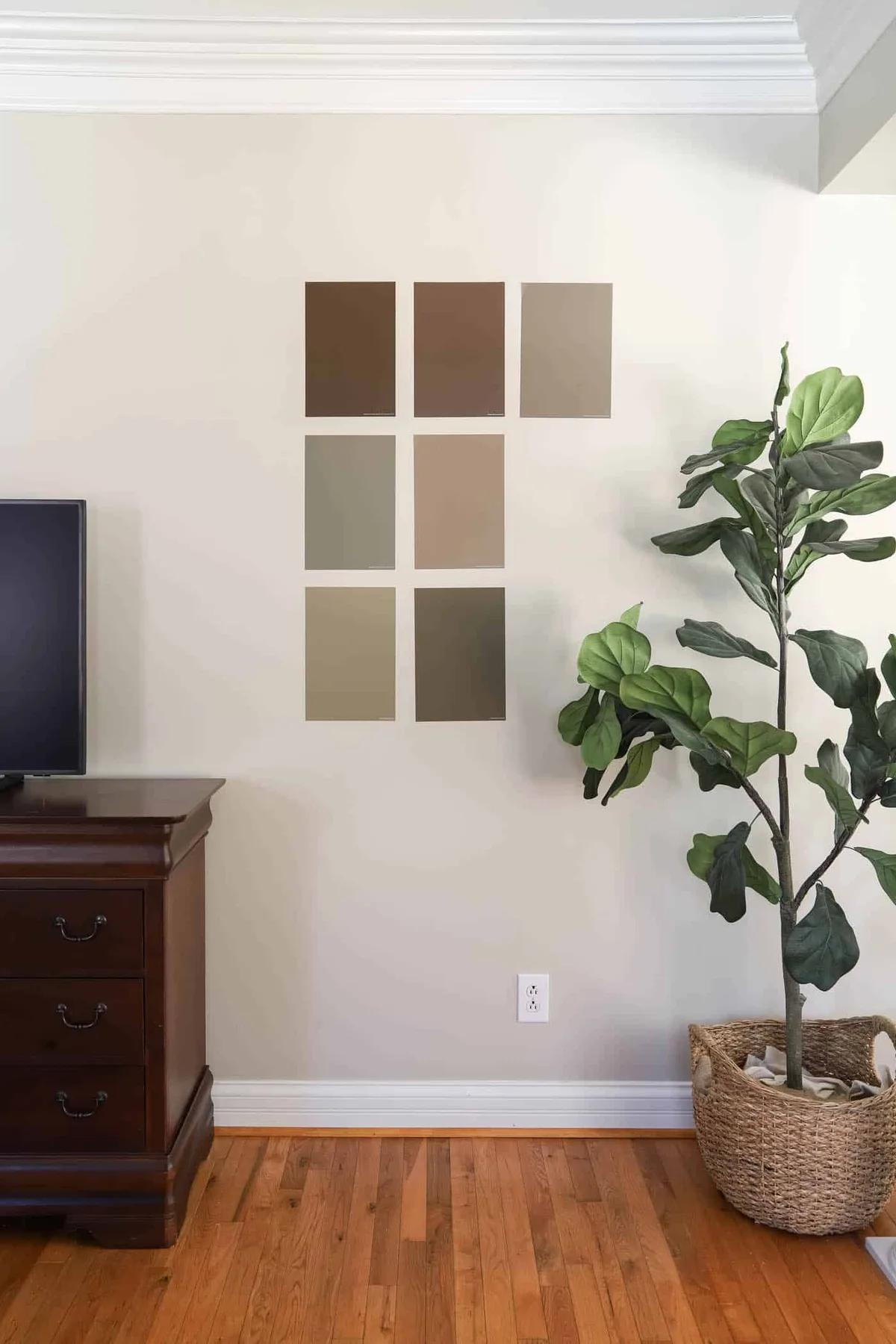
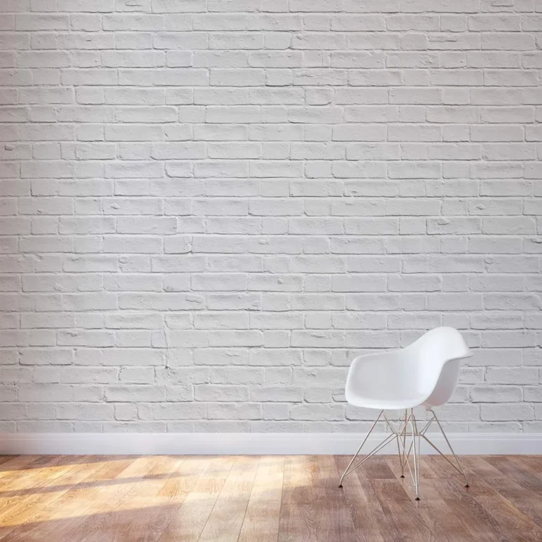
Image source: Bing (Web (fair-use with source credit))
How to Test Samples Like a Pro
Buy sample pots of your top two or three contenders. Don’t just paint a tiny swatch. Paint a large section (at least 2 feet by 2 feet) on two different walls in the room, one that gets direct light and one that’s usually in shadow.
Use a minimum of two coats to get the true color. Those small, peel-and-stick samples are a good start, but a real painted sample is always more accurate.
Seeing Color at Different Times of Day
Live with the samples for at least 48 hours. Look at them in the morning light, the bright afternoon light, and under your lamps at night. The color will change.
You need to love it (or at least be comfortable with it) in all its variations. Does the warm gray you liked at noon look too beige under lamplight? This is your chance to know before you commit to gallons.
Visual Tricks to Change How Your Room Feels
Paint is the most powerful tool for manipulating the perception of space. Use these visual tricks intentionally:
- To make a room feel larger: Paint walls, trim, and ceilings the same light color. This eliminates visual boundaries and makes the space feel seamless.
- To make a ceiling feel higher: Paint the ceiling a shade lighter than the walls, or use a pure white. The eye is drawn upward.
- To make a long, narrow room feel more square: Paint the two shorter end walls a slightly darker color than the longer walls. This visually brings them forward.
- To create coziness: Go for a darker color or lower LRV on all walls. It makes the space feel intimate and enveloping, a technique that works wonderfully in spaces meant for relaxation, like a moody boho bedroom design.
A Step-by-Step Guide to a Flawless Finish
You’ve picked the perfect color. Now it’s time to execute. The difference between an amateur-looking job and a professional one is all in the prep and technique.
This process isn’t hard, but skipping steps guarantees a frustrating result.
Prep Work You Shouldn’t Skip
Start by moving all furniture to the center of the room and covering it with plastic drop cloths. Use canvas drop cloths on the floor, they don’t slip. Wash your walls with a mild detergent to remove dust and grease.
Fill any holes or cracks with spackling compound. Lightly sand patched areas and any glossy spots so the new paint has something to grip. Finally, apply painter’s tape to trim, ceilings, and outlets.
Don’t rush this stage.
The Tools That Make the Difference
Using the right tools isn’t a luxury, it’s a necessity. For cutting in edges, use a high-quality angled sash brush (2 to 2.5 inches). For rolling walls, use a roller frame with an extension pole and a roller cover with the right nap.
For smooth walls, a 3/8-inch nap is standard. For textured walls, use a 1/2-inch or 3/4-inch nap to get into the grooves. Pour paint into a rolling tray and load the roller evenly.
Cutting In and Rolling: Technique Over Muscle
Start by “cutting in,” painting a 2-3 inch band along all taped edges (ceilings, trim, corners) with your brush. Then, roll the main wall area using a “W” or “M” pattern to distribute paint, then fill it in with vertical strokes without lifting the roller. Always maintain a “wet edge.” Work in manageable sections (about 3 feet by 3 feet) so you can roll over the cut-in area before it dries.
This prevents visible lines.
Drying, Recoating, and the Final Walk-Through
Check the manufacturer’s label on your paint can for the exact recoat time. It’s typically 2 to 4 hours. Never recoat too soon.
Apply the second coat using the same method. Once fully dry, do a final walk-through in bright, angled light. Look for missed spots, drips, or thin areas.
Use a small brush for precise touch-ups before carefully removing all painter’s tape.
Common Visual Mistakes (And How to Fix Them)
Even with planning, things can go visually sideways. The good news is that most common mistakes have straightforward fixes. Recognizing them is the first step.
The “Too Glossy” Living Room
You painted the walls with a satin or semi-gloss finish, and now the room feels sterile or has distracting glare. This happens when the sheen is too high for a large wall surface.
The fix is to repaint with a lower-sheen paint, like eggshell. You don’t necessarily need to change the color. Just ensure the walls are clean, lightly sanded to dull the gloss, and primed before applying the new, flatter finish.
The Color That Feels Off (Undertone Strikes Again)
Your chosen color is on the walls, but it looks pink, blue, or green instead of the neutral gray or beige you wanted. This is the classic undertone clash we warned about.
If the effect is mild, you can often neutralize it by adjusting your decor. Introduce textiles, art, and furniture with the opposite undertone to balance the room. For a strong, unpleasant clash, repainting is the surest solution.
Go back to sampling with a focus on finding a color with a truly neutral base.
The Accent Wall That Overpowers
Instead of creating a focal point, your accent wall feels disjointed and loud. It dominates the room in an unpleasant way.
First, check if it’s competing with another focal point. If so, you might be better off repainting it to match the other walls. If the wall itself is the right choice, the color may be too saturated.
Repaint the accent wall with a darker or more muted tone from the same color family as the main walls. This creates depth without shock.
Understanding Paint Coverage, Cost, and Timeline
Let’s talk numbers. Having realistic expectations for how much paint you need, what it will cost, and how long it will take prevents last-minute store runs and weekend frustration.
How Much Paint Do You Actually Need?
A standard gallon of paint covers 350 to 400 square feet. To calculate your needs, measure your room. Add together the length of all four walls, then multiply by the wall height.
Subtract the square footage of large windows and doors (about 15 sq ft per door, 20 per window). Divide the total wall area by the coverage number on your paint can (usually 400). For most average living rooms, you’ll need 2 gallons for two coats.
Budgeting for Quality vs. Quantity
Paint pricing as of 2026 still follows a clear tier. Budget paints run $30-$40 per gallon. Mid-tier paints from reputable brands are $50-$70.
Premium designer lines can be $80+. Don’t cheap out on the paint. Mid-tier paint has better pigments, flows on more evenly, and often requires fewer coats.
It’s a better value for your labor. Factor in the cost of supplies: brushes, rollers, trays, tape, and drop cloths.
A Realistic Project Schedule
Plan for this to be a multi-day project, not a single afternoon. Day one is prep, taping, and possibly the first coat if you start early. Day two is the second coat, drying, and careful tape removal.
Day three is for touch-ups, reassembling the room, and final cleanup. Rushing leads to errors. This thoughtful pace mirrors the approach needed for more involved projects, like planning a cohesive barndominium exterior design.
Expert Tips for Specific Situations
Every room has its quirks. These targeted tips solve the most frequent layout and lighting challenges.
Painting an Open-Concept Space
The goal here is flow, not a jarring color change at every architectural corner. Choose one main color for all the connected living area walls. You can then use a slightly different shade (lighter or darker) or a complementary neutral to define a dining nook or hallway.
Keeping the sheen consistent across all walls is crucial for a unified look. This technique creates definition without chaos.
Making a Small, Dark Room Feel Bigger
Beyond just using a light color, leverage contrast strategically. Paint the walls and the trim/ceiling the same light color. This eliminates visual stops and starts, making the boundaries of the room blur.
Use high-gloss or semi-gloss paint on the trim in a small space? It actually creates more visual breaks. Stick with your wall sheen or eggshell on the trim for maximum space-expanding effect.
Coordinating with the Rest of Your Home
Think about the sightlines from your sitting room into halls, foyers, and adjacent rooms. Colors should transition comfortably. A good rule is to stay within the same undertone family as you move through the house.
You don’t need every room to be the same color, but a warm-gray living room will feel disconnected next to a cool-blue hallway. This holistic view is key for whole-home harmony, much like ensuring a bathroom false ceiling style complements the adjacent bedroom’s aesthetic.
Safety and Smarts: Low-VOC Paints and Proper Ventilation
Your project’s impact on your home’s air quality matters. Volatile Organic Compounds (VOCs) are chemicals found in many paints that can off-gas, causing odors and potential health irritation. Always prioritize low-VOC or zero-VOC paints, especially for interior living spaces.
Most major brands now offer high-performing lines in this category.
During painting and for at least 48 hours after, ventilate the room aggressively. Open windows and use fans to create cross-ventilation. This helps paint cure properly and clears the air.
Keep children, pregnant individuals, and those with respiratory sensitivities away from the area during this time. For homes built before 1978, assume lead paint may be present and consult EPA guidelines for safe renovation practices before sanding or disturbing old paint layers.
Frequently Asked Questions
Should I paint my ceiling the same color?
Not necessarily. Painting the ceiling the same color as the walls makes the room feel cozy and modern, blurring boundaries. Painting it a lighter color or white makes the ceiling feel higher and the room more airy.
In a sitting room with standard 8-foot ceilings, a lighter ceiling is often the safer choice to avoid a boxed-in feeling.
My sample looked perfect, but the whole wall feels overwhelming. Help!
This is a classic case of color intensity at scale. The fix is often to use the same color family but choose a shade with a higher Light Reflectance Value (LRV). Go lighter.
You can also try repainting in a flatter sheen (like matte) to absorb more light and soften the color’s presence on the wall.
Is it worth hiring a professional, or can I truly DIY this?
You can absolutely DIY a sitting room paint job with proper prep and patience. Hire a professional if your walls are in very poor condition, you have exceptionally high ceilings, or you simply hate the physical work and can budget for it. For most standard rooms, DIY is very achievable and saves significant cost.
How do I choose a white that isn’t sterile or yellow?
Ignore the name “white” and look at the LRV and undertone. Avoid pure whites with an LRV near 100. Choose an “off-white” with an LRV in the 80s.
For a warm white, look for subtle red or yellow undertones. For a clean, bright white, look for gray or blue undertones. Always sample directly against your trim and flooring.