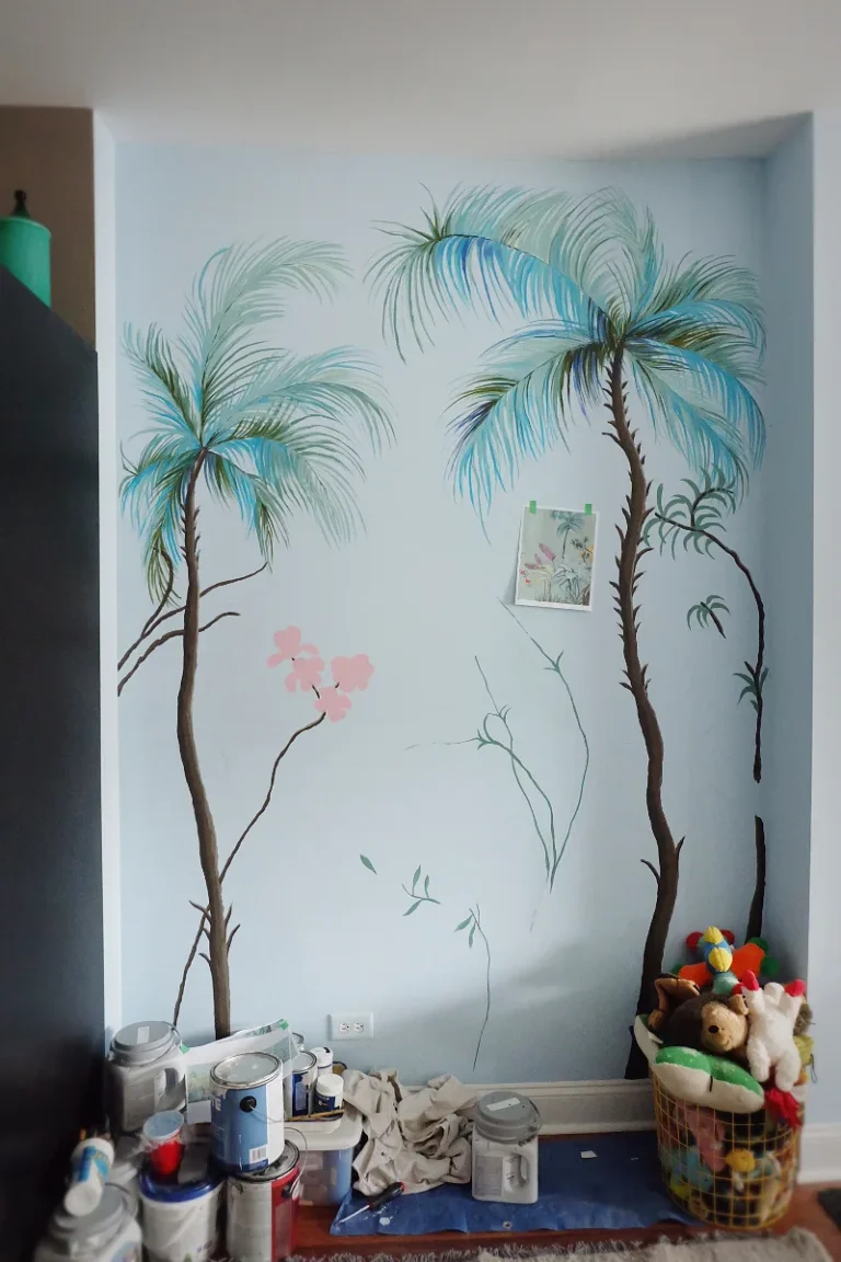
Entrance Wall Painting Design Ideas for a Striking First Impression
Ever picked a paint color that looked perfect on the swatch, then felt completely wrong on your foyer wall? You’re not alone. The entrance wall painting design process is one of the most common home decor frustrations because it’s where light, space, and first impressions collide in a way no paint chip can fully predict.
Getting it right, however, transforms the entire feel of your home from the moment you step inside.
The key lies in a specification most people overlook: Light Reflectance Value, or LRV. Every paint color has an LRV number from 0 (pure black) to 100 (pure white), and it tells you exactly how much light a color bounces back. For an entryway, this number is more important than the color name itself.
Understanding it, alongside a few other visual principles, is the difference between a welcoming statement and a daily regret.
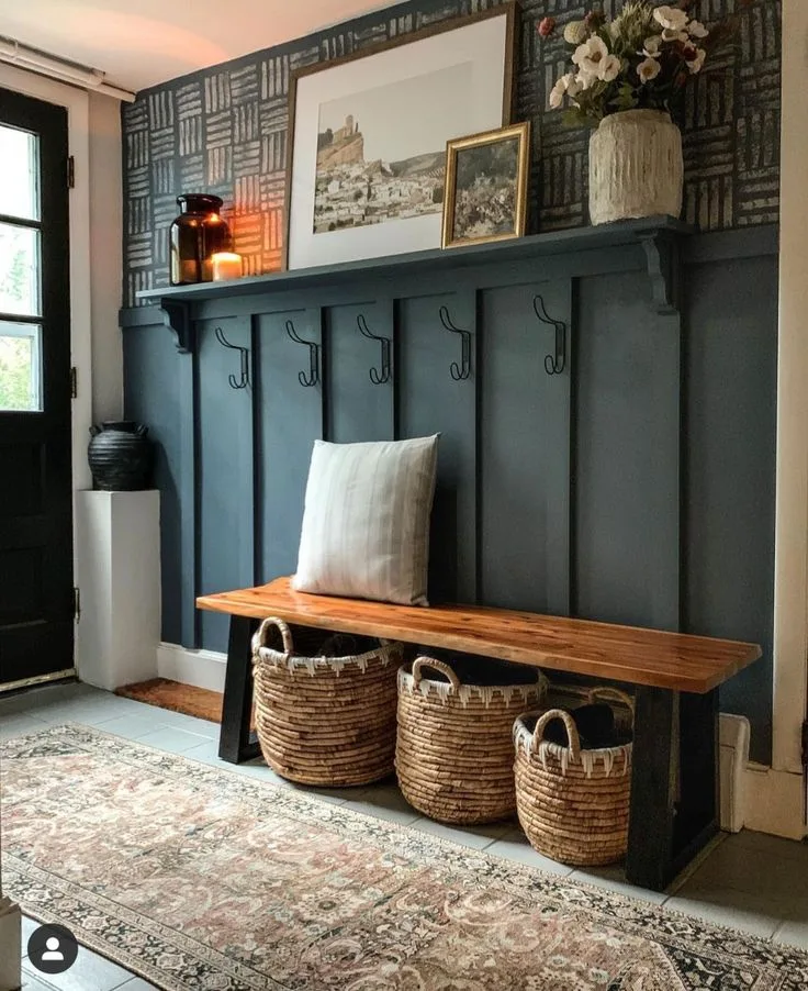
Quick Answer
The best entrance wall painting design creates an intentional first impression. Start with your home’s architectural style and lighting. Choose a paint with a Light Reflectance Value above 55 for small or dark entries.
Always use a durable satin or eggshell finish. Test large color samples on the wall for 48 hours. A successful design anchors the space without overwhelming it.
Why Your Foyer Color Never Looks Right on the Wall
It usually boils down to undertones and artificial light. A color might look beautifully warm and neutral in the store under fluorescent lighting. Then you bring it home, and under your specific mix of natural window light and LED bulbs, its hidden green, pink, or gray undertone screams at you.
This is why that “perfect greige” can suddenly look drab, sickly, or just plain cold in your space.
The second culprit is surrounding colors. Your foyer doesn’t exist in a vacuum. The color is in a constant visual conversation with your floor tile, wood stain, front door color, and the wall color of the room you see from the entrance.
A color that looked isolated on a swatch now has to harmonize with a dozen other fixed elements. When it clashes, your brain registers it as “wrong,” even if you can’t pinpoint why.
Finally, the sheer scale of the color changes everything. A one-inch square of a bold navy can feel sophisticated and manageable. Covering an entire eight-foot wall with that same navy creates a much more intense, saturated, and immersive experience.
The color becomes the environment, not just an accent. This intensity shift is the most common surprise in DIY painting.
The Single Most Important Design Rule for Entryways
It’s this: Design for the sight line. Your entryway is a transitional space, not a destination. The primary visual goal isn’t just to make the foyer itself look good, it’s to create a compelling visual path that draws the eye invitingly into the home. Think of your front door as a camera lens.
What is the first full view someone gets when they enter? That’s your sight line.
This means your entrance wall color should complement, not fight, the color palette of the main living area you see from the door. If your living room is a warm, earthy tan, painting the foyer a cool, stark gray creates a jarring, disconnected feel. Instead, pull a slightly darker or lighter shade from the same color family, or choose a coordinating neutral that bridges the gap beautifully.
This creates color continuity, which makes your home feel larger and more thoughtfully designed.
You also need to consider the ceiling and trim in this rule. A stark white ceiling and trim with a bold wall color can look harsh and unfinished, like the project was abandoned. For a more cohesive, designer look, consider painting the ceiling a lighter tint of the wall color (a 50% or 75% formula) and the trim in a soft, contrasting neutral.
This frames the space intentionally. You can find fantastic examples of this kind of intentional framing in spaces with a modern barndominium design, where clean lines and cohesive palettes are paramount.
Your Entryway’s Personality: Choosing a “Vibe” Over a Color
Forget searching for “the best foyer color.” Start by deciding on the emotional experience you want. Are you aiming for serene and airy, cozy and intimate, bold and dramatic, or warm and welcoming? Your target vibe will narrow your color choices from millions to a manageable few.
- Serene & Airy: You want the space to feel bright, open, and calm. Go for light, soft neutrals with high LRVs (above 70). Think creamy whites, very pale grays with warm undertones, or soft, barely-there blues and greens. This is ideal for small, windowless entries or homes where you want an immediate sense of spaciousness.
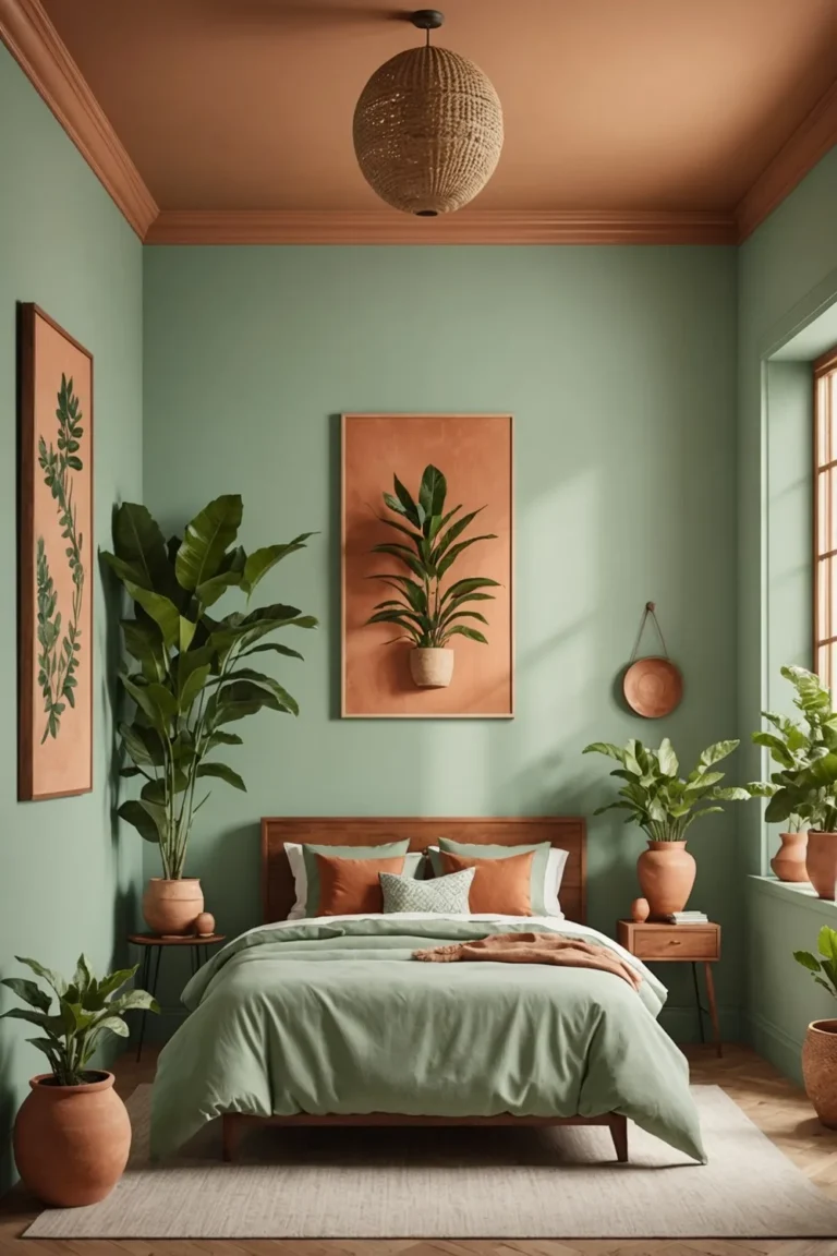
- Cozy & Intimate: You want the foyer to feel like a warm hug, not a hallway. This calls for medium-depth colors with warm undertones. Think taupe, warm greige, olive green, or muted terracotta. These colors absorb a bit more light, making the space feel snug and intentional, perfect for larger entries you want to feel more defined.
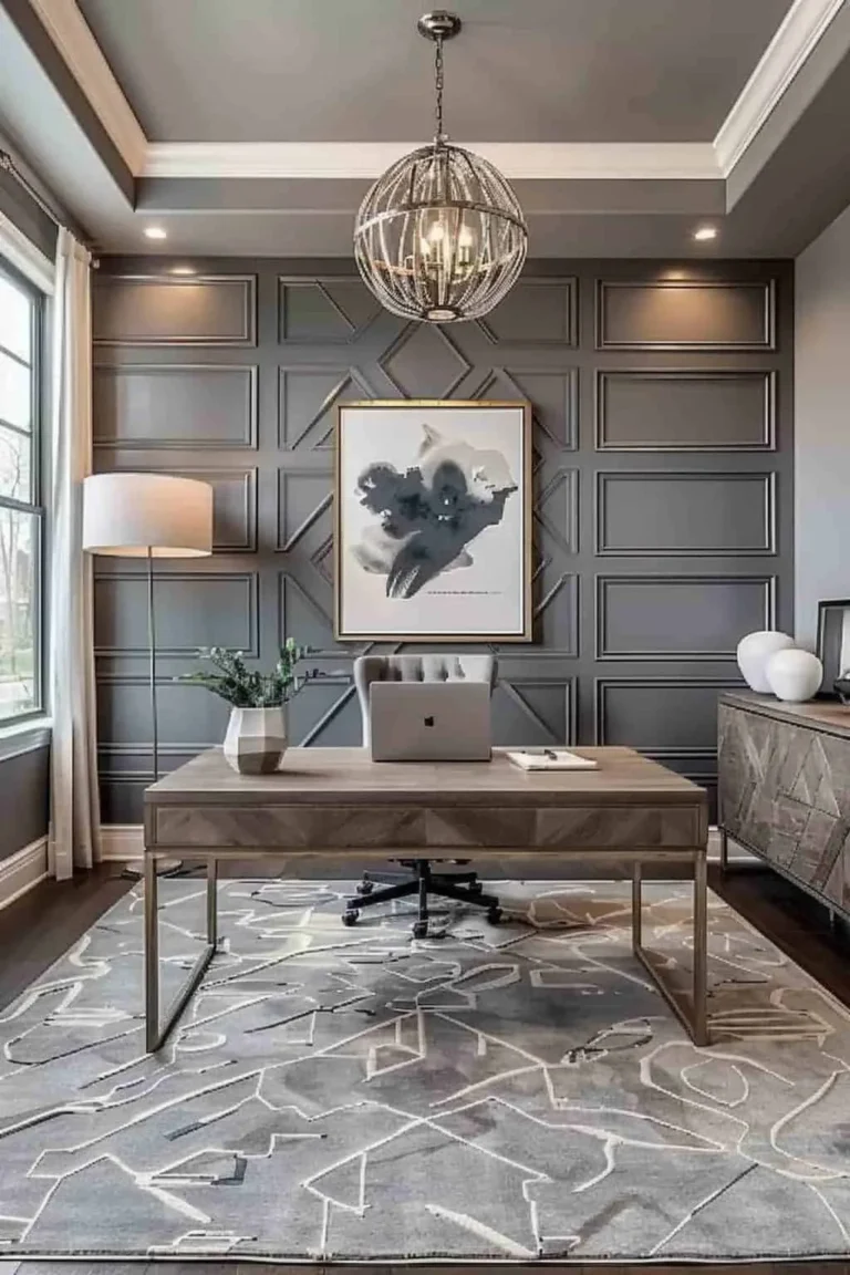
- Bold & Dramatic: You want a serious “wow” factor and aren’t afraid of color. This is where deep blues, charcoal grays, emerald greens, or even moody blacks come in. The key here is confidence and adequate lighting. A bold color demands good artificial light or a well-lit space to keep it from feeling like a cave. This vibe shares DNA with a moody purple bedroom decor approach, where depth and drama create the entire atmosphere.
- Warm & Welcoming: This is the classic, failsafe approach. It relies on colors that psychologically signal comfort and hospitality: soft yellows, warm beiges, peach-toned creams, or pale, earthy reds. These colors are inherently inviting and work with almost any architectural style.
How Light (or Lack of It) Dictates Your Color Choice
This is where science meets design. The amount and type of light your entryway gets is the single biggest factor in how your paint color will actually look. You must assess your space honestly before you pick up a single swatch.
North-facing or Windowless Entries: These spaces get little to no direct sunlight, only cool, indirect light. Colors here will look flatter, cooler, and darker. This is the most challenging scenario.
- The Fix: You must use colors with a high LRV (aim for 65+) to bounce the maximum amount of available light. Stick to warm undertones (creams, warm whites, pale peaches) to counteract the cool light. Avoid grays with blue or green undertones, as they will feel icy and unwelcoming.
South-facing Entries: These are flooded with warm, yellow-toned sunlight for most of the day. This warm light intensifies warm colors (yellows, reds, oranges) and mutes cool ones.
- The Fix: You have the most flexibility. You can use both warm and cool colors successfully. If you choose a warm color, know it will look even warmer. A cool gray here will be softened and balanced by the warm light, often looking more neutral than it would elsewhere.
East or West-facing Entries: These have strong directional light for half the day (morning for East, afternoon/evening for West) and are darker the other half. The color will look dramatically different at 9 AM versus 7 PM.
- The Fix: This is the strongest case for large-sample testing. You need to love the color in both its brightly lit and shadowed states. Mid-tone colors with balanced undertones often work best here, as they don’t swing to extremes.
Artificial Light Dominant: Many entries rely solely on overhead lights. The type of bulb is crucial.
- Warm White (2700K-3000K) Bulbs: Add yellow/red tones. They enrich warm colors but can make cool grays look dirty or beige.
- Cool White/Daylight (4000K-5000K+) Bulbs: Add blue tones. They sharpen cool colors but can make warm creams look sterile and cold.
Always view your final paint samples under the exact bulbs that will be in the fixture.
Beyond the Swatch: A Real Guide to Paint Finishes for High-Traffic Areas
The sheen (or finish) of your paint isn’t just about looks, it’s about performance. In an entryway, your walls face constant abuse: scuffs from backpacks, fingerprints near light switches, dirt from outdoor gear, and bumps from furniture. Choosing the wrong finish is a major reason paint jobs look tired prematurely.
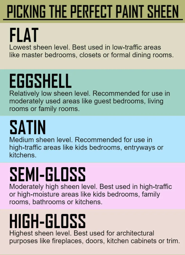
Here’s the simple breakdown of common finishes and where they work best in an entry:
| Finish (Lowest to Highest Sheen) | Pros in an Entryway | Cons in an Entryway | Best For |
|---|---|---|---|
| Matte / Flat | Hides wall imperfections beautifully. Rich, velvety look. | Not durable. Very difficult to clean. Marks easily. | Low-traffic, adult-only homes with perfect walls. Not recommended for most entries. |
| Eggshell | Subtle, low-luster sheen. More washable than matte. Good at hiding flaws. | Less durable than satin. Can still show frequent scuff marks. | Light-traffic entries, or homes where a softer look is prioritized over maximum durability. |
| Satin | The entryway gold standard. Excellent durability and scrubbability. Resists mildew. Good moisture barrier. | Shows surface imperfections more than eggshell. | Any and all entryways. The perfect balance of aesthetics and toughness for walls. |
| Semi-Gloss | Super durable, ultra-washable, and highly moisture-resistant. Reflects light well. | Highlights every wall bump and drywall flaw. Can look too shiny on walls. | Entryway trim, doors, and handrails. Use it on walls only if they are perfectly smooth or in a very wet climate. |
Our research into manufacturer specifications and professional painter recommendations confirms that for walls, Satin finish is the overwhelming choice for durability. Its slight sheen means you can wipe off dirt, scuffs, and fingerprints with a damp cloth without damaging the paint film, a must for any functional entry. Always check the paint can for the specific sheen name, as brands like “Pearl” or “Low-Lustre” are often their version of Satin.
For the trim, baseboards, and door casings, stepping up to Semi-Gloss makes sense. These areas get even more contact and need the toughest, most wipeable finish available. This two-sheen approach, satin on walls, semi-gloss on trim, is a professional standard for a reason.
It’s a technique that also works wonders when planning your barndominium exterior design, where material performance is key.
The Visualizer Tool Trap (And How to Use Them Right)
Most major paint brands offer free online visualizer apps. You upload a photo of your room and “paint” it with different colors. These tools are fun, but they’re not a substitute for real-world testing.
They often display colors with perfect, idealized lighting that doesn’t match your home’s actual conditions. The screen you’re viewing them on also drastically alters the color’s appearance.
Use these tools for one thing only, narrowing down possibilities. They’re excellent for getting a rough sense of how a color family (like blues versus greens) might look in a room-shaped space. Never make a final purchase based solely on a digital preview.
The color rendering is an approximation. Treat it as a brainstorming aid, not a final verdict.
Always move from the screen to physical samples. Once you’ve identified two or three promising digital options, get the actual paint swatches or sample pots from that brand. The color formula on screen is a best guess.
The physical paint is the truth.
Your 3-Step, No-Stress Color Testing Process
This process eliminates guesswork and regret. It requires a little patience, but it saves you from the cost and hassle of repainting an entire room you hate.
Step 1: Get the Right Samples.
Don’t rely on tiny paper swatches. Buy actual sample pots of your top two or three colors. As of 2026, a quart of sample paint typically costs between $5 and $8.
This is non-negotiable. Also, invest in a pack of white poster boards or a roll of primed drywall paper.
Step 2: Apply Them Correctly.
Paint two large squares (at least 2′ x 2′) of each color directly onto your foyer wall. Also, paint a swatch of each color on a white poster board. The wall squares show you the color in context with your fixed elements.
The poster board is movable, letting you see how the color looks at different times of day and in different parts of the entry.
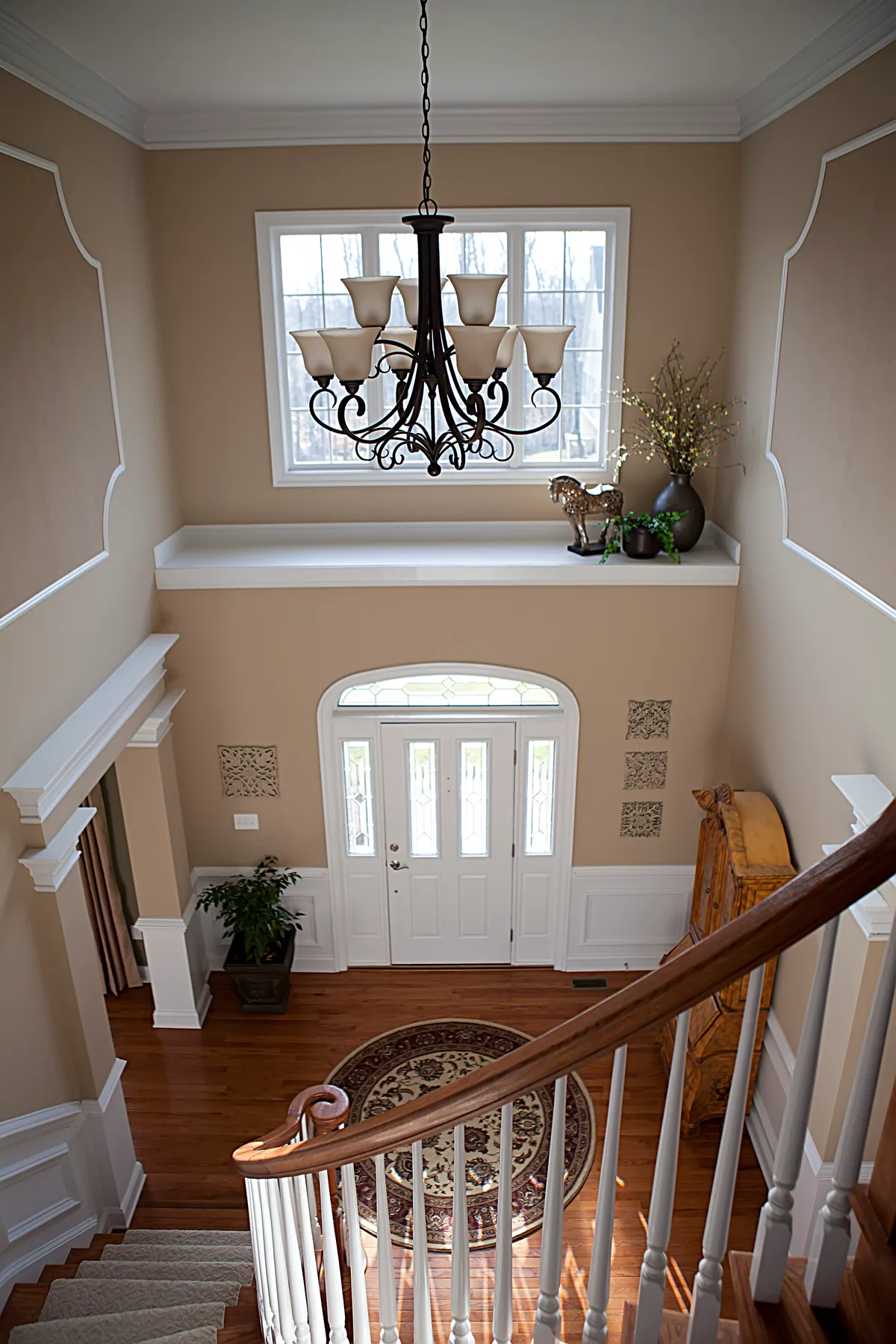
Step 3: Live With Them.
Observe the samples for a full 48 hours. Look at them in morning light, afternoon light, and with your artificial lights on at night. Notice how they look next to your floor and front door.
The right color will feel consistently good in all these conditions. The wrong one will feel “off” at some point.
The Accent Wall Question: Hero or Mistake?
An accent wall in an entryway can be a powerful design move. It can also be a distracting gimmick. The decision depends entirely on your space’s architecture.
Do an accent wall if: Your entryway has a natural, obvious focal point wall. This is usually the wall directly opposite the front door, or a wall with a striking architectural feature like a staircase, built-in bench, or fireplace. The accent color should highlight this existing feature, not fight for attention.
It works well in open-concept entries to visually define the zone without closing it off.
Skip the accent wall if: Your entry is a small, narrow hallway with no clear focal wall. A single dark or bright wall in a tight space can feel lopsided and make the area seem even smaller. Also avoid it if your sight line from the door shows multiple wall angles.
A lone colored wall can look random and unfinished from that key perspective.
If you proceed, choose the accent color thoughtfully. It should relate to the other walls, either as a darker shade from the same color strip or a complementary color that appears elsewhere in your adjoining room’s decor. This creates a sense of intentional design, much like using a feature wall to anchor a specific mood in an earthy moody bedroom decor scheme.
Paint vs. Wallpaper in the Entry: A Visual & Practical Breakdown
This is a classic design crossroad. Each material offers a distinct look and comes with its own set of practical considerations for a high-traffic area.
| Factor | Paint | Wallpaper (Peel-and-Stick / Traditional) |
|---|---|---|
| Visual Impact | Solid color, texture from sheen. Modern, clean. | Patterns, textures, murals. High visual detail and depth. |
| Durability | Good (with satin finish). Scuffs wipe off. Repairable. | Variable. Vinyl-coated is wipeable. Seams can lift. Harder to repair. |
| Installation | DIY-friendly with standard tools. | More skill-intensive. Requires precision, especially with patterns. |
| Moisture | Excellent resistance with proper paint. | Risk of peeling in humid climates unless specifically moisture-resistant. |
| Cost (DIY) | Lower cost per project. $30-$60 per gallon. | Higher. $50-$200+ per roll, plus adhesive, tools, and potential professional help. |
| Commitment | Easy to change. A weekend project. | High commitment. Removal can be difficult and damage walls. |
Choose paint for: Budget-friendly projects, a clean and timeless look, DIY ease, and climates with humidity fluctuations. It’s the flexible, low-risk champion for most entries.
Choose wallpaper for: Making a dramatic, high-design statement, adding intricate pattern or texture, or covering heavily flawed walls. Opt for modern, high-quality peel-and-stick versions for easier DIY installation and removal. This approach to creating a focal point is similar to the bold decisions seen in some moody pink bedroom design projects, where wallpaper defines the entire space.
Common Foyer Painting Fails (And How to Sidestep Them)
Learning from others’ mistakes is the cheapest education. Here are the most frequent missteps we see in aggregate homeowner reviews and professional forums.
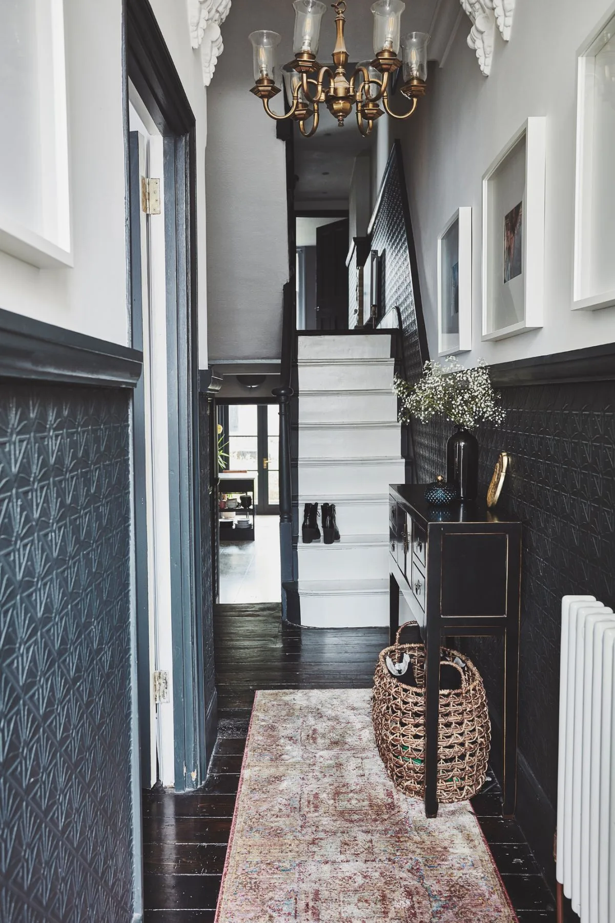
Fail 1: Painting a Small, Dark Entry a Dark Color.
This is the number one regret. A dark color absorbs light. In a space with no windows or poor lighting, this creates a cave-like feeling that’s the opposite of welcoming.
- The Fix: Follow the LRV rule. Use light, reflective colors (LRV 65+). If you crave drama, get it through a bold piece of art or a vibrant front door, not the wall color.
Fail 2: Using a Flat or Matte Finish.
It looks great for a week. Then the first scuff from a grocery bag appears, and you can’t clean it without leaving a shiny, smudged spot. Flat paint simply isn’t formulated for the wear an entryway receives.
- The Fix: Use a Satin finish on walls. It’s formulated to be scrubbed. For trim, use Semi-Gloss. This is non-negotiable for long-term satisfaction.
Fail 3: Ignoring the Primer.
Painting a deep color over a light one, or covering stains or patched drywall, without primer is a recipe for trouble. The old color will bleed through, stains will resurface, and you’ll need three or four coats of expensive paint for coverage.
- The Fix: Use a tinted primer. For dark colors, have the paint store tint your primer a mid-tone gray. This creates a neutral base so your topcoat color achieves true, rich coverage in just two coats.
The Pro’s Checklist: From Prep to Perfect Curb Appeal
Follow this sequence to ensure a flawless, durable finish that maximizes your home’s welcome.
- Surface Prep: Clean walls with a TSP substitute to remove grime. Fill holes with spackle, sand smooth, and wipe away dust. This step ensures paint adhesion.
- Prime: Apply a tinted primer to any patches, stains, or dark previous colors. This guarantees true color and even sheen from your topcoat.
- Tape & Cut In: Use painter’s tape on trim, ceilings, and corners. With a quality angled brush, carefully “cut in” by painting a 2-inch border along all edges.
- Roll Walls: Use a roller with a 3/8-inch nap for smooth walls. Work in 3-foot square sections, maintaining a wet edge to avoid lap marks. Apply two thin coats for best coverage.
- Paint Trim: After walls are dry, paint trim and doors with a semi-gloss finish using a smoother roller or brush designed for trim.
- Final Cleanup: Remove tape before paint is fully cured. Clean brushes and rollers immediately with soap and water for water-based paints.
Entryway Paint FAQs: Your Real Questions, Answered
What is the most timeless color for an entryway?
Warm, creamy whites and soft, greige neutrals are the most timeless choices. They provide a bright, clean backdrop that works with any decor style and won’t feel dated. Colors like Swiss Coffee by Benjamin Moore or Alabaster by Sherwin-Williams are perennial favorites for this reason.
Can I use the same color in my entryway and living room?
Yes, this is an excellent strategy for creating a seamless, expansive feel in an open floor plan. It strengthens the sight line and makes the home feel larger. If the spaces are distinct, using the same color on the entry wall that faces the living room can create a beautiful, intentional flow.
How long should I wait between coats?
Follow the paint can’s recoat time precisely. For most quality interior paints, this is 2 to 4 hours. Rushing this step can cause the second coat to peel or lift the first.
Full curing, when the paint reaches maximum hardness, takes about 30 days.
Is low-VOC paint worth it?
Absolutely. Low-VOC and Zero-VOC paints significantly improve indoor air quality during and after painting. They have minimal odor, making them better for households with children, pets, or anyone with sensitivities.
Most major brands now offer high-performance lines in these formulas.
How do I choose a paint color for a windowless entry?
Prioritize Light Reflectance Value (LRV). Choose a color with an LRV of 70 or higher. Lean into warm undertones like creamy yellow or soft peach to counteract the coolness of artificial light.
Ensure you have ample, warm-toned artificial lighting installed.
Should the ceiling be the same color as the walls?
Not necessarily. For a standard 8-foot ceiling, painting it white or a lighter tint of the wall color helps keep the space feeling open. In an entry with a tall, dramatic ceiling, you can paint it the same color as the walls for a cozy, enveloping effect.