Study Room Wall Painting Makeover Ideas for a Fresh, Focused, and Stylish Workspace
Ever stared at your study room wall and felt a strange sense of mental friction? You’re not imagining it. Your environment directly impacts your focus, and a successful study room wall painting makeover is less about decoration and more about cognitive design.
It’s about choosing colors and finishes that support deep work, not distract from it.
Modern, low-VOC paints have become the standard for indoor projects, with many top brands offering scrubbable matte finishes that hide imperfections beautifully. The trick is moving beyond a simple color swap to a strategy that considers light, purpose, and visual psychology. Let’s break down how to see your space with a designer’s eye first.
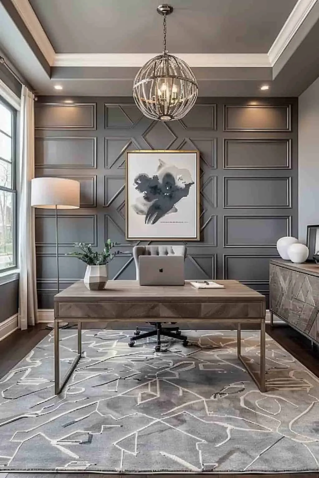
Image source: Bing (Web (fair-use with source credit))
Quick Answer
A study room wall painting makeover boosts focus by using color psychology and sheen. Choose cool, muted tones like soft greens or warm grays for calm concentration. Always test large paint samples on your wall to see the true color in your light.
Use a matte or eggshell finish to reduce screen glare. This strategic approach transforms your walls into a tool for productivity, not just a background.
Why Your Study Room Walls Might Be Working Against You
Think about the last time you tried to focus in a room that felt visually “loud.” Maybe the color was too bright, creating a constant low-level stimulation. Perhaps the finish was glossy, casting distracting reflections on your computer monitor. Your brain was working overtime to filter out that environmental noise, leaving less energy for the task at hand.
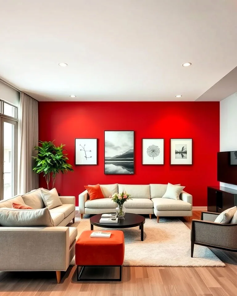
This isn’t just anecdotal. Research into environmental psychology consistently shows that our surroundings affect cognitive performance. A wall color that clashes with your intent, like a fiery red in a space meant for calm analysis, can subconsciously put you on edge.
The goal of a makeover is to remove these friction points. We’re not just painting; we’re calibrating your space to filter out distraction and signal to your brain, “It’s time to work.” This is the foundational principle behind creating an effective home office design.
Common culprits include high-gloss paint that acts like a mirror, dark colors that absorb light and make a small room feel cave-like, and undertones that fight with your furniture. A beige with a pink undertone next to wood with orange tones can create a visual dissonance you feel but can’t name. Identifying these issues is your first step toward a fix.
The “Look Test”: Understanding Your Space’s Visual Vibe
Before you open a paint fan deck, you need to diagnose your room. Grab a notebook and answer two key questions: what’s your light source, and what’s your primary task? This “look test” sets your entire project’s direction.
Assessing Your Light (Natural vs. Artificial)
Light changes everything. A color that looks serene and soft in north-facing natural light can look flat and dead under warm LED bulbs at night. Stand in your room at different times of day.
Note the direction of your windows and the color temperature of your overhead lights and lamps (cool white vs. warm white).
North-facing light tends to be cooler and bluer, which can make warm paint colors look more balanced. South-facing light is warmer and brighter, which can intensify warm colors. If you rely on artificial light, your paint choice is even more critical.
Always view your final paint samples under the lights you’ll actually use to work. This step alone prevents the most common post-paint regret: “It looked different in the store!”
Measuring the Mood You Actually Need
“Focus” isn’t one-size-fits-all. Is your study for intense reading and writing, requiring deep calm? Or is it for creative brainstorming, where you need a spark of energy?
Your answer dictates your color palette.
For analytical tasks, you’ll want colors that promote tranquility and limit stimulation. For creative work, you might allow for slightly more energetic, but still muted, tones. Be honest about how you use the space.
A room used for video calls also needs to consider how the wall color looks on camera and complements your skin tone, which is a factor in professional modern barndominium design offices, too. Define your core need in one sentence: “This wall must help me concentrate for three-hour study sessions,” or “This space should feel inspiring for my side projects.”
Beyond “Just Blue”: How Paint Color Actually Affects Focus
We’ve all heard “blue is calming,” but that’s an oversimplification. A neon blue is energizing, not calming. It’s the saturation, lightness, and undertone that do the heavy lifting.
A color’s Light Reflectance Value (LRV), a standard measurement on most paint chips, tells you how much light it reflects. For a study, you generally want an LRV in the 50-70 range, light enough to feel airy but not so bright it’s stark.
The Truth About Color Psychology for Studying
Here’s a more nuanced look at productive palettes, based on aggregated design research and color theory:
- Soft Greens & Blue-Greens: These are top contenders. Green is associated with balance and restfulness for the eyes. Sage, muted seafoam, or grayish-green can lower heart rate and ease anxiety, which is ideal for test prep or detailed work.
- Warm Grays & Greiges: These are incredibly versatile neutrals. A gray with a green, blue, or purple undertone (cool gray) feels crisp and modern. A gray with a brown or beige undertone (greige) feels warmer and more inviting. Both provide a perfect, quiet backdrop.
- Muted Blues: Think dusty blue, slate, or air force blue. These cooler tones can promote clear thinking and mental clarity, better than brighter blues. They pair exceptionally well with natural wood tones, a hallmark of cabin barndominium decor.
- Earthy Neutrals: Soft taupe, putty, or clay. These colors feel grounded and stable, reducing visual stress. They’re excellent if you want a hint of warmth without the energy of a true tan or beige.
The Undertone Trap (and How to Avoid It)
This is where most DIY projects go wrong. Every color has an undertone, a hint of another color hidden within it. Gray can lean blue, purple, or green.
Beige can lean pink, yellow, or orange. White can be stark, warm, or cool.
The trap happens when your wall’s undertone clashes with the fixed elements in the room: your flooring, furniture, or window trim. A gray with a blue undertone next to oak floors with yellow tones will look disconnected and often make the blue seem more pronounced. The fix?
Place your paint sample right next to these fixed items. Does it look harmonious, or does it suddenly look a different color? Choose a paint with an undertone that’s in the same family as your largest fixed element.
If you have warm wood floors, choose a gray with a subtle warm (brown) undertone, not a cool one.
The Visualizer’s Toolkit: Seeing It Before You Paint It
You would never buy a car without a test drive. Don’t buy paint without a visual test drive. This phase is non-negotiable and saves you time, money, and disappointment.
How to Build a Digital Mood Board
Start by gathering inspiration online. Use platforms like Pinterest, but be specific. Search for “home office green accent wall” or “study nook paint color.” Save images where you love the feeling, not just the color.
Look at the whole scene: the furniture, the lighting, the accessories.
Create a simple digital board by collaging these images. You’ll start to see patterns. Do you keep saving rooms with natural wood and white walls?
Or moody, dark academies? This clarifies your aesthetic direction before you spend a cent. This process is similar to planning a cohesive barndominium exterior design, where the interior mood begins with the external first impression.
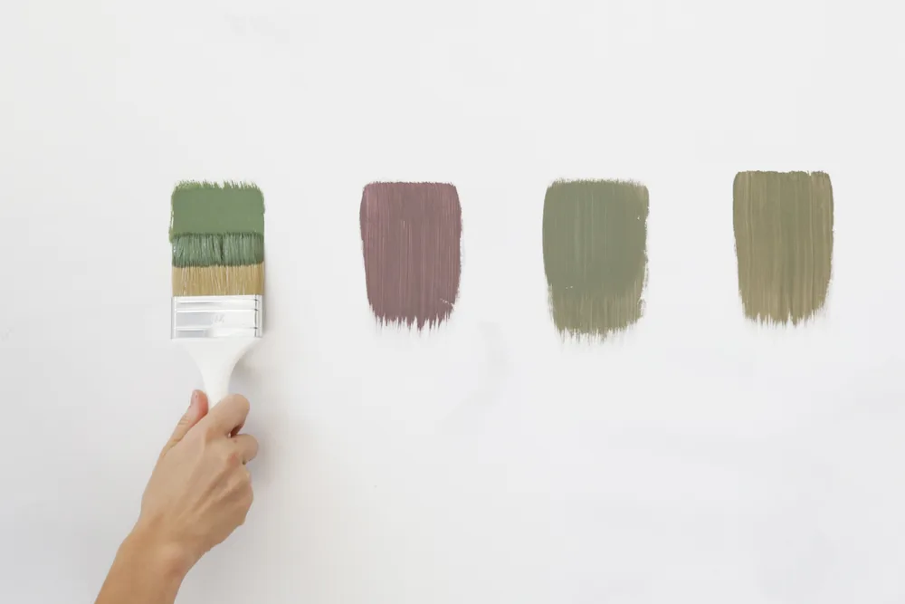
The Right Way to Test Paint Samples on Your Walls
Buy sample pots of your top 2-3 colors. Paint a large swatch (at least 2ft x 2ft) on two different walls: one in direct light and one in a shadowy corner. Do not paint a tiny patch; it’s impossible to judge.
Live with these samples for at least 48 hours. Look at them in the morning light, under your desk lamp at night, and with the overhead light on. The color will shift.
The winner is the one that looks good in all conditions and doesn’t fight with your rug, desk, or bookshelf. This real-world test is the only way to confirm your choice.
Choosing Your Finish: It’s Not Just About Shine
The sheen you pick impacts the room’s functionality as much as the color. Sheen refers to how glossy or reflective the paint surface is once dry. As of 2026, paint technology offers durable flat finishes that were once impossible, changing the game for home offices.
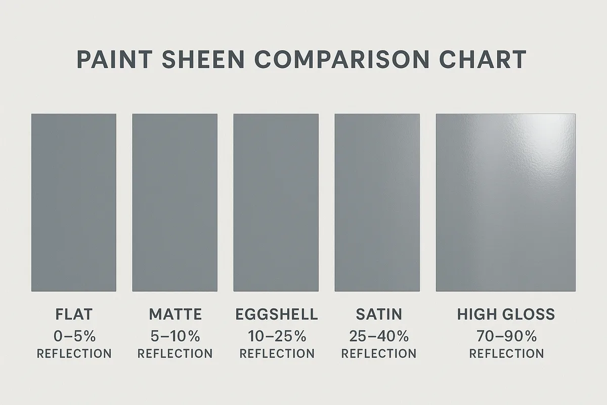
Here’s a breakdown of the most relevant finishes for a study room:
| Sheen | Look & Feel | Best For Study Rooms? | Key Consideration |
|---|---|---|---|
| Matte (Flat) | Non-reflective, velvety, hides wall imperfections well. | Excellent. Provides zero glare, ideal for screen-heavy work. | Modern formulas are more washable, but still less so than higher sheens. |
| Eggshell | Very slight, soft luster (like an eggshell). | Very Good. A safe, versatile choice with a hint more durability. | May show a faint sheen under direct light, but usually glare-free. |
| Satin | A gentle, pearl-like shine. | Use with caution. More scrubbable, but can cause reflections. | Can create noticeable glare on screens if opposite a window or light. |
| Semi-Gloss | Clearly shiny and reflective. | Not recommended for walls. | Creates far too much distraction and glare for focused work. |
Matte vs. Eggshell vs. Satin for Screen-Friendly Walls
For most study rooms, the debate is between matte and eggshell. Choose matte if:
- Your walls have minor bumps or imperfections you want to hide.
- You have multiple monitors or work directly opposite a window.
- You prioritize absolute minimal light reflection.
Choose eggshell if:
- The room doubles as a kids’ homework space and needs more cleanability.
- Your walls are in perfect condition (eggshell can highlight flaws).
- You want a touch more light reflection to make the color feel slightly more vibrant.
Avoid satin on all large wall areas. It can be useful for trim or doors in the same room for contrast, but it’s too reflective for productive wall space. The choice here directly affects eye strain, making it a critical part of your gaming room false ceiling lighting plan, where screen glare is a major concern.
Durability and Light Reflection: What the Sheen Really Does
The higher the sheen, the more durable and washable the paint film. That’s why semi-gloss is used on trim and doors, areas touched frequently. However, this durability comes with reflectivity.
The Light Reflectance Value (LRV) of the color is fixed, but the sheen controls how that light is dispersed.
A matte finish diffuses light evenly across the wall surface, creating a soft, uniform appearance. A glossier finish creates “hot spots” where light bounces off directly. In a study, you want that light diffused to prevent those hot spots from competing with your screen or reading material.
Always check the manufacturer’s specifications for a product’s specific sheen level and scrubability rating to match it to your room’s traffic.
Mapping Your Wall Strategy: Accent, Full, or Patterned?
Once you’ve chosen your color and finish, decide how much of the room to paint. This choice dictates the project’s scale and visual impact. The three main approaches serve different spatial and psychological functions.
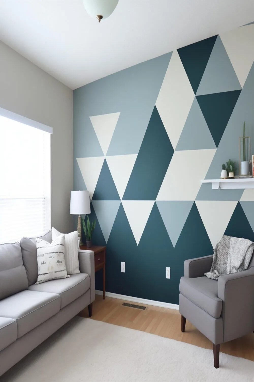
When an Accent Wall Makes All the Difference
An accent wall is a single wall painted a different color, or a different shade of the main color. It’s a powerful tool for visual zoning. Use an accent wall behind your desk to immediately define your work zone.
This creates a subconscious focal point, drawing you into the task.
This strategy works brilliantly in small rooms or shared spaces. It adds depth and interest without overwhelming the senses. In a room with a less-than-ideal layout, the accent wall can also trick the eye.
Paint the wall opposite the door in a slightly darker tone to make the room feel deeper and more intentional. This technique can anchor a space, much like a bold bathroom false ceiling style defines the room’s upper boundary.
The Case for Painting All Four Walls
Painting every wall the same color creates a cohesive, immersive environment. This is the best choice if your primary goal is a calm, uniform backdrop that minimizes distraction. It makes a small room feel larger and more defined, as there are no visual breaks.
Choose this route if your study is a dedicated room you want to feel like a true retreat. It’s also the simplest approach logistically. Just ensure your chosen color truly works in all lighting conditions, as you’ll be surrounded by it.
A full-room application of a serene color can be deeply effective for sustained concentration, similar to the enveloping feel of an earthy moody bedroom decor scheme.
Simple Geometric Patterns for Visual Zoning
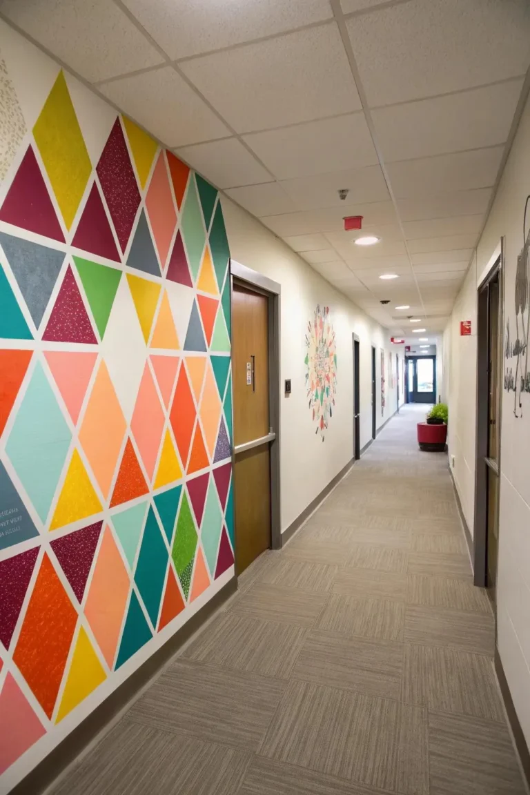
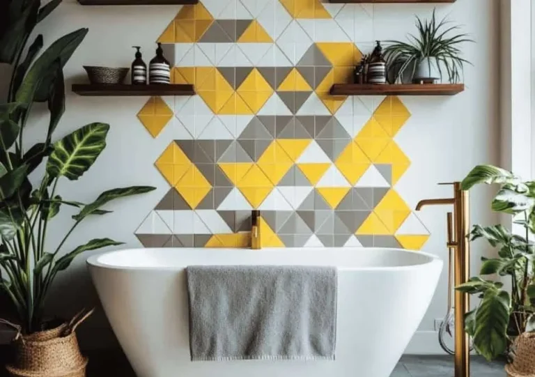
For the adventurous, geometric paint patterns offer high-impact zoning without physical furniture. Think of a painted arch behind your desk, or subtle vertical stripes on one wall. These patterns actively structure the space, which can be great for creative or ADHD brains that benefit from clear visual boundaries.
Keep the colors within the same family (e.g., two shades of the same green) to maintain calm. Use painter’s tape to create sharp lines. This approach requires more planning and skill, but the payoff is a completely custom, functional art piece.
It’s a step beyond a flat color and makes the room uniquely yours.
Your Paint Makeover Plan: From Blank Wall to Productive Space
A smooth execution relies on a clear sequence. Rushing the prep or the painting order is the fastest way to a sloppy result. Follow this five-step workflow.
Step 1: Define Your Goal in One Sentence
Before you touch a brush, write down your objective. “This room must help me focus on online courses for three hours at a time.” Or, “Create a cheerful, inspiring nook for my art projects.” This sentence becomes your decision filter for every choice that follows, from color to sheen.
Step 2: Gather Tangible Inspiration
Move from digital mood boards to a physical swatch kit. Collect paint chips, fabric samples from your chair, or a piece of your flooring. Tape them to your wall.
Seeing these elements together in your actual space prevents undertone clashes you might miss on a screen.
Step 3: The 48-Hour Sample Test (On Multiple Walls)
We can’t stress this enough. Paint your large sample swatches and observe them. This is the most important research you’ll do.
The right color will feel settled and “right” in your room’s unique light. The wrong one will feel off. This test is cheap insurance against a costly, frustrating repaint.
Step 4: Prep Work That Actually Matters
Good prep is 80% of a professional finish.
- Clear and clean: Move all furniture to the center and cover it. Remove outlet covers and switch plates. Wash the walls with a mild detergent to remove dust and oils. Let them dry completely.
- Repair: Fill any nail holes or dents with spackle. Sand smooth when dry.
- Tape: Use painter’s tape for clean edges on trim, ceilings, and adjacent walls. Press the tape down firmly to seal the edge and prevent bleed-through.
Step 5: The Painting Order for a Pro-Looking Finish
Use the right tools: a 2-inch angled brush for “cutting in” edges and corners, and a 9-inch roller with a medium-nap sleeve for walls.
- Prime if needed (over dark colors, stains, or new drywall).
- “Cut in” the edges of the entire room with your brush.
- Roll the main wall areas while the cut-in edges are still wet, to blend. Use a “W” pattern to distribute paint evenly, then fill it in without lifting the roller.
- Let the first coat dry completely (check the paint can, usually 2-4 hours).
- Apply the second coat following the same cut-in then roll sequence.
Remove the painter’s tape when the second coat is still slightly tacky, not bone dry. This gives the cleanest line.
Common Visual Pitfalls (And How to Sidestep Them)
Knowing what to avoid is as crucial as knowing what to do. These are the recurring issues that derail a study room’s functionality.
The Glare Problem on Monitors
This happens when light from a window or lamp reflects off a glossy wall directly onto your screen. You squint and tilt the monitor to compensate.
The fix: Stick with matte or flat finishes. Position your desk so the monitor is parallel to the window, not directly facing or backing it. Use adjustable task lighting that you can angle away from the wall.
Making a Small Room Feel Cramped
Painting a small study a dark color can feel cozy but often backfires, making it feel closed in and dark.
The fix: Use light, reflective colors (higher LRV) on walls. Consider painting the ceiling the same light color to visually lift it. Use your accent wall strategy on the farthest wall to create depth, not on a side wall which can make the room feel narrower.
Creating Visual “Noise” That Distracts
This is the result of too many competing elements: a busy wallpaper, a wall cluttered with shelves and art, or a paint color that’s too saturated. Your eye doesn’t know where to rest.
The fix: Embrace simplicity. One or two clean, muted colors. A single, well-defined focal point (like your desk against an accent wall).
Keep decor minimal and intentional. The wall should be a calm stage, not the main performer.
The Pro’s Cheat Sheet: Tips From a Designer’s Eye
These insider insights streamline your choices and elevate the final result from good to great.
Using LRV Numbers to Predict Lightness
Don’t guess how light a color is. Look at its Light Reflectance Value on the paint chip or website. An LRV of 0 is pure black (absorbs all light), 100 is pure white (reflects all light).
For study room walls, target an LRV between 50 and 70. This ensures enough lightness to feel airy without being sterile.
Pairing Your Wall Color with Existing Furniture
Your furniture is a fixed element. Find its undertone. Is your wood desk warm (yellow/orange) or cool (grayish)?
Is your chair fabric warm beige or cool gray? Choose a wall color with a complementary undertone. Warm furniture looks best with warm wall colors (greige, warm white).
Cool furniture pairs with cool walls (gray with blue/green undertones). This creates harmony, the foundation of any refined space, from a study to a moody pink bedroom design.
The One Thing to Splurge On (and What to Save On)
Splurge on quality paint and brushes. Premium paints often have better pigments, coverage, and durability. They may require fewer coats. A high-quality angled sash brush gives you crisp, controlled lines and holds more paint.
This makes the job faster and the finish cleaner.
Save on rollers, trays, and tape. These are disposable items. Buy a pack of roller covers and a few plastic tray liners. Good painter’s tape is important, but you don’t need the most expensive brand for a one-off project.
Invest the bulk of your budget where it touches the wall.
Paint, Wallpaper, or Something Else?
Paint is the default, but it’s worth a quick glance at the alternative to confirm your choice is right.
A Quick, Honest Look at Removable Wallpaper
Removable wallpaper has surged in popularity. It offers patterns and textures paint can’t replicate. It’s a great option for renters or commitment-phobes.
The installation requires patience and a very smooth wall.
For a study room, its downside is often visual complexity. Most patterns are busier than a solid paint color. This can introduce the visual noise we try to avoid.
If you choose it, opt for a small-scale, subtle pattern in a muted color palette and use it only on an accent wall.
Why Paint Wins for Flexibility and Cost
For a functional study room, paint is almost always the superior choice. It’s more affordable per square foot. You have an infinite range of custom color options.
It’s easier to apply uniformly to all walls, creating that cohesive, immersive feel. Most importantly, it’s easier to touch up or change later. The simplicity and versatility of paint make it the most reliable tool for a focus-oriented makeover.
What About Safety and Smell?
Indoor painting introduces fumes and chemicals into your air. Proper handling is non-negotiable for your health, especially in a room where you’ll spend hours breathing.
Choosing Low-VOC Paints for Indoor Air
Volatile Organic Compounds (VOCs) are chemicals that off-gas as paint dries. They cause that “new paint” smell and can trigger headaches or respiratory issues. The solution is low-VOC or zero-VOC paint, now standard from major brands.
Look for these labels on the can. They perform just as well as traditional paints for interior use and are a must for any home project.
Ventilation and Dry Time Realities
Even with low-VOC paint, you need airflow. Open windows and use fans to create a cross-breeze during painting and for at least 48 hours after. Drying to the touch happens in hours, but full curing, when off-gassing essentially stops, can take up to 30 days.
Plan your project when you can ventilate the room well for several days afterward.
Real Scenarios: Which Path Fits Your Room?
Let’s apply everything to three common situations. This shows how the theory works in practice.
The “Tiny Apartment” Focus Nook
This is a corner of a bedroom or living room. The goal is visual separation. Use a light, muted color (LRV 60+) on the accent wall behind your desk.
A soft green or warm gray works well. Pair it with a matte finish to kill glare. This visually carves out your zone without closing in the larger room.
The “Professional Zoom Background” Home Office
This room needs to look polished and calm on camera. Avoid pure white, which can blow out on video. A medium-toned color like a warm greige or dusty blue provides a flattering, non-distracting backdrop.
Ensure even lighting on the wall to avoid shadows. This creates a put-together look that supports your professional presence.
The “Kid-Friendly” Homework Station
Durability and cheer are key here. Choose an eggshell finish for wipeability. A soft, muted yellow or green can feel energetic yet calm.
Keep the palette simple and use an accent wall to define the study area within a playroom. This balances function with a welcoming vibe for young learners.
Frequently Asked Questions
What’s the best paint color for long study sessions?
Choose muted, cool-toned colors like soft sage green, dusty blue, or warm gray. These hues promote calm and mental clarity without being visually stimulating. Always test samples in your specific light.
Can dark colors work in a small study?
They can, but it’s risky. A dark accent wall on the far end of a small room can add depth. Painting all walls dark will likely make it feel smaller.
Ensure you have excellent, layered artificial lighting to compensate.
How do I stop my gray paint from looking blue?
Your gray has a blue undertone. Choose a gray with a complementary undertone like “greige” (gray-beige) which has warm brown or green undertones. View large samples next to your flooring and furniture in your room’s light.
Is it worth hiring a painter for just one room?
It depends on your skill, time, and the room’s complexity. If you have high ceilings, detailed trim, or a complex pattern, a pro ensures a flawless finish. For simple walls, DIY is very achievable with proper prep and patience.