Brown Wall Painting Ideas: Warm, Earthy Colors for a Richer Interior
Brown Wall Painting Ideas can feel like a risky jump into the dark compared to a safe white or beige. You’re not alone if you worry it will make a room feel dreary or dated. The truth is, a well-chosen brown is one of the most versatile and sophisticated neutrals you can use.
It grounds a space, adds instant warmth, and makes everything from art to wood furniture stand out beautifully.
The key to success lies almost entirely in understanding undertones and Light Reflectance Value, or LRV. This number, which you’ll find on most major paint brands’ swatches, tells you how much light a color reflects. Browns with an LRV below 30 will feel deep and dramatic, while those above 50 read as soft, light tans.
Getting this right means your space will feel cozy, not cave-like. Let’s break down exactly how to find your perfect shade.
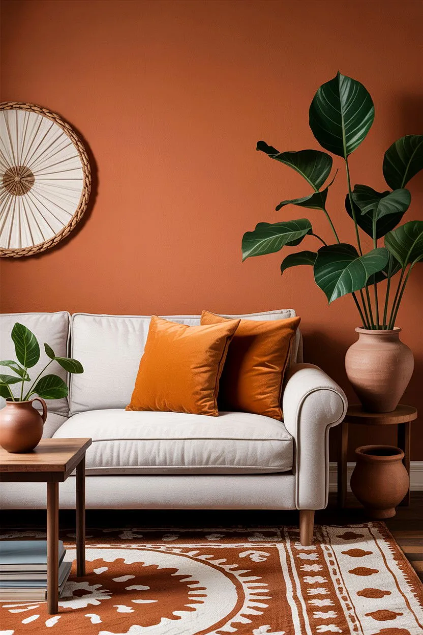
Image source: Bing (Web (fair-use with source credit))
Quick Answer
Brown walls create a warm and grounding backdrop. Start by sampling swatches to see the color in your room's unique light. Focus on finding a brown with an undertone that complements your fixed elements like flooring.
Darker browns with low LRV values work best as accents in well-lit rooms. Lighter, warmer browns can comfortably cover all four walls in most spaces.
Why Brown is More Than Just "Brown"
We often think of brown as a single, simple color. In reality, it’s a complex family of hues that can swing wildly warm or cool. The right brown doesn’t just add color.
It adds atmosphere. It can make a large, echoey room feel intimate and inviting. It can turn a bland box into a sophisticated study or a snug living room.
Where many neutral schemes fall flat, brown brings a rich, organic quality that feels inherently welcoming. It’s a background that doesn’t fight for attention but instead makes your furnishings, textiles, and decor the stars. This makes it a fantastic choice for creating a cohesive and intentional home, especially in designs that lean rustic or modern.
It’s also a champion at hiding the scuffs and marks that show up instantly on light gray or white walls, which is a huge practical win in high-traffic areas.
The First Thing You Should Do: Sample, Sample, Sample
This is the single most non-negotiable step. Do not buy a gallon of paint based on a tiny chip or a digital screen. The color you see online or under the fluorescent lights of a hardware store will transform in your home’s light.
You need to see it on your actual walls, at different times of day.
Buy sample pots, typically 8 oz sizes, of your top three to five contenders. Paint a generous swatch (at least 2' x 2') directly onto the wall. Better yet, paint two swatches: one in a spot that gets direct sun and another in a shadowy corner.
Live with these patches for at least 48 hours. Observe them in the morning light, the harsh afternoon sun, and under your artificial lighting at night.
You’ll be amazed at how a color can look like a warm caramel at noon and shift to a cool, grayish taupe by evening. This test run is cheap insurance against a costly and disappointing full-room paint job. It’s the only way to know for sure how the undertones will play with your specific flooring, cabinetry, and fixed finishes.
How to Read a Paint Swatch (It's All About Undertones)
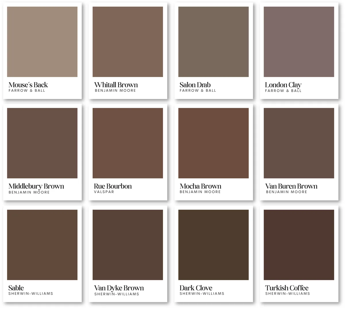
This is where most people go wrong. They pick a brown they like on a card without diagnosing its secret ingredient: the undertone. Every brown has a secondary color mixed in that dictates its personality and what it will pair with.
The main undertone families you’ll encounter are:
- Red/Orange: Think chocolate, coffee, or terra cotta. These are warm, stimulating, and cozy. They pair brilliantly with creams, golds, and warm woods.
- Green: This is your earthy, organic brown. It reads as sophisticated and calm. It loves to be paired with other natural elements, like linen, jute, and black metal accents.
- Yellow: These are your caramels, tans, and beigey-browns. They are sunny and welcoming but can risk looking dated if you pick one that’s too golden.
- Purple: Less common, but present in some deep, plummy browns. It feels luxurious and pairs well with jewel tones.
- Gray (Taupe): This is the most contemporary and versatile brown. Taupe is a gray-brown that feels clean, modern, and effortlessly pairs with both cool and warm accents.
The trick to spotting the undertone? Hold the swatch against a piece of pure white paper. The secondary color will often jump out.
Also, look at the darkest shade on the paint fan deck strip. The undertone is usually most pronounced in the deep version of the color.
Dark, Medium, or Light? Picking Your Brown's Intensity
The intensity of your brown, its lightness or darkness, is controlled by its Light Reflectance Value. This isn't just about mood. It's a functional choice that impacts how a room feels spatially.
| LRV Range | Intensity | Room Feel | Best Use |
|---|---|---|---|
| Below 30 | Dark | Dramatic, intimate, cozy | Accent walls, libraries, dining rooms, powder rooms. Use in rooms with excellent natural or artificial light. |
| 30 – 50 | Medium | Balanced, rich, grounded | Excellent for full rooms (living rooms, bedrooms). The most versatile range for creating warmth without heaviness. |
| Above 50 | Light | Airy, warm, neutral | Can feel like a warm white or beige replacement. Safe for small rooms, low-light spaces, or if you want a subtle shift. |
As of 2026, major paint brands prominently list a color's LRV on their websites and apps. Use this data. A dark brown (LRV 15) on all four walls of a north-facing bedroom with one small window will feel like a cave.
That same color on a single wall behind a bed in a south-facing room with large windows could be stunning. If you love a dark shade but have low light, use it selectively as an accent rather than the main event. This approach can add that moody, atmospheric depth you're after without overwhelming the space.
Choosing the Perfect Sheen for Your Brown Walls
The sheen, or finish, of your paint changes more than just how shiny it is. It changes the color's perceived depth and highlights the wall's texture. Here’s a quick guide to match the finish to your room’s needs.
- Flat/Matte: Has no shine. It provides the richest, deepest color and beautifully hides wall imperfections. The downside is that it’s the least durable and hardest to clean. Best for low-traffic adult spaces like formal living rooms, bedrooms, or ceilings.
- Eggshell: Has a soft, velvety sheen with a slight glow. It offers more durability and washability than flat while still minimizing imperfections. It’s the most popular all-around choice for living rooms, hallways, and dining rooms.
- Satin: Has a smooth, pearl-like sheen. It’s highly durable and easy to wipe clean, making it ideal for kitchens, bathrooms, kids’ rooms, and trim. Be warned: it will show every bump and patch job on an unprepared wall.
- Semi-Gloss: Has a noticeable shine. It’s ultra-durable and moisture-resistant. Reserve this for trim, doors, and cabinets, not full walls, as the high reflectivity can be overwhelming and highlight any surface flaw.
For most brown walls, especially in living areas, eggshell is the sweet spot. It gives you the warmth and depth of a low-sheen finish with the practicality needed for real life. If you’re going for a bold, dark brown on an accent wall, a flat finish can make it look incredibly luxurious and intense.
Just be sure the wall is in near-perfect condition first.
The 5 Main Brown Paint Families & Where They Shine
Now that you understand undertones, let’s put them to work. Think of these families as different personalities for your space. Each one creates a distinct vibe and pairs best with specific styles and fixed elements.
Warm & Cozy: The Red/Orange Undertones
This family includes colors like chocolate, coffee, and terra cotta. They radiate warmth and comfort, making them ideal for social spaces where you want to foster conversation and relaxation. They pair perfectly with warm woods, brass or gold finishes, and textiles in cream, mustard, or rust.
Use these in living rooms, dining rooms, or dens. They work especially well in rooms with cool northern light, as the warm undertone helps balance the bluish cast. Be cautious in small, sun-drenched south-facing rooms, as the extra warmth could make the space feel overly hot.
Earthy & Organic: The Green Undertones
These browns have a subtle green base that connects them directly to nature. Think mossy browns or muddy, clay-like shades. They feel calm, grounded, and incredibly sophisticated.
This family is a cornerstone of biophilic design and modern organic styles.
They look stunning with natural materials like linen, jute, leather, and blackened steel. Use them in bedrooms for a serene retreat, in home offices to promote focus, or in sunrooms to enhance the connection to the outdoors. They can also anchor an earthy, textural bedroom scheme beautifully.
Modern & Sleek: The Gray Undertones (Taupe)
Taupe is the ultimate chameleon. It’s a gray-brown that feels clean, contemporary, and endlessly flexible. It doesn’t commit strongly to warm or cool, so it works with almost any accent color you throw at it.
This makes it a fantastic choice for open-plan homes where colors need to flow.
Pair it with crisp white trim, chrome or nickel finishes, and pops of color like navy, blush, or sage green. It’s perfect for modern kitchens, hallways, and bedrooms where you want a neutral that’s more interesting than plain gray.
Rich & Sweet: The Yellow Undertones
These are your caramels, tans, and beigey-browns. They’re sunny, welcoming, and nostalgic. When done right, they feel like a warm hug.
The risk is choosing a shade with too much yellow, which can veer into a dated 90s look.
To keep it fresh, pair a yellow-based brown with plenty of contrast. Use black or charcoal accents, clean white trim, and modern furniture lines. Avoid pairing it with other yellow-toned woods or gold fixtures, as that can amplify the dated feeling.
It works well in casual family rooms or rustic kitchens.
Deep & Dramatic: The Neutral Browns
Some deep browns, like espresso or dark chocolate, have relatively neutral undertones. They are powerful and dramatic, acting more like a rich black than a colorful brown. They create incredible intimacy and make a striking backdrop for art and light-colored furniture.
These are almost exclusively accent wall colors. Use them behind a bed, on a fireplace wall, or in a powder room for high impact. They demand good lighting, either natural or layered artificial light, to keep the space from feeling closed in.
In the right setting, they achieve a level of moody opulence that lighter colors can’t match.
Visual Guide: Matching Brown Walls to Your Room's Light
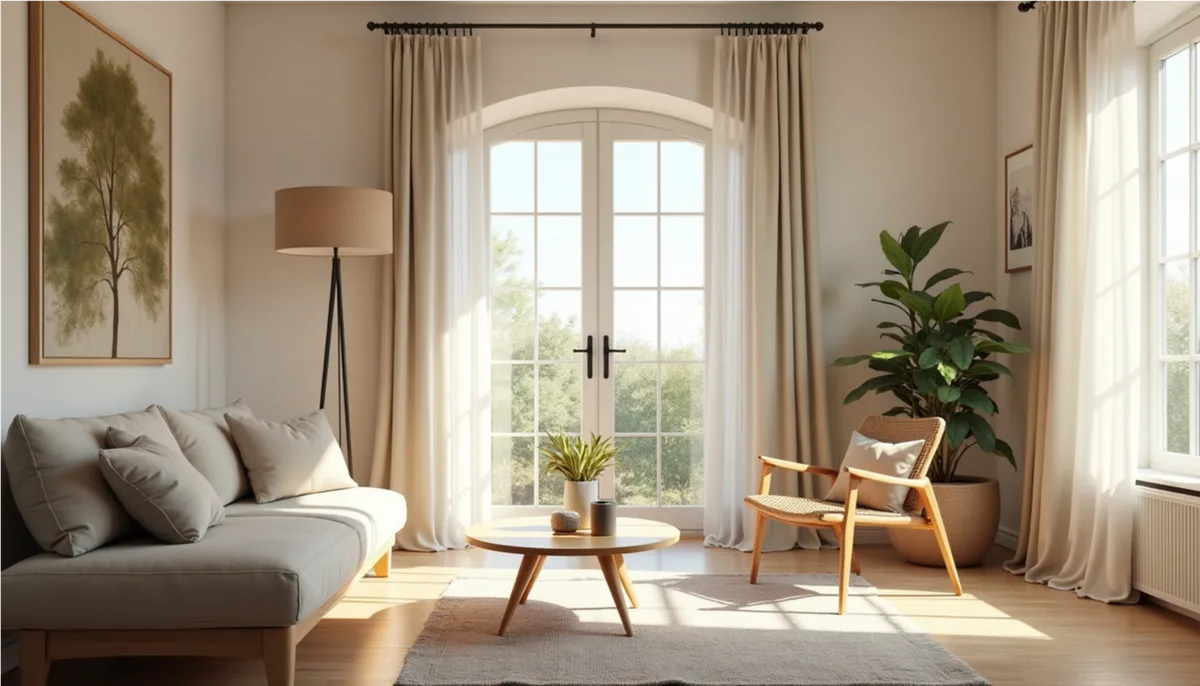
Light is the variable that changes everything. The same paint can look like two different colors across town. Your room’s direction and window quality are the final bosses of color selection.
North-Facing Rooms (Cool, Low Light)
North light has a cool, bluish, and flat quality. It lacks the warming rays of direct sun. This light can suck the warmth out of colors, making them look duller and grayer than they are.
Your strategy here is to fight the coolness with warm undertones. Lean into the red, orange, or yellow-based brown families. A warm caramel or a terra cotta brown will look balanced and inviting.
Avoid gray-based taupes or greens here, as they can amplify the cold, gloomy feeling. You might also need to go a shade lighter than you think, as the low light will make any color appear darker.
South-Facing Rooms (Warm, Abundant Light)
South-facing rooms are flooded with warm, golden light throughout the day. This light intensifies warm tones and can make a room feel overly yellow or hot if you’re not careful.
You have the most flexibility here. You can use those beautiful earthy greens and cool taupes without fear of them looking icy. You can also use darker shades effectively, as the abundant light will keep them from feeling oppressive.
If you do choose a warm brown, you might select one that’s slightly more muted or grayed-down to counteract the amplifying effect of the sun.
East/West-Facing Rooms (Changing Light)
These rooms have a split personality. East rooms get bright, warm light in the morning and cooler light in the afternoon. West rooms are the opposite, cool in the morning and blazingly warm in the evening.
For these spaces, focus on balanced, medium-tone browns. A true taupe or a brown with a subtle green undertone often works well because they don’t swing too wildly in either direction. Always sample here.
Watch your swatches at 9 AM and 5 PM to see how they transform. You want a color that feels good in both lights, not one that only works for half the day.
The 60-30-10 Rule: Building a Color Palette Around Brown
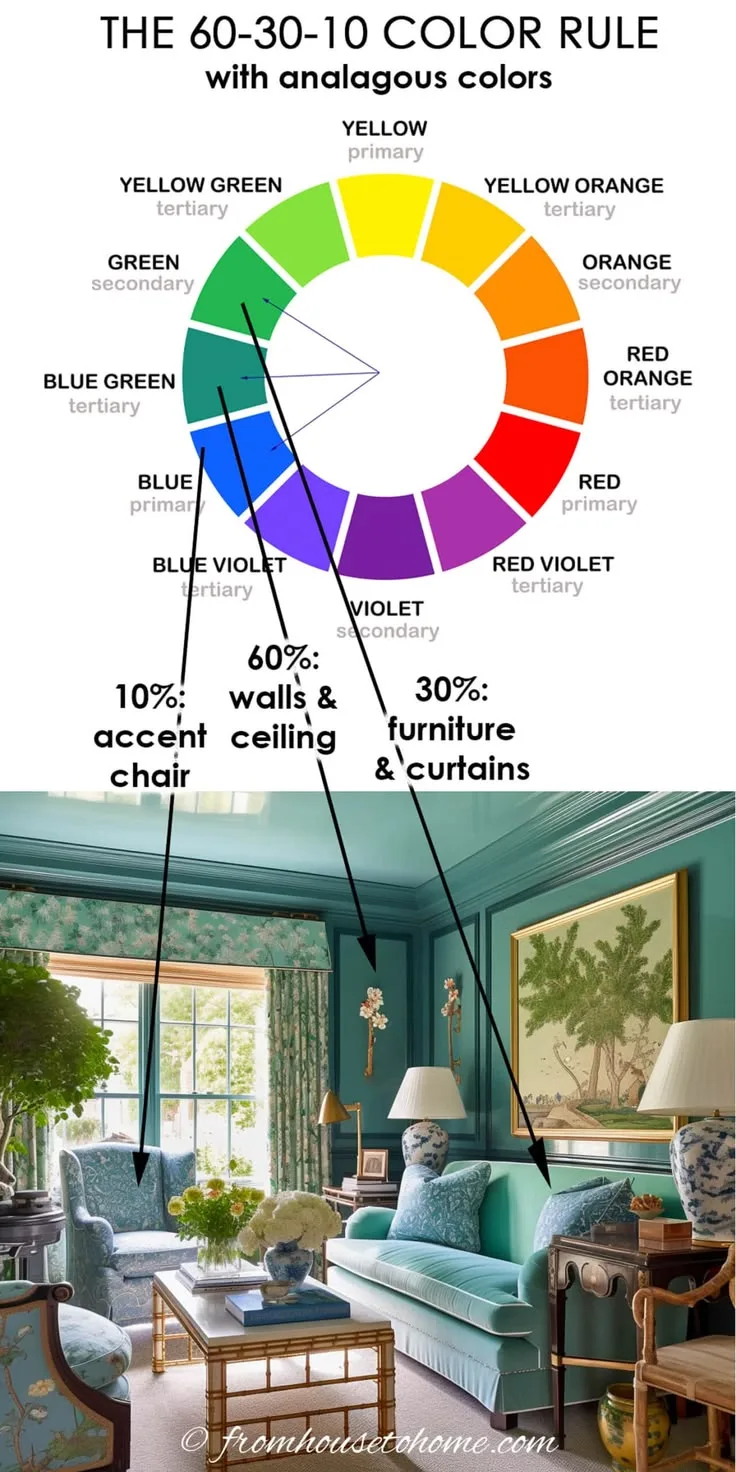
You’ve picked your perfect brown wall color. Now what about everything else? The 60-30-10 rule is a classic designer trick for building a balanced, layered color scheme.
It prevents a room from feeling flat or chaotic.
- 60% is your Dominant Color. This is your brown wall color. It sets the overall mood and feel of the room.
- 30% is your Secondary Color. This is usually your upholstery (sofa, chairs), area rug, or drapery. It provides visual interest and supports the main color. For brown walls, great secondary colors are creams, deep navies, olive greens, or soft taupes.
- 10% is your Accent Color. This is for pops of personality. Think throw pillows, artwork, vases, or a single accent chair. This is where you can introduce a bit of contrast or vibrancy, like terracotta, burnt orange, mustard yellow, or even a blush pink.
Let’s make it concrete. Imagine your walls are a warm, medium-brown (60%). Your large sofa is a neutral cream linen (30%).
Your accent pillows, a small side table, and the spines of some books are a rich terracotta (10%). This creates a cohesive, designed look that feels intentional, not random. This principle is just as effective for creating a coherent modern aesthetic as it is for a traditional living room.
Common Mistakes That Make Brown Look "Muddy"
A muddy brown is one that looks dirty, flat, and lifeless. It’s the number one fear and the most common result when the selection process is rushed. Here’s how to avoid it.
Ignoring the Undertone Clash. This is the biggest culprit. You fall in love with a brown swatch but don’t see its strong purple undertone. Then you put it in a room with orange-toned hardwood floors.
The warm orange and cool purple fight, creating a visually unpleasant, muddy mess. Always check your brown against your largest fixed elements before committing.
Using the Wrong Sheen. A flat or matte finish can look incredibly rich. On a poorly lit wall or a brown that’s already very muted, that same flat finish can absorb all light and look dead. If your room lacks light, consider an eggshell finish to add a subtle luminosity that keeps the color alive.
Choosing a Color That’s Too Muted or Grayed-Out. Some browns are deliberately formulated to be very quiet and complex. While sophisticated in theory, in a low-contrast room with similar-toned furniture, they can simply disappear into a blob of blah. Ensure you have enough contrast in textures and values (lights and darks) to define the space.
Forgetting to Test in Your Own Light. We can’t stress this enough. A brown that looks clear and beautiful at the store under 5000K LEDs can turn into a murky, greenish-gray on your wall at dusk. The only fix is to sample.
Paint a large swatch. Live with it. Observe it.
This single step eliminates most muddy outcomes before a single drop of real paint goes on the wall.
Step-by-Step: From Swatch to Painted Wall
You’ve done the hard work of choosing. Now let’s get it on the walls correctly. A good paint job is 90% preparation.
Buying the Right Sample Pots
Don’t just get the little paper chips. Buy the actual sample pots of your top two or three finalists. When you buy, make sure the store shakes the can thoroughly on their mechanical shaker.
A poorly mixed sample will not show the true color.
If you’re testing a very dark brown, ask if the brand offers a specific "deep tint base" for samples. Some standard sample pots can’t hold the amount of pigment needed for a true dark shade, giving you a misleading, lighter version.
How to Test Colors Properly
Paint two large squares (at least 2’ x 2’) on different walls. One should be in the primary light source, another in a shadow. Do not paint a small stripe.
A large sample lets you see the color as a field, which is how you’ll experience it.
Prime the test area with white primer if you’re painting over a dark color. Otherwise, the old color will distort your new sample. Apply two coats of the sample paint for full, accurate coverage.
Then, live with it for two full days. Look at it first thing in the morning, at noon, and with your lamps on at night. This tells you the whole story.
Prep, Prime, and Paint
- Prep: Remove switch plates and outlet covers. Fill any holes or cracks with spackle. Sand smooth once dry. Wash walls with a mild detergent to remove dust and grease. Tape off trim, ceilings, and fixtures with painter’s tape.
- Prime: This step is critical for a true, rich color, especially if you’re painting over a darker wall or new drywall. A tinted primer (gray for dark browns) is a pro secret that helps achieve full coverage in fewer topcoats. It seals the surface and ensures your brown looks exactly as intended.
- Paint: Always use high-quality brushes for cutting in (edging) and a high-quality roller cover for the field. Start by cutting in around all edges. Then roll the wall in a “W” or “M” pattern to distribute the paint evenly, then fill it in without lifting the roller. Maintain a “wet edge” to avoid lap marks. Always plan your work so you can complete an entire wall in one session.
- Second Coat: Almost every paint job needs two coats for uniform color and sheen. Check the paint can for the recommended dry time between coats, usually 2 to 4 hours. Do not skip this coat, as one coat of brown will often look streaky and patchy.
This methodical approach ensures a professional-looking finish that does your carefully chosen brown justice. It’s the same attention to detail that would go into planning a featured architectural element in your home.
Your Brown Wall Questions, Answered
"Will brown make my room look smaller?"
It can, but it doesn't have to. A dark brown on all walls in a room with low light will absorb light and feel more intimate. To avoid a shrinking effect, use a lighter brown (higher LRV) or use dark brown only on a single accent wall.
Pairing it with light-colored trim, ceilings, and furniture creates contrast that defines the space's dimensions.
"What's the best white trim for brown walls?"
The undertone rule applies here too. For warm browns (red/orange undertones), choose a white with a warm base, like Swiss Coffee or Alabaster. For cool browns (green/gray undertones), a clean, cool white like Chantilly Lace or Pure White works best.
Always test your trim white next to your brown wall swatch.
"Can I use brown in a modern, minimalist room?"
Absolutely. The key is choosing the right brown. Stick with taupe or an earthy brown with a green undertone.
Use it in a flat or matte finish for a quiet, sophisticated feel. Pair it with crisp white, black metal accents, and clean-lined furniture. This creates a modern, organic look that’s far from rustic.
"How do I decorate with brown walls?"
Treat brown as your rich neutral backdrop. Let it be the 60% in your 60-30-10 scheme. Layer in textures like linen, wool, and wood.
Add contrast with metals in brass, black, or chrome. Introduce your accent colors through artwork, ceramics, and textiles. The brown walls will make these elements pop beautifully.
Final Decision Guide: Finding Your Brown
Ready to choose? Let's make it simple. Follow this quick decision path.
First, identify your room's fixed elements. What color is your flooring? Your cabinets? Your countertop?
Your goal is to find a brown that complements these, not clashes.
Second, assess your light. Is it bright and warm (south-facing) or cool and dim (north-facing)? This tells you if you can go dark and cool or need to lean light and warm.
Third, pick your mood. Do you want cozy and traditional (warm undertones), calm and earthy (green undertones), or modern and flexible (taupe)? Your answer points you to the right family.
Finally, sample. Buy pots of your top two contenders that pass the first three tests. Paint large swatches. Watch them for two days.
The color that looks consistently good in all lights, against your fixed elements, is your winner.
Trust this process. It turns the overwhelming choice into a series of simple, logical steps. You’ll end up with a brown that feels intentional, personal, and perfectly suited to your home.